What is a Cloud Efficiency Tracker Dashboard?
A Cloud Efficiency Tracker Dashboard template helps IT teams and cloud administrators track how effectively cloud resources are being used. It displays key metrics like CPU and memory usage, storage utilization, uptime, and cost per instance across various services and regions. The dashboard wireframe provides actionable insights that help businesses reduce wastage, optimize performance, and make smarter decisions about their cloud infrastructure.
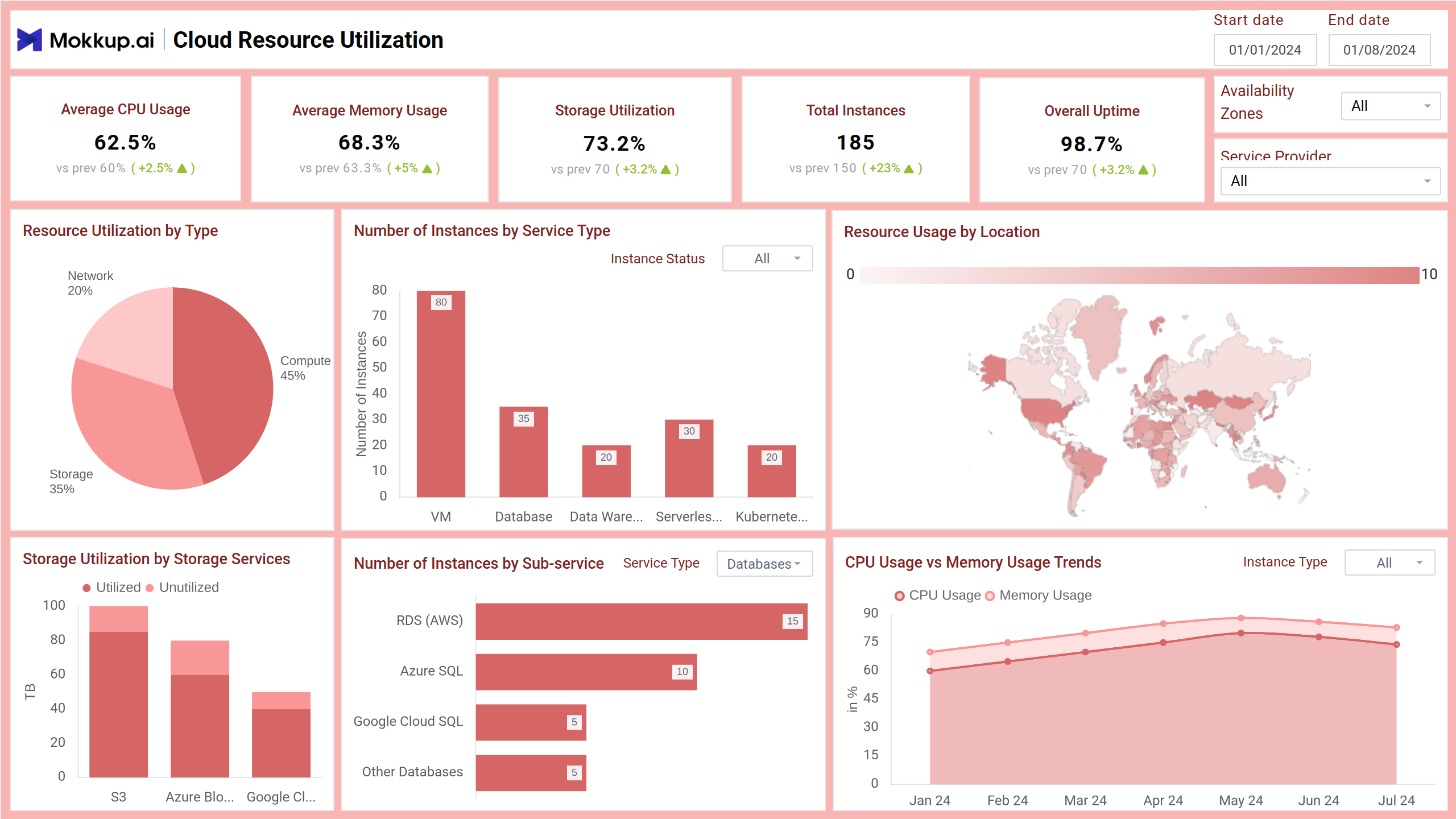
Cloud Efficiency Dashboard Example
The Cloud Efficiency Tracker Dashboard template provides a real-time view of how cloud resources, such as compute, storage, and network services, are being used across providers and availability zones. Designed for IT administrators and DevOps teams, the dashboard wireframe highlights resource usage, cost patterns, and service reliability to help businesses optimize infrastructure performance and spending.
How to Analyze Data in Cloud Efficiency Dashboards
The Cloud Efficiency Tracker Dashboard template helps IT teams monitor cloud usage, optimize spending, and improve performance. Here’s how to get actionable insights from it:
- Track CPU and memory trends using area charts to identify over- or underutilized instances. High usage may signal a need to scale, while low usage can indicate wasted resources.
- Monitor storage efficiency with stacked column charts comparing used and unused capacity across services like AWS S3 or Azure Blob. This reveals whether storage allocation matches actual demand.
- Analyze cost per service alongside usage efficiency using combo charts. Services with high costs and low utilization may need reconfiguration or downsizing.
- Use geomaps and heatmaps to locate high-usage regions or overloaded services, allowing targeted scaling or rebalancing of resources.
- Spot reliability issues through downtime visualizations, helping you investigate and reduce service disruptions across compute, network, or storage.
By using filters such as date, service provider, and availability zone, teams can drill down into problem areas, enabling smarter resource allocation and cost control.
How to Create a Cloud Efficiency Dashboard
You don’t need to build your report from scratch—just start with a ready-to-use sample Cloud Efficiency Tracker Dashboard template from Mokkup. Add in your data and export it however you like. Here’s how to do it:
1. Create or Log in to Your Mokkup Account
Start by signing up on Mokkup.ai using your email. Already have an account? Just log in, and you’re good to go.
2. Choose and Customize Your Dashboard Template
Find the Cloud Efficiency Tracker Dashboard in the Templates section. Use the drag-and-drop editor to adjust KPIs, edit filters, or add elements based on your data.
3. Export to Your BI Tool
Once your dashboard wireframe is ready, use the BI Tool Export feature to send it directly to Power BI or Tableau for further analysis and enhancements. You can also download the dashboard as a PDF, PNG, or JPEG, embed it on a platform, or invite your team to collaborate.
Note: This is a Pro template. To use and customize this dashboard wireframe, you’ll need a Pro subscription on Mokkup. Upgrade anytime to unlock full access.
Benefits of Cloud Efficiency Dashboards
The dashboard template helps IT teams take control of cloud infrastructure by delivering clear insights into usage, costs, and performance. Here are the key benefits:
- Optimized Resource Utilization: Visualize CPU, memory, and storage usage to avoid over-provisioning and underutilization.
- Improved Cost Management: Identify high-cost services with low efficiency and reallocate budgets based on usage insights.
- Enhanced Reliability Monitoring: Spot downtime trends and high-risk instances early to ensure uninterrupted service.
- Data-Driven Decision Making: Use real-time metrics to adjust workloads, scale resources, and manage demand more effectively.
- Performance Benchmarking: Compare services, regions, and sub-services to improve performance standards across the board.
These dashboard wireframes help organizations maintain high performance while minimizing waste, ensuring cloud investments deliver maximum value.
KPIs to Track in Cloud Dashboards
Tracking the right Key Performance Indicators (KPIs) in cloud dashboards ensures efficient resource usage, cost control, and service reliability. Here are the most critical ones:
- Average CPU Usage: Measures how much of the available processing power is being used across instances.
- Average Memory Usage: Tracks how efficiently memory is being utilized, identifying under or overuse.
- Storage Utilization: Compares used vs. available storage to evaluate data management and avoid waste.
- Total Instances: Counts all cloud instances, active or inactive, to understand capacity and scale.
- Overall Uptime: Indicates system availability, directly reflecting service reliability.
These KPIs are essential for spotting inefficiencies and making smarter decisions in cloud infrastructure management.
Frequently Asked Questions
Q1. What does a Cloud Efficiency Tracker Dashboard monitor?
It monitors key metrics like CPU and memory usage, storage utilization, cost per instance, and uptime to help IT teams manage cloud resources efficiently.
Q2. How can this dashboard help reduce cloud costs?
The dashboard supports cost-saving actions like rightsizing or decommissioning by identifying underutilized resources, high-cost services, and inefficient instance types.