What is a Christmas Airport Traffic & Passenger Flow Insights Dashboard?
A Christmas Airport Traffic & Passenger Flow Insights Dashboard template is designed to monitor and manage the surge in passenger volume and airport efficiency during the peak holiday travel period. It consolidates key metrics such as passenger volume, on-time performance, queue times, and baggage handling into a single visual platform.
By integrating Christmas passenger flow analytics, holiday airport efficiency metrics, and festive travel bottleneck identification, the dashboard helps airport operations teams optimize staffing, streamline security screening, and minimize flight delays. The dashboard wireframe serves as a central command center for tracking hourly throughput, analyzing causes of delays, and ensuring a seamless passenger experience during the Christmas rush.
How to Create a Christmas Airport Traffic & Passenger Flow Insights Dashboard
You don’t need to build your report from scratch—just start with a ready-to-use Christmas Airport Traffic & Passenger Flow Insights dashboard template from Mokkup. Add in your data and export it however you like. Here’s how to do it:
1. Create or Log in to Your Mokkup Account
Start by signing up on Mokkup.ai using your email. If you already have an account, just log in, and you’ll be good to go.
2. Choose and Customize Your Dashboard Template
Find the Christmas Airport Traffic & Passenger Flow Insights Dashboard template in the Templates section. Use the drag-and-drop editor to adjust KPIs, edit filters, or add elements based on your data.
3. Export to Your BI Tool
Once your dashboard wireframe is ready, use the BI Tool Export feature to send it directly to Power BI or Tableau for further analysis and enhancements. You can also download the dashboard as a PDF, PNG, or JPEG, embed it on a platform, or invite your team to collaborate.
Note: This is a Pro template. You’ll need a Pro subscription on Mokkup to use and customize this dashboard wireframe. Upgrade anytime to unlock full access.
Christmas Airport Traffic & Passenger Flow Insights Dashboard Example
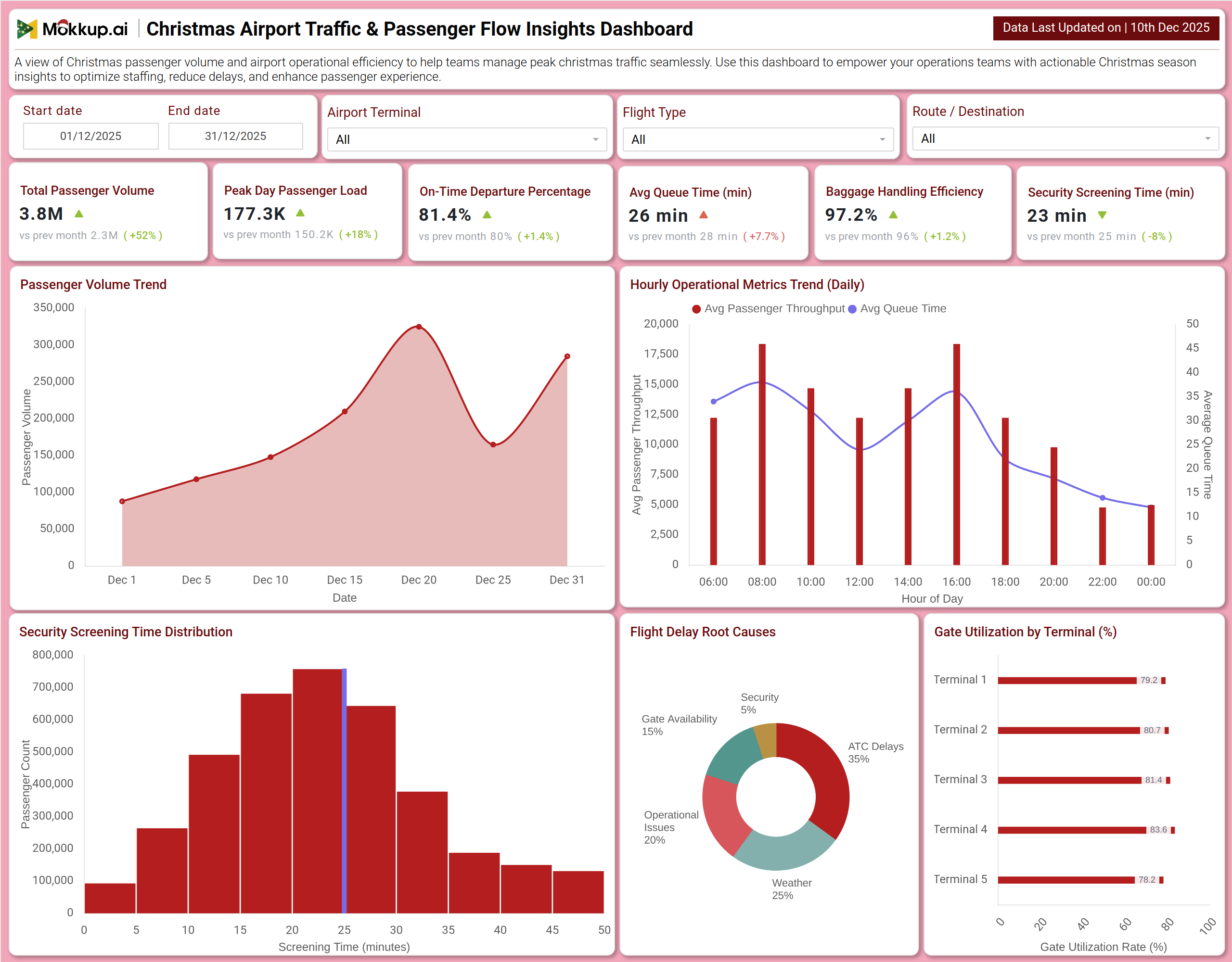
You can create a Christmas Airport Traffic & Passenger Flow Insights Dashboard that brings together passenger volume trends, operational efficiency, and delay diagnostics into a unified view. A typical dashboard includes an Overview section, where users can track Total Passenger Volume, Peak Day Passenger Load, and On-Time Departure Percentage. Visual charts, such as the Passenger Volume Trend and Hourly Operational Metrics, reveal daily and intraday patterns that are critical for resource planning. The Operations & Delay Analysis section builds on this by displaying Security Screening Time Distribution, Flight Delay Root Causes, and Gate Utilization by Terminal. Together, these modules deliver crucial airport holiday operations monitoring, enabling teams to proactively manage congestion, allocate staff efficiently, and minimize operational disruptions.
How to Analyze Data in Christmas Airport Traffic & Passenger Flow Insights Dashboard
Here is how you can analyze data from this dashboard:
- Total Passenger Volume: Monitor overall holiday travel demand and compare it with non-festive periods to understand scale and pressure points.
- Peak Day Passenger Load: Track the busiest travel day to plan staffing, counters, and security resources effectively.
- On-Time Departure Percentage: Analyze flight punctuality to assess operational reliability during peak Christmas traffic.
- Average Queue Time: Review wait times at check-in, security, and boarding to identify congestion areas.
- Baggage Handling Efficiency: Measure baggage processing accuracy and speed to reduce mishandling during high volumes.
- Security Screening Time: Evaluate checkpoint efficiency and throughput to maintain smooth passenger flow.
- Passenger Volume Trend: Study daily trends to anticipate fluctuations and adjust operational capacity.
- Hourly Operational Metrics: Identify peak hours of passenger movement to align shift planning and counter availability.
- Security Screening Time Distribution: Understand how long passengers typically wait and target process improvements.
- Flight Delay Root Causes: Investigate delay drivers such as weather, gates, or staffing to enable corrective actions.
Benefits of Christmas Airport Traffic & Passenger Flow Insights Dashboard
The following are the benefits of using this dashboard:
- Centralized Holiday Operations Visibility: Offers a unified view of passenger, flight, and queue performance during the peak holiday season.
- Dynamic Staffing & Resource Planning: Supports Christmas passenger flow analytics for real-time allocation of staff and facilities.
- Bottleneck Identification: Helps pinpoint congestion in security, baggage, and boarding processes before delays escalate.
- Operational Efficiency Improvement: Reduces average processing times through data-driven queue and capacity management.
- Enhanced Passenger Experience: Enables proactive actions to minimize wait times and travel stress during holidays.
- Integrated Performance Monitoring: Combines volume, punctuality, and processing speed metrics into one dashboard.
- Reduced Manual Reporting: Automates tracking of key airport KPIs, saving time for operations teams.
- Reliable Holiday Decision Support: Strengthens airport readiness with clear, actionable insights during peak Christmas travel.
KPIs to Track in Christmas Airport Traffic & Passenger Flow Insights Dashboard
The following key KPIs can be tracked by using this dashboard:
- Total Passenger Volume: The total number of passengers processed through the airport during the holiday period.
- Peak Day Passenger Load: The highest number of passengers handled on a single day within the season.
- On-Time Departure Percentage (%): The percentage of flights that depart at or within 15 minutes of their scheduled time.
- Average Queue Time (minutes): The average time passengers spend waiting in lines at key processing points.
- Baggage Handling Efficiency (%): The percentage of bags successfully processed without delay or mishandling.
- Security Screening Time (minutes): The average time taken for a passenger to clear security checkpoints.
- Hourly Passenger Throughput: The number of passengers processed per hour, used to identify peak operational periods.
- Flight Delay Attribution (%): The breakdown of delay minutes by primary cause (e.g., Weather, Gate Availability).
Frequently Asked Questions
Q1. What is the purpose of this airport dashboard?
It helps airport operations teams manage the significant increase in holiday travel by monitoring passenger flow, operational efficiency, and delay causes to ensure smooth and timely travel experiences.
Q2. Can the dashboard predict daily crowding?
Analyzing passenger volume trends and hourly metrics enables the forecasting of busy periods, allowing for proactive staff and resource planning.
Q3. How does the dashboard help reduce wait times?
It identifies bottlenecks in Security Screening Time and Average Queue Time, allowing managers to deploy additional staff or open more lanes where needed.
Q4. Does it show why flights are delayed?
Yes. The Flight Delay Root Causes chart categorizes the primary reasons for departures not being on time.
Q5. Who uses this dashboard?
Airport Operations Managers, Terminal Managers, Security Coordinators, Airline Station Managers, and Customer Experience Teams.