What is a Carbon Footprint & Energy Transition Dashboard?
A Carbon Footprint & Energy Transition Dashboard is a centralized analytics solution that enables utility companies to measure, monitor, and optimize greenhouse gas (GHG) emissions while tracking progress toward cleaner energy adoption. It consolidates carbon footprint measurement for utility companies across Scope 1, Scope 2, and Scope 3 emissions, alongside energy efficiency and renewable energy performance.
To create a Carbon Footprint & Energy Transition Dashboard, organizations typically integrate emissions data from fuel usage, electricity consumption, renewable sources, and carbon offsets. The dashboard is then structured using KPI cards, trend charts, scope-wise breakdowns, facility comparisons, and reconciliation tables to ensure accuracy, auditability, and decision-readiness for ESG stakeholders.
How to Create a Carbon Footprint & Energy Transition Dashboard
You don’t need to build your report from scratch, just start with a ready-to-use dashboard template from Mokkup. Add in your data and export it however you like. Here’s how to do it:
1. Create or Log in to Your Mokkup Account
Start by signing up on Mokkup.ai using your email. If you already have an account, just log in, and you’ll be good to go.
2. Choose and Customize Your Dashboard Template
Find the Carbon Footprint & Energy Transition Dashboard template in the Templates section. Use the drag-and-drop editor to adjust KPIs, edit filters, or add elements based on your data.
3. Export to Your BI Tool
Once your dashboard wireframe is ready, use the BI Tool Export feature to send it directly to Power BI or Tableau for further analysis and enhancements. You can also download the dashboard as a PDF, PNG, or JPEG, embed it on a platform, or invite your team to collaborate.
Note: This is a Pro template. You’ll need a Pro subscription on Mokkup to use and customize this dashboard wireframe. Upgrade anytime to unlock full access.
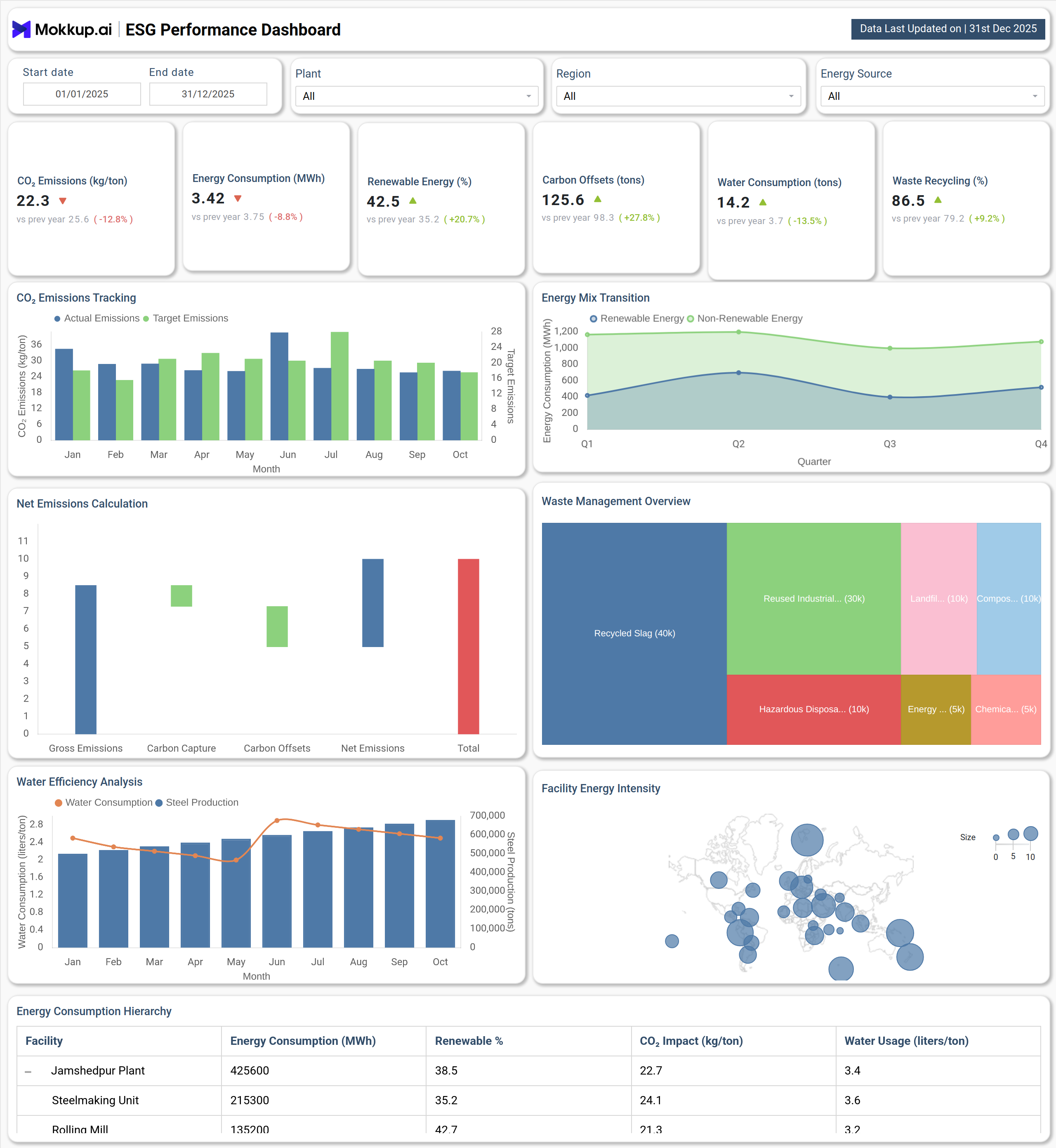
Carbon Footprint & Energy Transition Dashboard Example
A typical dashboard example includes interactive filters for date range, facility, scope, and region, allowing users to drill down into emissions performance. At the top, KPI cards highlight total GHG emissions, emissions intensity, renewable energy share, energy efficiency improvement, and Scope 1 emissions reduction, providing a quick ESG performance snapshot.
Trend visualizations show month-wise emissions movement for Scope 1 and Scope 2, helping utilities track decarbonization progress over time. Donut charts break down scope 1 2 3 emissions for utility companies, clearly showing the dominance of Scope 3 in total emissions. Energy transition progress is visualized through gauge charts, indicating how close the organization is to renewable energy targets.
Bar charts compare emissions across facilities such as manufacturing plants, distribution centers, and corporate offices, while stacked column charts display energy consumption by source, natural gas, coal, solar, and wind, supporting low-carbon energy transition planning. A reconciliation table at the bottom ensures transparent ESG reporting by mapping emissions totals, offsets, carbon credits, and year-over-year changes.
How to Analyze Data in a Carbon Footprint & Energy Transition Dashboard
Here is how you can analyze data from this dashboard:
- Start by reviewing total GHG emissions to understand overall environmental impact across all scopes.
- Analyze emissions intensity to evaluate how efficiently revenue is generated relative to carbon output.
- Track Scope 1 and Scope 2 trends monthly to assess operational decarbonization progress.
- Examine scope-wise emission distribution to identify high-impact Scope 3 contributors.
- Compare facility-level emissions to prioritize reduction initiatives at high-emission sites.
- Evaluate energy consumption by source to identify opportunities for fuel switching.
Benefits of a Carbon Footprint & Energy Transition Dashboard
The following are the benefits of using this dashboard:
- Enables accurate carbon footprint measurement for utility companies
- Supports regulatory and ESG reporting with transparent emissions tracking
- Improves decision-making through real-time emissions and energy insights
- Helps utilities prioritize decarbonization initiatives across operations
- Enhances ESG performance monitoring for utility operations
- Identifies cost-saving opportunities through energy efficiency improvements
- Aligns energy transition strategy with net-zero and sustainability goals
KPIs to Track in a Carbon Footprint & Energy Transition Dashboard
The following key KPIs can be tracked by using this dashboard:
- Total GHG Emissions (tCO₂e, All Scopes): Measures combined Scope 1, 2, and 3 emissions to assess overall climate impact.
- Emissions Intensity (tCO₂e per USD Revenue): Evaluates carbon efficiency relative to financial performance.
- Renewable Energy Share (%): Tracks the percentage of energy sourced from renewables such as solar and wind.
- Energy Efficiency Improvement (%): Measures reduction in energy consumption through operational efficiency initiatives.
- Scope 1 Emissions Reduction (tCO₂e): Quantifies direct emissions reduction from owned or controlled sources.
Frequently Asked Questions
1. What is the purpose of a Carbon Footprint & Energy Transition Dashboard?
It helps utility companies monitor emissions, track energy transition progress, and support ESG compliance and sustainability goals.
2. Can this dashboard support net-zero planning?
Yes, it enables low-carbon energy transition planning by tracking renewable adoption, efficiency gains, and emissions reduction trends.