
What is a Cancer Treatment Progress Dashboard?
A cancer treatment progress monitoring dashboard is a clinical analytics tool used by oncology centers to track how patients respond to cancer therapies over time. It consolidates key indicators such as treatment response rate, tumor shrinkage, survival rate, toxicity severity, treatment adherence, and symptom relief. This dashboard presents a unified view of how different treatment modalities, chemotherapy, radiation, immunotherapy, and targeted therapy perform across diverse patient groups and cancer stages. By operating as an oncology patient treatment response tracking tool, it helps oncologists monitor individual and aggregate patient progress, identify treatment delays, measure therapy effectiveness, and assess clinical outcomes. The dashboard supports evidence-based decision-making and ensures that patient care plans are optimized based on real-time response and toxicity metrics.
How to Create a Cancer Treatment Progress Dashboard
You don’t need to build your report from scratch, just start with a ready-to-use dashboard template from Mokkup. Add in your data and export it however you like. Here’s how to do it:
1. Create or Log in to Your Mokkup Account
Start by signing up on Mokkup.ai using your email. If you already have an account, just log in, and you’ll be good to go.
2. Choose and Customize Your Dashboard Template
Find the Cancer Treatment Progress Dashboard template in the Templates section. Use the drag-and-drop editor to adjust KPIs, edit filters, or add elements based on your data.
3. Export to Your BI Tool
Once your dashboard wireframe is ready, use the BI Tool Export feature to send it directly to Power BI or Tableau for further analysis and enhancements. You can also download the dashboard as a PDF, PNG, or JPEG, embed it on a platform, or invite your team to collaborate.
Note: This is a Pro template. You’ll need a Pro subscription on Mokkup to use and customize this dashboard wireframe. Upgrade anytime to unlock full access.
Cancer Treatment Progress Dashboard Example
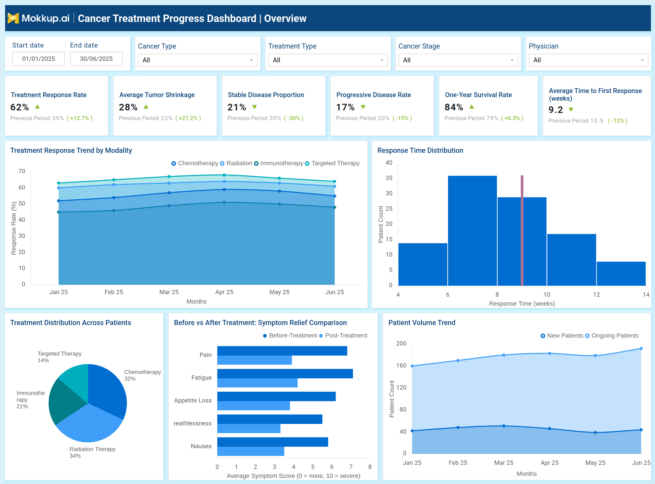
The example dashboard above provides a complete view of how oncology patients progress through their treatment journeys, showing key metrics such as Treatment Response Rate, Average Tumor Shrinkage, Stable Disease Proportion, Progressive Disease Rate, and Average Time to First Response. Visual components like Treatment Response Trend by Modality, Response Time Distribution, and Treatment Distribution Across Patients illustrate how different therapies chemotherapy, radiation, immunotherapy, and targeted therapy perform over time. This also supports chemotherapy and radiation therapy progress analytics, helping teams understand how each modality contributes to clinical outcomes.
The dashboard also evaluates stages of the oncology patient treatment response tracking tool, including Diagnosis, Treatment Start, Response Measurement, Symptom Relief, Continued Monitoring. Supporting charts, such as Before vs After Symptom Relief Comparison and Patient Volume Trend, help identify treatment impact, detect delayed responses, and highlight areas requiring clinical adjustments. Overall, this dashboard serves as a complete oncology treatment performance and progress visualization tool, offering actionable insights into treatment efficacy, patient adherence, symptom improvement, and outcome stability across cancer care programs.
How to Analyze Data in Cancer Treatment Progress Dashboard
Here’s how to best analyze data in a cancer treatment progress dashboard:
- Track Treatment Response Rates: Compare response rates across chemotherapy, radiation, immunotherapy, and targeted therapy.
- Assess Tumor Shrinkage: Use tumor reduction percentages to evaluate therapy effectiveness.
- Monitor Disease Stability vs Progression: Identify whether patients maintain stable disease or show progressive patterns.
- Analyze Response Time Distribution: Understand how long it takes for patients to show measurable treatment response.
- Review Modality-Specific Performance: Examine trends for each treatment type to optimize therapy protocols.
- Evaluate Symptom Relief: Compare before/after treatment symptom scores to measure clinical improvement.
- Monitor Treatment Delays: Identify causes such as side effects, low blood counts, lab pending results, or scheduling issues.
- Track Toxicity Levels: Use toxicity severity data to adjust doses or treatment schedules.
- Analyze Dose Modifications: Determine when dose reductions or holds are necessary due to adverse events.
- Monitor Patient Volume Trends: Assess growth in new and ongoing patients for capacity and staffing planning.
- Review Adherence Metrics: Evaluate completion rates for treatment cycles and their impact on outcomes.
- Identify Hospitalization Drivers: Track unplanned hospitalizations to understand complications related to cancer therapy.
Benefits of Cancer Treatment Progress Dashboard
A cancer treatment progress dashboard offers several benefits:
- Comprehensive Response Monitoring: Provides a unified view of how patients respond to various treatment modalities.
- Improved Clinical Decision-Making: The oncology treatment performance and progress visualization tool allows clinicians to adjust therapies based on real-world progress.
- Enhanced Patient Safety: Tracks toxicity severity and delays to prevent severe treatment complications.
- Better Treatment Planning: Helps oncologists identify which therapies yield the highest response for specific cancer types.
- Operational Efficiency: Reduces delays and improves adherence by revealing workflow issues affecting treatment cycles.
- Improved Patient Quality of Life: Measures symptom relief to evaluate treatment impact on daily functioning.
- Data-Driven Resource Allocation: Tracks patient volume trends to support staffing and scheduling decisions.
- Stronger Outcome Measurement: The dashboard supports continuous evaluation of survival rates, response timelines, and disease stability.
KPIs to Track in Cancer Treatment Progress Dashboard
- Treatment Response Rate (%): Measures overall clinical effectiveness of therapies.
- Average Tumor Shrinkage (%): Indicates how well tumors respond to treatment.
- Stable Disease Proportion (%): Shows the percentage of patients with non-progressive disease.
- Progressive Disease Rate (%): Highlights treatment resistance or ineffective response.
- One-Year Survival Rate (%): Tracks long-term treatment success.
- Average Time to First Response (Weeks): Measures how quickly patients respond to therapy.
- Treatment Delay Rate (%): Identifies operational or clinical issues disrupting treatment cycles.
- Toxicity Severity Levels: Tracks grade 1–4 toxicity to manage adverse events.
- Dose Modification Rate (%): Shows how often treatments need adjustments due to complications.
- Cycle Adherence & Completion Rates: Measures consistency of chemotherapy, radiation, and immunotherapy cycles.
- Unplanned Hospitalization Rate (%): Indicates complications and treatment-related emergencies.
- Symptom Relief Score: Tracks improvements in pain, fatigue, nausea, and other symptoms.
Frequently Asked Questions
Q1. What does a Cancer Treatment Progress Dashboard track?
It tracks treatment response, tumor shrinkage, toxicity, adherence, symptom relief, delays, and survival outcomes.
Q2. Who uses this dashboard?
Oncologists, oncology nurses, hospital administrators, and cancer program managers.
Q3. Can it compare different treatment modalities?
Yes, it evaluates chemotherapy, radiation, immunotherapy, and targeted therapy performance.
Q4. Does it help reduce treatment delays?
Yes, by identifying operational issues and clinical complications causing delays.
Q5. Can the dashboard help improve patient outcomes?
Absolutely—it allows teams to modify treatments early based on real-time response and toxicity data.