
What is an Asthma Patient Management & Therapy Dashboard?
An Asthma Patient Management & Therapy Dashboard is a digital platform designed to monitor and manage asthma patient outcomes across healthcare facilities. It provides pulmonologists, clinical directors, and respiratory therapists with insights into patient health, treatment effectiveness, and care quality. By consolidating key metrics such as asthma exacerbation rates, hospitalization trends, and medication adherence, the dashboard enables healthcare professionals to identify high-risk patients, optimize treatment plans, and reduce complications. The dashboard involves data from multiple sources, including electronic health records (EHR), lab results, and patient-reported outcomes, creating a comprehensive respiratory therapy patient monitoring dashboard that improves decision-making and overall patient care.
In addition, such a real-time asthma patient management dashboard allows clinicians to view patient data instantly, helping to make timely interventions when conditions worsen. By integrating analytics, it can serve as a Pulmonology care outcome tracking system, giving a clear picture of treatment success and care efficiency.
How to Create an Asthma Patient Management & Therapy Dashboard
You don’t need to build your report from scratch—just start with a ready-to-use Asthma Patient Management & Therapy dashboard template from Mokkup. Add in your data and export it however you like. Here’s how to do it:
1. Create or Log in to Your Mokkup Account
Start by signing up on Mokkup.ai using your email. If you already have an account, just log in, and you’ll be good to go.
2. Choose and Customize Your Dashboard Template
Find the Asthma Patient Management & Therapy Dashboard template in the Templates section. Use the drag-and-drop editor to adjust KPIs, edit filters, or add elements based on your data.
3. Export to Your BI Tool
Once your dashboard wireframe is ready, use the BI Tool Export feature to send it directly to Power BI or Tableau for further analysis and enhancements. You can also download the dashboard as a PDF, PNG, or JPEG, embed it on a platform, or invite your team to collaborate.
Note: This is a Pro template. You’ll need a Pro subscription on Mokkup to use and customize this dashboard wireframe. Upgrade anytime to unlock full access.
Asthma Patient Management & Therapy Dashboard Example
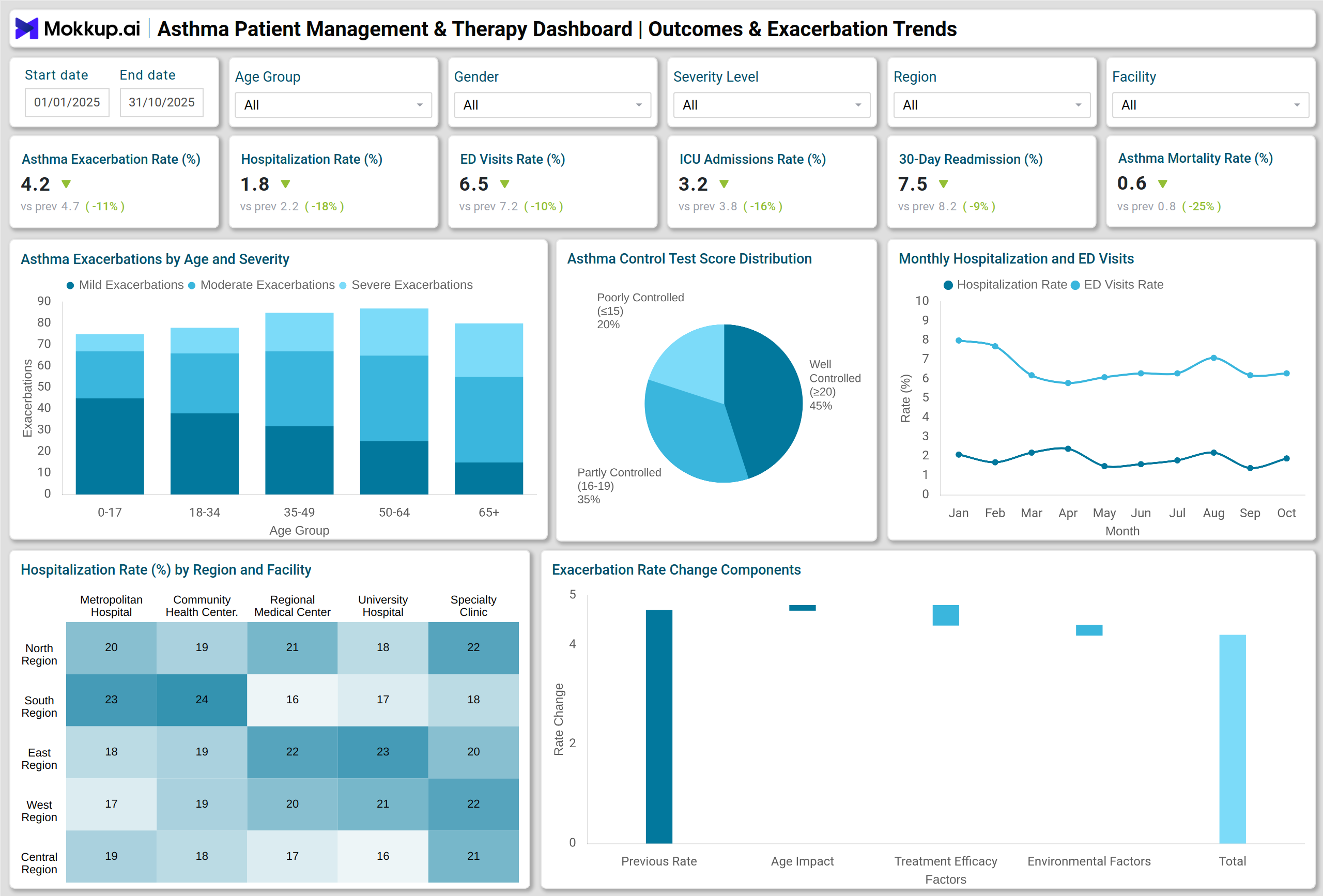
A typical Asthma Patient Management & Therapy Dashboard offers a visual and interactive representation of patient outcomes. For example, stacked column charts can display exacerbations by age group and severity, while line charts track monthly hospitalizations and ED visits. Pie charts and donut charts summarize Asthma Control Test (ACT) scores and therapy distributions, and heatmaps reveal hospitalization rates by facility or region. Other visuals like waterfall charts, combo charts, and treemaps help track medication adherence, preventive care compliance, and cost contributions.
Additionally, tracking exacerbation patterns over time transforms part of the dashboard into an Asthma exacerbation trend analytics tool, helping clinicians identify spikes and respond proactively. Monitoring inpatient trends with specialized visuals creates a Hospitalization metrics dashboard for asthma patients, enabling teams to manage capacity and optimize care. Algorithms that highlight patients with repeated exacerbations or high-risk indicators function as High-risk asthma patient identification software, supporting targeted interventions.
How to Analyze Data in Asthma Patient Management & Therapy Dashboards
Here is how you can analyze data in an Asthma Patient Management & Therapy Dashboard:
- Identify Exacerbation Trends – Track asthma flare-ups across age groups, severity levels, and regions to pinpoint high-risk populations.
- Assess Hospitalization & ED Visits – Compare monthly inpatient admissions and emergency department usage to measure intervention effectiveness.
- Monitor Therapy & Medication Adherence – Use combo charts and donut charts to evaluate patient compliance with prescribed treatments.
- Evaluate Preventive Care Compliance – Track vaccination coverage, preventive screenings, and follow-up adherence across facilities.
- Detect Geographic & Seasonal Patterns – Apply heatmaps and waterfall charts to reveal trends by location, season, or facility type.
- Measure Control & Treatment Success – Monitor changes in ACT scores over time to assess therapy effectiveness.
- Analyze Care Process Adherence – Use funnel charts to identify gaps in asthma management and target improvement areas.
Benefits of Asthma Patient Management & Therapy Dashboards
These are the benefits of using this Asthma patient mangement dashboard:
- Provides insights into asthma patient management for clinicians.
- Enables early identification of high-risk asthma patients.
- Supports data-driven decisions for treatment optimization and resource allocation.
- Improves preventive care and vaccination compliance rates.
- Reduces hospitalizations, ED visits, and readmissions through proactive monitoring.
- Facilitates reporting for quality assurance and regulatory compliance.
KPIs to Track in Asthma Patient Management & Therapy Dashboards
You can track following KPIs:
- Asthma Exacerbation Rate – Frequency of asthma flare-ups across patient populations.
- Hospitalization Rate for Asthma – Percentage of patients requiring inpatient care.
- ED Visits for Asthma – Emergency department usage trends.
- ICU Admissions for Asthma – Critical care interventions for severe cases.
- 30-Day Readmission (Asthma) – Patients readmitted within 30 days of discharge.
- Asthma-Related Mortality – Deaths attributable to asthma complications.
- Influenza & Pneumococcal Vaccination Rate – Preventive care coverage for patients.
Frequently Asked Questions
1. Who can benefit from an Asthma Patient Management & Therapy Dashboard?
Pulmonologists, clinical directors, respiratory therapists, and healthcare administrators can leverage the dashboard for better patient monitoring and care optimization.
2. How does the dashboard track high-risk asthma patients?
By analyzing trends in exacerbation rates, hospitalizations, ED visits, and ACT scores, the system identifies patients at higher risk of severe outcomes.
3. Can the dashboard improve preventive care compliance?
Yes, visual analytics like stacked bar charts and pie charts track vaccination rates, medication adherence, and therapy compliance, enabling proactive interventions.
4. What types of visualizations are used in an Asthma Patient Management dashboard?
Common visualizations include stacked columns, line charts, pie charts, heatmaps, waterfall charts, combo charts, donut charts, bar charts, funnel charts, and treemaps.
5. How does this dashboard support clinical decision-making?
It consolidates multiple patient metrics in one interface, allowing clinicians to quickly identify trends, gaps in care, and opportunities to optimize asthma management programs.