
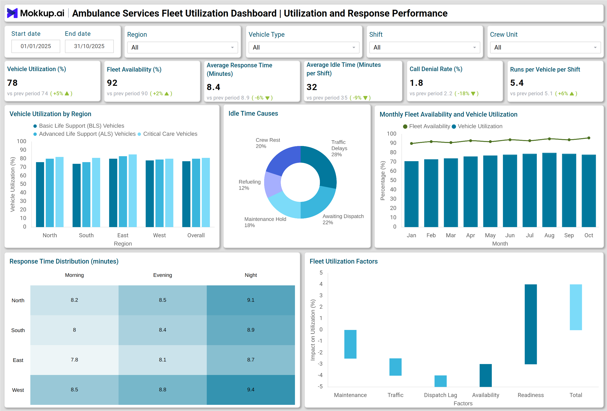
What is an Ambulance Services Fleet Utilization Dashboard?
An Ambulance Services Fleet Utilization Dashboard is a healthcare analytics tool designed to monitor, evaluate, and optimize ambulance operations. It helps healthcare organizations track vehicle usage, response times, crew performance, and maintenance activities in real time. The dashboard consolidates data from GPS tracking, dispatch logs, and maintenance systems to present a complete view of ambulance fleet performance.
This ambulance fleet performance monitoring system enables decision-makers to assess resource allocation, identify operational bottlenecks, and ensure optimal utilization of each vehicle. It provides hospital administrators and emergency response managers with actionable insights into fleet readiness, downtime, and efficiency across regions and vehicle types. In modern healthcare logistics, such dashboards are essential for maintaining a high standard of emergency response and reducing operational delays.
How to Create an Ambulance Services Fleet Utilization Dashboard
You don’t need to build your report from scratch—just start with a ready-to-use dashboard template from Mokkup. Add in your data and export it however you like. Here’s how to do it:
1. Create or Log in to Your Mokkup Account
Start by signing up on Mokkup.ai using your email. If you already have an account, just log in, and you’ll be good to go.
2. Choose and Customize Your Dashboard Template
Find the Ambulance Services Fleet Utilization Dashboard template in the Templates section. Use the drag-and-drop editor to adjust KPIs, edit filters, or add elements based on your data.
3. Export to Your BI Tool
Once your dashboard wireframe is ready, use the BI Tool Export feature to send it directly to Power BI or Tableau for further analysis and enhancements. You can also download the dashboard as a PDF, PNG, or JPEG, embed it on a platform, or invite your team to collaborate.
Note: This is a Pro template. You’ll need a Pro subscription on Mokkup to use and customize this dashboard wireframe. Upgrade anytime to unlock full access.
Ambulance Services Fleet Utilization Dashboard Example
A well-structured healthcare ambulance operations analytics dashboard typically displays key performance indicators (KPIs) such as fleet availability, utilization rate, and average response time. For example, a Stacked Column Chart can display the Vehicle Utilization Rate by Region and Vehicle Type, enabling operations teams to identify underutilized vehicles or areas with excess demand.
A Line Chart tracks monthly trends in fleet availability and utilization, while a Heatmap visualizes response time distribution across shifts and regions. Maintenance metrics are represented through visuals, such as bar charts for downtime by vehicle type, Donut Charts for maintenance type breakdowns, and combo charts that combine repair costs with mean time to repair.
A Treemap can categorize vehicle incidents by type and cause, helping improve safety protocols. Lastly, a Gauge Chart showing crew utilization versus target provides quick visibility into staffing efficiency. Together, these visuals transform raw data into insights that enhance ambulance readiness and response performance. As an emergency medical transport performance dashboard, it empowers healthcare teams to evaluate response times and improve patient outcomes.
How to Analyze Data in Ambulance Services Fleet Utilization Dashboards
Here is how you can analyze data in a fleet management dashboard for ambulance services:
- Assess Utilization Trends: Monitor the Vehicle Utilization Rate and Fleet Availability to ensure each ambulance is used effectively across shifts and service regions.
- Track Response Efficiency: Review response time distributions by region and shift to detect operational delays or inefficiencies in dispatch management.
- Monitor Maintenance Performance: Analyze Mean Time to Repair (MTTR), Preventive Maintenance Compliance, and maintenance cost trends to prevent breakdowns and optimize servicing schedules.
- Evaluate Resource Allocation: Compare the number of runs per vehicle and crew utilization rates to determine if resources are distributed efficiently across the fleet.
- Identify Safety and Reliability Issues: Study vehicle incident data by cause and type to address recurring mechanical or operational problems.
- Optimize Financial Performance: Utilize repair cost and downtime analysis to manage maintenance budgets and enhance cost efficiency per vehicle effectively.
Benefits of Ambulance Services Fleet Utilization Dashboards
Here are benefits of using this dashboard:
- Improved Operational Efficiency: Ensures ambulances are utilized optimally, reducing idle time and enhancing fleet efficiency.
- Enhanced Response Performance: Identifies regions with slower response times to improve patient service levels and emergency readiness.
- Reduced Maintenance Costs: Monitors preventive maintenance schedules and MTTR to minimize repair costs and extend vehicle lifespan.
- Better Resource Allocation: Enables data-driven staffing and dispatch decisions to maintain consistent fleet availability.
- Compliance and Safety Tracking: Tracks incident rates and safety compliance metrics to ensure operational and regulatory standards are upheld.
- Data-Driven Decision-Making: Combines utilization, maintenance, and financial data for accurate performance forecasting and planning.
This approach to tracking ambulance utilization rates in healthcare ensures continuous improvement and transparency in operational performance.
KPIs to Track in Ambulance Services Fleet Utilization Dashboards
The key KPIs include:
- Vehicle Utilization Rate (%): Measures the effectiveness of ambulance deployment across operations.
- Fleet Availability (%): Tracks the proportion of operational vehicles ready for dispatch.
- Average Response Time (Call-to-Scene, Minutes): Measures efficiency in responding to patients.
- Idle/Standing Time (Minutes per Shift): Identifies periods when vehicles are not in use.
- Percent of Calls with No Unit Available (Call Denials): Highlights service coverage gaps.
- Average Runs per Vehicle per Shift: Measures workload and resource distribution.
- Mean Time to Repair (MTTR, Hours): Tracks repair efficiency and downtime.
Frequently Asked Questions
1. What is the primary purpose of an Ambulance Services Fleet Utilization Dashboard?
It helps healthcare organizations monitor ambulance performance, utilization, and maintenance to optimize operations and emergency response times.
2. How does it improve ambulance efficiency?
By tracking fleet availability, response time, and maintenance compliance, the dashboard enables better scheduling and minimizes downtime.
3. Who uses this dashboard?
Fleet managers, hospital administrators, and emergency operations teams use it to oversee ambulance deployment and maintenance performance.