What is an A/B Test Analysis Dashboard?
The A/B Testing Dashboard helps you compare multiple versions of a campaign to find out which performs better. It gives a side-by-side view of CTR, conversions, bounce rate, and other key metrics for the control group and its variations. This layout helps teams understand which version is more effective and why. For an example of A/B test dashboard, this setup provides a clear, organized way to visualize performance differences.
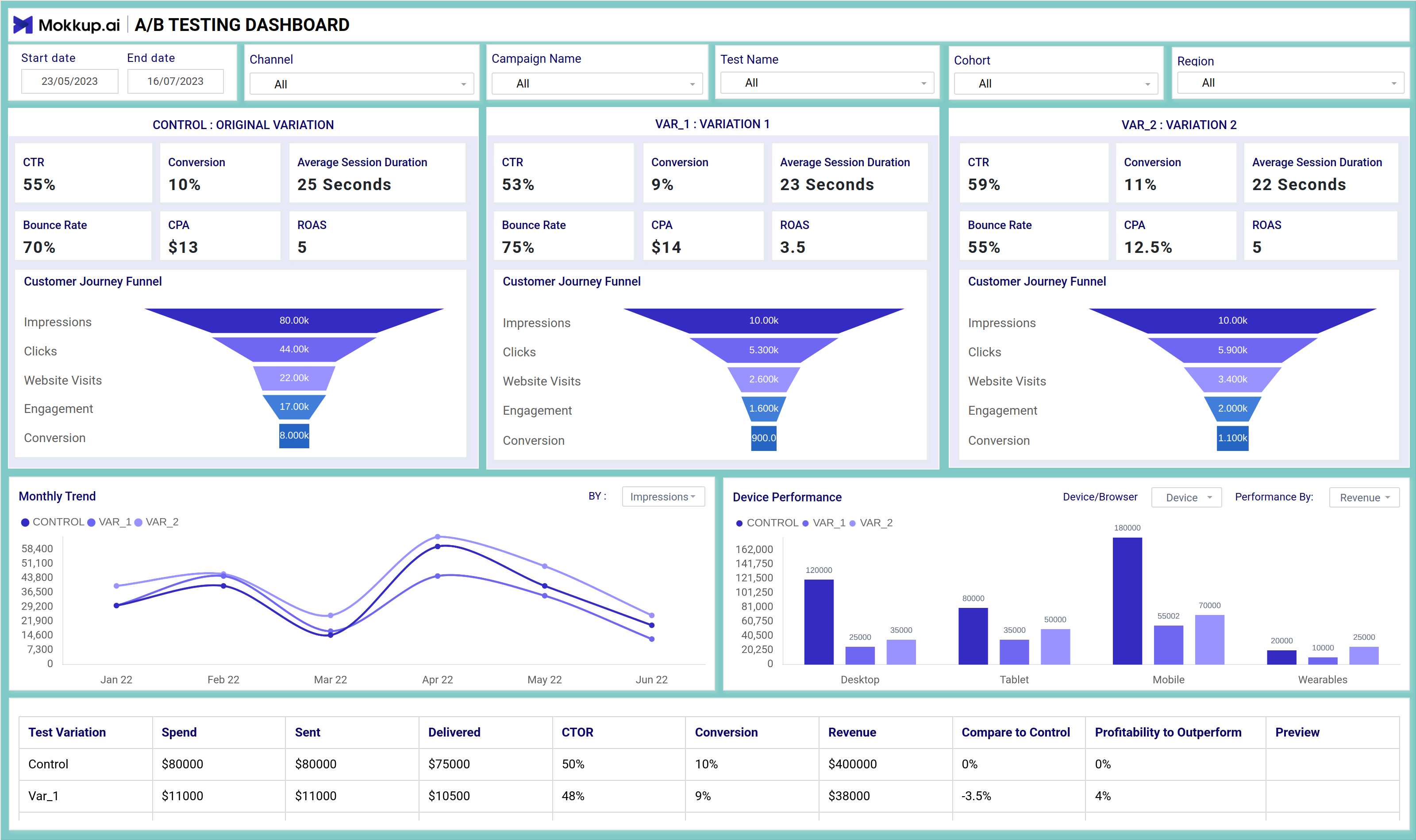
A/B Testing Dashboard Example
Build your own A/B test report dashboard with a layout that organizes campaign metrics, customer funnels, and performance trends in one place. The Mokkup A/B Testing Dashboard offers a clear structure for comparing different test versions across devices, browsers, and delivery channels. With flexible filters for dates, campaign names, cohorts, and test variants, you can customize the view to match your reporting needs. Once your data is added, the wireframe can be exported to Power BI or Tableau for detailed analysis and reporting. This provides a solid starting point for teams running marketing experiments. Using the A/B Testing dashboard template, you can get started quickly and shape your report to fit your analysis goals.
How to Analyze Data in A/B Test Dashboards
This A/B testing analytics dashboard lets you compare performance metrics across test versions with ease. From high-level stats like CTR and CPA to funnel drop-offs and device breakdowns, you get a full picture of what’s working and what’s not.
Each panel is structured to give you quick insights:
- Compare CTR, conversion rate, ROAS, and bounce rate for each variant.
- Visualize funnel steps from impressions to conversions.
- Use line charts to analyze monthly performance trends.
- Check how test versions are performed across devices like mobile, tablet, and desktop.
All this data is laid out side-by-side, so you can quickly identify which version outperformed the others—and why.
How to Create A/B Testing Dashboards
You don’t need to build your A/B testing dashboard from scratch. Use Mokkup’s A/B Testing Dashboard template to speed up your setup. Add your data and export it in your preferred format. Here's how to get started:
1. Create or Log in to Your Mokkup Account
To access the dashboard templates, sign up on Mokkup.ai using your email. If you already have an account, just log in and jump right in.
2. Choose and Customize Your A/B Test Analysis Dashboard
Head to the Templates section and select the A/B test analysis dashboard. Use the drag-and-drop editor to modify metrics, apply demographic filters, or add elements to adjust filters for better reporting.
3. Export to Your BI Tool
Once your dashboard is set, use the BI Tool Export feature to move it to Power BI or Tableau for deeper insights. You can also download it as a PDF, PNG, or JPEG, embed it where needed, or share it with your team for easy collaboration.
This dashboard is a time-saving tool that helps your team visualize A/B test results, share insights faster, and more confidently plan their next moves.
Benefits of A/B Test Dashboards
An A/B testing dashboard offers several valuable advantages. It helps you compare the performance of two or more variations with ease, all within a single, well-structured layout. With Mokkup’s customizable A/B test dashboard template, you can:
- Simplify Test Analysis: View the performance of each version side-by-side for quick, clear comparisons.
- Support Faster Decisions: Use visual indicators to understand which variant performs better across specific demographics.
- Flexible Layouts: Modify the dashboard to suit your testing goals, whether you're analyzing clicks, conversions, or user engagement.
Overall, an A/B testing dashboard helps you understand what’s working and what needs improvement. It’s the best A/B testing dashboard option for teams that want to streamline reporting and make data-driven decisions with confidence.
KPIs to Track in A/B Test Dashboards
This dashboard brings together the most important metrics for evaluating A/B testing campaigns. By comparing these numbers across versions, you can quickly identify the best-performing variant.
Key KPIs to Track:
- CTR (Click-Through Rate): Measures how many users clicked compared to how many saw your campaign
- Conversion Rate: Shows the percentage of users who took action after interacting.
- ROAS (Return on Ad Spend): Helps assess cost efficiency across variations.
- CPA (Cost Per Acquisition): Compares how much you spend per conversion.
- Bounce Rate & Session Duration: Offers insight into content engagement.
Tracking these key metrics in one dashboard helps your team quickly spot performance differences and confidently decide which variant to roll out.
Frequently Asked Questions
1. What is the purpose of an A/B testing dashboard?
An A/B testing dashboard helps you compare different versions of a campaign or web page by showing key performance data side by side. It helps you understand which version performs better based on metrics like conversions, engagement, and bounce rates.
2. Do I need any technical skills to use this dashboard?
No. With Mokkup, you can use the A/B testing dashboard without any coding or advanced setup. Just pick a template, add your data, and export it to Power BI or Tableau for further enhancements.