
Many reports are produced in the field of business reporting to highlight developments, successes, and areas that could use improvement. Stacked bar charts are unique among the visualization tools available since they provide a flexible way to present information.
Table of Contents
- What are Stacked Bar Graphs?
- When to Use Stacked Graphs?
- Best Practices for Using Stacked Graphs
- Steps to Create a Stacked Graph
- Common Misuses of Stacked Graphs
- Alternative Options for Stacked Graphs
What are Stacked Bar Graphs?
A stacked bar chart is a type of bar graph that shows how individual data points contribute to a whole. The length of each bar represents the proportion of each group's contribution.
A 100% stacked bar chart is a variation of the stacked bar chart where the total length of the bars is standardized to 100%. Each segment within the bar represents the percentage contribution of a category to the total length of the bar, making it easier to compare relative proportions.
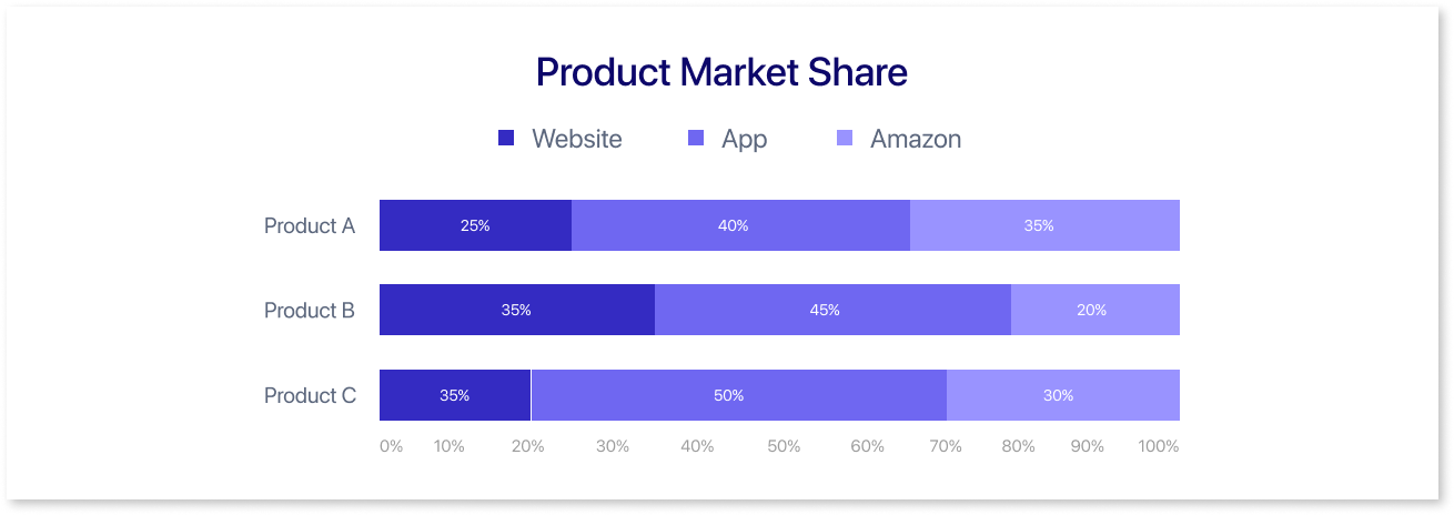
For example, the segmented horizontal bar graph above shows the market share of three products sold through three channels (website, app, and Amazon) across three years (2015, 2016, and 2017). The y-axis represents the market share, which is likely a percentage of the total sales for each product.
The x-axis represents the distribution channels: website, app, and Amazon. Each bar is divided into three sections, colored differently to represent the market share of each product sold through that particular channel.
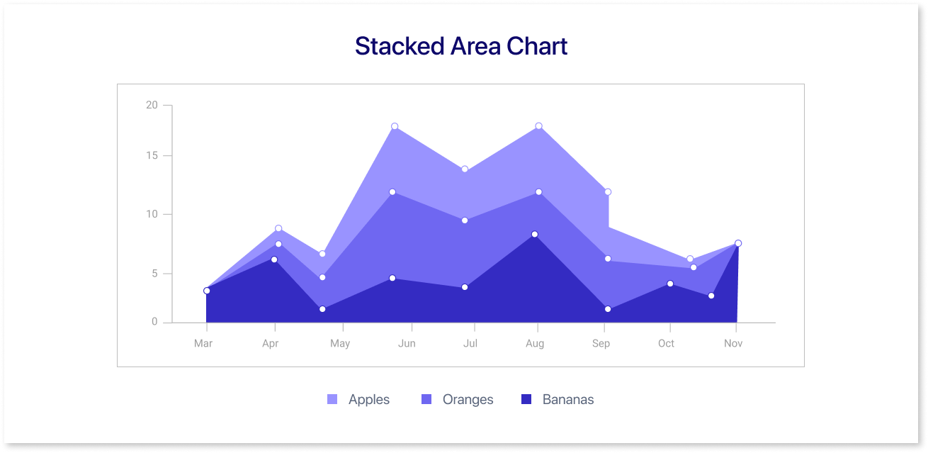
Another option you can use is a stacked area chart, which allows you to compare data points from each group to the overall data across all segments. For example, the chart above shows the number of apples, oranges, and bananas sold over the course of five months, likely from May to September. The x-axis, or horizontal axis, shows the month, while the y-axis, or vertical axis, shows the number of fruits sold.
The lines on the chart connect the points for each month, and the area underneath each line represents the total number of fruits sold for that category in that month.
How to Interpret a Stacked Bar Chart?
Analyzing a horizontal stacked bar chart requires understanding how the data is presented visually. Here are steps to interpret a horizontal stacked bar chart:
- Bar Segments: The bars are divided into segments which represent a category or sub-group within the data.
- Total Length of the Bar: The overall length of the horizontal bar represents the whole or the total of the data.
- Individual Segment Lengths: The length of each segment relates to the portion or a percentage that a specific category contributes.
- Left to Right Reading: You can see how each category builds on the others to create an overall impact by reading the chart from left to right.
- Color Coding: Colors are used to differentiate between segments, making it easier to identify and compare the different categories.
- Legend: The color coding can be explained using a legend that explains what each color signifies.
- Pattern & Trends: Compare segment lengths to understand each category's individual contribution to the total. Identify patterns or trends by observing how segment lengths vary across bars over time.
- Baseline Reference: The baseline (usually the x-axis) serves as a reference point. Segments above the baseline show positive values, whereas, segments below represent negative values if applicable.
Lastly, to improve your understanding, always look for labels, legends, and other contextual information included with the chart.
When to Use Stacked Graphs?
Standard bar charts are used to compare numerical values across many categories. Every bar symbolizes a category, and the length of the bar shows the value in numbers. In a stacked bar chart, the primary goal remains numeric value comparison, but it also introduces a second goal.
It becomes helpful, when we need to figure out how each primary bar breaks down in relation to levels of a second category variable. Sub-bars within each bar indicate different levels of the secondary variable. Since the total length doesn't change, we can see the contributions made by various related categories. Let’s look at the cases when you can use a stacked bar chart:
1. Efficiently Comparing Numerous Categories and Analyzing Sub-Category Contributions:
You can opt for 100% Stacked Bar Charts for comprehensive category and sub-category comparisons. It provides insights into the performance of each category and monitors the individual contributions of sub-groups to the whole.
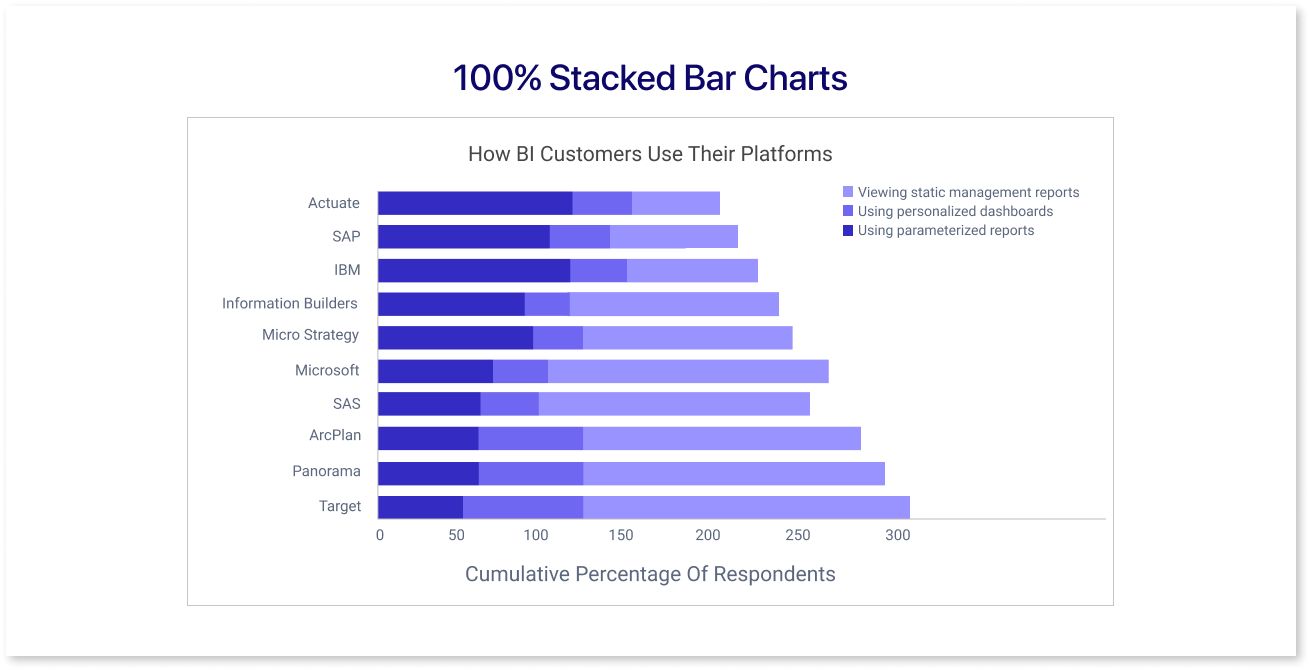
Stacked bar charts provide a complete overview, reducing the need to delve into minute details like subtle changes.
2. Comparing Sub-Category Contributions Across Categories:
Make use of 100% stacked bar charts to see proportionate Information clearly. Analyze subgroups within a category to determine how each one adds to the overall total.
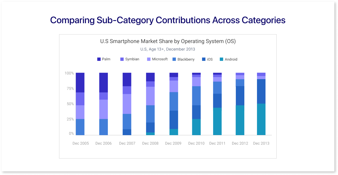
The graph provides a part-to-whole viewpoint, making it easier to compare comparable subgroups across categories and pinpoint significant item-level changes.
3. When Dealing with Unmanageable Group Charts:
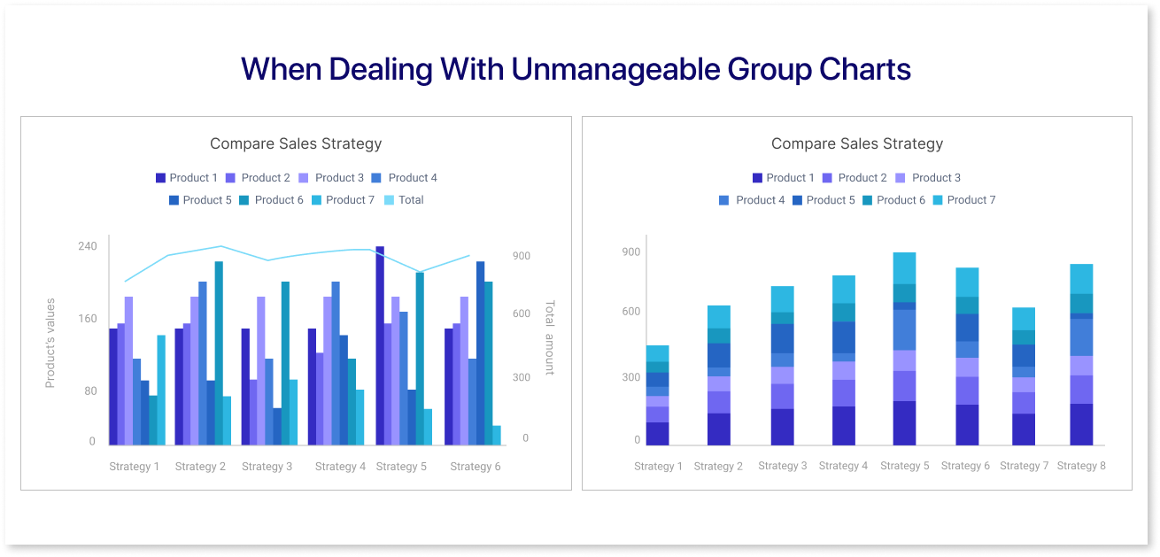
Stacked bar charts offer a clear way to view both cumulative totals and compare individual data sets within a category, especially when dealing with a large number of data points.
However, combining stacked column charts, total comparisons, line charts, and categorical variables in a group chart can make it hard to read and visually messy.
Best Practices for Using Stacked Graphs
Stacked bar charts have the same best practices like standard bar charts. Yet, when adding a second category, there are extra things to think about for making your stacked bar chart work well.
1. Zero-Baseline Integrity in Horizontal Stacked Bar Charts:
In a normal bar chart, if there's a negative number, the bar goes down (for up-and-down bars) or to the left (for side-to-side bars) of the starting point. In a horizontal stacked bar chart, negative values are also displayed by stacking bars in the opposite (left) direction.
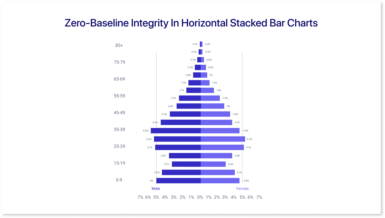
The baseline, starting at zero, is like a benchmark for measuring changes. This ensures a clear view of how different parts contribute to the whole, especially when dealing with positive and negative values.
2. Organizing Category Levels for Clarity:
When using horizontal stacked bar charts, it's important to organize category levels for clarity. Visualize each bar going from left to right.
The bar's many divisions represent different categories. You can make the information easier to interpret by carefully organizing them. For example, consider presenting sales information for various products.
Each portion in the bar might stand for a different product, and logically placing them makes it easier for everyone to understand how each product affects overall sales.
3. Effective Color Choices for Data Representation:
Selecting colors for horizontal stacked charts is essential for effective data communication. Use different colors for each category, ensuring easy differentiation.
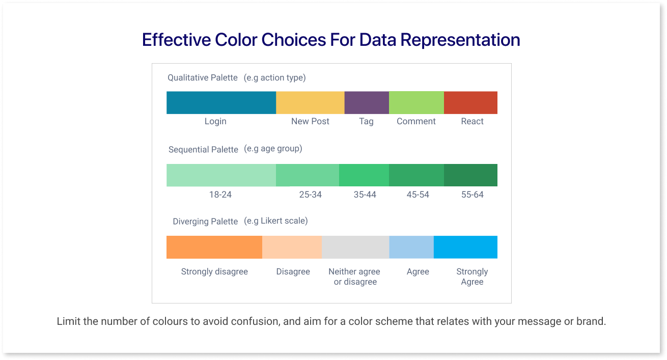
Limit the number of colors to avoid confusion, and aim for a color scheme that relates with your message or brand.
Steps to Create a Stacked Graph
Let's look at the steps for creating a horizontal stacked bar chart -
1. Defining Segments for Thorough Comparison:
For a stacked bar chart, the data depends on the x-axis (horizontal) showing ordered values and the y-axis (vertical) listing items, which can be either numbers or labels.
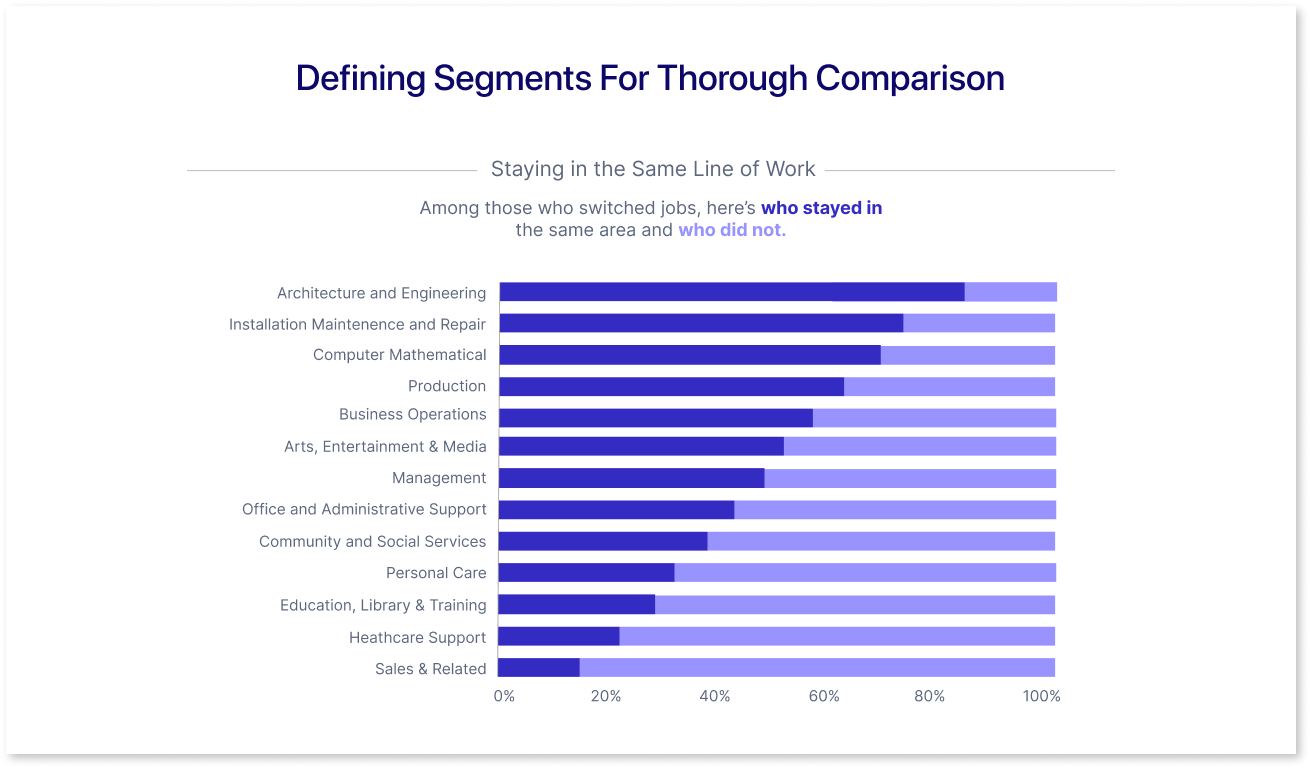
The primary variable in the chart is used to compare and analyze, specifically to compare the total within the data.
2. Selecting the Right Stacked Bar Chart Template:
Selecting the right bar chart template is essential for presenting data in an efficient manner. Take into consideration variables like the type of data you have and the narrative you want to convey.
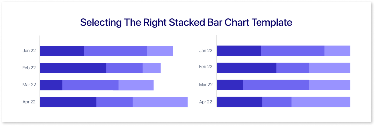
A useful resource for this is Mokkup.ai, offering various elements that include a variety of chart types. This platform provides a valuable resource for creating visually compelling visualizations tailored to diverse data representation needs.
3. Ensuring Data Clarity:
Using colors strategically is one way to improve data clarity. The audience can better understand and be able to visually separate and emphasize important information by using various and contrasting colors for different data categories or groupings.
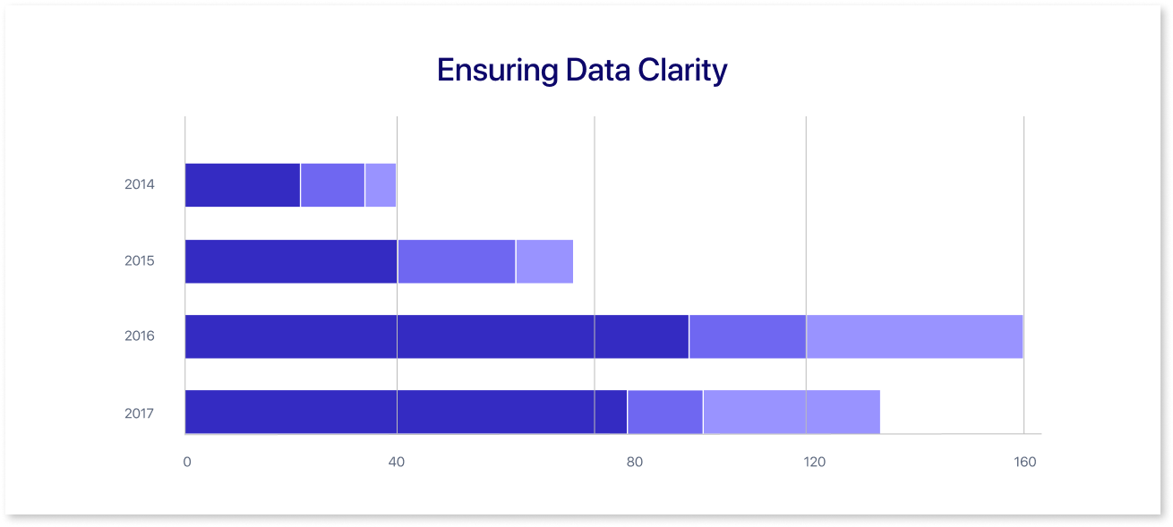
It is essential to pay close attention to elements such as labeling, formatting, and general presentation to ensure that your data reaches your target audience in an efficient and comprehensible manner.
Common Misuses of Stacked Graphs
Despite their strength, stacked bar charts can be misused which can make it more challenging to convey data effectively. You should take care of the following:
- Adding Too Many Categories: Steer clear of adding too many categories as this can result in a cluttered and confusing representation.
- False Scale Adjustments: Avoid making irregular scale adjustments since they may skew the impression of relative proportions between categories.
- Inadequate Labeling: Making sure that all bar segments are labeled clearly and thoroughly to avoid mistaking what they mean.
When these factors are carefully taken into account, stacked bar charts continue to be an effective tool for conveying insights.
Alternative Options for Stacked Graphs
Considering other stacked graph choices can provide insightful information and a variety of graphical representations. Let's discuss alternatives that provide different viewpoints on data visualization, enabling more complex analyses and interpretations.
1. Area Chart:
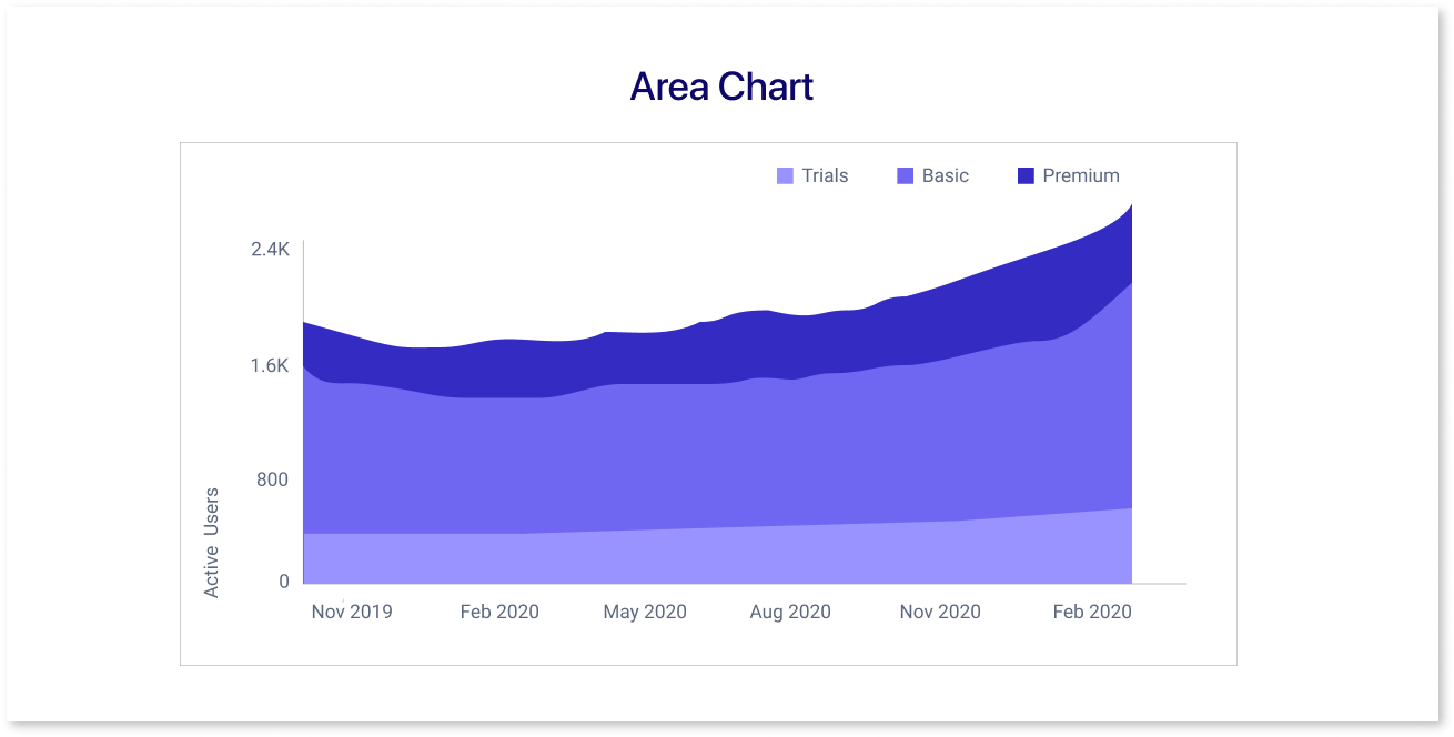
Stacked area charts are a useful substitute for stacked bar charts when working with time or continuous data. They are easier to understand and interpret because they place more emphasis on trends than precise numbers, particularly when there are numerous bars to plot. Their optimal use case is for tracking trends over time.
2. Pie Chart:
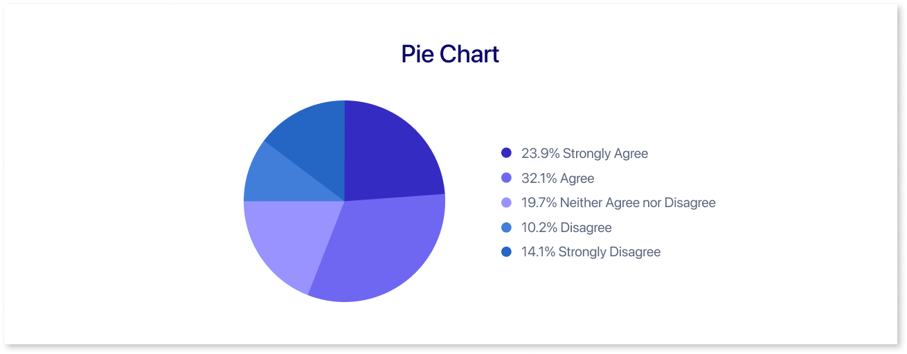
Pie charts represent data in a circular graph, dividing it into slices to show the proportion of each category in relation to the whole. They are most useful for displaying part-to-whole relationships with a small number of categories, despite being visually intuitive.
3. Grouped Bar Charts:
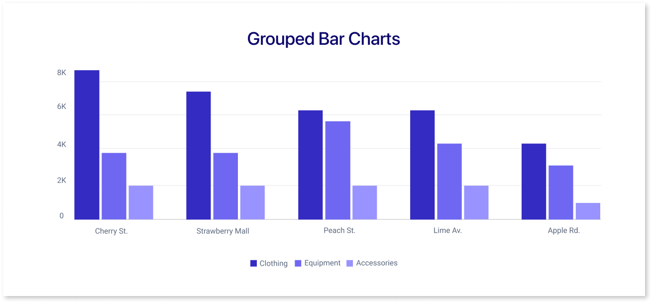
Grouped bar charts display multiple bars for each category side by side, making it easy to compare data across different subcategories within each main category. This format is effective for showcasing variations within related groups.
4. Mosaic Plot:
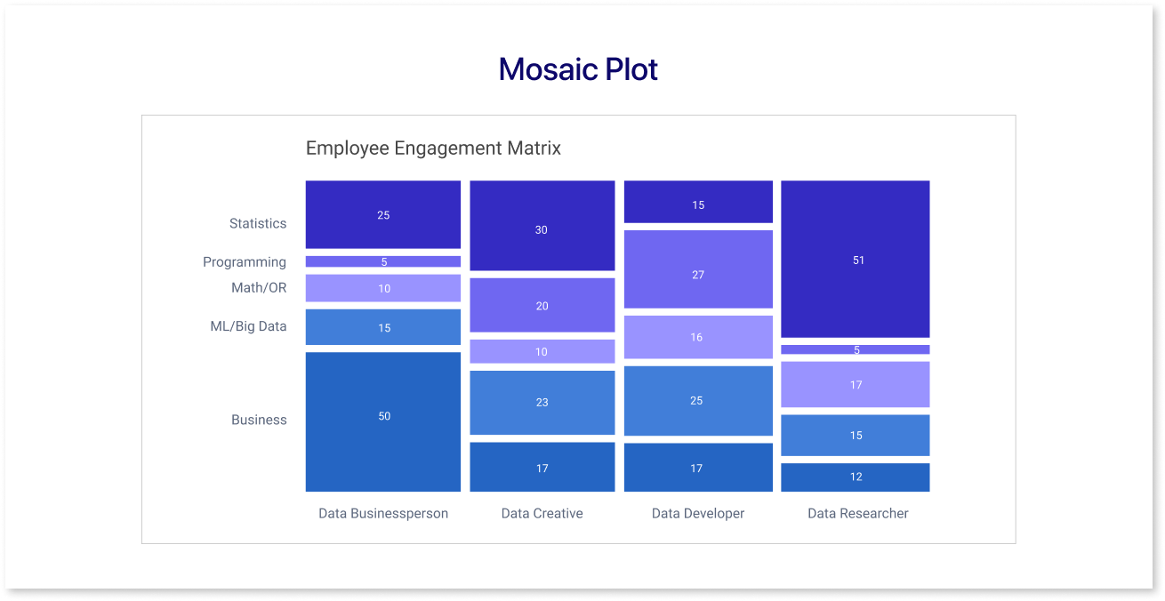
Mekko charts, also referred to as mosaic plots, are a type of bar chart in which the width of each bar denotes the percentage of the total. They combine the benefits of bar charts and stacked bar charts, offering a visual representation of both the percentage and absolute values in a single chart.
Conclusion
To sum up, stacked bar graphs, which go beyond ordinary bar charts in business reporting, are an effective way to compare and analyze categories. Variations such as 100% stacked bars improve readability, and alternatives such as grouped bar charts and stacked area charts cover a range of visualization needs.
Prompt it. Wireframe it with Mokkup.ai.
