A new sales dashboard request arrives in your inbox, and you're staring at an empty Power BI canvas with no idea where to begin.
What KPIs belong in the first row? Which chart type is most suited for pipeline data? How do you create a layout that a VP will actually use?
This post covers 8 real-world Power BI sales dashboard examples, including the KPIs they track, the audience they serve, and the visual approach to the layout.
All 8 are available as wireframe templates on Mokkup, with 46+ additional free templates in the library covering every use case beyond these eight.
Table of Contents
- What is a Power BI Sales Dashboard?
- Key KPIs Every Power BI Sales Dashboard Should Track
- 8 Power BI Sales Dashboard Examples
- Power BI Sales Dashboards: Quick Comparison
- Types of Power BI Sales Dashboards
- How to Design a Power BI Sales Dashboard (The Wireframe-First Approach) - With Mokkup
- Explore All 46 Free Power BI Sales Dashboard Templates
What is a Power BI Sales Dashboard?
A Power BI sales dashboard is a one-page interactive report that combines CRM, revenue, and pipeline data to provide real-time KPI insights for sales teams and leadership. It links directly to your data sources (Salesforce, HubSpot, Excel, or a data warehouse) and refreshes automatically, ensuring that stakeholders always see up-to-date figures. Unlike static spreadsheet reports, a Power BI sales dashboard allows users to filter, drill through, and slice data on demand, transforming a single canvas into dozens of contextual views without having to create a new report for each question.
The most effective sales dashboards are developed before they are created. Agreeing on the layout, KPIs, and visual hierarchy with stakeholders beforehand, via a wireframe, saves weeks of revision following the initial Power BI demo. That is exactly what the templates in this blog are meant to help you with.

Key KPIs Every Power BI Sales Dashboard Should Track
Before you open a canvas, decide what questions the dashboard needs to answer. Every KPI on the page should map to a specific business question, not just look impressive in a meeting. Adding ten KPI cards to a dashboard because they are available in the data model is one of the fastest ways to produce a report that nobody uses.
The categories below cover the most common requirements across every type of sales dashboard Power BI teams build, from executive summaries to rep-level views. Use them as a checklist when planning your layout, not as a mandatory list.
Revenue KPIs:
These KPIs tell leadership whether the business is hitting its financial goals and where performance is ahead of or behind plan. Revenue KPIs are the foundation of any executive-facing sales dashboard and should always appear in the top card row where they are visible without scrolling.
- Total Revenue: The baseline number every sales dashboard must show. This is actual revenue generated in the selected period, and it anchors every other metric on the page.
- Month-Over-Month Growth: Tracks momentum and flags early drops before they show up in quarterly reviews. A single month of decline is noise; two consecutive months is a signal.
- YTD vs Target: Compares cumulative actual revenue against the annual plan. This is the most-asked question in any executive review and should be visible at a glance.
- Average Deal Size: Rising deal size signals a healthy upsell motion. Falling deal size signals discounting pressure or a product mix shift toward smaller contracts.
- Revenue by Product or Region: Breaks the top-line number down to show which segments are driving performance and which are holding it back. Essential for any business with more than one product line or territory.
Pipeline and Activity KPIs:
These KPIs tell managers and operators whether there is enough in the funnel to hit future targets and whether the sales process is moving efficiently. Pipeline and activity KPIs are leading indicators: they tell you what revenue will look like in 30, 60, or 90 days, not what it looked like last month.
- Pipeline Value and Coverage Ratio: Total open pipeline versus the revenue target. According to Gartner, organisations that prioritise sales pipeline quality are 2x more likely to exceed customer acquisition expectations. A commonly used industry benchmark is a coverage ratio of 3x or above, meaning there should be enough in the funnel to absorb deal slippage and still hit the number.
- Win Rate: Closed-won deals divided by total deals that reached a final stage. This is the clearest measure of sales effectiveness and one of the first metrics to check when revenue drops unexpectedly.
- Deal Velocity: How fast deals move through the pipeline in days. Slowing velocity usually points to qualification or negotiation problems and is often the earliest signal of a stalling quarter.
- Lead-To-Close Rate: The percentage of leads that enter at the top of the funnel and convert into customers. A low lead-to-close rate points to either poor lead quality or a breakdown somewhere in the middle of the funnel.
- Sales Cycle Length: Average days from first contact to closed-won, which is critical for forecasting and capacity planning. Lengthening sales cycles reduces forecast reliability and increases revenue risk.
- Open Deals by Stage: A stage-by-stage count of live opportunities that shows where deals are accumulating or skipping steps. Large clusters in a single stage often indicate a process bottleneck or a coaching gap.
8 Power BI Sales Dashboard Examples
The eight examples below show the most common use cases requested by BI analysts, ranging from executive revenue summaries to SaaS recurring revenue tracking. Each example is available as a wireframe template on Mokkup, where you can also browse 46+ free templates to find the right fit for your use case.
1. Sales Overview Dashboard:
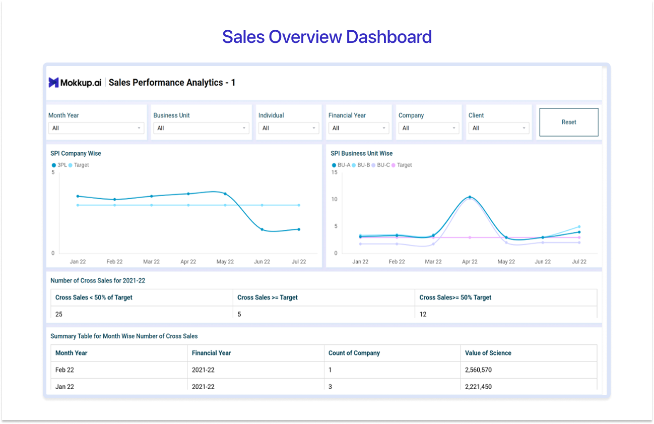
The Sales Overview Dashboard gives sales leaders a high-level view of team performance against target across companies, business units, and individual contributors. Available on Mokkup as the Sales Performance Analytics Dashboard, it tracks Sales Performance Index (SPI) trends over time, highlights cross-sales performance across different bands, and breaks results down by month and financial year.
The filter controls at the top make it easy for any stakeholder to slice the data to their own view without needing a separate report.
Best for: VP of Sales, C-suite leaders, and sales directors who need a single, trusted view of overall team performance across a complex organisational structure.
Top KPIs to cover: Sales Performance Index (SPI) trends, cross-sales performance by band, month-wise deal count and value, YTD revenue, and financial year breakdown.
Pros:
- Gives executives a fast, reliable read on overall team performance without navigating multiple reports.
- Six filter controls make it easy to personalise the view for any stakeholder at any level.
Cons:
- Not designed for deal-level detail, reps and managers will need a separate operational dashboard.
- Focused on SPI trends, so it may not suit businesses that do not track performance against a formal index.
Use Sales Performance Analytics template →
2. Sales Pipeline Dashboard:
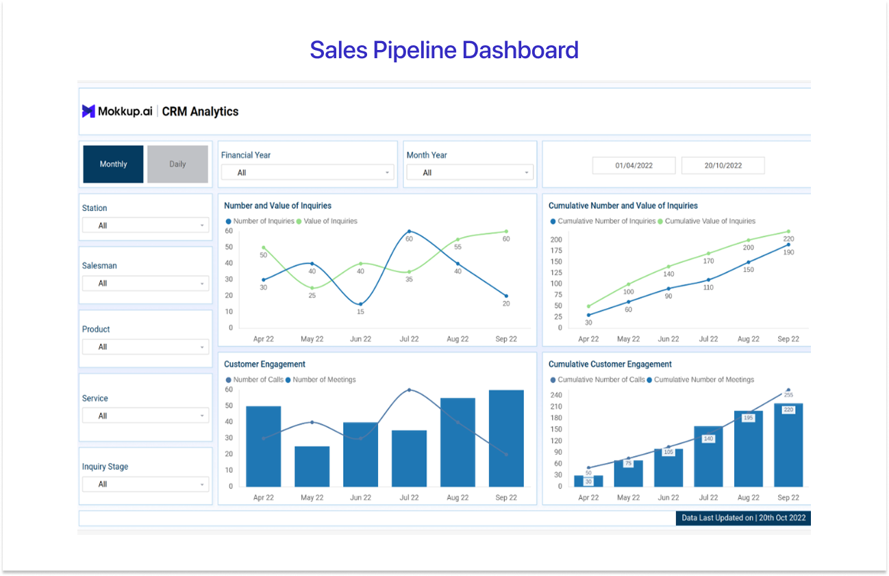
The Sales Pipeline Dashboard gives sales managers a clear picture of inquiry activity and customer engagement across the pipeline. Available on Mokkup as the CRM Analytics Dashboard, it tracks the number and value of inquiries over time alongside cumulative totals, so managers can see both the current period snapshot and the running trend in one view.
Customer engagement metrics, including calls and meetings, are displayed alongside their cumulative counts, giving a full picture of sales activity at every stage.
Best for: Sales managers and operations teams who need to monitor inquiry volume, customer engagement, and pipeline movement across stations, salespeople, and product lines.
Top KPIs to cover: Number and value of inquiries, cumulative inquiry totals, number of calls, number of meetings, cumulative customer engagement, and inquiry stage breakdown.
Pros:
- The dual periodic and cumulative view makes it easy to separate one-off slow periods from genuine downward trends.
- Activity and inquiry metrics on the same page give managers a complete picture before every one-to-one.
Cons:
- Focused on inquiry and engagement data, so it does not surface deal-stage or pipeline coverage metrics.
- Best suited to businesses with a formal inquiry tracking process — less useful for teams without structured CRM input.
3. Sales Rep Performance Dashboard:
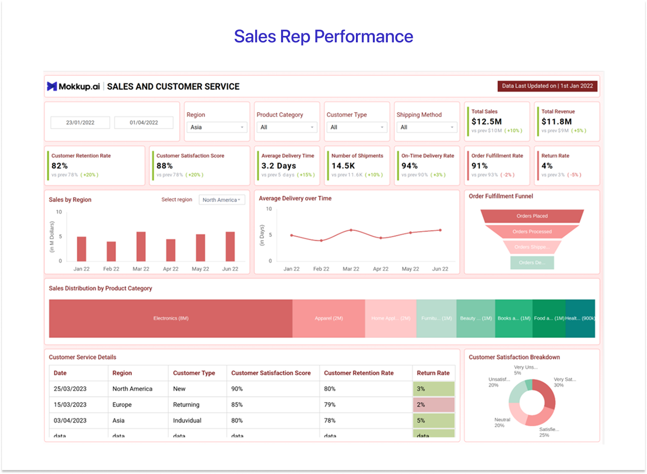
The Sales Rep Performance Dashboard gives frontline managers a consolidated view of both sales output and customer service quality in a single page. Available on Mokkup as the Sales and Customer Service Dashboard, it surfaces key metrics including total sales, total revenue, customer retention rate, customer satisfaction score, order fulfillment rate, and return rate, each shown with a comparison against the previous period so managers can see direction of travel, not just a point-in-time number.
Best for: Frontline sales managers overseeing individual reps who need to track both sales performance and service quality side by side across regions and customer types.
Top KPIs to cover: Total sales, total revenue, customer retention rate, customer satisfaction score, average delivery time, number of shipments, on-time delivery rate, order fulfillment rate, return rate, and sales distribution by product category.
Pros:
- Uniquely connects sales output to service quality, making it ideal for businesses where post-sale experience drives repeat revenue.
- Period-over-period comparisons on every KPI card make direction of travel immediately visible.
Cons:
- The combination of sales and service metrics makes it a broad dashboard team looking for a pure sales rep leaderboard may find it too wide in scope.
- Less suited to pure SaaS or digital businesses where delivery and fulfillment metrics are not relevant.
Use Sales and Customer Service template →
4. Regional Sales Dashboard:
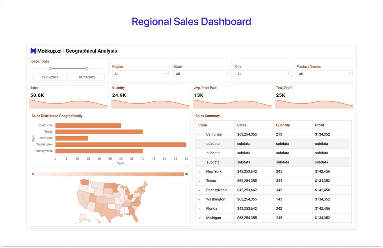
The Regional Sales Dashboard helps sales directors and territory managers understand how revenue, quantity, and profit are distributed across geographies. Available on Mokkup as the Ecommerce | Geographical Analysis Dashboard, it spans three pages covering sales distributed by state with an interactive US map, lost sales and cancelled orders by state, and a regional split table alongside top 10 cities and top 10 products by sales.
The heat map colouring on the US map makes high and low-performing territories immediately visible without reading a single number.
Best for: Sales directors and territory managers at multi-region businesses who need geographic revenue breakdowns and visibility into where sales are being won and lost by location.
Top KPIs to cover: Sales by state, quantity, average price paid, total profit, lost sales by state, cancelled orders, cancelled amount, regional split by revenue and profit, top 10 cities by sales, and top 10 products by sales.
Pros:
- The interactive US map makes geographic performance patterns immediately visible without reading a table.
- The lost sales page adds a dimension most regional dashboards miss, where revenue is being lost after entering the pipeline.
Cons:
- The geographic layout is built around US states, so businesses operating outside the US or across international territories will need to adapt the template.
- Does not include rep-level or individual contributor data, so it is not a substitute for a sales rep performance view.
Use Ecommerce | Geographical Analysis template →
5. Sales vs. Target (Budget vs. Actual) Dashboard:
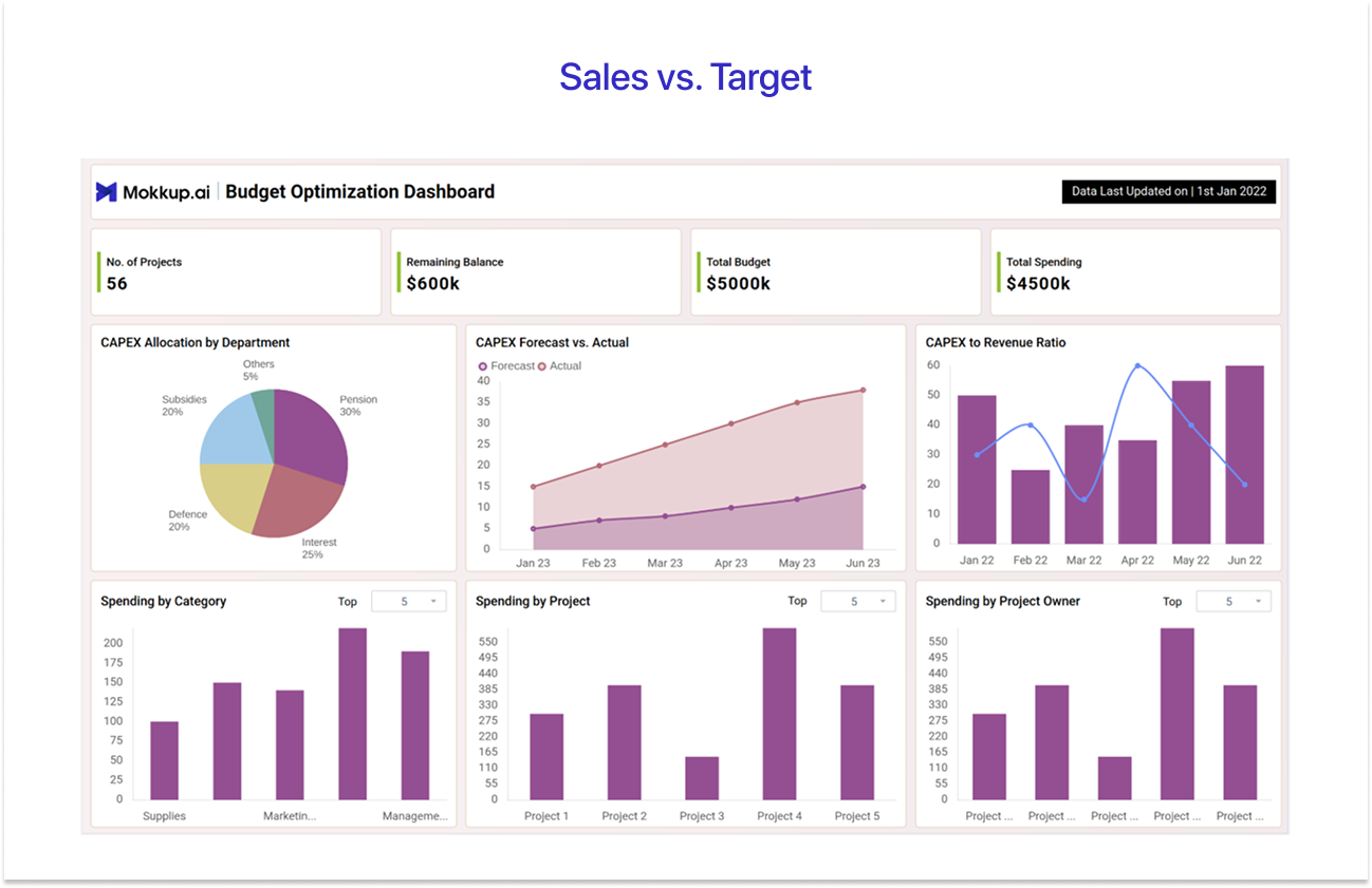
The Sales vs. Target Dashboard helps finance leads and sales leadership track how actual performance is measuring up against plan across budgets, spending, and revenue. Available on Mokkup as the Budget Optimization Dashboard, it covers three pages: a CAPEX overview showing budget allocation by department, forecast vs actual spend, and spending breakdowns by category, project, and project owner; a detailed project table with budget allocated, spending, balance, and status per project; and a revenue page tracking actual vs speculated revenue, monthly recurring revenue, average revenue per customer, revenue by channel and category, and year-over-year growth.
Best for: Finance leads, FP&A teams, and VPs of Sales who need to track actual revenue and spending against plan and explain variances clearly to leadership and the board.
Top KPIs to cover: Number of projects, remaining balance, total budget, total spending, CAPEX allocation by department, CAPEX forecast vs actual, CAPEX to revenue ratio, spending by category and project owner, actual vs speculated revenue, MRR, average revenue per customer, revenue by channel and category, and YoY revenue growth.
Pros:
- One of the few templates that connects spending decisions to revenue outcomes, giving finance and sales a shared view of the business.
- Three-page structure separates CAPEX, project detail, and revenue analysis cleanly, so each audience gets the right level of detail.
Cons: The breadth of the template means it requires more data preparation than a single-focus dashboard; CAPEX, project, and revenue data all need to be connected.
Use Budget Optimization template →
6. B2B Sales Manager Dashboard:
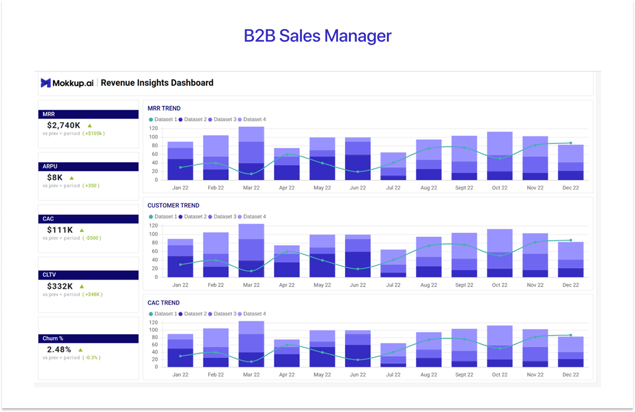
The B2B Sales Manager Dashboard gives sales managers a running view of revenue health and customer dynamics across the full year. Available on Mokkup as the Revenue Insights Dashboard, it tracks Monthly Recurring Revenue (MRR), Average Revenue Per User (ARPU), Customer Acquisition Cost (CAC), Customer Lifetime Value (CLTV), and churn percentage as headline KPI cards, each compared against the previous period.
Three stacked bar and line combo charts display MRR trend, customer trend, and CAC trend month by month, making it easy to spot where revenue momentum is building or where acquisition costs are climbing relative to customer growth.
Best for: B2B sales managers and revenue leaders who need a full-year view of recurring revenue health, customer growth, and acquisition cost trends across multiple segments.
Top KPIs to cover: MRR, ARPU, CAC, CLTV, churn percentage, MRR trend, customer trend, and CAC trend, all tracked month by month with period-over-period comparisons.
Pros:
- The combination of MRR and CAC trends on the same page makes it easy to catch the early signs of deteriorating unit economics before they show up in revenue.
- Full-year monthly view gives managers a longer horizon than most operational dashboards, making it better for spotting seasonal patterns.
Cons:
- Focused on recurring revenue metrics, so it is less relevant for transactional or project-based businesses without MRR.
- Does not include deal-level or rep-level detail, so it works best alongside an operational dashboard rather than as a standalone view.
Use Revenue Insights template →
7. SaaS Recurring Revenue Dashboard:
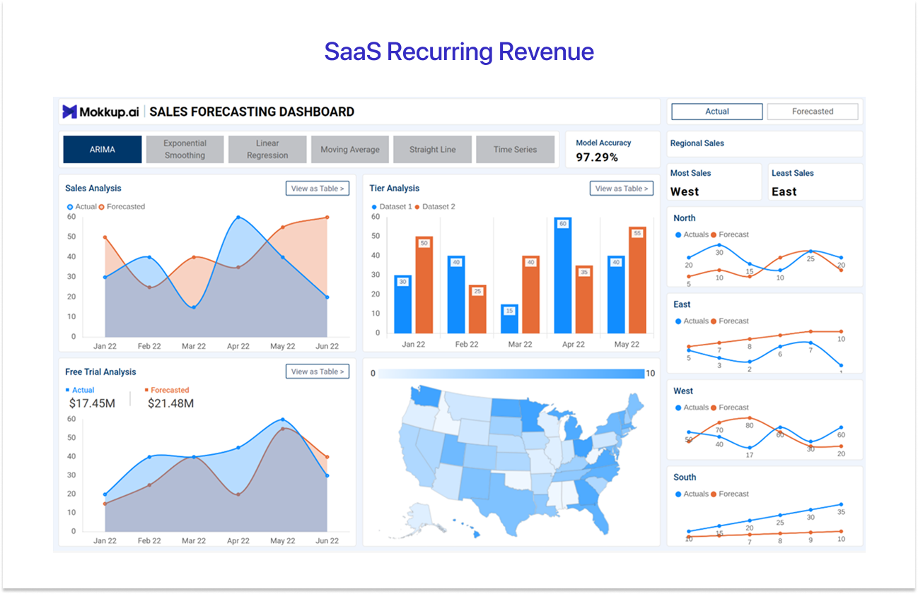
The SaaS Recurring Revenue Dashboard is built for sales and revenue teams that need to forecast future performance with confidence alongside tracking actuals. Available on Mokkup as the SaaS | Sales Forecasting Dashboard, it supports six forecasting models, including ARIMA, Exponential Smoothing, Linear Regression, Moving Average, Straight Line, and Time Series, with a model accuracy score displayed prominently so teams can trust the numbers they are working with.
Sales analysis, tier analysis, and free trial analysis are each plotted as actual vs forecasted comparisons, with a regional breakdown across North, East, West, and South.
Best for: SaaS founders, RevOps leaders, and sales teams at subscription businesses who need to forecast revenue accurately and track actuals against model predictions across regions and customer tiers.
Top KPIs to cover: Model accuracy score, actual vs forecasted sales, tier analysis, free trial analysis, regional sales (North, East, West, South), most and least performing regions, and interactive geographic breakdown.
Pros:
- Support for six forecasting models with a visible accuracy score gives revenue teams genuine confidence in the numbers they are presenting.
- The free trial analysis chart is particularly valuable for SaaS businesses where free-to-paid conversion is a primary growth lever.
Cons:
- The complexity of the forecasting model selection makes this one of the more technically demanding templates to configure with real data.
- Less relevant for non-subscription businesses where MRR and recurring revenue metrics do not apply.
Use SaaS | Sales Forecasting template →
8. Sales Funnel Conversion Dashboard:
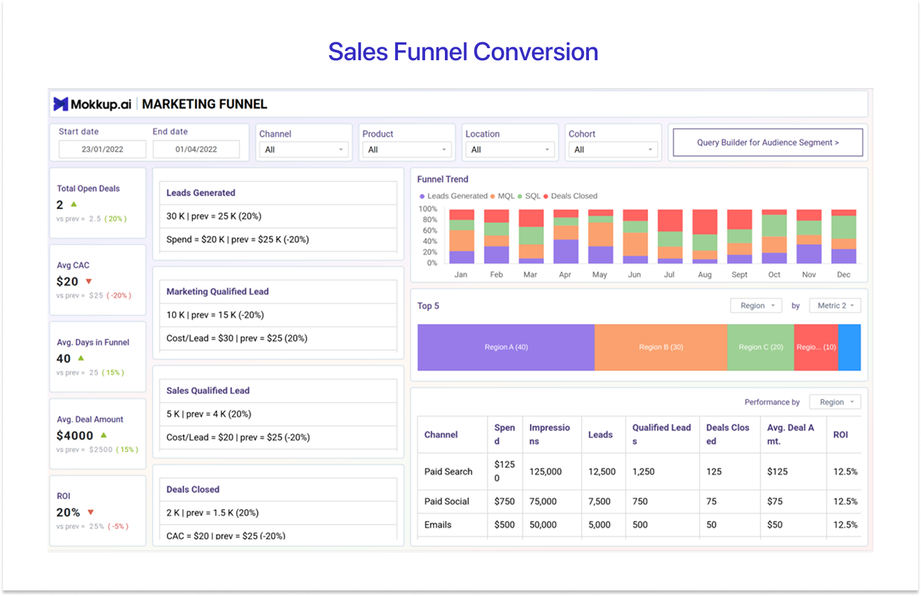
The Sales Funnel Conversion Dashboard gives demand generation and sales operations teams a complete view of how leads move from first touch through to closed deals. Available on Mokkup as the Marketing Funnel Dashboard, it spans four pages covering channel and funnel performance, a cohort comparison view, a full funnel breakdown by top, middle, and bottom stages, and a sales team performance page.
Together, the four pages give sales and marketing teams everything they need to identify where the funnel is leaking and where to focus to improve conversion.
Best for: Demand generation and sales operations teams who need to track full-funnel lead movement, cohort performance, and channel ROI from first touch to closed-won.
Top KPIs to cover: Leads generated, MQL, SQL, deals closed, average CAC, average days in funnel, ROI, CTR, cost per conversion, AOV, CLTV, retention rate, spend by channel, impressions, qualified leads, and reasons for unqualified leads.
Pros:
- The four-page structure covers the full funnel from awareness to closed-won, making it one of the most comprehensive sales and marketing alignment tools available.
- The reasons for unqualified leads chart is uniquely actionable, it tells teams exactly where lead quality is breaking down, rather than just showing a drop-off number.
Cons:
- The breadth of the template means it requires alignment between marketing and sales on data definitions, particularly around MQL and SQL criteria.
- Teams without a structured lead scoring or cohort tracking process may find some pages difficult to populate with meaningful data initially.
Use Marketing Funnel template →
These Power BI sales dashboard examples showcase how various teams use visual analytics to analyse revenue, monitor pipeline health, evaluate performance, and forecast growth. For a broader look at how these dashboards compare across industries, see the top 10 Power BI dashboard examples guide.
With ready-to-edit Mokkup templates, teams can move quickly from dashboard planning to Power BI implementation, while also aligning stakeholders before development begins.
Power BI Sales Dashboards: Quick Comparison
Use this table to quickly pick the dashboard that matches your role and the question you are trying to answer.
|
Dashboard |
Best For |
Pick This When... |
|
1. Sales Overview Dashboard |
VP of Sales, C-suite, sales directors |
You need a single trusted view of overall team performance across companies, business units, and individual contributors. |
|
2. Sales Pipeline Dashboard |
Sales managers, operations teams |
You need to monitor inquiry volume, customer engagement, and pipeline movement across salespeople and product lines. |
|
3. Sales Rep Performance Dashboard |
Frontline sales managers |
You need to track both sales output and service quality side by side across reps, regions, and customer types. |
|
4. Regional Sales Dashboard |
Sales directors, territory managers |
You need a geographic breakdown of revenue, profit, and lost sales to make data-driven territory and resource decisions. |
|
5. Sales vs. Target Dashboard |
Finance leads, FP&A teams, VPs of Sales |
You are tracking actuals vs plan, watching for variances, and need to explain budget performance to leadership or the board. |
|
6. B2B Sales Manager Dashboard |
B2B sales managers, revenue leaders |
You need a full-year view of MRR, CAC, CLTV, and churn to monitor revenue health and customer growth trends. |
|
7. SaaS Recurring Revenue Dashboard |
SaaS founders, RevOps, sales leaders |
You need to forecast revenue using multiple models and track actuals vs predictions across regions and customer tiers. |
|
8. Sales Funnel Conversion Dashboard |
Demand gen, sales ops teams |
You need to identify where leads are dropping off across the full funnel from first touch to closed-won. |
Types of Power BI Sales Dashboards
The eight examples presented above represent three separate dashboard styles, each tailored to a different audience and decision cycle.
Knowing which kind you are creating before opening Power BI avoids the most typical dashboard failure by a single report that attempts to serve everyone but ultimately serves no one.
1. Operational Sales Dashboards
Representatives and front-line supervisors use operational dashboards on a daily or weekly basis. They prioritize real-time data refresh, deal-level information, and actionable alerts over overall trends.
The questions they answer are immediate, such as which transactions require attention today, which phases are stuck, and which salespeople are falling behind on activity targets. This category includes examples 2 (pipeline), 3 (rep performance), and 8 (funnel conversion).
2. Executive Sales Dashboards
Executive dashboards are intended for CFOs, VPs of Sales, and board members who need to swiftly answer a single question without delving into each deal or rep data.
They prioritize clear KPI cards, revenue totals, quota attainment percentages, and prediction accuracy in an easy-to-scan structure. Examples 1 (Sales Overview) and 5 (Budget vs. Actual) fall within this category.
3. Analytical Sales Dashboards
Analytical dashboards are designed for in-depth study into why revenue moved the way it did, where the forecast stands at the conclusion of the quarter, and which categories are expanding the fastest.
They use trend lines, variance waterfall charts, and period-over-period comparisons to address strategic issues rather than operational questions. Examples 6 (B2B Sales Manager) and 7 (SaaS Recurring Revenue) fall within this category.
How to Design a Power BI Sales Dashboard (The Wireframe-First Approach) - With Mokkup.ai
Most BI developers launch Power BI, connect to a data source, and begin working. Two weeks later, they present the dashboard to a stakeholder who requests changes to layout, filters, and page structure. The build restarts, the timeline slips, and frustration grows.
This is one of the most common Power BI wireframing mistakes that delays dashboard projects: skipping the layout agreement step before building.
The wireframe-first technique completely precludes this. Before writing a single line of DAX, you map the layout, agree on KPIs, and obtain express stakeholder approval for the visual framework. Instead of guessing, the Power BI build now executes against a proven specification. Here's how the procedure works.
- Choose Your Dashboard Type: Use the three types above (operational, executive, and analytical) and the eight samples to decide which template best fits your audience and use case.
- Open a Free Mokkup Wireframe Template: Choose the template that is closest to what you want from the 46+ templates in the Mokkup library. Drag and drop KPI cards, charts, and tables to customize your data structure. No prior design experience or access to business intelligence tools is required.
- Share the Wireframe Link With Your Stakeholder: Mokkup generates a shareable link that your stakeholder can open in a browser and annotate with comments directly on the wireframe. Collect feedback on layout and KPI placement in one round before committing any development time to a specific structure.
- Export to Power BI: Once the wireframe is approved, export directly from Mokkup to Power BI as a starting template. The layout, visual types, and panel structure transfer, giving you a scaffolded canvas to connect data to rather than starting from blank.
Getting sign-off on a wireframe converts vague feedback into specific, actionable changes before the expensive part of the work begins. It is one of the most effective ways to shorten a dashboard project and reduce the back-and-forth that typically follows a first demo.
Explore All 46 Free Power BI Sales Dashboard Templates
The eight examples above address the most frequent sales dashboard use cases, although they are only a portion of what is available. Mokkup's library contains 46 sales-related wireframe templates that cover all reporting needs, including direct sales performance, ecommerce revenue tracking, SaaS and subscription analytics, CRM and pipeline management, retail sales, full-funnel conversion analysis, and KPI scorecards for any business.
Unlike static PBIX files, Mokkup templates are fully interactive and editable in the browser. You can update KPI cards, change chart types, rename sections, and rearrange layouts using drag and drop, without needing a Power BI license during the wireframing stage. Once the design is ready, export it directly to Power BI or Tableau and share a live wireframe link with stakeholders for quick feedback before development begins.
Browse all 46 free Power BI sales dashboard templates →
Conclusion
The best Power BI sales dashboard depends on two variables, namely your target audience and the question you want to answer. An executive requires a revenue and quota overview that they can evaluate in seconds. A frontline manager requires deal-level pipeline insight and rep-by-rep performance comparisons. A SaaS RevOps team requires MRR waterfall and churn rate, not only closed-won revenue.
The eight examples above, ranging from Sales Overview to SaaS Recurring Revenue to Funnel Conversion, represent the most typical pairings of audience and inquiry. All 46+ templates are free to open, edit, and export.
Frequently Asked Questions
A Power BI sales dashboard should include 5 to 7 KPIs covering revenue performance, pipeline health, and team activity. The baseline set for most audiences includes total revenue, quota attainment, win rate, pipeline value, and average deal size.
The exact KPIs depend on the audience. An executive view prioritises revenue totals and forecast accuracy, while a frontline manager needs rep-level pipeline activity and deal-stage breakdowns.
The fastest path is wireframe-first: map out your KPI placement and agree the layout with stakeholders before opening Power BI. Start by choosing one of the eight dashboard types above, open a free Mokkup wireframe template that matches your use case, customise the layout in the browser, collect stakeholder sign-off on the wireframe link, and then export directly to Power BI.
This approach eliminates the most common source of delay, which is stakeholder revision requests after the build has already started.
The five KPIs that appear in virtually every sales dashboard are total revenue vs target, pipeline value and coverage ratio, win rate, average deal size, and sales cycle length.
SaaS businesses add MRR and churn rate to this foundation. Rep-level dashboards add quota attainment per rep and activity counts covering calls, emails, and meetings.
Yes. Mokkup.ai offers 46+ free Power BI sales dashboard templates you can open directly in your browser, customise with AI-assisted editing, and export to Power BI in one click. No PBIX download is required, and no design experience is needed to get started.
Every template is fully editable; you can swap chart types, relabel KPI cards, add or remove panels, and rearrange the layout to match your exact data structure before exporting.
Prompt it. Wireframe it with Mokkup.ai.
