Imagine a world where everyone can grasp your data's story, regardless of their abilities or background. A world where data visualizations aren't just colorful charts but accessible doorways to insights, empowering everyone to make informed decisions. This is the promise of inclusive design in data visualization. Today, it's about crafting visualizations that embrace diversity, from visual impairments and cognitive differences to varying levels of data literacy.
Think of it as building a ramp to your data feast, welcoming everyone to pull up a chair and dig in. The rewards are immense: a more engaged audience, richer understanding, and a truly data-driven society where no one is left behind.
Table of Contents
- Introduction to Inclusive Design in Data Visualizations
- Key Principles & Practices of Inclusive Data Visualization
- Accessible Tools and Technologies
- Top 5 Tips for Incorporating Inclusive Design in Your Visualizations
Introduction to Inclusive Design in Data Visualizations
Visualizations have become indispensable tools for communicating insights and driving decision-making in a world awash with data. But too often, these visualizations fail to reach their full potential because they exclude a significant portion of their audience.
Inclusive design in data visualizations aims to bridge this gap by ensuring that everyone, regardless of their abilities, can access, understand, and engage with the information presented. It's a design approach that embraces diversity and champions the idea that data should be truly for everyone.
Here's why inclusive design matters in data visualization:
- Ethical Imperative: It's a matter of fairness and inclusion to make information accessible to all.
- Enhanced Understanding: Diverse perspectives lead to richer insights and better decision-making.
- Broader Reach: Inclusive visualizations reach a wider audience, amplifying their impact.
- Legal Compliance: Many countries have laws mandating accessibility in digital content.
Ready to explore this inclusive approach? Let's dive deeper into the principles and practices that make data visualizations accessible to all.
Key Principles & Practices of Inclusive Data Visualization
Inclusive design is not just about compliance; it's about creating a better future where everyone has equal access to information and insights. Let’s dive into the principles and practices that can create data visualizations that are truly inclusive and accessible to everyone.
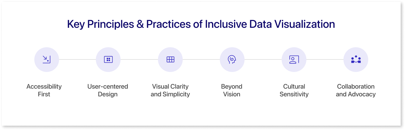
1. Accessibility First:
- Color Choice: Use high contrast between background and data elements, consider color blindness, and avoid red/green reliance.
- Text and Labels: Use clear, concise language, avoid jargon, and use appropriate font size and spacing for readability.
- Navigation and Interaction: Keyboard accessibility, intuitive layout, predictable behavior.
- Alternative Formats: Provide options like audio descriptions or tactile representations for data.
2. User-centered Design:
- Know Your Audience: Understand potential viewers' diverse needs and abilities.
- Usability Testing: Get feedback on your designs from people with disabilities.
- Iterative Improvement: Constantly refine your visualizations based on user feedback.
3. Visual Clarity and Simplicity:
- Declutter the Design: Prioritize key information and avoid unnecessary elements.
- Choose the Right Chart Type: Match the chart to the data and audience understanding.
- Data Labeling and Annotations: Explain the data clearly and concisely.
4. Beyond Vision:
- Audio Descriptions: Provide narrated explanations of the data for visually impaired users.
- Tactile Representations: Consider raised elements or textured maps for data exploration.
- Screen Reader Compatibility: Ensure text elements are accessible to screen readers.
5. Cultural Sensitivity:
- Avoid Stereotypes and Biases: Be mindful of cultural symbols and representations in your visuals.
- Internationalization: Consider language translations and cultural formatting of numbers and dates.
6. Collaboration and Advocacy:
- Partner with Accessibility Experts: Involve people with disabilities in the design process.
- Share Resources and Best Practices: Raise awareness and educate others about inclusive design.
- Advocate for Change: Push for standards and policies that promote accessibility in data visualization.
Accessible Tools and Technologies
Let’s explore a spectrum of accessible tools and technologies that empower designers and developers to create effective and inclusive data visualizations. From user-friendly platforms that prioritize accessibility features to innovative technologies enhancing data interpretation, we delve into the resources that pave the way for a more inclusive approach to visualizing complex information.
1. Mokkup
Mokkup.ai is a cloud based dashboard wireframing tool that helps business professionals create high quality dashboard wireframes without any prior design experience. It provides a selection of pre-built themes and color schemes that adhere to design principles, enabling you to create visually appealing dashboards with harmonious color palettes. Experiment with different color combinations to find the perfect match for your dashboard's aesthetic and purpose.
2. Infogram
Infogram is a powerful tool for creating interactive and engaging infographics, charts, and maps. With a user-friendly interface, Infogram enables users to transform data into visually compelling stories. It offers a wide range of chart types, customization options, and the ability to embed interactive elements, making it suitable for creating visually appealing and informative data visualizations.
3. PowerMockup
PowerMockup is a PowerPoint add-in that facilitates the creation of wireframes and mockups directly within Microsoft PowerPoint. While not a standalone data visualization tool, it can be useful for integrating simple visualizations or demonstrating layout concepts within PowerPoint presentations. This can be particularly helpful when conveying data insights in a familiar and widely used format.
4. Whatagraph
Whatagraph is a reporting platform that automates the creation of visual reports from various data sources. While not a direct data visualization tool, Whatagraph can aggregate and present data in visually appealing formats, such as charts and graphs. It streamlines the reporting process, making it easier to communicate key insights through dynamic visualizations.
5. Figma
Figma is a collaborative design tool that allows teams to work together on the user interface (UI) and user experience (UX) design projects in real time. While not specifically focused on data visualizations, Figma's robust design capabilities make it a versatile tool for creating visually compelling graphics, charts, and prototypes. Its collaborative features make it easy for teams to iterate on designs and ensure consistency.
Top 5 Tips for Incorporating Inclusive Design in Your Visualizations
Here are some practical tips for incorporating inclusive design examples into your data visualizations:
1. Color and Contrast:
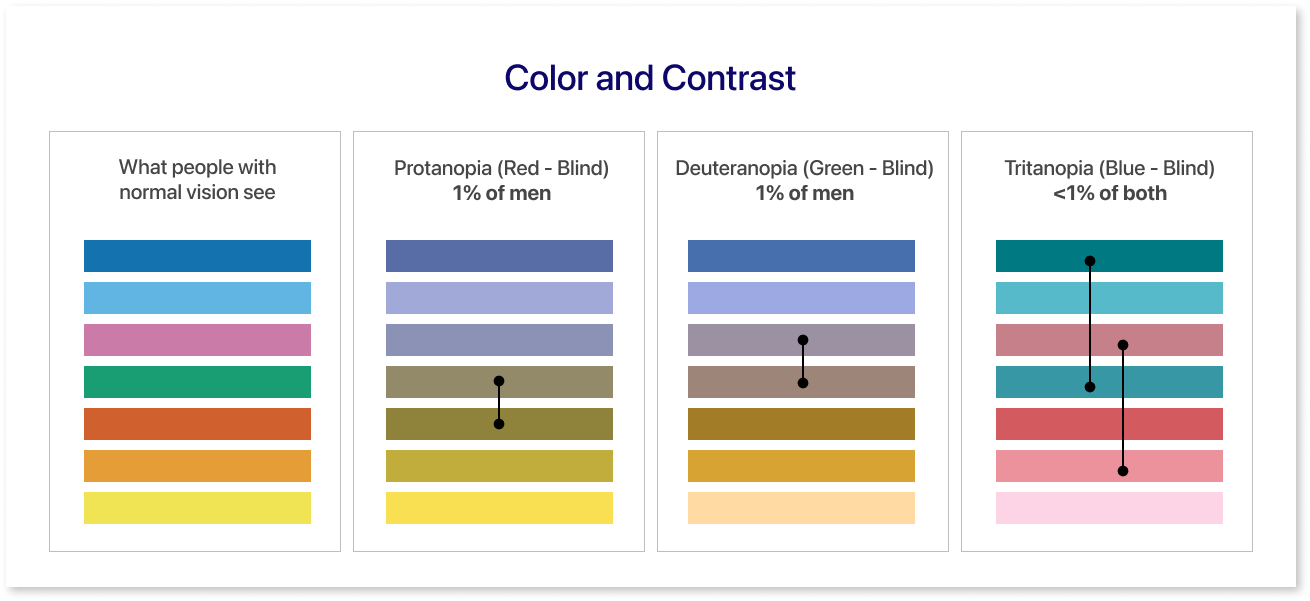
- Prioritize high contrast between text and background. Aim for a contrast ratio of at least 4.5:1 for readability.
- Use color-blind friendly palettes. Avoid relying solely on color to convey information; combine it with patterns, labels, and text explanations.
- Provide alternative color schemes. Offer options for users to customize color palettes based on their preferences or needs.
- Test color combinations for legibility. Use online color contrast checkers or tools like Adobe Color to ensure accessibility.
2. Text and Labels:
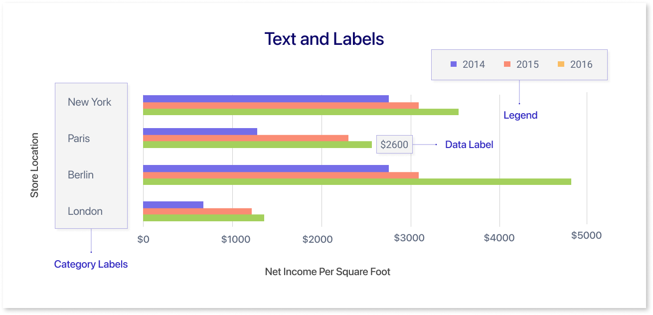
- Use clear, concise language. Avoid jargon or overly technical terms.
- Choose legible fonts and sizes. Aim for sans-serif fonts at a minimum of 12pt size for comfortable reading.
- Ensure adequate spacing between text elements. Avoid clutter and crowding.
- Provide alternative text for images and charts. Use descriptive text that screen readers can access.
3. Layout and Navigation:
- Organize information logically. Use clear headings, subheadings, and visual cues to guide users.
- Provide alternative navigation options. Consider a table of contents, breadcrumbs, or search functionality for easy exploration.
4. Data Representation:
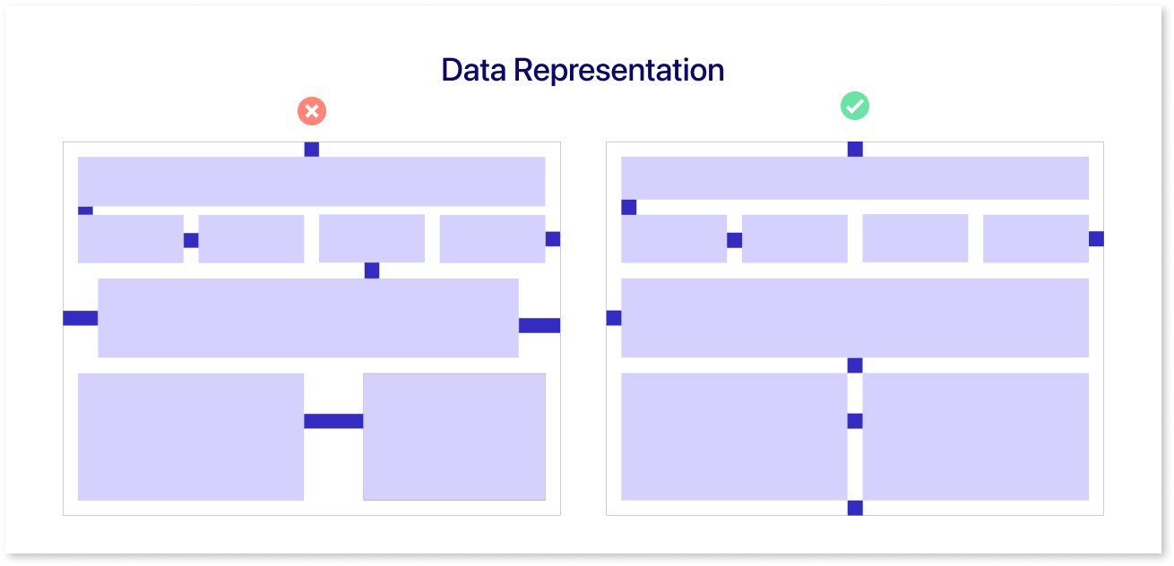
- Choose appropriate chart types. Consider the complexity of the data and the audience's familiarity with different visualizations.
- Use annotations and labels clearly. Explain the data and any patterns or trends visually.
- Provide interactive options. Allow users to filter, sort, or zoom in on data to explore it in more detail.
5. Alternative Formats:
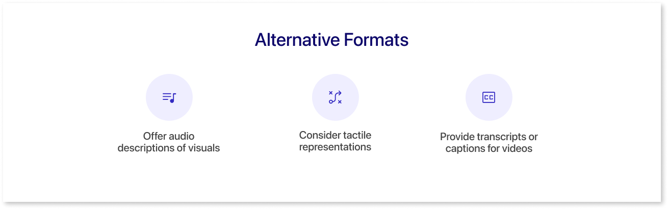
- Offer audio descriptions of visuals. Record narrations that describe the data and its meaning for visual impairments.
- Consider tactile representations. For those who see differently, consider tactile charts like textured maps or 3D-printed graphs to unlock data through touch.
- Provide transcripts or captions for videos. Make video content accessible to users with hearing impairments.
Remember, inclusive graphic design is an ongoing process. Gather feedback from diverse users to identify and address accessibility barriers & stay informed about best practices, consult with accessibility experts, and prioritize user feedback to create visualizations that empower everyone to access and understand data.
Conclusion
In conclusion, embracing inclusive design principles in data visualizations unveils a paradigm shift in how we communicate information. By prioritizing accessibility, clarity, and adaptability, we transform data visualizations into powerful tools that resonate with diverse audiences. Inclusivity in design enhances the user experience and addresses the ethical imperative of making information universally accessible. The future of data communication lies in the commitment to inclusivity, ensuring that no one is left behind in the journey of knowledge dissemination.
Prompt it. Wireframe it with Mokkup.ai.
