In the realm of data visualization, dashboards have emerged as powerful business analytics tools for transforming raw data into actionable insights. However, two distinct approaches to dashboard design have emerged: business dashboards and design-centric dashboards. While both types aim to communicate data effectively, their primary focus and underlying principles differ. Business intelligence dashboards prioritize functionality and clarity, catering to users who need to quickly grasp key performance indicators (KPIs) and monitor trends. In contrast, design-centric dashboards elevate aesthetics and user experience, engaging users and guiding them toward deeper data exploration and uncovering hidden insights. Understanding the nuances of each approach is crucial for organizations to select the dashboard design that aligns with their specific goals and user needs.
Table of Contents
- What are Business Dashboards and Design-Centric Dashboards
- Understanding The User Focus of Each Approach
- Use Cases for Each Type of Business Dashboards
- Use Cases for Design-Centric Dashboards
- Challenges & Limitations of Each Approach
- Best practices for Creating Effective Dashboards
What are Business Dashboards and Design-Centric Dashboards

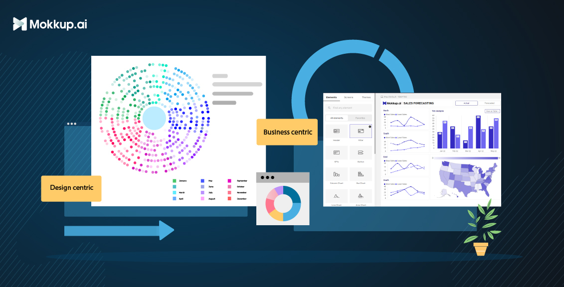
Business dashboards and design-centric dashboards are two distinct approaches to data visualization that serve different purposes and cater to different audiences.
Business dashboards focus on presenting data clearly and concisely, making it easy for users to monitor key performance indicators (KPIs) and track trends. They typically use simple visualizations and straightforward layouts to ensure users can quickly grasp the essential information. Business dashboards are often used by executives, managers, and other decision-makers who need to stay up-to-date on the performance of their businesses or departments.
On the other hand, design-centric dashboards prioritize aesthetics and user experience, aiming to engage users and guide them toward deeper data exploration and uncovering hidden insights. They often use more complex visualizations and interactive elements to create a more immersive and engaging experience.
Here is a table summarizing the key differences between business dashboards and design-centric dashboards:
|
Feature |
Business Dashboards |
Design-Centric Dashboards |
|
Primary focus |
Data presentation and information delivery |
User experience and and aesthetics |
|
Aesthetics |
Emphasize functionality and clarity over visual appeal |
Employ aesthetics to enhance engagement |
|
Data complexity |
Capable of handling complex data and facilitating deeper insights |
Suitable for simple data sets and straightforward analyses |
|
Impact on decision-making |
Support informed business decisions based on readily available data |
Guide more social media engagement and presentations |
|
Use cases |
Monitoring KPIs and tracking trends |
Showcase latest trends in the industry, create catchy visuals |
Understanding The User Focus of Each Approach
Business dashboards are designed for users who need to quickly grasp key performance indicators (KPIs) and monitor trends. These users typically understand the data well and are familiar with the business context. As a result, business dashboards can use relatively simple visualizations and straightforward layouts. However, ensuring that the dashboards are clear, concise, and easy to use is important.
Design-centric dashboards are tailored to captivate audiences and spark engagement rather than delve into in-depth data analysis. They prioritize visually appealing elements like eye-catching charts, vibrant colors, and dynamic animations to capture attention and make a lasting impression. Instead of overwhelming viewers with intricate BI visualization, they focus on distilling complex information into easily digestible and visually appealing formats. They often employ storytelling techniques to weave a compelling narrative around the presented information, making it more relatable and impactful for the audience.
By understanding the user focus of each approach, organizations can select the dashboard design that best meets the needs of their users.
Use Cases for Each Type of Business Dashboards
Business dashboards are visual data display tools that help businesses monitor and track key performance indicators (KPIs) and make informed decisions. There are three main types of business dashboards: operational, strategic, and analytical.
Here are some specific use cases for each type of business dashboard:
1. Operation dashboards
a) Procurement | Inventory
The procurement-inventory dashboard template can be used to track the performance of KPIs over time, identify trends, and make informed decisions about procurement strategies.
b) Cost Center Analysis
Cost Center Analysis helps track and analyze costs by cost center, and businesses can identify areas where costs can be reduced, improve efficiency, and make informed decisions about resource allocation.
c) Inventory Stock Analysis
An Inventory Stock Analysis dashboard is a tool to track and analyze inventory levels of a business. The dashboard provides a visual representation of the key metrics related to inventory.
2. Marketing dashboards
a) Customer Journey
The Customer Journey dashboard helps visualize and analyze the customer journey across all touchpoints to identify areas for improvement and deliver a better customer experience. It can track key metrics, such as customer satisfaction, churn rate, and NPS, to identify trends and patterns over time.
b) Social Media Analysis
Social Media Analysis can track key social media metrics, such as followers, reach, engagement, and brand sentiment, to measure the effectiveness of your social media campaigns and identify areas for improvement. You can also visualize data from multiple social media platforms in one place to get a holistic view of your social media performance and identify trends and patterns over time.
c) Marketing Mix Model
Businesses may efficiently optimize marketing spending and increase ROI by using the Market Mix Modeling (MMM) dashboard, which is intended to assist companies in analyzing the influence of their advertising efforts and platforms on revenue.
3. Finance dashboards
a) Profit & loss report
With the Profit & loss report, companies can see how their sales and profits have changed over time. This is an important way to measure financial progress. It helps identify areas where expenses can be trimmed, improving overall profitability. The P&L statement serves as a foundation for future budget planning.
b) Fixed deposit analysis
This dashboard gives a 360-degree view of the institution's fixed deposits, demonstrating mokkup.ai's dashboard wireframe expertise. Customer Scoring, Churn Analysis, and FD Forecasting are strategically organized into three parts that analyze different aspects of fixed deposits.
c) Financial Ratio Report
Financial Ratio Report can track key financial ratios such as current, quick, debt-to-equity, and return on assets to assess your business's financial health and identify improvement areas. It can also visualize data over time to identify trends and patterns and compare your ratios to industry benchmarks to see your performance.
Use Cases for Design-Centric Dashboards
Design-centric dashboards are visual data display tools that are specifically designed to help designers and other stakeholders understand and interpret design data. They typically use a combination of charts, graphs, and other visuals to communicate complex information clearly and concisely.
Here are some use cases for design-centric dashboards for presentations, competitions, challenges, blogs, and social media:
1. Presentations
Design-centric dashboards can be used to create visually appealing and informative presentations that engage audiences and communicate complex information clearly and concisely. For example, a design-centric dashboard could be used to:
- Present marketing data to stakeholders
- Showcase product performance to potential customers
- Share research findings with a scientific community
- Educate students about a complex topic
2. Competitions & Challenges
Design-centric dashboards can be used to create dashboards that allow users to explore data and identify trends and insights. For example, a design-centric dashboard could be used to:
- Storytelling to present the data in a way that is easy to understand and remember.
- Visuals to break down complex concepts into smaller, more manageable chunks.
- Case studies to show how the product has helped other customers.
3. Blogs
Design-centric dashboards can be used to create visually appealing and informative blog posts that engage readers and communicate complex information clearly and concisely. For example, a design-centric dashboard could be used to:
- Present data-driven insights about a particular topic
- Share research findings from a recent study
- Showcase the results of a design experiment
4. Social media
Design-centric dashboards can be used to create engaging and informative social media posts that share data and insights with followers. For example, a design-centric dashboard could be used to:
- Share key metrics about a social media campaign
- Showcase the results of a social media listening experiment
- Share insights about customer behavior and trends.
Design-centric dashboards are a powerful tool for designers and other stakeholders to understand and interpret design data. By using these dashboards, designers can improve the quality of their designs and make a more meaningful impact on business outcomes.
Challenges & Limitations of Each Approach
Both business and design-centric dashboards have their own challenges and limitations.
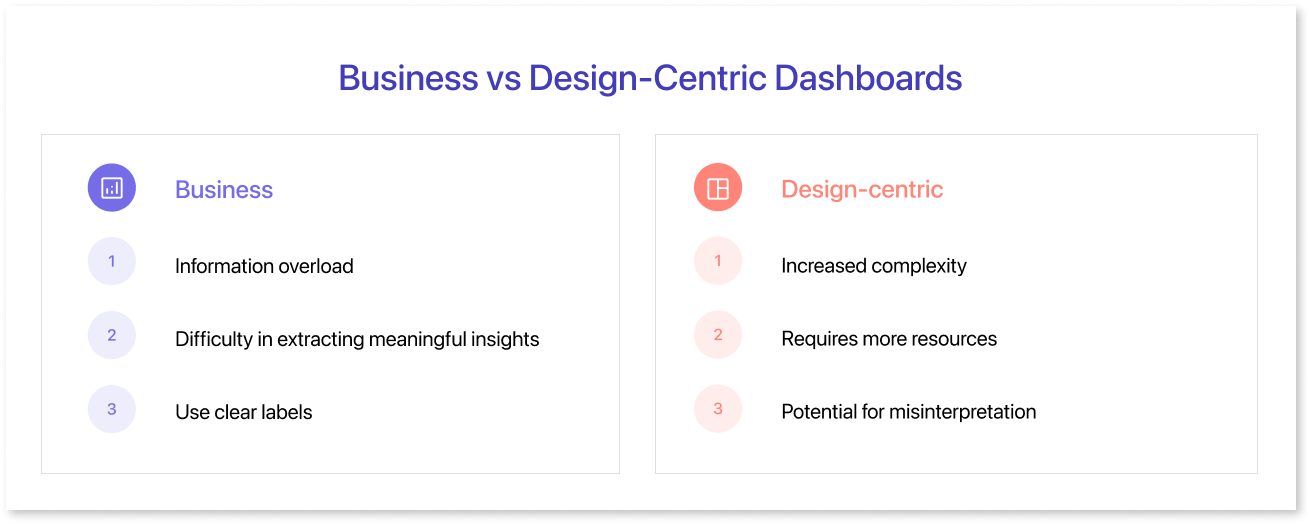
Challenges of business dashboards:
- Information overload: Business dashboards can sometimes present too much information, making it difficult for users to focus on the most important data.
- Difficulty in extracting meaningful insights: Business dashboards can be good for monitoring trends and identifying patterns, but they can be less effective at extracting deeper insights from data.
- Limited user engagement: Business dashboards can sometimes be static and uninspiring, limiting user engagement.
Limitations of design-centric dashboards:
- Increased complexity: Design-centric dashboards can be more complex to design and implement than business dashboards.
- Requires more resources: Design-centric dashboards, such as designers and data analysts, often require more resources to create and maintain.
- Potential for misinterpretation: Design-centric dashboards can sometimes be over-designed, leading to data misinterpretations.
Best practices for Creating Effective Dashboards
Here are some BI dashboard best practices for creating effective dashboards:
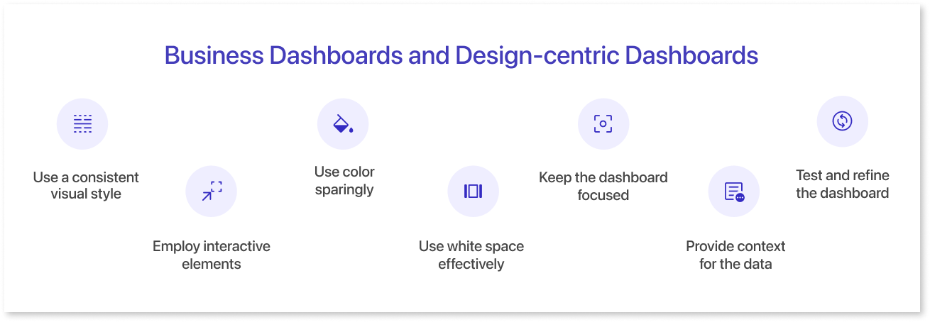
- Use a consistent visual style: This will help users to quickly understand the dashboard and find the information they need.
- Employ interactive elements to enhance engagement: Interactive elements like filters, drills-downs, and tooltips can help users explore the data more deeply and uncover hidden insights.
- Use color sparingly: Color can be used to highlight important data or make the dashboard more visually appealing, but use only a few colors, as this can overwhelm users.
- Use white space effectively: White space can help to make the dashboard more readable and less cluttered.
- Keep the dashboard focused: Avoid including too much information or too many features on the dashboard. This can make it difficult for users to focus on the most important data.
- Provide context for the data: Users need to understand the context of the data to interpret it correctly. This can be done by providing labels, legends, and tooltips that explain the data and its relationships.
- Test and refine the dashboard regularly: Get user feedback and make changes as needed to ensure that the business analytics dashboard meets their needs.
Summary
Business and design-centric dashboards are valuable tools for data visualization and analysis, but they have different strengths and weaknesses. The best type of dashboard to use will depend on the user's or organization's specific needs. Ultimately, the best way to choose between a business dashboard and a design-centric dashboard is to consider the user's or organization's specific needs. If the goal is to track KPIs and make data-driven decisions, then a business dashboard is a good choice. If the goal is to communicate complex data insights to a non-technical audience or tell a story with data, then a design-centric dashboard is a good choice. There is no one-size-fits-all solution, and the best approach is to use a hybrid dashboard that combines the strengths of both design-centric & BI dashboards. This type of dashboard can be used to track KPIs and make data-driven decisions while also providing a visually appealing and engaging way to communicate insights to users.
Mokkup.ai is your one stop solution for all your dashboard wireframing needs starting from bussiness dashboards to design centric dashboards. Start wireframing today!
Prompt it. Wireframe it with Mokkup.ai.
