ChatGPT for BI teams has become a default first stop when a new dashboard project kicks off. It handles DAX and writes stakeholder copy, and it is already open. Using it for ChatGPT dashboard wireframing is the logical next step.
It is not. And the gap is not obvious until a developer tries to build from the output.
This article runs the same prompt through ChatGPT Canvas and Mokkup's AI generator and documents exactly what each produces. If you are evaluating ChatGPT for BI wireframing, this is the comparison you need before committing time to it.
Table of Contents
- What ChatGPT Can Do for Dashboard Design
- We Tested ChatGPT for a Power BI Dashboard Wireframe
- Where ChatGPT Falls Short for BI Dashboard Wireframing
- What a Purpose-Built BI Wireframing Tool Does Instead
- ChatGPT vs. Mokkup: Side-by-Side Comparison
- Where ChatGPT is Genuinely Useful in a BI Workflow
What ChatGPT Can Do for Dashboard Design
ChatGPT design capabilities were not built for wireframing, but the tool has evolved to support visual outputs through Canvas and the GPT store. For ChatGPT BI dashboard design, the capabilities are real, just not BI-specific, and that distinction matters more than it appears upfront.
1. ChatGPT Canvas: The Closest Thing to a Wireframing Mode
Canvas is ChatGPT's side-by-side code editor. It generates and iterates on HTML and CSS layouts in real time, responding to follow-up prompts without losing context. 92% of Fortune 500 companies now use ChatGPT, and with over 900 million weekly active users, the tool is already open on most desks, making Canvas the path of least resistance for a quick wireframe attempt. As a ChatGPT Canvas wireframe BI option, it works well enough that product and UX teams use it as a first-pass prototyping tool.
What Canvas does well:
- Generates a visual layout from a text prompt in seconds
- Responds to iteration instructions like "Move the KPI row above the filters.'
- Produces renderable HTML that can be opened in a browser and shared as a screenshot
The ceiling appears the moment you add a BI-specific requirement. ChatGPT UI design knowledge covers only web conventions. Power BI report pages, Tableau dashboards, slicer panels, and matrix visuals are outside its vocabulary.
2. Wireframe GPTs in the ChatGPT Store
Two dedicated wireframing tools in the Wireframe GPT store are worth acknowledging: Wireframe Wizard and Proper Wireframe Builder. Both produce low-to-mid fidelity layouts from prompts and work for general product and web design. The component vocabulary is still web UI, not BI. Neither has a concept of a slicer, a KPI card visual, a Tableau filter panel, or a matrix with drill-through behavior.
3. What ChatGPT Actually Produces for a BI Dashboard Prompt
Run any of these tools with a BI-specific prompt, and the output is typically one of: an HTML wireframe ChatGPT rendered in Canvas, a described layout with placeholder labels, or a ChatGPT dashboard template code snippet. The output passes a surface-level check. The problem is what it is made of and what it is missing.
We Tested ChatGPT for a Power BI Dashboard Wireframe
The same ChatGPT prompt for dashboard layout was submitted to ChatGPT Canvas and Mokkup's AI generator, a direct test of ChatGPT for Power BI dashboards. Identical wording, no extra context.
1. The Prompt Used
"Generate a stakeholder-ready Power BI executive sales dashboard wireframe optimized for presentation and BI handoff. Include a filter panel, KPI summary row, regional comparison visuals, trend analysis, product ranking, and tabular drill-through section with proper dashboard spacing."
2. What ChatGPT Produced
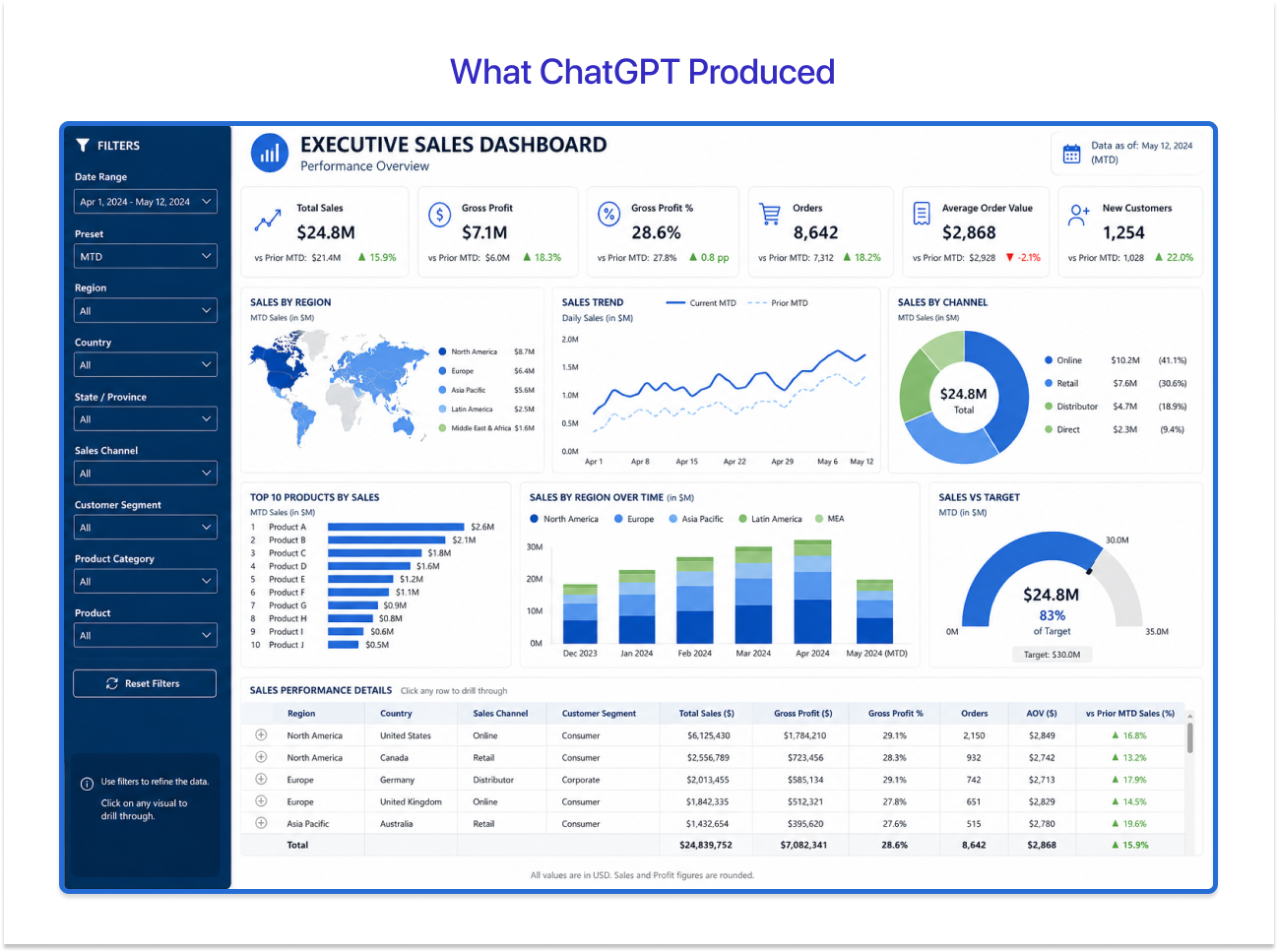
The output renders a full-page dashboard that, on first view, addresses the brief:
- Six KPI cards: Total Sales ($24.8M), Gross Profit ($7.1M), Gross Profit % (28.6%), Orders (8,642), Average Order Value ($2,868), New Customers (1,254), each with a vs. prior MTD comparison
- Left-side filter panel with dropdowns for Date Range, Region, Country, Sales Channel, Customer Segment, Product Category, and Product
- Charts for Sales by Region (map), Sales Trend (line), Sales by Channel (donut), Top 10 Products (bar), Sales by Region Over Time (stacked bar), and Sales vs Target (gauge)
- A Sales Performance Details table with Region, Country, Sales Channel, Customer Segment, Total Sales, Gross Profit, Orders, AOV, and vs Prior MTD columns
For a web product dashboard, this is a useful starting reference. As a Power BI dashboard from ChatGPT, the problems are structural.
3. What BI Users Notice Immediately
A Power BI developer looking at this output alongside an open .pbix file identifies the issues within minutes:
- The filter panel uses HTML dropdowns, not Power BI slicers: In Power BI, slicers are interactive visual components that cross-filter other visuals, respond to bookmark states, and have specific type configurations. An HTML select element has no equivalent in a .pbix file. The developer has to determine slicer type, cross-filter scope, and bookmark behaviour from scratch.
- KPI cards are rendered HTML, not Power BI card visuals: Power BI has distinct card visual types (standard card, multi-row card, KPI visual), each with different field requirements. The ChatGPT cards show a number and a trend arrow but carry no information about which visual type to use or how to configure the comparison logic.
- Chart components are CSS elements, not BI visual types: The Sales vs Target gauge is an HTML arc. The donut chart is a styled SVG. Neither maps to a Power BI or Tableau visual. A Power BI gauge requires minimum, maximum, and target field bindings that the wireframe does not define.
- The drill-through table has no drill-through logic: The prompt requested a tabular drill-through section. The output delivers an HTML table. In Power BI, drill-through is a page-level navigation feature requiring a dedicated report page, specific field configuration, and cross-page filter setup. None of that is represented.
Every component requires a rebuild decision; the wireframe does not inform. It is a visual reference, not a build document.
4. What Mokkup Produced
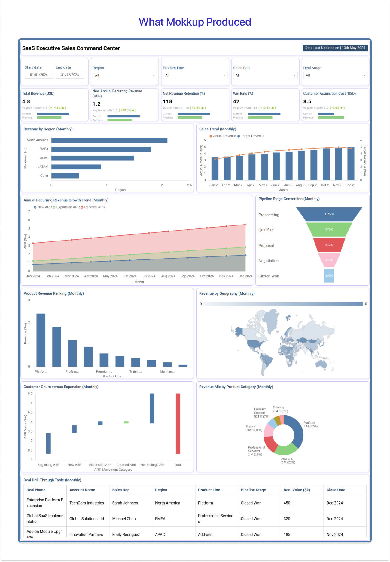
The Mokkup output uses the same prompt and produces a different category of result:
- Filter row with typed Power BI slicers: Start Date, End Date, Region, Product Line, Sales Rep, and Deal Stage rendered as recognizable slicer components. A developer knows exactly which slicer type to place and how it cross-filters.
- BI-native KPI cards: Each card shows a primary metric, a vs. previous month delta with a directional indicator, and a sparkline bar matching the Power BI KPI visual structure exactly. No rebuild decisions required.
- Correctly typed chart components: Revenue by Region as a horizontal bar chart, ARR Growth Trend as a stacked area chart with three named series, Pipeline Stage Conversion as a funnel visual. Each has a direct Power BI equivalent.
- Drill-through table structured as a Power BI matrix: Deal Name, Account Name, Sales Rep, Region, Product Line, Pipeline Stage, Deal Value, and Close Date as a matrix visual with sortable headers. The developer maps this directly without interpretation.
The Mokkup wireframe is a build document. Every component type is defined, every layout decision is made, and the handoff is direct.

Where ChatGPT Falls Short for BI Dashboard Wireframing
The test results are clear. ChatGPT produces a dashboard that looks right and builds wrong. Here are the five gaps every Power BI and Tableau developer runs into:
1. The Output Is a Web UI Mockup, Not a BI Wireframe
A web UI mockup shows how an interface could look. A BI wireframe specifies which components to use, how they relate to data, and how they interact. ChatGPT's design limitations mean it produces the former. Every visual element is an HTML or CSS component with no Power BI or Tableau equivalent. The developer opens a blank .pbix and rebuilds from scratch. The wireframe adds a reference document. It does not remove a step.
2. No BI Component Library
ChatGPT does not know Power BI or Tableau component conventions. The components absent from every ChatGPT BI wireframe:
- Slicers with dropdown, list, date range, and tile variants, each with distinct cross-filter behavior.
- KPI visual, standard card, and multi-row card with their respective field requirements.
- Matrix visual with row and column hierarchies, subtotals, and drill-down configuration.
- Drill-through pages with cross-page filter setup and navigation triggers.
- Tableau filter panels with parameter controls and context filter ordering.
When none of these exist in a wireframe, every placement and configuration decision falls on the developer.
3. No Export to Power BI or Tableau
There is no pathway from a ChatGPT wireframe to a .pbix or .twbx file. The wireframe and the build are disconnected workflows. Mokkup exports directly as a Power BI or Tableau starting template. The developer opens a file that already reflects the approved wireframe and begins configuration rather than composition.
4. No Tableau Semantic Layer Awareness
Enterprise Tableau deployments are built on a semantic layer that defines metrics, hierarchies, calculated fields, and data relationships centrally. A wireframe that ignores the semantic layer can imply data relationships that the underlying model does not support, creating rework discovered late in the build cycle. ChatGPT generates visual layouts without any reference to the semantic layer structure. Mokkup's wireframing accounts for these conventions before a calculated field is written.
5. No Stakeholder Sign-Off Workflow
BI teams need stakeholder approval before the build begins. The cost of discovering a rejected layout mid-build is not just revision time. It is time spent building to the wrong specification.
- No shareable link a stakeholder can open in a browser.
- No annotation layer for marking specific components.
- No interactive mockup for exploring the layout before approving it.
Sharing a screenshot in a Teams message is not a sign-off workflow. It has no feedback mechanism, no audit trail, and no clear approval state.
What a Purpose-Built BI Wireframing Tool Does Instead
For teams looking for a dashboard mockup alternative built for Power BI and Tableau, Mokkup closes every gap the test exposed.
1. A Component Library That Speaks Power BI and Tableau
Mokkup's component library maps directly to Power BI and Tableau visual types: KPI cards with sparklines and period-over-period deltas, typed slicers, matrix visuals with drill-down markers, funnel and gauge visuals, and the Tableau filter panels with parameter controls. A developer reads the wireframe the same way they read a Power BI layout. No translation required.
2. Tableau Semantic Layer Integration
Mokkup's wireframing accounts for Tableau's semantic layer structure. Wireframes reflect how metrics and hierarchies are defined in the underlying data model, not just how they appear on the surface. This prevents late-stage rework when a visual layout conflicts with the data model that was never consulted during wireframing.
3. One-Click Export to Power BI and Tableau
A Mokkup wireframe exports directly as a .pbix starting template or a .twbx file. The developer opens a build-ready file where components are placed, and visual types are defined. The time saving is in the build phase, not the wireframing phase.
4. Shareable Links for Stakeholder Sign-Off
Mokkup produces a shareable link stakeholders can open, annotate, and approve before a single line of DAX is written. Revision cycles happen on the wireframe, where changes cost minutes. Not on a half-built report, where they cost days.
5. AI Prompt Generation, BI-Aware
Mokkup's AI generator understands BI layout conventions. The same prompt that returns a generic HTML mockup in ChatGPT returns a wireframe with correctly typed Power BI and Tableau components in Mokkup.
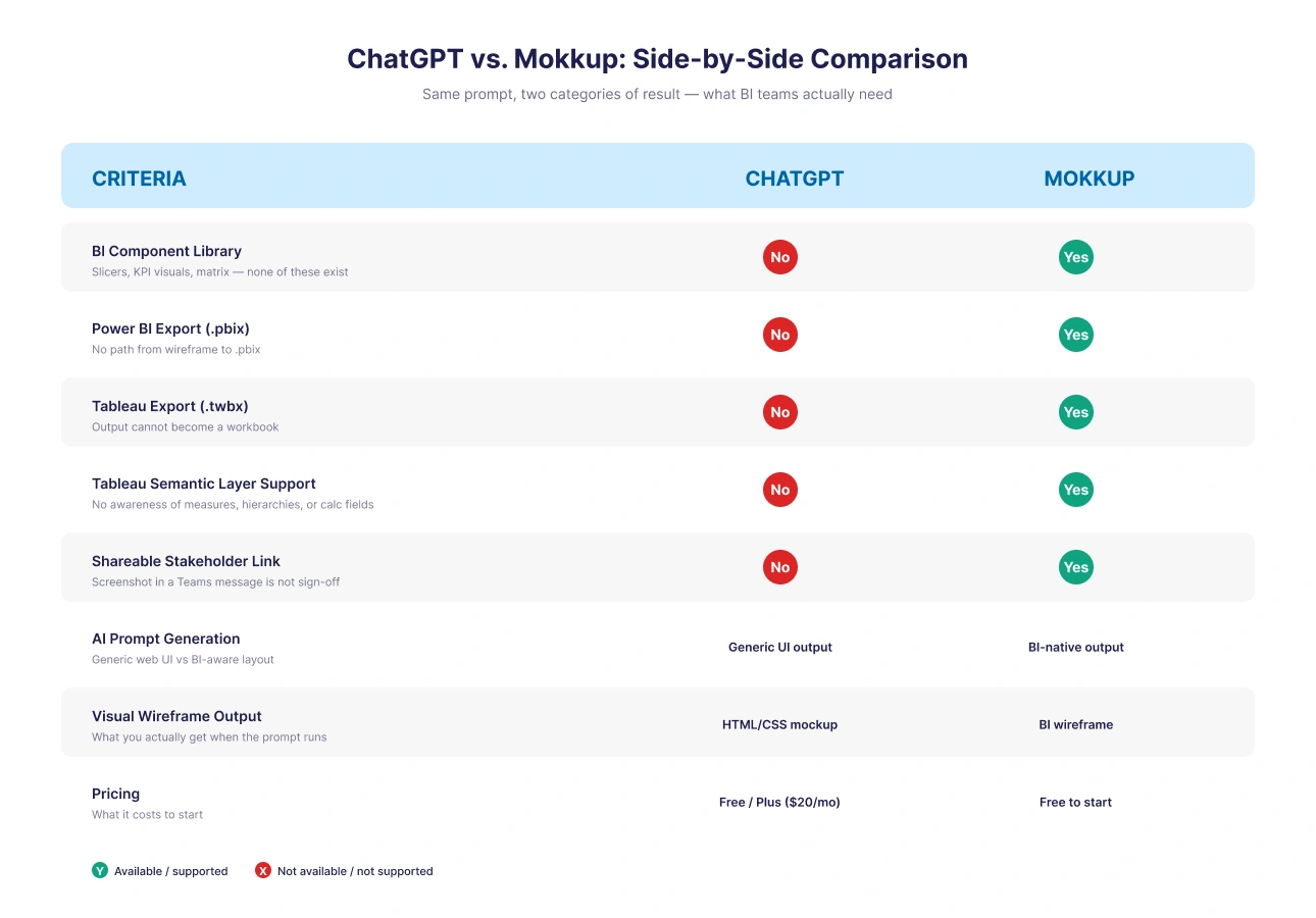
ChatGPT vs. Mokkup: Side-by-Side Comparison
Where ChatGPT is Genuinely Useful in a BI Workflow
ChatGPT has real value in a BI project. The mistake is using it for the wireframing step. Here is where it earns its place:
- Defining KPIs and metric frameworks: Ask it to suggest the five metrics an executive sales dashboard should track for a SaaS business. The output is structured, well-reasoned, and faster than a discovery workshop.
- Generating DAX measure logic: Describe a calculation in plain English, and ChatGPT returns a working DAX formula. This is its strongest BI use case. Complex time intelligence measures sometimes need correction, but as a first draft, it is faster than writing from scratch.
- Writing dashboard copy and labels: Axis labels, tooltip text, section headers, and KPI card titles. ChatGPT writes these quickly and consistently across a full dashboard.
- Drafting stakeholder briefs: Translating a BI build specification into plain language for a non-technical audience. Also useful for post-build user guides and metric dictionaries.
Use ChatGPT upstream for definition, logic, and copy. Use a purpose-built tool for the wireframe.
Conclusion
ChatGPT is a useful tool in a BI workflow. It is not the right tool for the wireframing step. It does not use BI component language. It cannot export to Power BI or Tableau. It has no semantic layer awareness and no stakeholder sign-off workflow. The output for a BI dashboard prompt is a web UI mockup that a developer rebuilds from scratch.
Use it upstream for KPI definitions, DAX logic, and dashboard copy. For the wireframe itself, use a tool built for the job.
Frequently Asked Questions
ChatGPT can generate a dashboard-style HTML mockup from a prompt, but the output uses generic web UI components, not Power BI visuals. There is no slicer, no KPI visual, no matrix, and no drill-through logic. A developer rebuilds every element from scratch in Power BI.
Canvas is a side-by-side code editor that generates and iterates on HTML and CSS layouts. It works for web UI wireframing. For BI teams, it produces HTML output that does not use Power BI or Tableau component conventions and cannot export to either platform.
Wireframe Wizard and Proper Wireframe Builder are GPTs in the ChatGPT store that handle general wireframing. Neither has a BI component library or export to .pbix or .twbx. For BI-specific wireframing, they carry the same limitations as Canvas.
No. ChatGPT generates visual layouts without reference to Tableau's semantic layer. Wireframes can imply data relationships that the underlying model does not support, creating rework during build. Mokkup accounts for semantic layer conventions at the design stage.
Mokkup is purpose-built for BI wireframing. It provides BI-native components, Power BI and Tableau export with semantic layer support, and a stakeholder sign-off workflow. ChatGPT is best used upstream for KPI definition, DAX logic, and dashboard copy.
Use ChatGPT in the discovery phase: defining KPIs, generating DAX drafts, writing metric descriptions, and drafting stakeholder briefs. Then use Mokkup to build the wireframe and export it directly to Power BI or Tableau.
Prompt it. Wireframe it with Mokkup.ai.
