
What is a Water Treatment and Purification Intake Risk Dashboard?
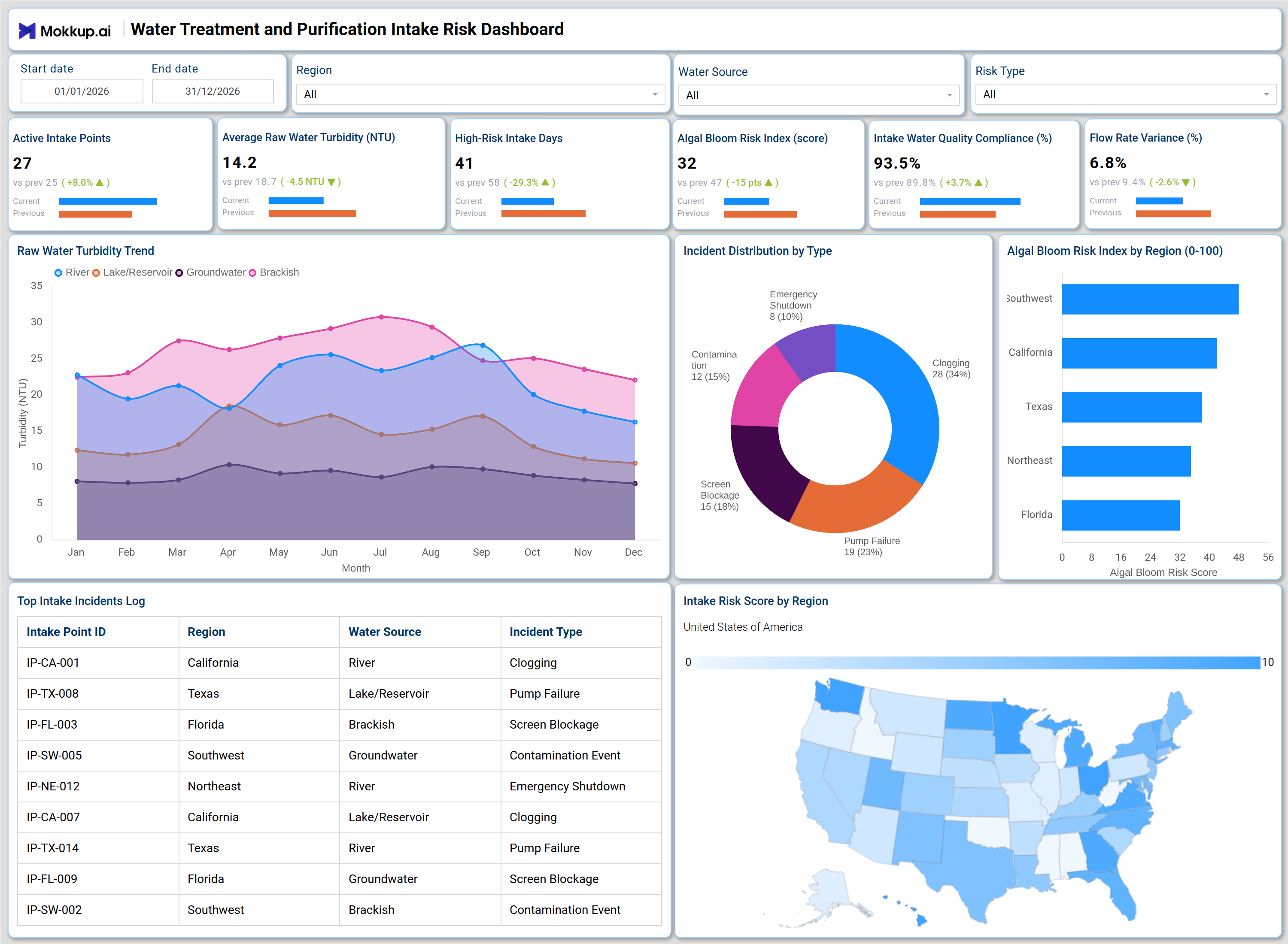
The Water Treatment and Purification Intake Risk Dashboard is a structured analytics template built for water utility managers, environmental compliance officers, and plant operations teams who need to monitor and control risks at raw water intake points. This water treatment intake risk dashboard consolidates six core performance indicators, including turbidity levels, algal bloom risk, compliance rates, and flow variance, into a single, actionable view. It tracks conditions across multiple water sources, including rivers, lakes, and reservoirs, groundwater, and brackish supplies, enabling teams to detect deteriorating intake quality before it affects treatment operations. By providing a structured view of intake conditions, risk distribution, and regional exposure, this dashboard supports water source intake risk assessment workflows that would otherwise require manual data pulling across disconnected systems.
How to Create a Water Treatment and Purification Intake Risk Dashboard
You don't need to build your report from scratch, just start with a ready-to-use dashboard template from Mokkup. Add in your data and export it however you like. Here's how to do it:
1. Create or Log in to Your Mokkup Account
Start by signing up on Mokkup.ai using your email. If you already have an account, just log in, and you'll be good to go.
2. Choose and Customize Your Dashboard Template
Find the Water Treatment and Purification Intake Risk Dashboard template in the Templates section. Use the drag-and-drop editor to adjust KPIs, edit filters, or add elements based on your data.
3. Export to Your BI Tool
Once your dashboard wireframe is ready, use the BI Tool Export feature to send it directly to Power BI or Tableau for further analysis and enhancements. You can also download the dashboard as a PDF, PNG, or JPEG, embed it on a platform, or invite your team to collaborate.
Note: This is a Pro template. You'll need a Pro subscription on Mokkup to use and customize this dashboard wireframe. Upgrade anytime to unlock full access.
Water Treatment and Purification Intake Risk Dashboard Example
A water utility operations manager opens this dashboard to assess intake conditions across all active monitoring points. The first thing they review is whether intake water quality compliance is holding above acceptable thresholds, and whether any regions are recording elevated risk scores that require immediate intervention. When the algal bloom risk index tracking panel shows a spike in a particular region, the team can cross-reference it against the incident log to determine whether a contamination event or emergency shutdown has already been triggered at affected sites. Deeper in the dashboard, operations leads use the Raw Water Turbidity Trend area chart to understand how turbidity is evolving across different source types throughout the year.
This raw water turbidity monitoring dashboard view is especially useful for seasonal planning, identifying months when river or lake intake quality tends to decline so pre-treatment capacity can be scaled accordingly. The Incident Distribution by Type donut chart gives water purification incident management dashboard users a clear breakdown of what is causing service disruptions. Whether clogging, pump failures, or screen blockages are dominating the incident log, teams can prioritize maintenance resources accordingly. Combined with the US choropleth map showing intake risk scores by region, managers can make informed decisions about where to deploy field teams or trigger additional testing protocols.
How to Analyze Data in a Water Treatment and Purification Intake Risk Dashboard
Here is how you can analyze data from this dashboard:
- Use the Region filter to isolate intake performance and risk scores for specific geographic areas.
- Apply the Water Source filter to compare turbidity and compliance trends across rivers, lakes, groundwater, and brackish sources.
- Monitor the Raw Water Turbidity Trend chart to detect seasonal spikes in source water quality degradation.
- Track the Algal Bloom Risk Index by Region bar chart to support algal bloom risk index tracking and identify which regions require pre-treatment adjustments.
- Review the Incident Distribution by Type donut chart to assess which failure categories are most frequent and allocate maintenance resources accordingly.
- Cross-reference the Top Intake Incidents Log table with the risk map to confirm whether high-risk regions are generating the most incident reports.
- Use the Intake Risk Score by Region map to identify geographic concentrations of risk and guide field inspection scheduling.
- Filter by Risk Type to focus analysis on a single incident category and isolate patterns by region or water source.
- Monitor Flow Rate Variance to detect pressure or volume inconsistencies at intake points before they escalate.
Benefits of a Water Treatment and Purification Intake Risk Dashboard
The following are the benefits of using this dashboard:
- Centralizes intake water quality compliance, turbidity data, and incident logs across multiple regions in one structured template.
- Supports raw water turbidity monitoring dashboard workflows by visualizing source-type trends across a full calendar year.
- Reduces manual effort for compliance reporting with pre-built KPI tiles covering all critical intake risk indicators.
- Enables region-level water source intake risk assessment to guide inspection prioritization and pre-treatment planning.
- Provides a donut chart breakdown of incident types for targeted water purification incident management dashboard use.
- Helps operations managers and compliance officers align monitoring with seasonal risk patterns without rebuilding reports.
- Gives field teams and plant managers a shared view of intake conditions, incident history, and regional exposure.
KPIs to Track in a Water Treatment and Purification Intake Risk Dashboard
The following key KPIs can be tracked by using this dashboard:
- Active Intake Points: Measures the number of operational intake monitoring points across all regions, central to any water treatment intake risk dashboard for scoping risk coverage.
- Average Raw Water Turbidity (NTU): Tracks the average turbidity of incoming raw water across all source types, a core metric in raw water turbidity monitoring dashboard analysis for assessing treatment demand.
- High-Risk Intake Days: Counts the number of days within the selected period when intake conditions crossed into high-risk thresholds, used to evaluate the frequency of adverse intake events.
- Algal Bloom Risk Index (Score): Quantifies algal bloom activity across intake regions on a 0-100 scale, essential for algal bloom risk index tracking and pre-treatment chemical dosing decisions.
- Intake Water Quality Compliance (%): Measures the percentage of intake monitoring periods where water quality met required standards, a direct indicator of intake water quality compliance performance.
- Flow Rate Variance (%): Tracks the percentage deviation in water flow at intake points, used to detect pump inefficiencies, blockages, or supply instability that affect treatment throughput.
Frequently Asked Questions
1. What types of water utilities benefit most from this dashboard?
Municipal water treatment plants, regional water authorities, and environmental compliance teams benefit most. It is particularly useful for operations teams managing multiple intake points across source types such as rivers, reservoirs, groundwater, and brackish water.
2. Can this dashboard track incidents by both region and water source type?
Yes. The Top Intake Incidents Log table includes columns for Region, Water Source, and Incident Type, allowing teams to cross-reference incident patterns across both dimensions simultaneously.
3. Is this dashboard suitable for seasonal intake risk planning?
Yes. The Raw Water Turbidity Trend chart displays turbidity levels month by month across all source types, helping operations teams identify high-risk periods and plan pre-treatment capacity in advance.