What is a Water Supply Demand Forecast & Supply Adequacy Dashboard?
The Water Supply Demand Forecast & Supply Adequacy Dashboard is a structured planning tool designed for water utility managers, municipal planners, and resource analysts who need to monitor supply reliability across regions and seasons. This water supply demand forecast dashboard consolidates six core performance indicators, including Supply Adequacy Margin, Demand Forecast Accuracy, and New Capacity in Pipeline into a single, decision-ready view. Understanding drought risk exposure by water source vulnerability is central to how this water supply demand forecast dashboard surfaces supply risk.
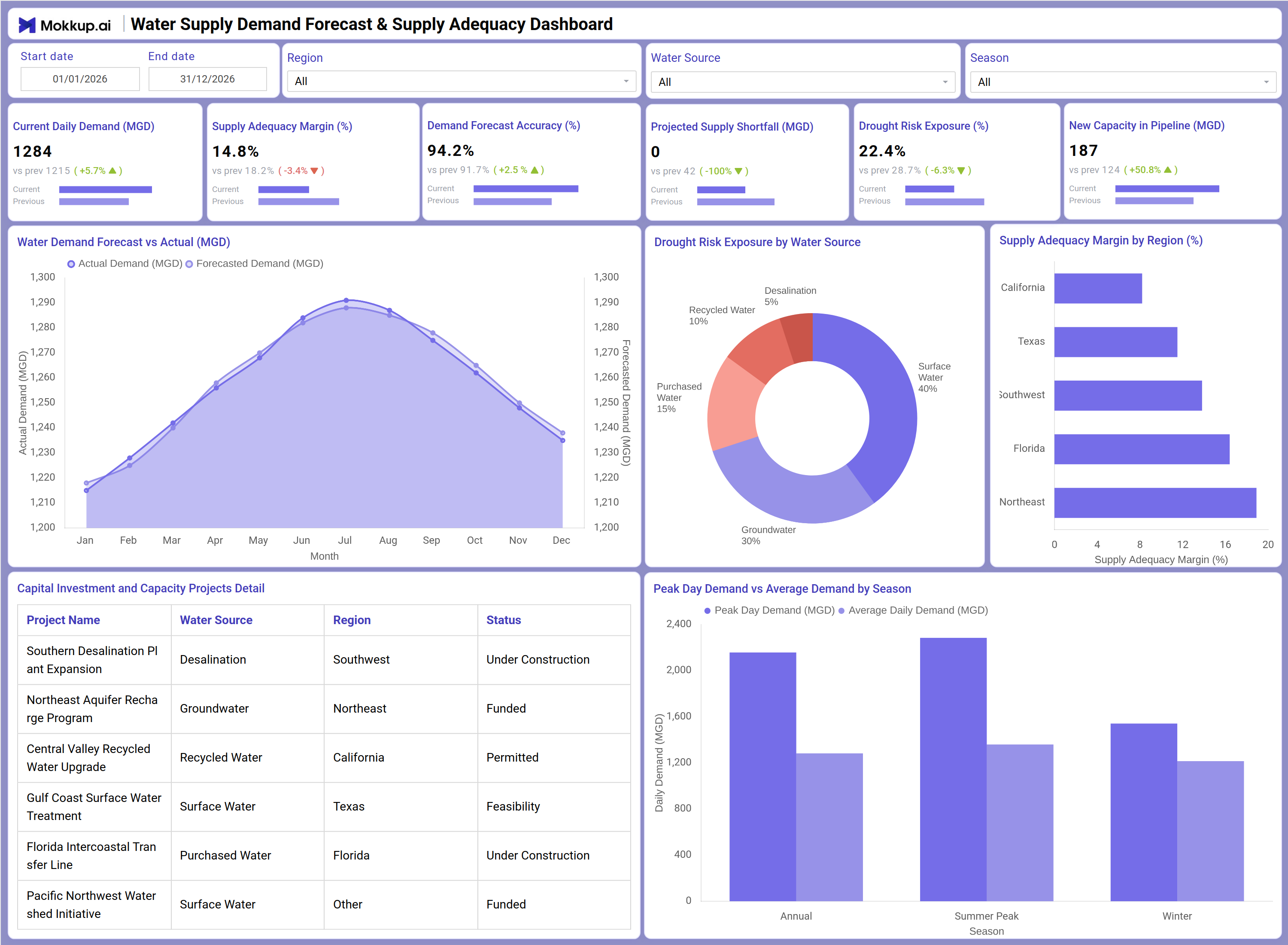
It tracks how current daily demand aligns with forecasted projections, identifies where supply gaps may emerge, and surfaces regional adequacy shortfalls before they become operational crises. By supporting capital investment water capacity planning alongside ongoing demand analysis, this dashboard gives water management teams the visibility they need to act ahead of shortfalls rather than react to them.
How to Create a Water Supply Demand Forecast & Supply Adequacy Dashboard
You don’t need to build your report from scratch, just start with a ready-to-use Water Supply Demand Forecast & Supply Adequacy dashboard template from Mokkup. Add in your data and export it however you like. Here’s how to do it:
1. Create or Log in to Your Mokkup Account
Start by signing up on Mokkup.ai using your email. If you already have an account, just log in, and you'll be good to go.
2. Choose and Customize Your Dashboard Template
Find the Water Supply Demand Forecast & Supply Adequacy Dashboard template in the Templates section. Use the drag-and-drop editor to adjust KPIs, edit filters, or add elements based on your data.
3. Export to Your BI Tool
Once your dashboard wireframe is ready, use the BI Tool Export feature to send it directly to Power BI or Tableau for further analysis and enhancements. You can also download the dashboard as a PDF, PNG, or JPEG, embed it on a platform, or invite your team to collaborate.
Note: This is a Pro template. You'll need a Pro subscription on Mokkup to use and customize this dashboard wireframe. Upgrade anytime to unlock full access.
Water Supply Demand Forecast & Supply Adequacy Dashboard Example
A regional water authority planner opens this dashboard at the start of a planning cycle to understand whether current supply levels are tracking ahead of or behind projected demand. By filtering for a specific season or water source, they can quickly determine whether the utility is on pace to meet peak day demand commitments or whether certain regions are entering a period of stress. The demand forecast vs actual line chart allows teams to verify water demand forecast accuracy tracking month by month, which is critical for adjusting procurement and infrastructure timelines.When supply adequacy margins start narrowing in specific regions, managers use the Supply Adequacy Margin by Region view to isolate which areas require immediate attention. Teams can compare the supply adequacy margin by region side by side and prioritize where supplemental sourcing or demand-side interventions are needed most.
The drought risk exposure by water source breakdown helps planners understand which supply categories such as groundwater, recycled water, or surface water carry the most vulnerability during dry periods. This analysis directly informs which capital projects to fast-track in the Capital Investment and Capacity Projects Detail table, where teams monitor project status across funding stages from feasibility through construction. Taken together, this dashboard gives water management teams a connected view from current demand signals through long-range infrastructure readiness, enabling them to support both near-term operational decisions and multi-year capital investment water capacity planning.
How to Analyze Data in a Water Supply Demand Forecast & Supply Adequacy Dashboard
Here is how you can analyze data from this dashboard:
- Filter by Region: Compare supply adequacy across California, Texas, Southwest, Florida, and Northeast regions.
- Analyze Water Sources: Evaluate demand and drought exposure by groundwater, desalination, or other supply categories.
- Compare Seasonal Demand: Use seasonal filters to assess summer and winter demand patterns.
- Track Forecast Accuracy: Review forecast vs actual demand trends to identify planning gaps.
- Assess Drought Risk: Analyze drought exposure by water source to identify vulnerable supply categories.
- Monitor Supply Margins: Use regional adequacy charts to detect low-margin risk areas.
- Compare Peak Demand Trends: Evaluate peak day versus average demand across seasons to support capacity planning.
- Track Capital Projects: Review project status from feasibility through construction and funding stages.
- Monitor Supply Shortfalls: Track projected deficits before they impact operations.
- Review Pipeline Capacity: Confirm new capacity projects are progressing on schedule.
Benefits of a Water Supply Demand Forecast & Supply Adequacy Dashboard
The following are the benefits of using this dashboard:
- Centralized Planning Visibility: Combines demand forecasting, drought risk, and supply adequacy metrics in one dashboard.
- Improved Forecast Accuracy: Supports month-by-month comparison of forecasted versus actual demand.
- Regional Infrastructure Insights: Helps prioritize investments based on supply adequacy margins.
- Reduced Reporting Effort: Prebuilt KPIs simplify utility demand and capacity reporting.
- Better Drought Risk Management: Highlights exposure by water source for proactive planning.
- Integrated Capital Planning: Connects operational demand trends with infrastructure project tracking.
- Shared Seasonal Visibility: Gives planners and utility managers a unified view of regional supply performance.
KPIs to Track in a Water Supply Demand Forecast & Supply Adequacy Dashboard
The following key KPIs can be tracked by using this dashboard:
- Current Daily Demand (MGD): Measures the volume of water consumed per day across all active service regions - the baseline for all supply adequacy and shortfall calculations.
- Supply Adequacy Margin (%): Tracks the buffer between available supply and current demand. Essential to supply adequacy margin by region analysis, it signals how much headroom exists before a deficit appears.
- Demand Forecast Accuracy (%): Quantifies how closely projected demand matched actual consumption. Strong water demand forecast accuracy tracking values indicate reliable planning models; deviations trigger recalibration.
- Projected Supply Shortfall (MGD): Measures the gap between forecasted demand and available supply. A non-zero value signals that capital investment water capacity planning decisions need acceleration.
- Drought Risk Exposure (%): Evaluates the share of supply vulnerable to drought conditions - directly linked to drought risk exposure by water source analysis across groundwater, surface water, recycled water, and purchased water.
- New Capacity in Pipeline (MGD): Tracks total new supply capacity approved and under development, confirming capital projects are progressing to close future adequacy gaps.
- Peak Day Demand vs Average Demand by Season: Compares peak day demand vs average demand across Annual, Summer Peak, and Winter periods to support surge capacity planning and seasonal resource allocation.
Frequently Asked Questions
Q1. What types of organizations benefit most from this dashboard?
Municipal water utilities, regional water authorities, and infrastructure planning agencies benefit most. It is also well-suited for sustainability teams and consultants managing multi-region supply portfolios.
Q2. Can this dashboard track drought risk across different water source types?
Yes. The Drought Risk Exposure by Water Source donut chart breaks down risk across groundwater, surface water, recycled water, desalination, and purchased water, helping teams identify which categories are most vulnerable.
Q3. How does the Capital Investment and Capacity Projects Detail table work?
The table lists active infrastructure projects with their water source, region, and status from Feasibility through Under Construction and Funded, so teams can monitor whether capital investment water capacity planning projects remain on schedule.
Q4. Is this dashboard suitable for seasonal water planning?
Yes. The Season filter and Peak Day Demand vs Average Demand by Season chart let planners compare peak day demand vs average demand across Annual, Summer Peak, and Winter periods for targeted seasonal resource allocation.
Q5. What does Demand Forecast Accuracy measure?
Demand Forecast Accuracy (%) measures how closely projected demand matched actual consumption. Strong water demand forecast accuracy tracking reduces over-procurement costs and prevents under-preparation during high-demand periods.