
What is a Water Recycling & Reuse Sustainability Dashboard?
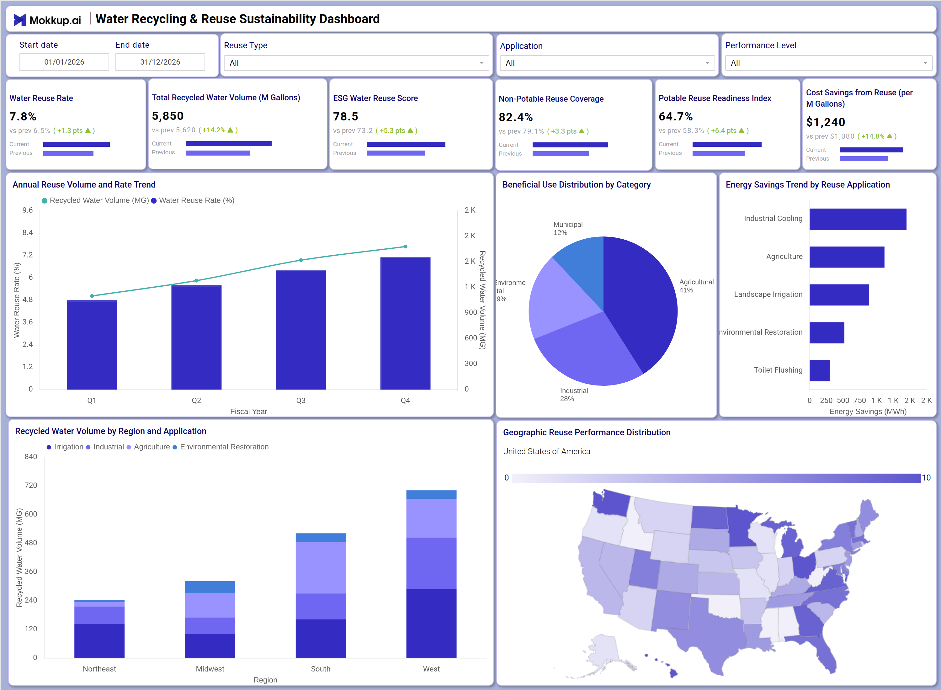
The Water Recycling & Reuse Sustainability Dashboard is a structured analytics tool designed for water utility managers, environmental compliance teams, and municipal planners who need to monitor treated water reuse across multiple applications and regions. This water recycling and reuse sustainability dashboard consolidates KPIs such as Water Reuse Rate, Total Recycled Water Volume, ESG Water Reuse Score, Non-Potable Reuse Coverage, Potable Reuse Readiness Index, and Cost Savings from Reuse into a single view, making it easier to assess program performance at a glance. By presenting annual volume trends, regional application breakdowns, and energy savings by reuse category side by side, the dashboard helps teams identify where treated water reuse programs are delivering value and where gaps remain. It supports sustainability reporting cycles by providing ESG teams and infrastructure planners with the structured data they need to evaluate potable reuse readiness and justify investment in water recycling infrastructure.
How to Create a Water Recycling & Reuse Sustainability Dashboard
You don't need to build your report from scratch; just start with a ready-to-use dashboard template from Mokkup. Add in your data and export it however you like. Here's how to do it:
1. Create or Log in to Your Mokkup Account
Start by signing up on Mokkup.ai using your email. If you already have an account, just log in, and you'll be good to go.
2. Choose and Customize Your Dashboard Template
Find the Water Recycling & Reuse Sustainability Dashboard template in the Templates section. Use the drag-and-drop editor to adjust KPIs, edit filters, or add elements based on your data.
3. Export to Your BI Tool
Once your dashboard wireframe is ready, use the BI Tool Export feature to send it directly to Power BI or Tableau for further analysis and enhancements. You can also download the dashboard as a PDF, PNG, or JPEG, embed it on a platform, or invite your team to collaborate.
Note: This is a Pro template. You'll need a Pro subscription on Mokkup to use and customize this dashboard wireframe. Upgrade anytime to unlock full access.
Water Recycling & Reuse Sustainability Dashboard Example
When a water utility team opens this dashboard, they begin with the top filter row, selecting a date range, reuse type, application, and performance level to scope the view to the period or program segment most relevant to their review cycle. With filters set, they can immediately read across the six KPI tiles to understand headline performance: how much water has been recycled, the current reuse rate, and how well non-potable reuse coverage has expanded across the service area. Moving down to the Annual Reuse Volume and Rate Trend chart, teams track treated water reuse program performance year over year, spotting inflection points where reuse rate growth outpaced volume increases or vice versa, giving planners context for where infrastructure investments paid off. The Beneficial Use Distribution by Category donut chart lets managers compare how recycled water is allocated across municipal, commercial, agricultural, and industrial segments. The Energy Savings Trend by Reuse Application horizontal bar chart highlights which applications, including industrial cooling, agriculture, landscape irrigation, environmental restoration, and toilet flushing, are generating the greatest energy return on recycled water investments. The Recycled Water Volume by Region and Application stacked bar and the Geographic Reuse Performance Distribution map together support regional water reuse benchmarking, allowing teams to prioritize funding and expansion efforts by geography across the Northeast, Midwest, South, and West.
How to Analyze Data in a Water Recycling & Reuse Sustainability Dashboard
Here is how you can analyze data from this dashboard:
- Use the Reuse Type filter to isolate performance for specific treated water categories such as agricultural or industrial reuse.
- Monitor the Annual Reuse Volume and Rate Trend chart to detect years where the reuse rate growth slowed relative to volume increases.
- Review the Beneficial Use Distribution by Category donut chart to compare allocation shares across municipal, commercial, agricultural, and industrial segments.
- Use the Energy Savings Trend by Reuse Application bar chart to identify which reuse application generates the highest energy savings.
- Compare the recycled water volume by region and application stacked bar to find regions with the highest industrial or agricultural reuse concentration.
- Analyze the Geographic Reuse Performance Distribution map to identify states with the strongest energy savings from treated water reuse programs.
- Filter by Application to align the dashboard view with a specific reuse category for focused program reporting.
- Track the Potable Reuse Readiness Index over time to measure progress toward broader potable water recycling adoption.
Benefits of a Water Recycling & Reuse Sustainability Dashboard
The following are the benefits of using this dashboard:
- Centralizes Water Reuse Rate, ESG Water Reuse Score, and Cost Savings KPIs into one structured water recycling sustainability program template.
- Supports monitoring of water recycling and reuse applications across multiple regions and use categories simultaneously.
- Reduces manual data compilation for ESG and sustainability reports with pre-built KPI tiles and chart layouts.
- Enables region-level analysis of recycled water volume distribution for infrastructure investment decisions, supporting regional water reuse benchmarking.
- Provides an annual trend view of reuse volume and rate for long-term water recycling infrastructure planning.
- Helps compliance teams track non-potable reuse coverage and potable reuse readiness index against regulatory targets.
- Gives utility managers and ESG teams a shared view of sustainability performance across all reuse applications.
KPIs to Track in a Water Recycling & Reuse Sustainability Dashboard
The following key KPIs can be tracked by using this dashboard:
- Water Reuse Rate (%): The water recycling and reuse sustainability dashboard tracks this as the primary indicator of how much treated water is successfully redirected into active use rather than discharged.
- Total Recycled Water Volume (M Gallons): Measures the absolute volume of water recycled across all applications, essential for tracking treated water reuse program scale over time.
- ESG Water Reuse Score: Quantifies the program's environmental, social, and governance performance on water recycling, with ESG water reuse score reporting supporting utility and municipal transparency goals.
- Non-Potable Reuse Coverage (%): Tracks the share of non-potable applications served by recycled water, reflecting how broadly reuse has expanded into irrigation, industrial cooling, and environmental restoration.
- Potable Reuse Readiness Index (%): Evaluates infrastructure and regulatory readiness for potable water recycling adoption, a key metric for utilities planning advanced treatment investments.
- Cost Savings from Reuse (per M Gallons) ($): Measures the financial benefit of reuse operations, helping justify infrastructure spending and demonstrating economic value through regional water reuse benchmarking.
Frequently Asked Questions
1. What industries benefit most from this Water Recycling & Reuse Sustainability Dashboard?
Water utilities, municipal planning agencies, and industrial facility managers gain the most from this dashboard. It is also well-suited for ESG reporting teams at corporations with significant water consumption in agriculture, manufacturing, or cooling operations.
2. Can this dashboard track energy savings by the reuse application?
Yes. The Energy Savings Trend by Reuse Application horizontal bar chart shows savings across industrial cooling, agriculture, landscape irrigation, environmental restoration, and toilet flushing. This allows teams to prioritize applications with the highest energy efficiency returns.
3. How does the Geographic Reuse Performance Distribution map work?
The map visualizes energy savings from water reuse at the state level across the United States using a color gradient scale. Darker shades indicate states where treated water reuse programs are delivering the strongest results, making regional comparison easy.