
What is a Smart Water Network Operations Performance Dashboard?
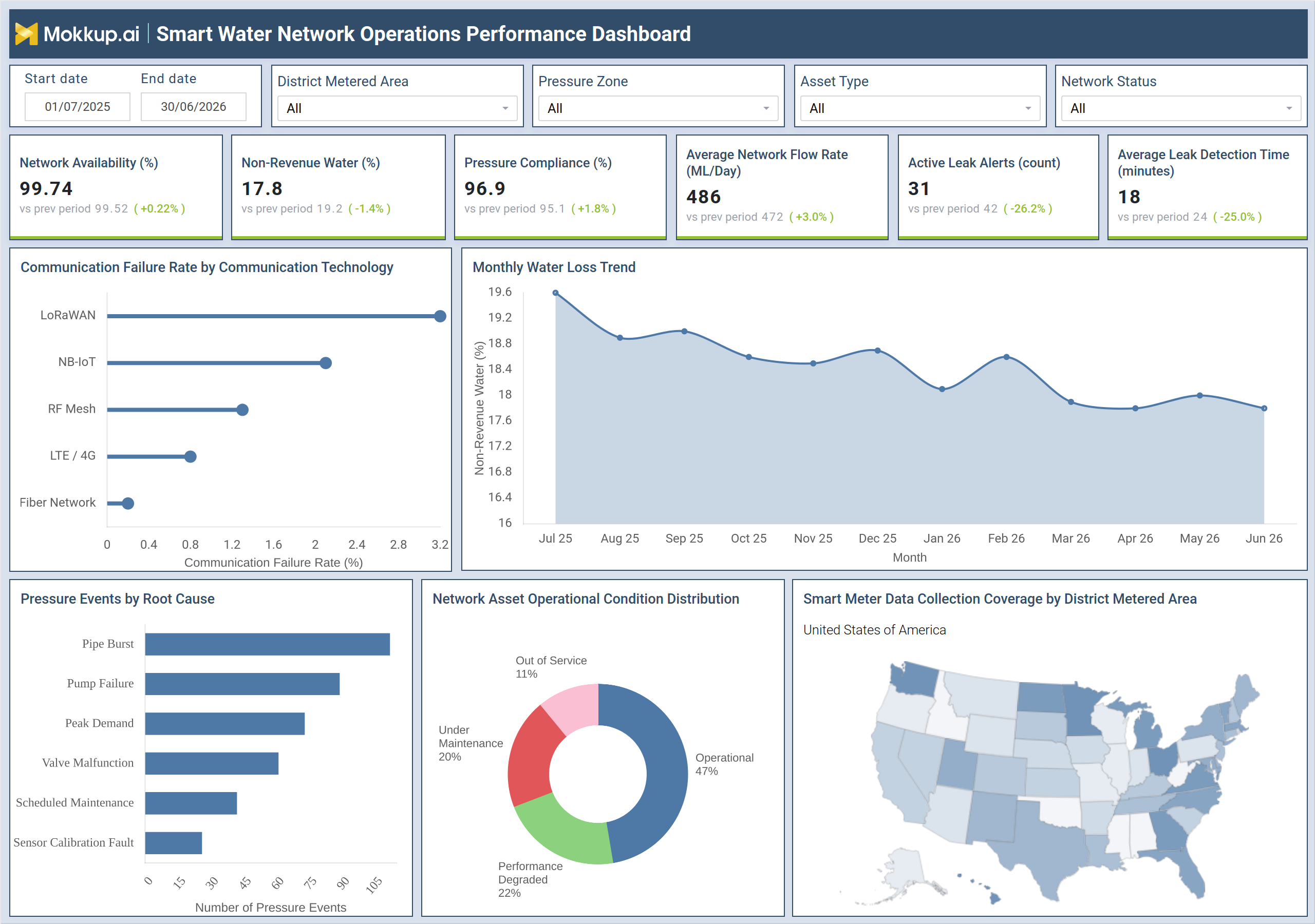
The Smart Water Network Operations Performance Dashboard is a smart water network performance dashboard template built for utility operations teams managing distribution infrastructure across multiple district metered areas. It consolidates network availability, non-revenue water percentage, pressure compliance, average flow rate, active leak alerts, and leak detection time into a single wireframe, replacing scattered SCADA exports and manual spreadsheets. Filters for date range, district metered area, pressure zone, asset type, and network status sit at the top of the layout, letting teams narrow their review to one zone, one asset class, or one reporting period before concluding.
As a water utility leak-detection monitoring tool, the wireframe pairs headline metrics with supporting charts on communication technology reliability, pressure-event causes, and asset operational conditions so operations managers can connect infrastructure health to water-loss outcomes instead of reviewing each data source separately. Analysts also get a non-revenue water tracking dashboard view that plots loss percentage over 12 months in a single visual.
How to Create a Smart Water Network Operations Performance Dashboard
You don't need to build your report from scratch, just start with a ready-to-use dashboard template from Mokkup. Add in your data and export it however you like. Here's how to do it:
1. Create or Log in to Your Mokkup Account
Start by signing up on Mokkup.ai using your email. If you already have an account, just log in, and you'll be good to go.
2. Choose and Customize Your Dashboard Template
Find the Smart Water Network Operations Performance Dashboard template in the Templates section. Use the drag-and-drop editor to adjust KPIs, edit filters, or add elements based on your data.
3. Export to Your BI Tool
Once your dashboard wireframe is ready, use the BI Tool Export feature to send it directly to Power BI or Tableau for further analysis and enhancements. You can also download the dashboard as a PDF, PNG, or JPEG, embed it on a platform, or invite your team to collaborate.
Note: This is a Pro template. You'll need a Pro subscription on Mokkup to use and customize this dashboard wireframe. Upgrade anytime to unlock full access.
Smart Water Network Operations Performance Dashboard Example
A distribution operations manager at a water utility opens the Smart Water Network Operations Performance Dashboard at the start of a reporting cycle to understand whether the network is holding steady or whether specific zones need attention. Before reviewing any chart, the manager sets the date range and narrows the view by district, metered area or pressure zone, focusing on the segment tied to a customer complaint or maintenance backlog. From the top metric row, the manager can gauge whether network availability and pressure compliance are holding within acceptable ranges and whether leak alerts are resolved faster or more slowly than in the previous period.
If water loss is drifting upward, the manager traces the monthly trend to judge whether it is a short spike or a sustained pattern needing escalation. Looking at pressure events by root cause, planners can prioritize whether pipe bursts, pump failures, or peak demand are driving the most disruption and route maintenance crews accordingly. Reviewing communication technology reliability lets network engineers identify which connectivity type is contributing to lost readings, so upgrade budgets go where failure rates are highest. The coverage map and asset condition breakdown give the same team a geographic and infrastructure view of the network. Coverage gaps can be spotted by state, helping teams plan sensor deployment or replacement work.
Combined with the asset condition split between operational, degraded, under maintenance, and out-of-service equipment, this district-metered area performance dashboard view helps supervisors decide where capital and maintenance budgets should go next. Engineers responsible for a smart meter data collection coverage dashboard can confirm which areas need additional device rollout before compliance reporting is due. Together, these views let operations, maintenance, and network engineering teams work from one dashboard instead of separate spreadsheets, aligning leak response, asset upkeep, and communication infrastructure investment around the same reporting period.
How to Analyze Data in a Smart Water Network Operations Performance Dashboard
Here is how you can analyze data from this dashboard:
- Compare performance over time: Set the date range to evaluate current metrics against prior-period values.
- Analyze specific service areas: Filter by district metered area to isolate performance for the zone under review.
- Narrow root-cause analysis: Use pressure zone or asset type filters to focus on a specific network segment.
- Monitor water loss trends: Review the non-revenue water trend line to distinguish temporary spikes from sustained losses.
- Prioritize pressure issues: Rank pressure events by root cause to identify pipe bursts, pump failures, or peak demand impacts.
- Identify communication problems: Compare communication failure rates across technologies to pinpoint unreliable connectivity.
- Plan maintenance effectively: Cross-check asset operational condition with network status to prioritize maintenance activities.
- Evaluate smart meter coverage: Review the coverage map to identify regions with limited smart meter data collection.
Benefits of a Smart Water Network Operations Performance Dashboard
The following are the benefits of using this Water network asset condition monitoring software dashboard:
- Centralize network performance: Combine network availability, water loss, and leak metrics into a single smart water network performance dashboard.
- Reduce reporting effort: Eliminate manual SCADA and meter data consolidation from multiple spreadsheets.
- Accelerate root-cause analysis: Identify the causes of pressure events across pipes, pumps, and demand-related issues.
- Monitor asset health: Provide maintenance teams with water network asset condition insights without requiring separate audits.
- Improve leak response: Track leak alert counts alongside average detection time to respond more quickly.
- Plan communication upgrades: Analyze technology failure rates to prioritize communication infrastructure improvements.
- Support budget planning: Monitor the distribution of operational, degraded, maintenance, and out-of-service assets.
- Enable zone-level reporting: Turn filtered views into district-metered area performance dashboards for targeted analysis.
KPIs to Track in a Smart Water Network Operations Performance Dashboard
The following key KPIs can be tracked by using this District metered area performance dashboard:
- Network Availability (%): share of the distribution network operating without service interruption during the reporting period.
- Non-Revenue Water (%): portion of treated water lost before reaching billed customers, tracked in the non-revenue water tracking dashboard view.
- Pressure Compliance (%): percentage of the network maintaining pressure within defined operating limits.
- Average Network Flow Rate (ML/Day): volume of water moving through the network per day, used to detect demand shifts.
- Active Leak Alerts (count): number of unresolved leak alerts currently open across the network.
- Average Leak Detection Time (minutes): average time between a leak event and its detection, a core measure for this water utility leak detection monitoring tool.
Frequently Asked Questions
1. What does the Smart Water Network Operations Performance Dashboard track?
It tracks network availability, non-revenue water, pressure compliance, flow rate, leak alerts, and leak detection time across district metered areas. Supporting charts add water loss trend, pressure event causes, communication reliability, and asset condition context.
2. Who uses this dashboard?
Distribution operations managers, maintenance planners, and network engineers at water utilities use it to monitor performance and prioritize infrastructure work. It also supports teams reporting on a smart meter data collection coverage dashboard for compliance purposes.
3. Can I customize this dashboard template for my utility?
Yes. The wireframe is built in Mokkup, so KPIs, filters, and chart labels can be adjusted to match your utility's district-metered areas and asset categories before exporting to Power BI or Tableau.