What is a Server Load Tracker Dashboard?
A Server Load Tracker Dashboard template is used by IT and DevOps teams to visualize server performance, identify system bottlenecks, and ensure optimal uptime. It tracks critical metrics such as transaction volume, system response time, uptime percentage, and error rates across regions and services. This dashboard wireframe helps maintain server health, quickly resolve issues, and ensure a seamless digital experience for users.
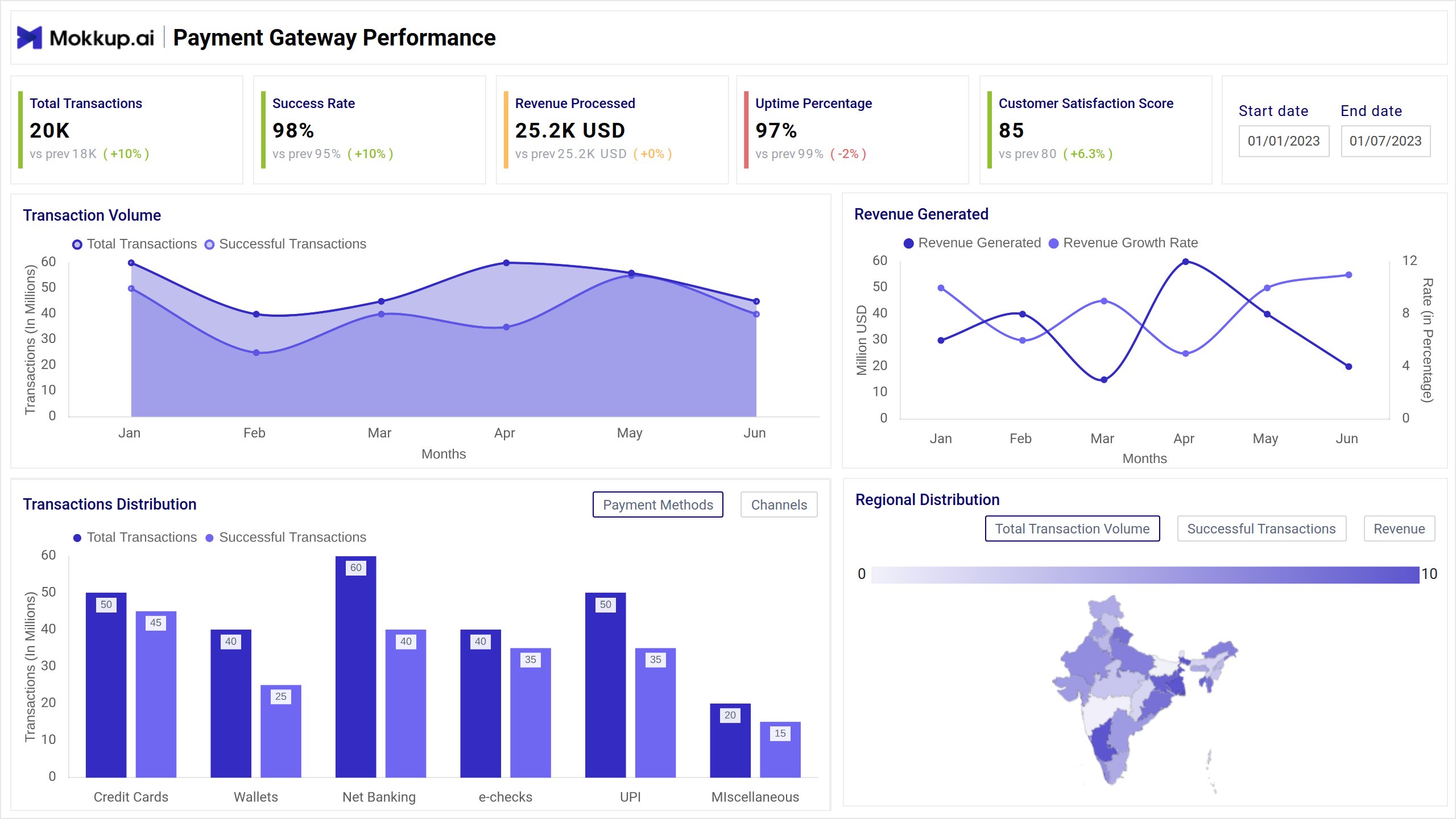
Server Load Dashboard Example
The Server Load Tracker Dashboard template offers a visual summary of system performance by tracking server uptime, transaction success rates, and error trends across different platforms and regions. It’s designed for IT administrators, DevOps teams, and performance engineers who need to monitor system load, response times, and operational health in real time.
How to Analyze Data in Server Load Dashboards
The Server Load Tracker Dashboard helps system administrators and DevOps teams maintain performance, identify failure points, and ensure uptime. Here's how to approach it:
- Monitor total request trends over time using area charts. Spot spikes in server activity that may indicate peak traffic or underlying issues.
- Evaluate success rates vs. error rates to assess system reliability. Use bar charts or gauges to compare these metrics across different platforms or regions.
- Track average load and response times to measure performance under stress. Line charts help identify slowdowns or lags, especially during peak usage.
- Use heatmaps and geomaps to identify regions or zones with high server loads or downtime. This helps prioritize where optimizations are needed.
- Drill into alert data and error causes to uncover patterns in system failures. Pie charts and tables highlight recurring issues like memory overload or API failures.
- Assess user journey funnels to understand where users drop off due to system delays or failures, an essential step in improving end-user experience.
By combining real-time metrics with historical performance, the dashboard wireframe supports fast troubleshooting and informed infrastructure scaling.
How to Create a Server Load Dashboard
You don’t need to build your report from scratch—just start with a ready-to-use sample Server Load Tracker Dashboard template from Mokkup. Add in your data and export it however you like. Here’s how to do it:
1. Create or Log in to Your Mokkup Account
Start by signing up on Mokkup.ai using your email. Already have an account? Just log in, and you’re good to go.
2. Choose and Customize Your Dashboard Template
Find the Server Load Tracker Dashboard in the Templates section. Use the drag-and-drop editor to adjust KPIs, edit filters, or add elements based on your data.
3. Export to Your BI Tool
Once your dashboard wireframe is ready, use the BI Tool Export feature to send it directly to Power BI or Tableau for further analysis and enhancements. You can also download the dashboard as a PDF, PNG, or JPEG, embed it on a platform, or invite your team to collaborate.
Note: This is a Pro template. To use and customize this dashboard wireframe, you’ll need a Pro subscription on Mokkup. Upgrade anytime to unlock full access.
Benefits of Server Load Tracking Dashboards
Server Load Tracker Dashboard templates give IT teams real-time visibility into server performance and infrastructure health. Here’s how they add value:
- Monitor System Uptime: Instantly view uptime percentages and ensure mission-critical services stay available.
- Detect Bottlenecks Quickly: Spot spikes in load, response delays, or system failures before they affect users.
- Improve Incident Response: With alert panels and error breakdowns, teams can respond faster to outages and issues.
- Optimize Resource Usage: Track CPU, memory, and network usage to right-size resources and reduce cloud costs.
- Enhance User Experience: Analyze drop-off points in user journeys caused by server lags or high load conditions.
- Ensure Geographic Stability: Identify performance issues specific to regions or availability zones and act accordingly.
- Support Scalability: Use historical load trends to plan and scale infrastructure efficiently.
These dashboards help teams make faster, smarter decisions to improve reliability, performance, and operational efficiency.
KPIs to Track in Server Dashboards
To ensure smooth performance, server dashboards should highlight metrics that reflect usage, stability, and issue detection. Here are the key KPIs to monitor:
- Total Transactions: This measure measures how many transactions or requests are processed in a given period, helping assess traffic load.
- Success Rate: Percentage of successfully processed transactions out of total initiated ones, shows system reliability.
- Uptime Percentage: Indicates the server’s operational availability—crucial for maintaining service-level agreements (SLAs).
- Average Processing Time: Tracks how long it takes for the server to process a request, long times may signal overload or inefficiencies.
- API Response Time: Measures how fast APIs respond, which is key to assessing backend performance and user experience.
These KPIs offer a comprehensive view into server load, helping IT teams detect issues, manage traffic, and keep systems running efficiently.
Frequently Asked Questions
Q1. What does a server load tracker dashboard monitor?
It monitors real-time server performance metrics such as transaction volume, processing speed, uptime, and error rates to ensure systems run smoothly and efficiently.
Q2. Who uses a server load tracking dashboard?
IT teams, DevOps engineers, and infrastructure managers use it to detect bottlenecks, optimize performance, and ensure system reliability across different environments.