
What is a Secondary Schools Student Admissions & Enrollment Dashboard?
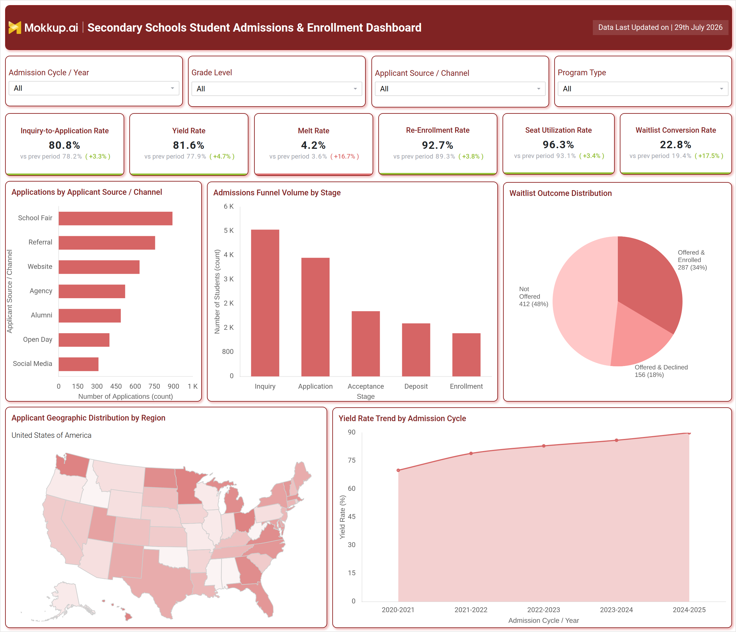
The Secondary Schools Student Admissions & Enrollment Dashboard is a reporting template built for admissions offices and enrollment management teams to monitor how applicants move from first inquiry through to confirmed enrollment. As a secondary school student admissions dashboard, it consolidates inquiry volume, application activity, and conversion performance into a single view so admissions directors do not need to piece together numbers from separate spreadsheets or systems. The template is organized around four filters - Admission Cycle / Year, Grade Level, Applicant Source / Channel, and Program Type - so teams can narrow the view to a specific grade, recruiting channel, or program before comparing results. Because the layout pairs funnel-stage counts and channel volume from an applicant source channel analysis dashboard with geographic distribution and cycle-over-cycle yield rate tracking for school admissions, it works equally well for a weekly admissions standup or a board-level enrollment review. As a student enrollment conversion rate monitoring tool, it also ties recruiting channel performance directly to enrollment outcomes rather than application counts alone.
How to Create a Secondary Schools Student Admissions & Enrollment Dashboard
You don't need to build your report from scratch; just start with a ready-to-use dashboard template from Mokkup. Add in your data and export it however you like. Here's how to do it:
1. Create or Log in to Your Mokkup Account
Start by signing up on Mokkup.ai using your email. If you already have an account, just log in, and you'll be good to go.
2. Choose and Customize Your Dashboard Template
Find the Secondary Schools Student Admissions & Enrollment Dashboard template in the Templates section. Use the drag-and-drop editor to adjust KPIs, edit filters, or add elements based on your data.
3. Export to Your BI Tool
Once your dashboard wireframe is ready, use the BI Tool Export feature to send it directly to Power BI or Tableau for further analysis and enhancements. You can also download the dashboard as a PDF, PNG, or JPEG, embed it on a platform, or invite your team to collaborate.
Note: This is a Pro template. You'll need a Pro subscription on Mokkup to use and customize this dashboard wireframe. Upgrade anytime to unlock full access.
Secondary Schools Student Admissions & Enrollment Dashboard Example
An admissions director opens the Secondary Schools Student Admissions & Enrollment Dashboard during peak recruiting season to understand where this year's applicant pool stands compared to prior cycles. Before reporting numbers to leadership, they need a clear read on whether inquiry volume is converting into applications at a healthy pace, and whether the incoming class is on pace to fill available seats. From the top of the dashboard, the team compares how each recruiting channel is performing, deciding whether to invest more in school fairs, referrals, or digital outreach based on which source produces applicants who go on to enroll. Moving into the funnel view supports admissions funnel analysis for secondary schools by showing exactly where prospective students drop off - whether between inquiry and application, or between acceptance and deposit - so counselors can prioritize follow-up outreach at the stage losing the most candidates.
When reviewing the waitlist, staff weigh how many offered seats convert into enrollments versus declines, which shapes how aggressively they work through the remaining waitlist pool. Looking at the geographic breakdown, recruiters identify which regions are underrepresented and adjust travel or advertising plans accordingly, while cycle-over-cycle yield rate tracking for school admissions confirms whether recruiting changes are actually paying off. Ultimately, the dashboard helps enrollment management teams move from reactive reporting to informed planning - prioritizing the channels and stages that most affect yield, catching melt risk before deposits are due, and building a class that matches capacity and program goals for the coming year.
How to Analyze Data in a Secondary Schools Student Admissions & Enrollment Dashboard
Here is how you can analyze data from this dashboard:
- Filter by Admission Cycle / Year to compare this year's funnel against prior cycles.
- Segment by Grade Level to see which grades are under or over capacity.
- Break down by Applicant Source / Channel to compare recruiting channels side by side.
- Apply the Program Type filter to isolate performance for a specific academic program.
- Review the Admissions Funnel Volume by Stage chart for admissions funnel analysis for secondary schools and spot the largest drop-off point.
- Use the Applications by Applicant Source / Channel chart to rank channels by volume.
- Check the Waitlist Outcome Distribution pie chart for waitlist conversion rate tracking for schools working through remaining offers.
- Scan the Applicant Geographic Distribution map to find underrepresented regions.
- Track the Yield Rate Trend by Admission Cycle chart to confirm year-over-year progress.
Benefits of a Secondary Schools Student Admissions & Enrollment Dashboard
The following are the benefits of using this dashboard:
- This secondary school student admissions dashboard centralizes inquiry, application, and enrollment data in one view.
- Functions as a student enrollment conversion rate monitoring tool for tracking yield across cycles.
- Surfaces funnel drop-off points early enough for counselors to act on them.
- Helps recruiting teams reallocate outreach budget toward higher-converting channels.
- Supports capacity planning through seat utilization and re-enrollment visibility.
- Reduces manual reporting by replacing spreadsheet-based admissions tracking.
- Gives leadership a shared, filterable view for admission cycle reviews.
KPIs to Track in a Secondary Schools Student Admissions & Enrollment Dashboard
The following key KPIs can be tracked by using this dashboard:
- Inquiry-to-Application Rate - measures the share of inquiries that convert into submitted applications.
- Yield Rate - tracks the percentage of accepted students who choose to enroll.
- Melt Rate - measures how many students who accept or deposit fail to enroll by the start of term.
- Re-Enrollment Rate - shows what share of current students return for the following academic year.
- Seat Utilization Rate - indicates how close enrollment is to available seat capacity.
- Waitlist Conversion Rate - supports waitlist conversion rate tracking for schools by showing how many waitlisted applicants are offered and enrolled.
Frequently Asked Questions
1. What does the Secondary Schools Student Admissions & Enrollment Dashboard track?
As a secondary school student admissions dashboard, it tracks inquiries, applications, acceptances, deposits, and enrollments, along with yield, melt, and waitlist conversion rates across admission cycles.
2. Who uses this dashboard?
Admissions directors, enrollment counselors, and marketing teams use this applicant source channel analysis dashboard to compare recruiting channels, plan outreach budgets, and forecast class size.
3. Can this dashboard template be customized for a specific school or program?
Yes. Filters for Grade Level, Program Type, and Applicant Source / Channel let teams narrow the view, and the template can be edited directly in Mokkup before exporting to a BI tool.