What is a Pulmonology & Respiratory Critical Care Dashboard?
A Pulmonology & Respiratory Critical Care Dashboard is a centralized tool designed for clinical leaders, department heads, and hospital administrators to monitor and analyze the performance of respiratory care services. It provides a clear view of key clinical and operational metrics such as emergency admission trends, response times, patient outcomes, and condition-specific statistics. Unlike traditional reports, this dashboard serves as a comprehensive Pulmonology & Respiratory Care performance dashboard, helping healthcare teams track efficiency, patient progress, and clinical outcomes in one intuitive interface.
How to Create a Pulmonology & Respiratory Critical Care Dashboard
You don’t need to start from scratch—simply use a ready-made Pulmonology & Respiratory Critical Care Dashboard template from Mokkup. Input your data and export it in your preferred format. Here’s how:
1. Create or Log in to Your Mokkup Account
Sign up on Mokkup.ai using your email address. Existing users can log in directly.
2. Choose and Customize Your Dashboard Template
Navigate to the Templates section and select the Pulmonology & Respiratory Critical Care Dashboard. Use the drag-and-drop editor to modify KPIs, adjust filters, or add new visual elements based on your data.
3. Export to Your BI Tool
Once your dashboard wireframe is ready, use the BI Tool Export feature to transfer it to Power BI or Tableau for deeper analysis. You can also download it as a PDF, PNG, or JPEG, embed it on a website, or invite colleagues to collaborate.
Note: This is a Pro template. A Mokkup Pro subscription is required to use and customize this dashboard wireframe. Upgrade at any time to access all features.
Pulmonology & Respiratory Critical Care Dashboard Example
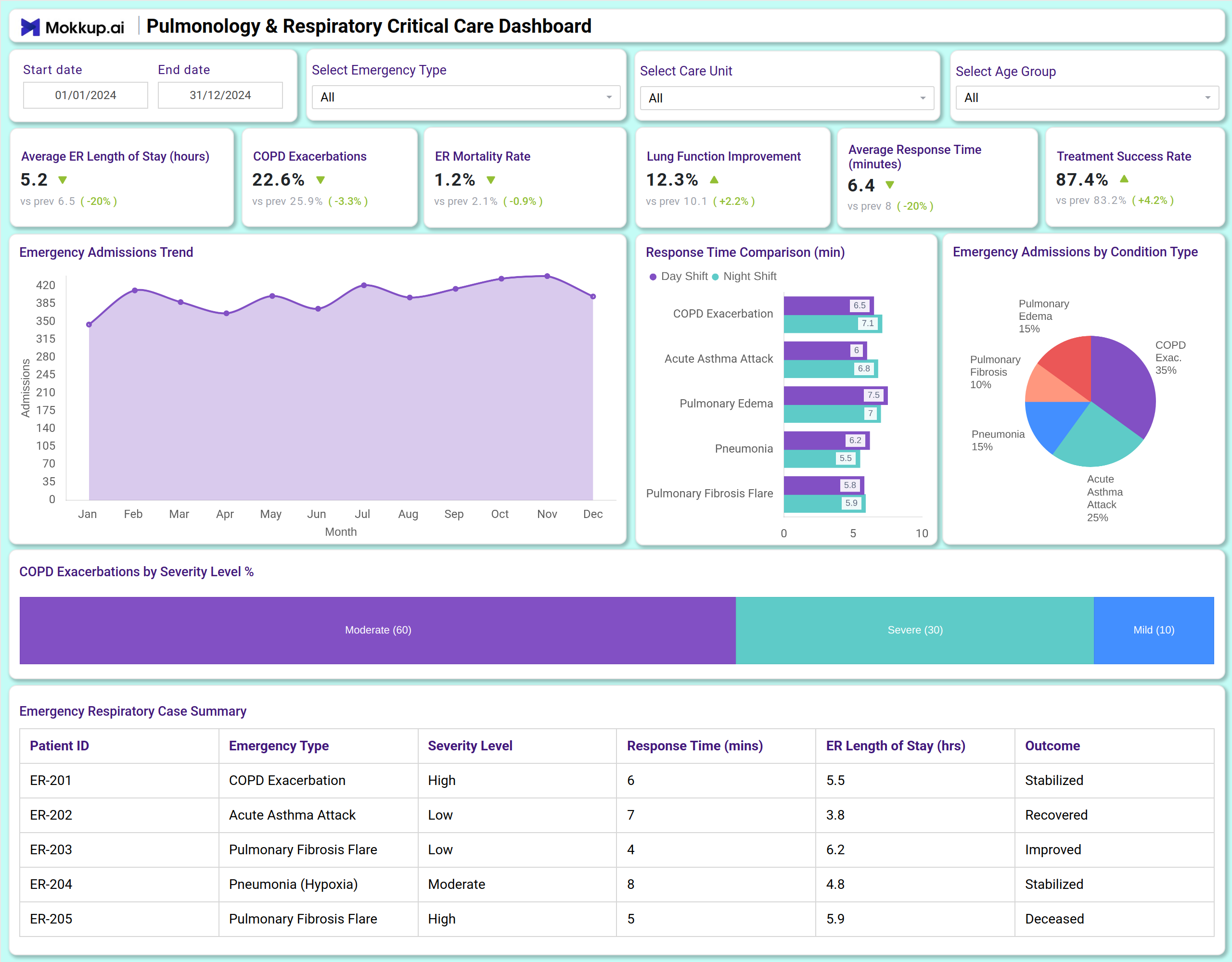
A Pulmonology & Respiratory Critical Care Dashboard can include a combination of KPI tiles and visualizations. At the top, KPI cards display critical metrics, including average ER length of stay, COPD exacerbation rates, mortality rates, lung function improvement, response times, and treatment success rates. Below, charts illustrate trends in emergency admissions, response time comparisons by shift and condition, and breakdowns of admissions by condition type. A summary table provides detailed patient-level data. This layout makes it an effective dashboard for tracking Pulmonology & Respiratory Care metrics, offering both clinical and operational insights.
How to Analyze Data in Pulmonology & Respiratory Critical Care Dashboards
Here’s how healthcare teams can leverage the data in a Pulmonology & Respiratory Critical Care Dashboard:
- Monitor admission trends: Use line charts to track monthly emergency admissions and identify seasonal patterns.
- Evaluate response efficiency: Compare response times across day and night shifts and by emergency type.
- Assess clinical outcomes: Review mortality rates, treatment success, and lung function improvement over time.
- Analyze condition prevalence: Understand the distribution of cases, such as COPD exacerbations, pulmonary edema, and fibrosis flares.
- Track severity levels: Monitor the percentage of moderate vs. severe COPD exacerbations.
- Review patient summaries: Use the case summary table to evaluate individual patient outcomes and ER resource use.
Benefits of Pulmonology & Respiratory Critical Care Dashboards
- Enhanced clinical oversight: A clear view of key respiratory care metrics and patient outcomes.
- Operational efficiency: Track ER length of stay and response times to optimize workflows.
- Outcome tracking: Monitor treatment success and mortality rates to improve care quality.
- Condition-specific insights: Understand trends in COPD, asthma, pulmonary edema, and other respiratory emergencies.
- Data-driven decisions: Use severity and response data to allocate resources effectively.
- Compliance and reporting: Functions as a Pulmonology & Respiratory Care reporting and compliance dashboard for audits and governance.
Together, these elements provide clinical and administrative leaders with the insights needed to align operations with patient outcomes. That’s why many refer to it as the best Pulmonology & Respiratory Care dashboard for enhancing clinical efficiency and patient care.
KPIs to Track in Pulmonology & Respiratory Critical Care Dashboards
- Average ER Length of Stay (hours): Measures the average time patients spend in the emergency respiratory unit.
- COPD Exacerbations (%): Tracks the rate of chronic obstructive pulmonary disease flare-ups.
- ER Mortality Rate (%): Monitors the percentage of patients who do not survive emergency care.
- Lung Function Improvement (%): Shows the rate of improvement in patients' respiratory function.
- Average Response Time (minutes): Indicates how quickly clinical teams respond to emergencies.
- Treatment Success Rate (%): Measures the percentage of treatments leading to positive patient outcomes.
- Emergency Admissions by Condition: Breakdown of cases by type such as COPD, asthma, or pulmonary edema.
- COPD Exacerbations by Severity: Tracks the proportion of moderate vs. severe cases.
Frequently Asked Questions
1. Who should use a Pulmonology & Respiratory Critical Care Dashboard?
Pulmonologists, respiratory therapists, ER directors, and hospital administrators are responsible for providing respiratory care services and monitoring their performance.
2. Can this dashboard help improve patient outcomes?
Yes. By tracking treatment success, response times, and clinical trends, care teams can identify areas for improvement and adjust protocols accordingly.
3. How does it support operational efficiency?
It highlights ER length of stay, response times, and admission patterns—key factors in resource and staff allocation.
4. Is this dashboard useful for compliance?
Yes. As a Pulmonology & Respiratory Care workflow and outcome analytics dashboard, it supports governance, regulatory reporting, and internal audits.