
What is a Primary Schools Financial Performance Dashboard?
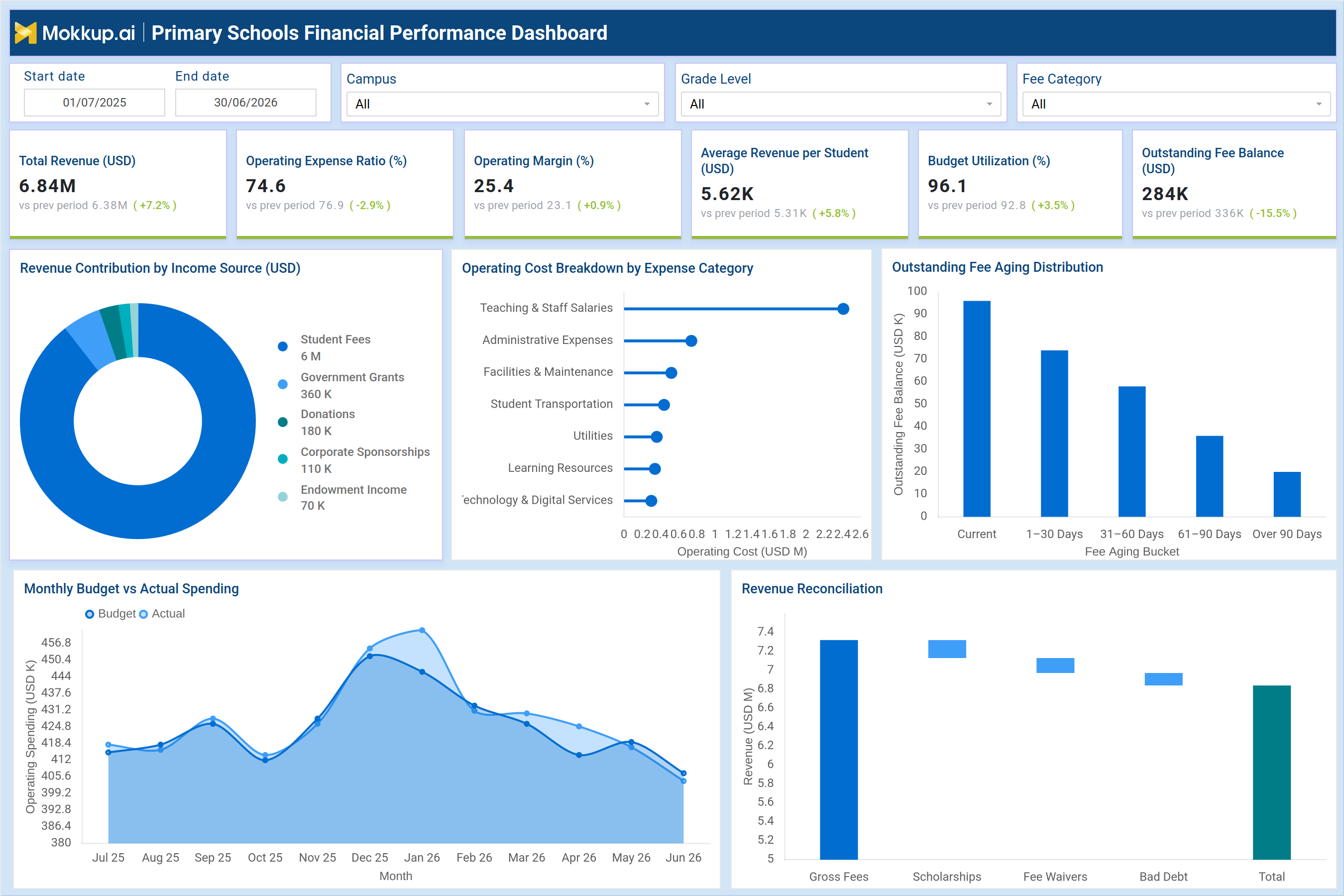
The Primary Schools Financial Performance Dashboard gives school administrators and finance teams a single view of how a campus generates and spends money across an academic year. It brings together revenue, operating costs, fee collections, and budget execution so decision makers no longer have to reconcile numbers across separate spreadsheets. Built for multi-campus school networks, the dashboard supports primary school financial performance tracking by consolidating income sources, expense categories, and outstanding balances into one connected view. Finance heads can filter by campus, grade level, and fee category to isolate performance for a specific segment of the school without losing the overall picture. This structure makes it function as a school revenue management dashboard where leaders can move from a headline number to the underlying driver in a few steps.
Because revenue, cost, and collections sit in one place, teams also rely on it for education budget variance analysis when actual spending departs from the plan. Whether the goal is preparing a board update or investigating a shortfall, the dashboard keeps every relevant figure within reach.
How to Create a Primary Schools Financial Performance Dashboard
You don’t need to build your report from scratch; just start with a ready-to-use dashboard template from Mokkup. Add in your data and export it however you like. Here’s how to do it:
1. Create or Log in to Your Mokkup Account
Start by signing up on Mokkup.ai using your email. If you already have an account, just log in, and you'll be good to go.
2. Choose and Customize Your Dashboard Template
Find the Primary Schools Financial Performance Dashboard template in the Templates section. Use the drag-and-drop editor to adjust KPIs, edit filters, or add elements based on your data.
3. Export to Your BI Tool
Once your dashboard wireframe is ready, use the BI Tool Export feature to send it directly to Power BI or Tableau for further analysis and enhancements. You can also download the dashboard as a PDF, PNG, or JPEG, embed it on a platform, or invite your team to collaborate.
Note: This is a Pro template. You'll need a Pro subscription on Mokkup to use and customize this dashboard wireframe. Upgrade anytime to unlock full access.
Primary Schools Financial Performance Dashboard Example
A school finance director typically opens this dashboard at the start of a monthly or term-end review to judge whether the campus is on track against its annual financial plan. The filters for campus, grade level, and fee category let the director narrow the view to a single site or program before drawing conclusions, so a multi-campus network can be reviewed campus by campus rather than as one blended number.
From there, the director can identify which income sources are carrying the bulk of revenue and where the school is over-reliant on student fees versus grants, donations, or sponsorship income. Looking at the cost side, finance teams can compare spending across categories such as staffing, administration, facilities, and technology to prioritize where cost discipline is needed most. When outstanding balances are reviewed by aging bucket, the team can flag which overdue fees are recent and recoverable versus balances that have aged past ninety days, supporting sharper school fee collection tracking.
Tracking budget against actual spending month over month lets planners catch overspending trends early rather than after the term closes, and reconciling gross fees down to net collected revenue through scholarships, waivers, and bad debt gives leaders a clear line of sight from billed revenue to cash actually realized, reinforcing school revenue reconciliation tracking as a routine part of the review. The overall outcome is a finance function that can explain campus performance with confidence instead of assembling it under deadline pressure. Teams spend less time reconciling spreadsheets and more time acting on what the numbers indicate, whether that means renegotiating a vendor contract, adjusting a fee waiver policy, or reallocating budget between campuses to keep campus operating expense monitoring consistent across the network.
How to Analyze Data in a Primary Schools Financial Performance Dashboard
Here is how you can analyze data from this dashboard:
- Filter by campus and grade level to compare financial performance across sites before drawing network-wide conclusions.
- Review the revenue mix to check dependence on student fees versus grants, donations, and sponsorships.
- Compare operating cost categories to identify where spending is concentrated and where it can be trimmed.
- Track the outstanding fee aging distribution to prioritize collections before balances turn into bad debt.
- Use the monthly budget versus actual view to catch overspending trends ahead of term close as part of education budget variance analysis.
- Follow the revenue reconciliation waterfall to see how gross fees convert into net realized revenue.
- Apply the fee category filter to assess collection performance for a specific fee type.
- Monitor operating margin and expense ratio together to judge whether cost control is improving or slipping.
Benefits of a Primary Schools Financial Performance Dashboard
The following are the benefits of using this dashboard:
- Centralizes revenue, cost, and collections data into one school revenue management dashboard view.
- Reduces manual reconciliation work across finance spreadsheets and campus reports.
- Improves visibility into which income sources drive total school revenue.
- Speeds up detection of budget overruns before they affect year-end results.
- Strengthens school fee collection tracking by surfacing aging balances early.
- Supports faster, evidence-based conversations with school boards and management.
- Gives multi-campus networks a consistent way to compare campus operating expense monitoring across sites.
KPIs to Track in a Primary Schools Financial Performance Dashboard
The following key KPIs can be tracked by using this dashboard:
- Total Revenue (USD): total income earned by the school across student fees, grants, donations, sponsorships, and endowment income.
- Operating Expense Ratio (%): share of revenue consumed by operating costs, showing how efficiently the school manages spending.
- Operating Margin (%): percentage of revenue remaining after operating expenses, indicating overall financial health.
- Average Revenue per Student (USD): average income generated per enrolled student, useful for comparing campuses of different sizes.
- Budget Utilization (%): proportion of the approved annual budget spent to date, flagging pacing issues early.
- Outstanding Fee Balance (USD): total unpaid student fees still owed to the school at a point in time.
Frequently Asked Questions
1. What is the Primary Schools Financial Performance Dashboard used for?
It is used to track school revenue, operating costs, fee collections, and budget performance in one place. Finance teams rely on it for primary school financial performance tracking across campuses, grade levels, and fee categories without switching between separate reports.
2. Can this dashboard be customized for a specific school network?
Yes. The Mokkup template can be edited with the drag-and-drop editor to adjust KPIs, filters, and layout to match a school's chart of accounts and reporting cycle before exporting it to Power BI or Tableau.
3. How does the dashboard help with fee collection?
The outstanding fee aging distribution groups unpaid balances by how overdue they are, making school fee collection tracking easier to prioritize. This helps finance teams focus collection efforts on balances that are still recoverable before they age into bad debt.