
What is a Patient Satisfaction Analysis Dashboard?
The Patient Satisfaction Dashboard empowers healthcare administrators to evaluate and enhance patient-centric services. It identifies areas for improvement in communication, wait times, and overall satisfaction while also optimizing department-level efficiency and resource allocation. By leveraging these insights, healthcare providers can foster trust and deliver exceptional care.
Patient Satisfaction Dashboard Example
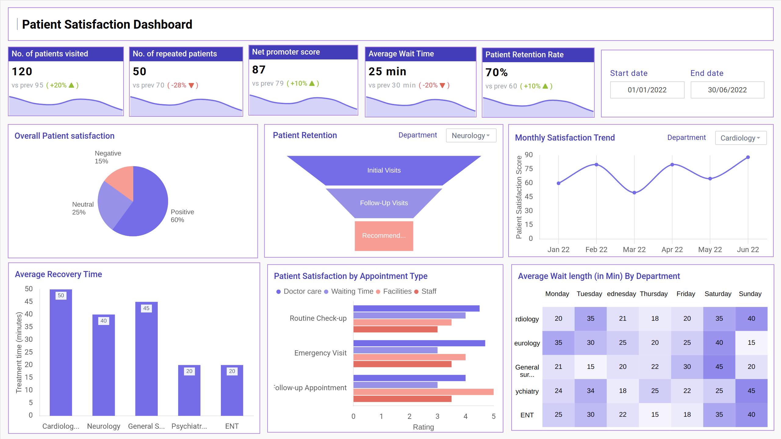
Build your own Patient Satisfaction Analysis Dashboard with a layout designed to organize key patient experience and operational metrics in one place. The Mokkup Patient feedback analysis dashboard provides a clear structure to explore visit frequency, wait times, and satisfaction scores across departments. With flexible filters for time periods, demographics, and locations, you can tailor the view to match your reporting needs. Once your data is added, the wireframe can be exported to Power BI or Tableau for deeper analysis and reporting. This makes it a practical starting point for healthcare teams aiming to improve service quality, patient communication, and resource planning.
How to Analyze Data in Patient Satisfaction Dashboards
The Patient Satisfaction Analysis Dashboard combines key experience metrics with operational data to offer a comprehensive view of patient interactions across departments. The interface highlights statistics like total visits, repeat patients, average wait times, and communication scores alongside monthly satisfaction trends.
This dashboard is thoughtfully designed to display patient feedback in context, offering side-by-side views of satisfaction levels and engagement patterns. Visual panels show how trends vary by gender, age range, and department, while treatment times and communication ratings help identify improvement areas. The built-in location map further breaks down patient density by region, making it easier to plan resources effectively and deliver better care experiences.
How to Create a Patient Satisfaction Dashboard
You don’t need to build your Patient satisfaction dashboard template from scratch. Use Mokkup’s healthcare dashboard template to speed up your setup. Add your data and export it in your preferred format. Here's how to get started:
1. Create or Log in to Your Mokkup Account
To access the dashboard templates, sign up on Mokkup.ai using your email. If you already have an account, just log in and get started right away.
2. Choose and Customize Your Patient Satisfaction Dashboard Template
Head to the Templates section and select the Patient experience dashboard. Use the drag-and-drop editor to customize metrics like visit count, wait times, feedback scores, and departmental performance. You can also apply filters for demographics, time ranges, and service types.
3. Export to Your BI Tool
Once your dashboard is ready, use the BI Tool Export feature to transfer it to Power BI or Tableau for deeper analysis. You can also export it as a PDF, PNG, or JPEG, embed it in reports, or share it with your team for streamlined collaboration.
This dashboard saves time and effort, helping your healthcare team visualize patient experiences, track satisfaction trends, and make informed decisions with clarity and confidence.
Note: This is a Pro template. To use and customize this dashboard, you’ll need a Pro subscription on Mokkup. Upgrade anytime to unlock full access.
Benefits of Patient Satisfaction Dashboards
Patient satisfaction dashboards offer several key advantages for healthcare providers. They centralize patient experience data, allowing healthcare teams to track performance, identify improvement areas, and enhance service quality. With Mokkup’s customizable templates, you can:
- Monitor Patient Experience: Easily track satisfaction scores, wait times, and communication ratings to get a clear view of patient experiences.
- Identify Improvement Areas: Quickly spot trends in feedback and operational inefficiencies, helping prioritize actions to improve patient care.
- Enhance Operational Efficiency: By breaking down patient data by demographics, departments, and geographic locations, you can optimize resource allocation and improve service delivery.
Overall, this helps healthcare teams gain valuable insights, improve patient outcomes, and boost operational performance, making it the best patient satisfaction dashboard for optimizing care quality.
KPIs to Track in Patient Satisfaction Dashboards
A Sample patient satisfaction dashboard offers a comprehensive view of the key performance indicators (KPIs) that help healthcare teams evaluate patient satisfaction. By tracking relevant metrics, such as patient feedback, wait times, and satisfaction scores, the Healthcare satisfaction dashboard provides valuable insights to improve care quality.
- No. of Patients Visited: Tracks the total number of visits, indicating patient inflow.
- Net Promoter Score (NPS): Measures patient satisfaction and likelihood of recommendation.
- Monthly Trend of Patient Visits: Compares visits by gender over time, helping healthcare facilities identify patterns or seasonal spikes in patient volumes.
- Overall Patient Satisfaction: Categorizes satisfaction, providing actionable insights to address dissatisfaction.
- Patient-Provider Communication Score: Assesses the quality of interaction between patients and healthcare staff.
Frequently Asked Questions
1. What is the purpose of a Patient Satisfaction Dashboard?
It helps track key metrics like satisfaction scores, wait times, and communication to improve patient care.
2. Do I need any technical skills to use the Patient Satisfaction Dashboard?
No, the dashboard is user-friendly with drag-and-drop functionality, requiring no technical skills.