
What is an Orthopedic Hospital Executive Overview Dashboard?
An Orthopedic Hospital Executive Overview Dashboard template is a centralized digital platform designed to provide healthcare leaders with a 360-degree view of hospital operations. It consolidates key orthopedic metrics such as outpatient visits, inpatient admissions, surgeries by specialty, revenue, quality indicators, and patient satisfaction scores.
This dashboard wireframe serves as a decision-support tool for executives, offering a clear picture of hospital performance and resource utilization. By combining data from different systems, like patient management, billing, and quality monitoring, it helps administrators identify trends, evaluate department efficiency, and improve care outcomes. The Orthopedic Executive Overview Dashboard wireframe ensures leadership teams can make fast, data-driven decisions to optimize financial and clinical performance across all orthopedic departments.
How To Create Orthopedic Hospital Executive Overview Dashboards?
You don’t need to build your report from scratch—just start with a ready-to-use Orthopedic Hospital Executive Overview dashboard template from Mokkup. Plug in your own data and export it however you like. Here’s how to do it:
1. Create or Log in to Your Mokkup Account
Start by signing up on Mokkup.ai using your email. Already have an account? Just log in, and you’re good to go.
2. Choose and Customize Your Dashboard Template
Find the Orthopedic Hospital Executive Overview Dashboard template in the Templates section. Use the drag-and-drop editor to adjust KPIs, edit filters, or add elements based on your data.
3. Export to Your BI Tool
Once your dashboard is ready, use the BI Tool Export feature to send it directly to Power BI or Tableau for further analysis and enhancements. You can also download the dashboard as a PDF, PNG, or JPEG, embed it on a platform, or invite your team to collaborate.
Note: This is a Pro template. To use and customize this dashboard wireframe, you’ll need a Pro subscription on Mokkup. Upgrade anytime to unlock full access.
Orthopedic Hospital Executive Overview Dashboard Example
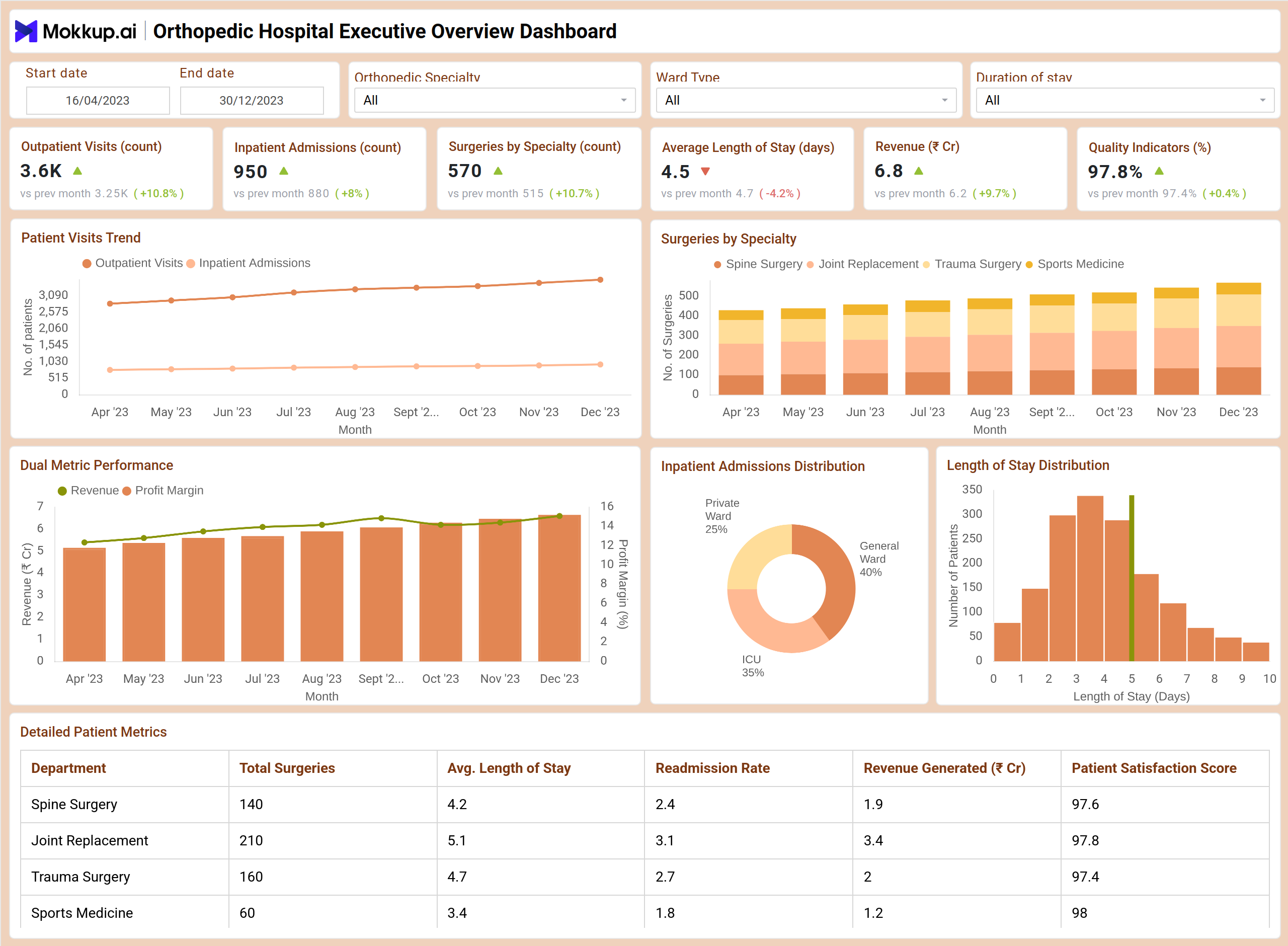
The Orthopedic Hospital Executive Overview Dashboard example from Mokkup.ai showcases how hospital administrators can visualize key metrics in one streamlined view. The dashboard template highlights Outpatient Visits, Inpatient Admissions, and Surgeries by Specialty, showing growth compared to the previous month. Executives can monitor the Average Length of Stay, Revenue Performance, and Quality Indicators to assess hospital productivity and patient outcomes. Interactive charts such as the Patient Visits Trend and Surgeries by Specialty provide quick insights into monthly patterns. In contrast, donut and bar charts visualize Inpatient Admission Distribution and Length of Stay.
A detailed metrics table breaks down performance by department, Spine Surgery, Joint Replacement, Trauma Surgery, and Sports Medicine, including KPIs such as readmission rate, revenue generated, and patient satisfaction. This layout helps executives easily identify areas of improvement, optimize operations, and maintain clinical excellence across all orthopedic services.
How to Analyze Data in Orthopedic Hospital Executive Overview Dashboards?
An executive overview dashboard helps hospital leaders monitor overall performance by combining clinical, operational, and financial insights into one view. It highlights trends and performance metrics for optimizing care delivery and resource management.
- Track Patient Visit Trends: Monitor monthly changes in outpatient and inpatient volume to understand service demand.
- Compare Surgical Performance: Identify which specialties perform the most procedures and generate the highest revenue.
- Assess Average Length of Stay (ALOS): Detect efficiency gaps in discharge and recovery processes.
- Evaluate Care Quality: Review patient satisfaction and quality indicators to maintain clinical excellence.
- Analyze Readmission Rates: Identify recurring post-surgery complications to improve outcomes.
- Monitor Ward Utilization: Track bed distribution across Private, General, and ICU wards for better resource planning.
- Align Revenue and Profit Goals: Review dual metrics (Revenue vs. Profit Margin) to balance operational and financial objectives.
Benefits of Orthopedic Hospital Executive Overview Dashboard
An executive overview dashboard simplifies decision-making by giving hospital leaders a holistic view of orthopedic operations, performance, and outcomes:
- Centralized Performance Monitoring: Access all orthopedic metrics in one unified interface.
- Operational Efficiency: Detect high-load departments and optimize staff or bed allocation.
- Clinical Quality Tracking: Measure readmission rates, recovery times, and patient satisfaction across units.
- Revenue Optimization: Correlate surgical volumes with profitability and department contribution.
- Executive-Ready Visualization: High-contrast visuals and KPI cards simplify board reporting.
- Benchmarking & Trend Analysis: Compare month-over-month growth in admissions, revenue, and outcomes.
- Improved Patient Experience: Continuous tracking of satisfaction and quality indicators drives service improvement.
KPIs to Track in the Orthopedic Hospital Executive Overview Dashboards
Tracking the right KPIs ensures a complete view of hospital performance, enabling leadership to make informed strategic and operational decisions:
- Outpatient Visits (Count): Track total orthopedic consultations per month.
- Inpatient Admissions (Count): Monitor total hospitalizations and bed occupancy.
- Surgeries by Specialty: Measure surgery volumes across Spine, Joint Replacement, Trauma, and Sports Medicine.
- Average Length of Stay (Days): Evaluate hospital efficiency and discharge turnaround.
- Revenue (₹ Crores): Track total orthopedic department revenue and month-over-month growth.
- Quality Indicators (%): Measure adherence to clinical standards and safety benchmarks.
Frequently Asked Questions
Q1. What is the purpose of an Orthopedic Hospital Executive Overview Dashboard?
It provides hospital executives with an integrated view of clinical, operational, and financial data, helping them monitor hospital performance and make informed management decisions.
Q2. Which tools can be used to build this dashboard?
You can use BI tools like Power BI, Tableau, or Mokkup.ai’s ready-to-use dashboard templates that allow easy customization and data integration.
Q3. Can this dashboard track department-wise performance?
Yes, it breaks down data by departments such as Spine Surgery, Joint Replacement, and Trauma Surgery, showing surgeries performed, revenue, and satisfaction levels.
Q4. How frequently should the data be updated?
Weekly or monthly updates ensure the dashboard reflects accurate hospital performance trends and supports timely decision-making.
Q5. Can the dashboard support executive presentations and reports?
Yes, you can export visuals as PDFs, PNGs, or Tableau/Power BI files for board meetings or strategic performance reviews.