
What is an Oncology Cost & Revenue Dashboard?
An Oncology Cost & Revenue Dashboard is a financial performance tool designed to help cancer centers monitor treatment costs, revenue streams, and profit margins in one integrated view. It provides real-time visibility into expenditure patterns, service line profitability, payer reimbursements, and operational cost drivers. This dashboard functions as an oncology cost and revenue performance monitoring dashboard, allowing administrators and finance teams to evaluate the financial health of oncology programs with precision. By consolidating metrics from chemotherapy, radiation therapy, immunotherapy, targeted therapy, surgery, pharmacy, diagnostics, and inpatient services, it becomes an oncology department financial analytics and reporting tool that supports data-driven decisions. Hospitals use it to understand revenue growth trends, performance gaps, reimbursement risks, claim denial patterns, and the overall return on investment for oncology treatment pathways.
How to Create an Oncology Cost & Revenue Dashboard
You don’t need to build your report from scratch, just start with a ready-to-use dashboard template from Mokkup. Add in your data and export it however you like. Here’s how to do it:
1. Create or Log in to Your Mokkup Account
Start by signing up on Mokkup.ai using your email. If you already have an account, just log in, and you’ll be good to go.
2. Choose and Customize Your Dashboard Template
Find the Oncology Cost & Revenue Dashboard template in the Templates section. Use the drag-and-drop editor to adjust KPIs, edit filters, or add elements based on your data.
3. Export to Your BI Tool
Once your dashboard wireframe is ready, use the BI Tool Export feature to send it directly to Power BI or Tableau for further analysis and enhancements. You can also download the dashboard as a PDF, PNG, or JPEG, embed it on a platform, or invite your team to collaborate.
Note: This is a Pro template. You’ll need a Pro subscription on Mokkup to use and customize this dashboard wireframe. Upgrade anytime to unlock full access.
Oncology Cost & Revenue Dashboard Example
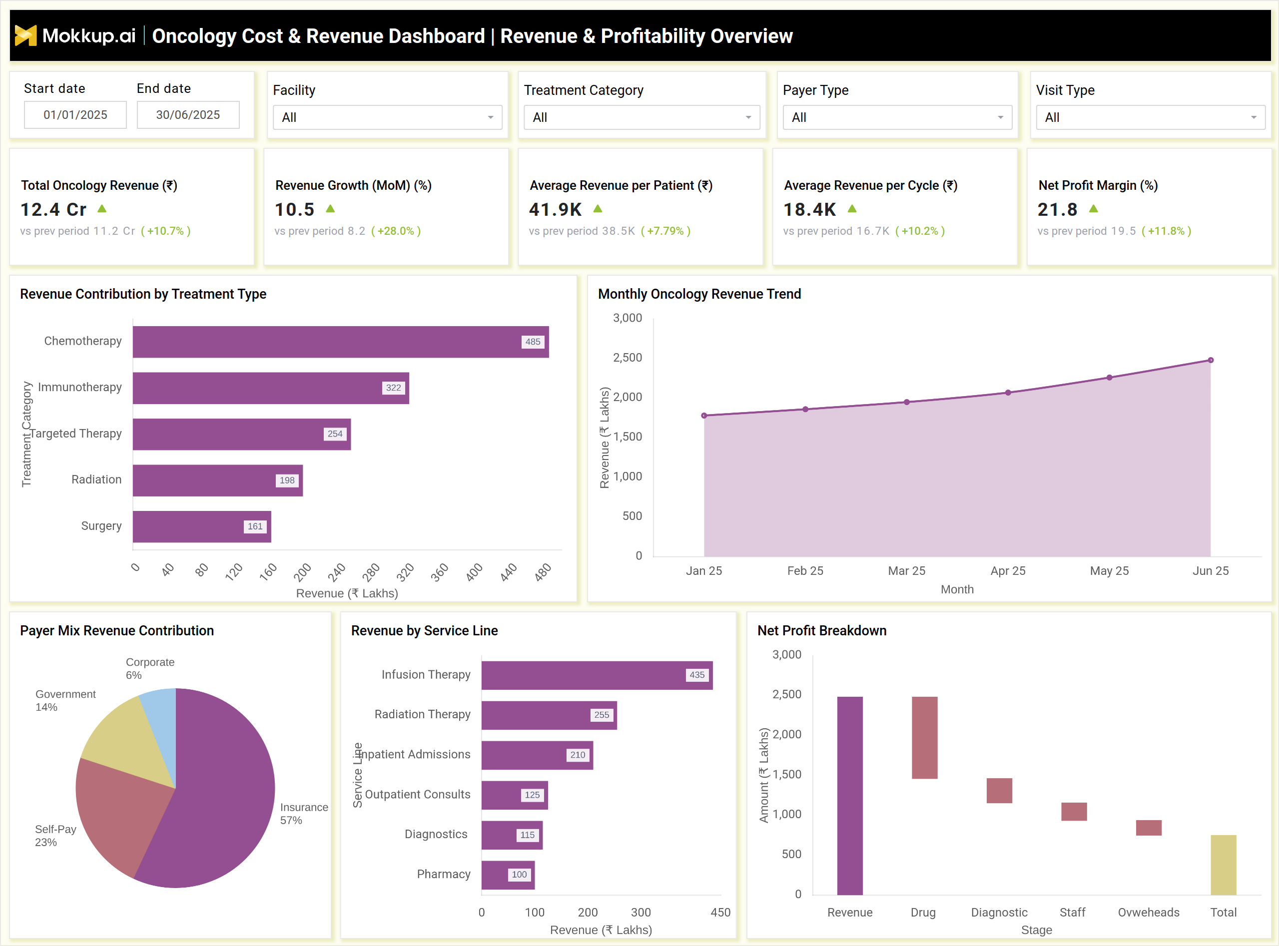
The example dashboard shown above provides a full financial snapshot of oncology operations, covering both revenue performance and treatment-related expenses. It displays KPIs such as Total Oncology Revenue, Revenue Growth (MoM), Average Revenue per Patient, Net Profit Margin, Total Treatment Cost, Average Cost per Cycle, Drug Cost Share, Claim Denial Rate, and Collection Efficiency. These KPIs help finance and oncology leaders assess profitability, cost distribution, and reimbursement outcomes. Visual insights such as Revenue Contribution by Treatment Type, Monthly Revenue Trend, and Revenue by Service Line illustrate how different oncology services contribute to overall financial performance. This aligns with the purpose of a cancer care treatment cost analysis and profitability dashboard, helping leaders understand cost drivers and profit-generating activities.
The second part of the dashboard analyzes cost patterns through charts like Cost Breakdown by Treatment Type, Monthly Treatment Cost Trend, Key Drivers of Claim Denials, and Unplanned Cost Overruns. These views support oncology service line cost utilization and revenue tracking, allowing teams to pinpoint inefficiencies, identify high-cost procedures, and understand financial risks. Together, these visual components operate as a comprehensive hospital oncology financial performance dashboard, offering clarity on payer mix impact, reimbursement recovery, operational cost sources, and clinical service profitability. Overall, this dashboard works as the best oncology cost and revenue dashboard, giving organizations the financial intelligence they need to improve margins and stabilize oncology service line performance
How to Analyze Data in an Oncology Cost & Revenue Dashboard
Start by reviewing how treatment mix, cost behaviour, and revenue patterns shape overall oncology financial performance:
- Track Revenue by Treatment Type: Compare earnings from chemotherapy, radiation, immunotherapy, targeted therapy, and surgery.
- Review Monthly Revenue and Cost Trends: Spot seasonality, volume-driven shifts, and payer-related fluctuations.
- Analyze Cost Breakdown: Examine drug, staff, consumables, diagnostics, and supportive care expenses to find high-cost areas.
- Evaluate Payer Mix Contribution: Measure reliance on insurance, government schemes, or self-pay and assess reimbursement risk.
- Assess Claim Denial Patterns: Identify documentation issues, coding errors, and authorization gaps affecting revenue recovery.
- Monitor Cost Overruns: Detect spikes from complications, emergency admissions, drug wastage, or equipment-driven expenses.
- Compare Revenue and Cost per Patient: Highlight profitable vs. loss-making oncology pathways and refine care delivery models.
Benefits of an Oncology Cost & Revenue Dashboard
A good oncology cost and revenue dashboard does more than track numbers. It gives teams the clarity they need to manage care, costs, and performance with confidence.
- Get a Unified Financial View: See performance across services, payers, and treatment lines in one place.
- Identify High-Value Services: Spot profitable therapies and flag underperforming areas that need attention.
- Improve Cost Control: Break down drug usage, diagnostics, staff effort, and other components to manage expenses better.
- Enhance Reimbursement Accuracy: Surface denial drivers, documentation gaps, and coding issues early.
- Strengthen Financial Planning: Use revenue forecasts and cost trend patterns to guide budgeting and strategy.
- Enable Faster Decisions: Give oncology leaders real-time financial intelligence for daily operational calls.
- Boost Operational Efficiency: Align treatment costs, reimbursements, and resource utilization to streamline care delivery.
KPIs to Track in an Oncology Cost & Revenue Dashboard
- Total Oncology Revenue (₹): Measures overall revenue generated across all oncology services.
- Revenue Growth (MoM/YoY) (%): Shows the rate of financial growth over time.
- Average Revenue per Patient (₹): Indicates the financial return generated per oncology patient.
- Revenue per Treatment Cycle (₹): Tracks the average earnings per chemotherapy, radiation, or immunotherapy cycle.
- Net Profit Margin (%): Measures the profitability of oncology services after all expenses.
- Total Treatment Cost (₹): Captures the total cost incurred across drugs, diagnostics, staff, consumables, and supportive care.
- Claim Denial Rate (%): Measures the percentage of claims rejected due to documentation issues, coding errors, or authorization gaps.
- Average Claim Processing Time (Days): Shows how long payers take to process and approve claims.
Frequently Asked Questions
1. Who uses an Oncology Cost & Revenue Dashboard?
Finance teams, oncology administrators, hospital leadership, service line managers, and revenue cycle management teams.
2. Can it track revenue by therapy type?
Yes, it breaks down revenue for chemotherapy, immunotherapy, radiation therapy, targeted therapy, and surgical oncology.
3. How does it help with reimbursement improvement?
It highlights denial reasons, processing delays, and payer performance, allowing teams to fix issues and improve collection efficiency.
4. Can this dashboard support budgeting and forecasting?
Yes, revenue trends and cost analytics help oncology teams create more accurate financial projections.