What is an Oil Power Plant Economics & Margin Dashboard?
An Oil Power Plant Economics & Margin Dashboard is a structured financial and operational monitoring tool designed for oil-fired generation units across electric power utilities. It gives finance managers, operational planners, and plant controllers a single view of revenue performance, cost per MWh, margin behavior, and compliance cost exposure. This dashboard simplifies complex economic factors, including fuel volatility, O&M cost fluctuations, LCOE shifts, and environmental cost pressures. It supports the evaluation of profitability drivers by combining revenue trends, cost composition, and contribution margin changes across the reporting period.
As a result, utility teams gain a clearer understanding of where margin leakage occurs, how revenue realization compares to market targets, and how fuel or operational cost components impact overall economics. The dashboard aligns with utility finance workflows, making margin forecasting more accurate, especially for oil-fired power generation. The structure is suitable for utilities seeking an oil power plant economics performance dashboard, a financial dashboard for oil-based power plants, oil power plant profitability and cost tracking, and revenue and margin monitoring for oil-fired utilities.
How to Create an Oil Power Plant Economics & Margin Dashboard
You don’t need to build your report from scratch—just start with a ready-to-use dashboard template from Mokkup. Add in your data and export it however you like. Here’s how to do it:
1. Create or Log in to Your Mokkup Account
Start by signing up on Mokkup.ai using your email. If you already have an account, just log in, and you’ll be good to go.
2. Choose and Customize Your Dashboard Template
Find the Oil Power Plant Economics & Margin Dashboard template in the Templates section. Use the drag-and-drop editor to adjust KPIs, edit filters, or add elements based on your data.
3. Export to Your BI Tool
Once your dashboard wireframe is ready, use the BI Tool Export feature to send it directly to Power BI or Tableau for further analysis and enhancements. You can also download the dashboard as a PDF, PNG, or JPEG, embed it on a platform, or invite your team to collaborate.
Note: This is a Pro template. You’ll need a Pro subscription on Mokkup to use and customize this dashboard wireframe. Upgrade anytime to unlock full access.
Oil Power Plant Economics & Margin Dashboard Example
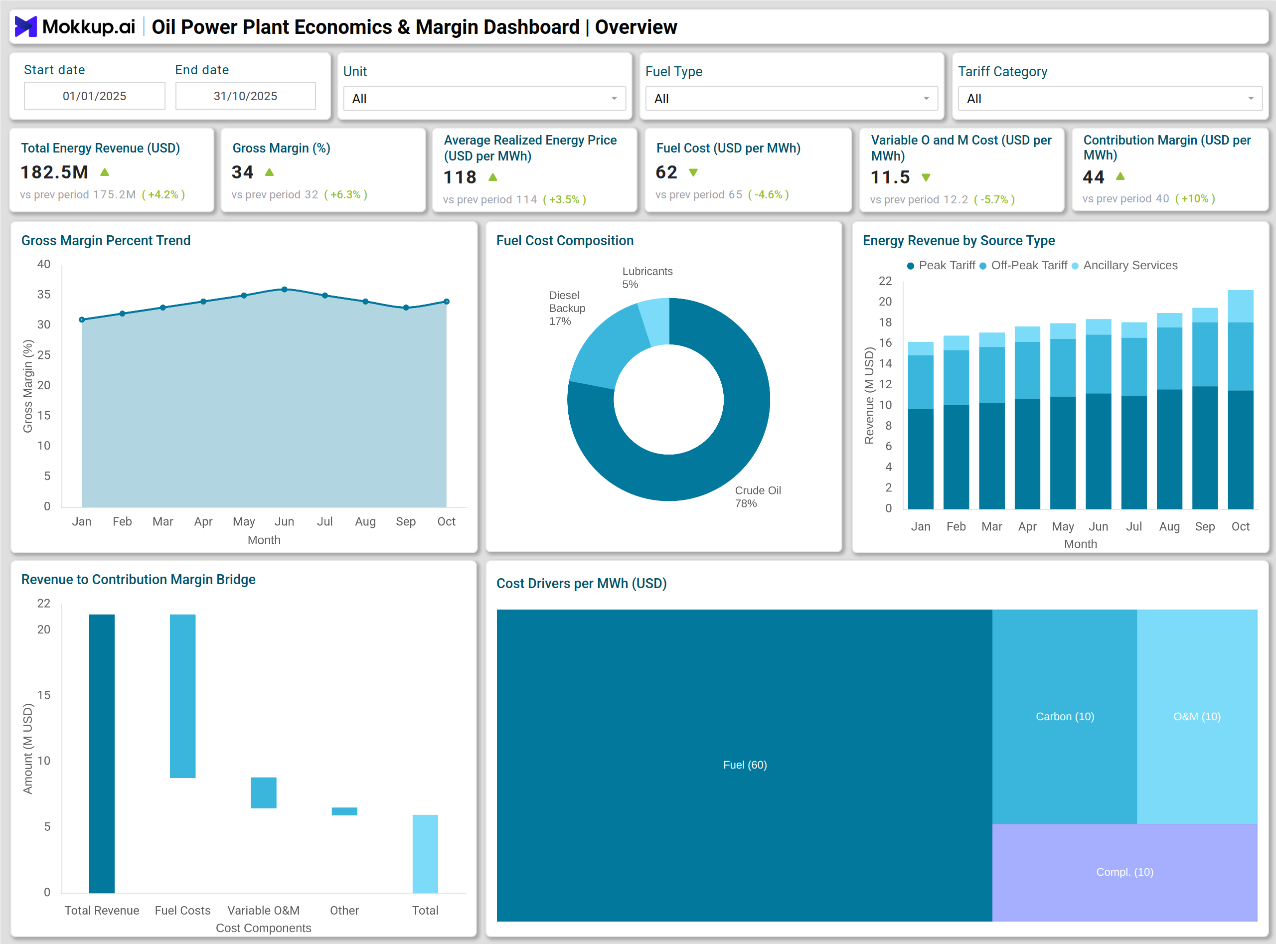
A typical Oil Power Plant Economics & Margin Dashboard presents revenue, cost, and profit metrics in a structured visual layout. A line chart illustrates the trend of Gross Margin Percent over the last 10 months, enabling users to compare margin stability with operational conditions and fuel price fluctuations. Stacked column charts display Total Energy Revenue by Source Type, helping utilities understand revenue streams across contracts, spot markets, and ancillary services. A waterfall chart visualizes the movement from revenue to Contribution Margin, making the impact of margin clearer.
The dashboard also includes a pie chart that presents Fuel Cost Composition and a treemap summarizing key Cost Drivers per MWh. With bar charts for Total Cost per MWh Breakdown and a gauge chart for Net Margin per MWh vs Target, finance teams can quickly assess whether the plant’s economics are aligned with utility-level goals. Environmental compliance elements, such as SOx/NOx cost share and heat rate performance, are captured through a donut chart and a heatmap. This example addresses the needs of utilities that require an oil-fired power generation margin analysis template and a fuel cost analysis per MWh for oil power stations.
How to Analyze Data in an Oil Power Plant Economics & Margin Dashboard
Here is how you can analyze data from this dashboard:
- Compare Gross Margin Percent trends to identify periods of margin compression.
- Review Total Energy Revenue by source to understand the balance between contract and market revenue.
- Use the Revenue to Contribution Margin waterfall to identify cost drivers that affect profitability.
- Track fuel, fixed O&M, and variable O&M cost components to identify controllable vs uncontrollable contributors.
- Monitor Total Cost per MWh to evaluate operational efficiency against utility targets.
- Assess environmental and compliance costs to ensure the plant remains in compliance with regulatory expectations.
- Track maintenance cost variances to evaluate asset reliability strategy and cost planning.
- Use heat rate performance behavior to assess combustion efficiency across units.
Benefits of an Oil Power Plant Economics & Margin Dashboard
The following are the benefits of using this dashboard:
- Improves margin visibility for oil-fired generation units.
- Helps identify high-cost components that affect the Total Cost per MWh.
- Supports financial planning for fuel procurement and operational and maintenance (O&M) budgeting.
- Assists utility teams in optimizing contribution margin.
- Enables better tracking of environmental and regulatory cost obligations.
- Strengthens forecasting for revenue and fuel cost exposure.
- Enhances operational decision-making with clear economic insights.
- Establishes a standardized framework for reporting production costs across the utility.
KPIs to Track in an Oil Power Plant Economics & Margin Dashboard
- Total Energy Revenue: Measures total revenue generated from energy sold across contracts and market channels.
- Gross Margin Percent: Indicates overall profitability by comparing revenue to total operating costs.
- Average Realized Energy Price per MWh: This represents the effective price earned per MWh after accounting for commercial adjustments.
- Fuel Cost per MWh: Tracks the fuel expense required to produce one MWh of electricity.
- Variable O&M Cost per MWh: Measures operational and maintenance expenses that fluctuate with production.
- Contribution Margin per MWh: Calculates the margin remaining after fuel and variable O&M costs.
- Total Cost per MWh: Summarizes all production costs, including fuel, O&M, compliance, and overhead.
Frequently Asked Questions
1. Who should use an Oil Power Plant Economics & Margin Dashboard?
Finance managers, plant controllers, operations planners, and utility executives who monitor profitability and cost structure in oil-fired power plants.
2. What makes this valuable dashboard for utilities?
It provides a consolidated view of revenue, cost per MWh, environmental obligations, and margin behavior, allowing utilities to identify opportunities for cost control and improve economic performance.
3. How does this dashboard support fuel cost planning?
It helps teams compare fuel cost per MWh, evaluate cost drivers, and assess how fuel price shifts influence plant margins.
4. Can this dashboard be used for regulatory and compliance planning?
Yes, it includes carbon cost, SOx/NOx compliance cost, and environmental cost share, helping utilities track regulatory obligations and plan for upcoming compliance periods.