
What is a Nuclear Power Plant Cost & Profitability Dashboard?
A Nuclear Power Plant Cost & Profitability Dashboard template is a financial performance dashboard for nuclear utilities that helps track cost behavior, earning potential, and operational efficiency across the generation fleet. It acts as a cost monitoring system for nuclear power plants by presenting financial and operational indicators that influence profitability.
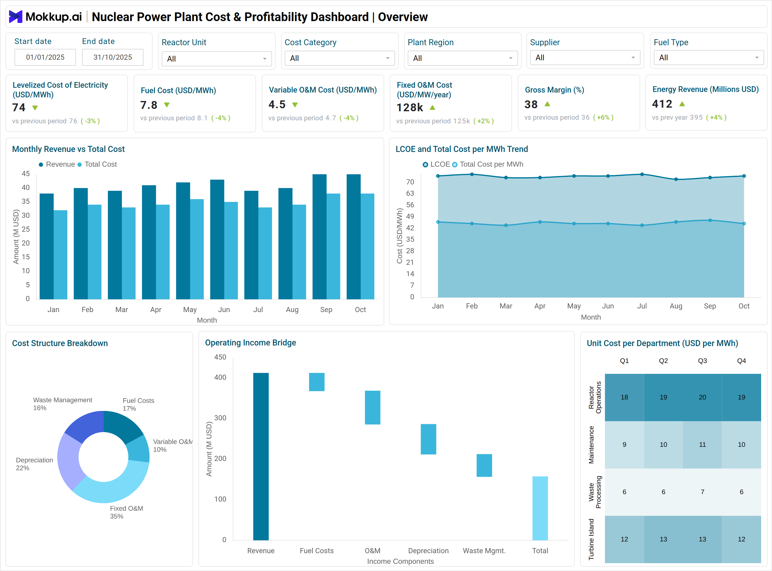
The dashboard wireframe displays a nuclear power plant cost analysis dashboard, showing metrics such as LCOE, fuel cost per MWh, O&M structure, gross margin, EBITDA margin, and cash flow strength. It supports leadership teams in electric power utilities by showing the nuclear power generation profitability metrics needed for capital planning, operational analysis, and long-term performance evaluation.
Because it combines cost drivers, revenue indicators, and profitability tracking tools for nuclear energy utilities, it helps financial teams quantify the economic position of each reactor unit and the overall station.
How to Create a Nuclear Power Plant Cost & Profitability Dashboard
You don’t need to build your report from scratch—just start with a ready-to-use Nuclear Power Plant Cost & Profitability dashboard template from Mokkup. Add in your data and export it however you like. Here’s how to do it:
1. Create or Log in to Your Mokkup Account
Start by signing up on Mokkup.ai using your email. If you already have an account, just log in, and you’ll be good to go.
2. Choose and Customize Your Dashboard Template
Find the Nuclear Power Plant Cost & Profitability Dashboard template in the Templates section. Use the drag-and-drop editor to adjust KPIs, edit filters, or add elements based on your data.
3. Export to Your BI Tool
Once your dashboard wireframe is ready, use the BI Tool Export feature to send it directly to Power BI or Tableau for further analysis and enhancements. You can also download the dashboard as a PDF, PNG, or JPEG, embed it on a platform, or invite your team to collaborate.
Note: This is a Pro template. You’ll need a Pro subscription on Mokkup to use and customize this dashboard wireframe. Upgrade anytime to unlock full access.
Nuclear Power Plant Cost & Profitability Dashboard Example
A standard dashboard includes visuals that help translate complex financial metrics into clear insights. A column chart compares monthly revenue with total cost, giving a direct view of earning strength. A line chart outlines LCOE and cost per MWh trends to show how cost efficiency evolves over time. A pie chart displays the cost structure, split between fuel, variable operating and maintenance (O&M), and fixed O&M.
A waterfall chart illustrates the path from revenue to net income. A heatmap displays cost variance across departments and months, helping identify areas with rising financial pressure. A combo chart compares EBITDA and net cash flow to show operational profitability and liquidity. A stacked bar chart outlines CAPEX allocation by category, and a gauge chart represents DSCR risk exposure. A Sankey chart illustrates how cash flows across major cost and revenue nodes, while a treemap shows profit contribution by reactor unit and generation block. These visuals create a unified financial view that supports nuclear plant operational cost efficiency KPIs and detailed analysis for finance teams.
How to Analyze Data in Nuclear Power Plant Cost & Profitability Dashboards
Start with a holistic view of cost, revenue, and profitability trends to understand how financial and operational factors shape plant performance:
- Evaluate LCOE Movement: Understand changes in long-term generation cost efficiency.
- Compare Monthly Revenue vs. Total Costs: Measure short-term margin behavior and profitability shifts.
- Review Variable and Fixed O&M Trends: Identify changes in operational workload or maintenance spending.
- Analyze EBITDA Margin: Assess overall profitability strength across reporting cycles.
- Assess Cash Flow per MWh and Net Cash Flow: Determine liquidity performance and financial stability.
- Monitor DSCR Bands: Evaluate debt-servicing capability and financial risk levels.
- Track CAPEX Distribution: Understand investment priorities and long-term asset needs.
- Assess Profit Contribution by Reactor Units: Identify underperforming units or operational imbalance.
Benefits of Nuclear Power Plant Cost & Profitability Dashboards
These dashboards help financial and operations teams manage costs, improve margins, and plan long-term investments more effectively:
- Structured Cost Visibility: Offers clear insight into nuclear plant cost performance.
- Early Cost Deviation Detection: Flags margin erosion and efficiency drops.
- Improved CAPEX Planning: Supports strategic long-term investment decisions.
- Operational Cost Control: Strengthens monitoring across departments and cost centers.
- Profitability Tracking: Helps financial teams compare performance across reactor units.
- Enhanced Accountability: Promotes transparent financial and operational reporting.
- Better Budgeting Accuracy: Shows trends that support more reliable financial forecasts.
KPIs to Track in Nuclear Power Plant Cost & Profitability Dashboards
Track these key financial and operational indicators to evaluate cost efficiency and profitability:
- Levelized Cost of Electricity (LCOE): Measures the total cost of generation per MWh across the plant lifecycle.
- Fuel Cost per MWh: Indicates the cost contribution of nuclear fuel to each unit of generation.
- Variable O&M Cost per MWh: Shows flexible operational costs that change with generation levels.
- Fixed O&M Cost per MW-Year: Represents baseline operational expenses required regardless of output.
- Gross Margin: Measures the difference between revenue and total operating cost.
- Energy Revenue: Tracks earnings generated from electricity sales.
- EBITDA Margin: Shows operating profitability before interest, taxes, depreciation, and amortization.
Frequently Asked Questions
Q1. Why is LCOE important for nuclear utilities?
LCOE consolidates fuel, O&M, and capital recovery into a single metric, providing a clear benchmark for nuclear generation economics.
Q2. How does this dashboard support financial planning?
It presents detailed cost and profitability indicators that help teams evaluate revenue, expenses, investment decisions, and debt exposure.
Q3. Which areas benefit most from this dashboard?
Finance, operations, plant management, and asset management teams use it to track margin stability, investment needs, and operational efficiency.
Q4. How do visuals help interpret nuclear plant financials?
Visuals simplify cost structure, income flow, CAPEX allocation, and profitability distribution across reactor units.
Q5. Can the dashboard help identify underperforming reactors?
Yes, reactor-level profit contribution and cost variance metrics highlight units needing operational review.