
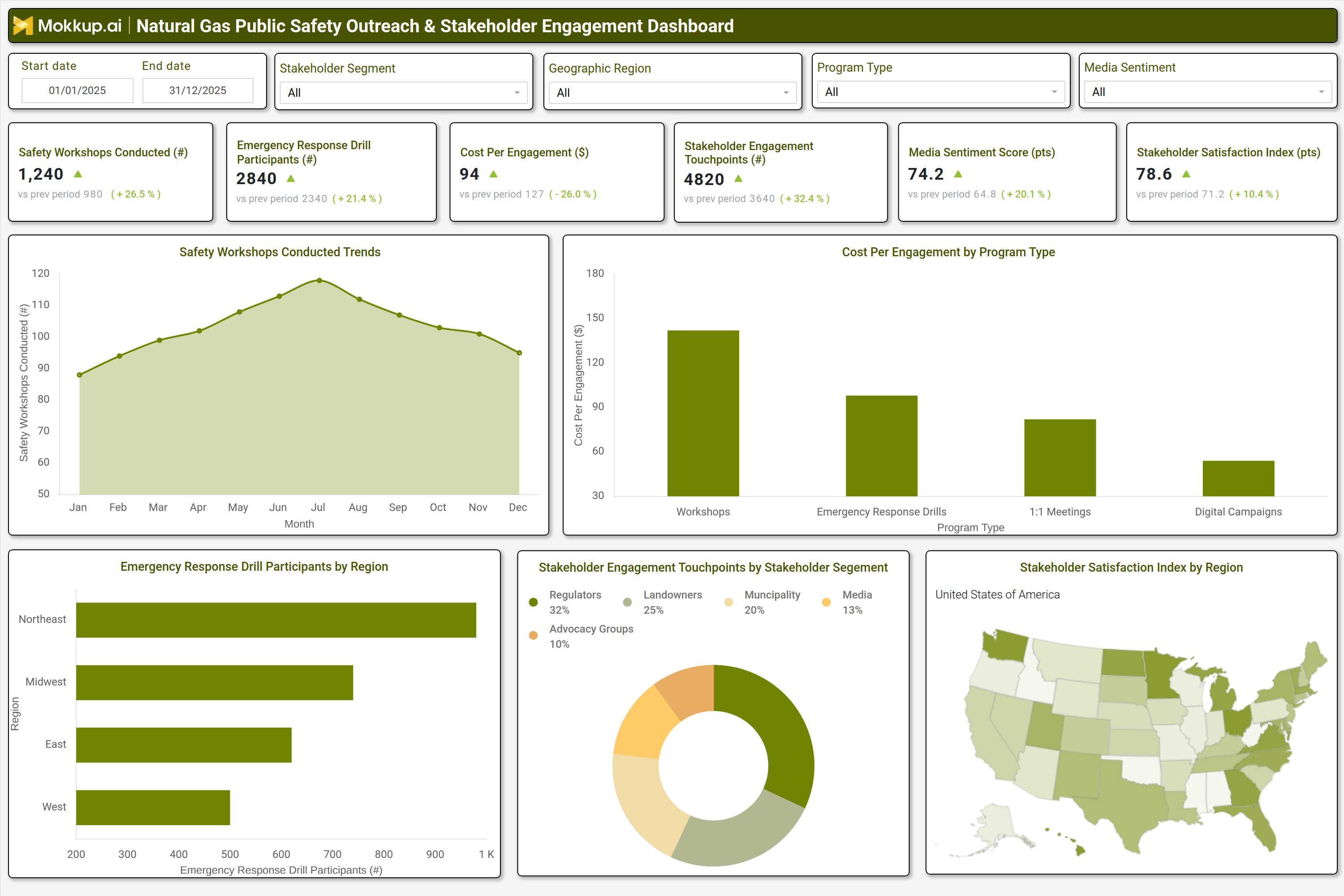
What is a Natural Gas Public Safety Outreach & Stakeholder Engagement Dashboard?
A Natural Gas Public Safety Outreach & Stakeholder Engagement Dashboard is a centralized analytics platform designed to monitor, track, and optimize public safety education and stakeholder communication programs for natural gas transmission operators. It consolidates data from outreach events, emergency drills, stakeholder interactions, and media sentiment analysis into a single interface. This dashboard helps public affairs teams, safety officers, and community relations managers measure the effectiveness of safety workshops, track engagement with landowners and regulators, and assess public perception through media sentiment. By integrating stakeholder feedback and program participation metrics, the dashboard enables data-driven decisions to improve community safety awareness, strengthen regulator relationships, and enhance emergency preparedness.
How to Create a Natural Gas Public Safety Outreach & Stakeholder Engagement Dashboard
You don’t need to build your report from scratch; just start with a ready-to-use dashboard template from Mokkup. Add in your data and export it however you like. Here’s how to do it:
1. Create or Log in to Your Mokkup Account
Start by signing up on Mokkup.ai using your email. If you already have an account, just log in, and you’ll be good to go.
2. Choose and Customize Your Dashboard Template
Find the Natural Gas Transmission Public Safety Outreach & Stakeholder Engagement Dashboard template in the Templates section. Use the drag and drop editor to adjust KPIs, edit filters, or add elements based on your data.
3. Export to Your BI Tool
Once your dashboard wireframe is ready, use the BI Tool Export feature to send it directly to Power BI or Tableau for further analysis and enhancements. You can also download the dashboard as a PDF, PNG, or JPEG, embed it on a platform, or invite your team to collaborate.
Note: This is a Pro template. You’ll need a Pro subscription on Mokkup to use and customize this dashboard wireframe. Upgrade anytime to unlock full access.
Natural Gas Public Safety Outreach & Stakeholder Engagement Dashboard Example
A well-designed stakeholder engagement dashboard for gas utilities provides interactive filters for date ranges, stakeholder segments, geographic regions, program types, and media sentiment. Key performance tiles display metrics such as safety workshops conducted, emergency response drill participants, cost per engagement, stakeholder touchpoints, media sentiment scores, and stakeholder satisfaction indices. Trend charts compare current performance against previous periods, highlighting improvements or declines in outreach effectiveness. Regional breakdowns show participation in emergency drills, while stakeholder segment analyses reveal engagement levels across landowners, regulators, municipalities, and advocacy groups. A geographic heatmap visualizes satisfaction scores by region, helping utilities prioritize areas needing targeted outreach. Together, these components create a pipeline safety reporting and stakeholder collaboration tool that enables data-driven decision-making for public safety programs.
How to Analyze Data in a Natural Gas Public Safety Outreach & Stakeholder Engagement Dashboard
Here is how you can analyze data from this stakeholder engagement tracking dashboard:
- Review safety workshops conducted to measure the reach of public education programs.
- Track emergency response drill participants to assess community preparedness and engagement levels.
- Monitor cost per engagement to optimize budget allocation across outreach initiatives.
- Evaluate stakeholder touchpoints to identify high-impact communication channels.
- Analyze media sentiment scores to gauge public perception and adjust messaging strategies.
- Compare stakeholder satisfaction indices across regions to prioritize areas for improvement.
- Break down engagement by stakeholder segment to tailor outreach for regulators, landowners, and municipalities.
- Assess trends in program participation to detect shifts in community interest or awareness
Benefits of a Natural Gas Public Safety Outreach & Stakeholder Engagement Dashboard
The following are the benefits of using this natural gas public safety dashboard:
- Enhances public safety awareness through structured outreach and education programs.
- Improves stakeholder collaboration by tracking engagement across regulators, landowners, and emergency responders.
- Optimizes outreach budgets by analyzing cost per engagement and program effectiveness.
- Strengthens emergency preparedness with data driven drill participation and response tracking.
- Boosts public trust by monitoring media sentiment and stakeholder satisfaction.
- Supports regulatory compliance with transparent reporting on safety and engagement efforts.
- Enables targeted outreach by identifying underperforming regions or stakeholder groups.
- Drives continuous improvement with trend analysis and performance benchmarking.
KPIs to Track in a Natural Gas Public Safety Outreach & Stakeholder Engagement Dashboard
The following key KPIs can be tracked by using such Pipeline Safety Outreach dashboard:
- Safety Workshops Conducted (count): Measures the number of public safety education sessions delivered.
- Emergency Response Drill Participants (count): Tracks community and stakeholder involvement in preparedness drills.
- Cost Per Engagement ($): Calculates the average expense per stakeholder interaction.
- Stakeholder Engagement Touchpoints (count): Counts interactions (meetings, emails, calls) with key stakeholders.
- Media Sentiment Score (pts): Evaluates public perception based on news coverage and social media analysis.
- Stakeholder Satisfaction Index (pts): Assesses stakeholder feedback on outreach programs and communication.
Frequently Asked Questions
1. How does this emergency drill participation dashboard improve community engagement?
By analyzing community engagement strategies for natural gas transmission, utilities can refine messaging, target high need areas, and measure the impact of outreach programs.
2. What data sources feed into this IoT sensor deployment tracking dashboard?
Data comes from public safety event logs, stakeholder communication records, media monitoring tools, and survey feedback systems.
3. Who should use a pipeline monitoring dashboard?
Utility safety managers, public affairs teams, emergency response coordinators, and executive leadership benefit from tracking pipeline safety reporting and stakeholder collaboration tools via such Media sentiment monitoring dashboard.