
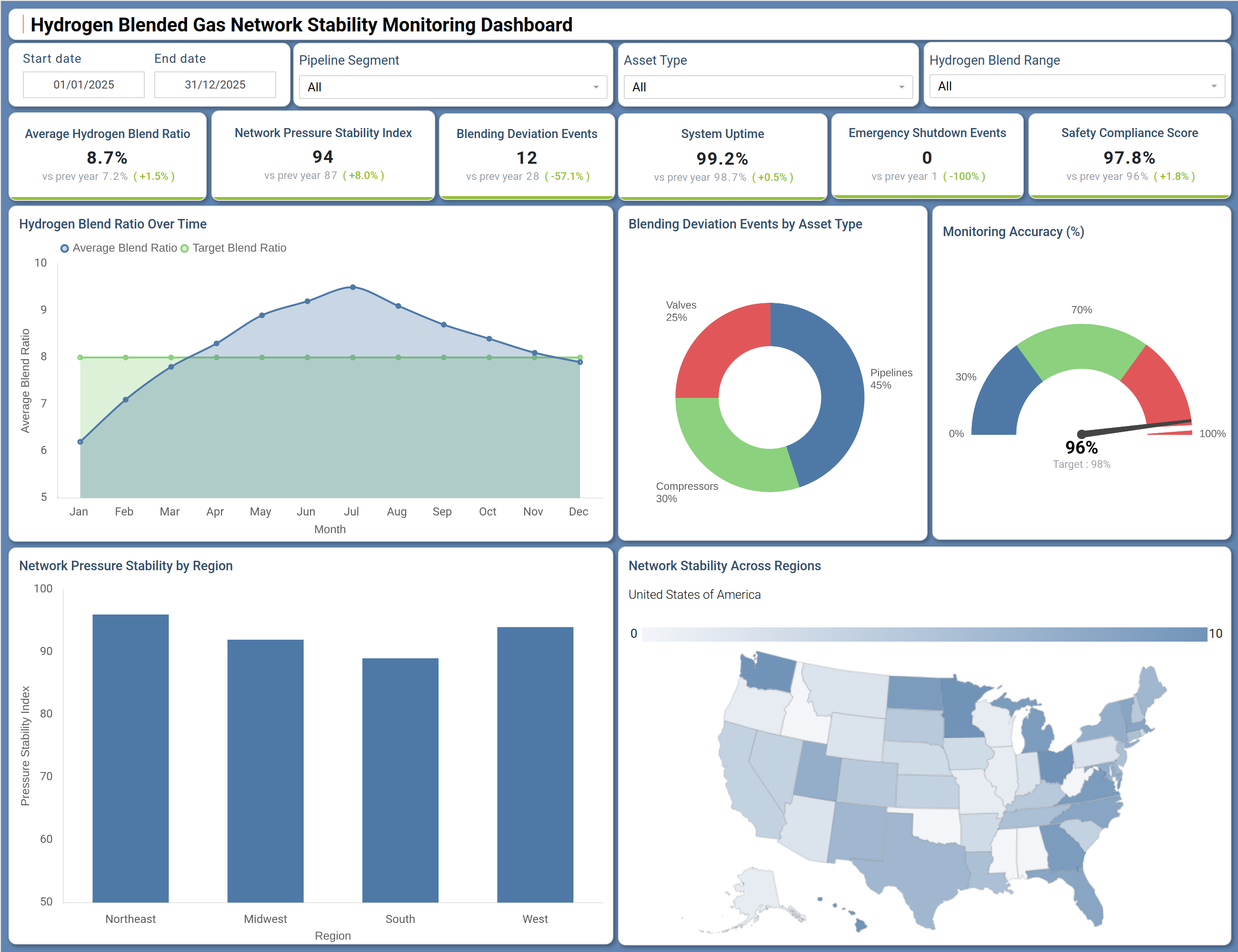
What is a Hydrogen Blended Gas Network Stability Monitoring Dashboard?
The Hydrogen Blended Gas Network Stability Monitoring Dashboard is a structured analytics template built for gas utilities, pipeline operators, and energy infrastructure teams managing hydrogen blending programs. As hydrogen injection into existing gas grids becomes a central decarbonization strategy, this hydrogen-blended gas network stability monitoring tool gives operators a single, consistent view of blend performance, pressure integrity, and regulatory compliance across the full network.
It tracks how actual hydrogen blend ratios compare to targets over time, flags deviations by asset type, and measures safety compliance scores across pipeline segments. Teams responsible for both operational reliability and emissions reporting use this hydrogen gas pipeline monitoring template to stay ahead of blend irregularities before they affect downstream consumers or trigger safety incidents. The template is especially relevant for organizations scaling hydrogen injection across multi-region networks where centralized oversight is essential to managing both risk and performance.
How to Create a Hydrogen Blended Gas Network Stability Monitoring Dashboard
You don’t need to build your report from scratch, just start with a ready-to-use Hydrogen Blended Gas Network Stability Monitoring dashboard template from Mokkup. Add in your data and export it however you like. Here’s how to do it:
1. Create or Log in to Your Mokkup Account
Start by signing up on Mokkup.ai using your email. If you already have an account, just log in, and you'll be good to go.
2. Choose and Customize Your Dashboard Template
Find the Hydrogen Blended Gas Network Stability Monitoring Dashboard template in the Templates section. Use the drag-and-drop editor to adjust KPIs, edit filters, or add elements based on your data.
3. Export to Your BI Tool
Once your dashboard wireframe is ready, use the BI Tool Export feature to send it directly to Power BI or Tableau for further analysis and enhancements. You can also download the dashboard as a PDF, PNG, or JPEG, embed it on a platform, or invite your team to collaborate.
Note: This is a Pro template. You'll need a Pro subscription on Mokkup to use and customize this dashboard wireframe. Upgrade anytime to unlock full access.
Hydrogen Blended Gas Network Stability Monitoring Dashboard Example
An operations manager overseeing a regional hydrogen blending program opens this dashboard to assess whether injection targets are being met across all active pipeline segments. The overview row immediately surfaces whether system uptime is within target thresholds, whether any emergency shutdown events have occurred, and how the gas network safety compliance score is trending compared to the prior period. If the safety compliance figure has slipped, the manager can quickly cross-reference the blending deviation count to determine whether the drop is tied to a specific asset class. From there, the hydrogen blend ratio tracking dashboard layer - specifically the Hydrogen Blend Ratio Over Time line chart - shows whether actual blend ratios have been drifting above or below target across the year, helping the team identify seasonal or operational causes.
The Blending Deviation Events by Asset Type donut chart then narrows the analysis: if compressors or pipelines are generating the majority of deviation events, maintenance teams can be dispatched to the right equipment category. The Network Pressure Stability by Region bar chart and the choropleth map allow regional leads to see which geographies - Northeast, Midwest, South, or West - are showing pressure index weaknesses, so interventions can be prioritized where network stability risk is highest.
How to Analyze Data in a Hydrogen Blended Gas Network Stability Monitoring Dashboard
Here is how you can analyze data from this dashboard:
- Filter by Pipeline Segment: Isolate performance for specific network sections and compare against targets.
- Identify Asset-Level Issues: Filter by asset type to see whether valves, compressors, or pipelines drive deviations.
- Track Blend Ratio Trends: Monitor blend ratio over time to detect divergence from target levels.
- Prioritize Maintenance: Use deviation events by asset type to focus on high-impact assets.
- Analyze Blend Ranges: Segment by hydrogen concentration to assess impact on pressure stability.
- Evaluate Regional Stability: Review pressure stability by region to identify underperforming areas.
- Check Monitoring Accuracy: Compare accuracy against the 98% target to ensure reliable instrumentation.
- Link Safety & Incidents: Track shutdown events alongside safety scores to assess compliance impact.
Benefits of a Hydrogen Blended Gas Network Stability Monitoring Dashboard
The following are the benefits of using this dashboard:
- Centralized Monitoring: Combines blend ratios, pressure stability, and safety metrics in one view.
- Multi-Asset Insights: Enables analysis across pipeline segments and asset types.
- Reduced Reporting Effort: Prebuilt KPIs simplify compliance and performance tracking.
- Regional Performance Visibility: Highlights pressure stability issues for targeted action.
- Targeted Maintenance: Identifies asset classes driving deviation events.
- Regulatory Alignment: Supports adherence to hydrogen injection and safety standards.
- Shared Operational View: Aligns operations, engineering, and compliance teams.
KPIs to Track in a Hydrogen Blended Gas Network Stability Monitoring Dashboard
The following key KPIs can be tracked by using this dashboard:
- Average Hydrogen Blend Ratio (%): The core metric in hydrogen blended gas network stability monitoring - measures the actual percentage of hydrogen injected into the gas stream relative to the target blend ratio.
- Network Pressure Stability Index: Quantifies how consistently pressure is maintained across the network - central to the network pressure stability index pipeline assessment that flags mechanical stress or flow imbalances.
- Blending Deviation Events (count): Tracks the number of instances where the blend ratio falls outside acceptable limits - directly tied to the blending deviation events by asset type breakdown for root cause diagnosis.
- System Uptime (%): Measures the percentage of time the network remains fully operational - a foundational reliability KPI for any hydrogen gas pipeline monitoring template deployment.
- Emergency Shutdown Events (count): Counts unplanned shutdowns triggered by safety or pressure anomalies - when combined with the gas network safety compliance score, reveals whether incidents are isolated or systemic.
- Safety Compliance Score (%): Evaluates overall network adherence to safety standards and regulatory requirements - the primary indicator for assessing whether hydrogen blending operations meet mandated thresholds.
- Monitoring Accuracy (%): Measures the share of network assets being actively monitored - supports confidence in reported KPIs and identifies instrumentation gaps that could affect compliance reporting.
Frequently Asked Questions
Q1. What industries benefit most from the Hydrogen Blended Gas Network Stability Monitoring Dashboard?
This dashboard is built for gas utilities, pipeline infrastructure operators, and energy transition teams managing hydrogen blending programs. It is also relevant for regulatory compliance teams and engineering departments responsible for network safety and performance reporting.
Q2. Can this dashboard track blending deviations across different asset types?
Yes. The Blending Deviation Events by Asset Type donut chart breaks down deviation counts across valves, compressors, and pipelines, giving maintenance teams a clear view of which asset class is generating the most instability.
Q3. Is this dashboard suitable for multi-region pipeline networks?
Yes. The Network Pressure Stability by Region bar chart and the Network Stability Across Regions choropleth map both support regional comparison, allowing operators to identify geographic pressure weaknesses and prioritize interventions accordingly.