
What is a Hydrogen Blend CapEx Portfolio & ROI Dashboard?
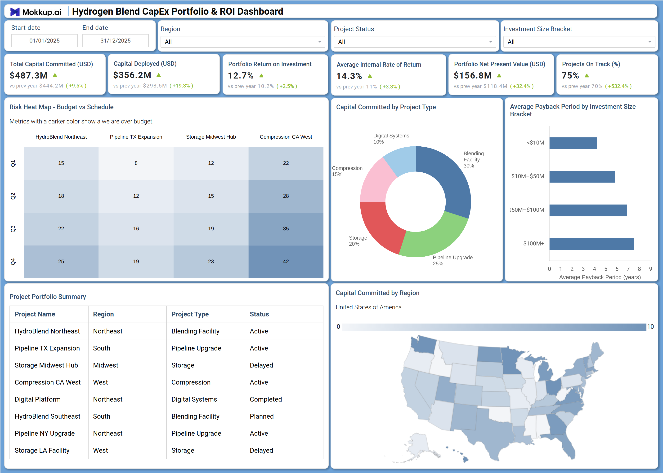
The Hydrogen Blend CapEx Portfolio & ROI Dashboard is a structured financial planning tool designed for energy investment teams managing capital expenditures across hydrogen infrastructure projects. This hydrogen blend capex portfolio dashboard consolidates capital allocation, return metrics, and project schedules into a single view, enabling portfolio managers and infrastructure finance teams to evaluate spending efficiency and investment outcomes. It tracks six core financial KPIs alongside a risk heat map, project portfolio summary, and regional capital distribution, giving stakeholders the clarity they need to prioritize funding decisions. Teams operating across blending facilities, pipeline upgrades, compression stations, and storage assets use this Hydrogen Project Status Monitoring Dashboard to maintain oversight of both active and planned initiatives.
How to Create a Hydrogen Blend CapEx Portfolio & ROI Dashboard?
You don’t need to build your report from scratch—just start with a ready-to-use dashboard template from Mokkup. Add in your data and export it however you like. Here’s how to do it:
1. Create or Log in to Your Mokkup Account
Start by signing up on Mokkup.ai using your email. If you already have an account, just log in, and you'll be good to go.
2. Choose and Customize Your Dashboard Template
Find the Hydrogen Blend CapEx Portfolio & ROI Dashboard template in the Templates section. Use the drag-and-drop editor to adjust KPIs, edit filters, or add elements based on your data.
3. Export to Your BI Tool
Once your dashboard wireframe is ready, use the BI Tool Export feature to send it directly to Power BI or Tableau for further analysis and enhancements. You can also download the dashboard as a PDF, PNG, or JPEG, embed it on a platform, or invite your team to collaborate.
Note: This is a Pro template. You'll need a Pro subscription on Mokkup to use and customize this dashboard wireframe. Upgrade anytime to unlock full access.
Hydrogen Blend CapEx Portfolio & ROI Dashboard Example
A typical investment planning team opens this dashboard at the start of a portfolio review cycle to understand how capital is deployed across hydrogen infrastructure projects and whether returns are meeting targets. The overview section immediately surfaces whether total committed capital is on pace with the deployment schedule and flags projects where budget alignment is at risk, a critical input for any hydrogen infrastructure ROI tracking process. Planners can scan the risk heat map to identify which specific projects are falling behind on budget or schedule thresholds before those delays compound into larger cost overruns.
From there, analysts review capital committed by project type hydrogen to understand how funding is distributed across blending facilities, pipeline upgrades, compression stations, digital systems, and storage assets. This breakdown helps leadership decide whether to rebalance the portfolio toward higher-return categories or maintain the current allocation. The average payback period of hydrogen investment view supports these conversations by showing how quickly capital is expected to recoup across different deal sizes, making it straightforward to compare short-cycle and long-cycle investments within the same portfolio review. The regional map adds a geographic dimension, helping teams identify where concentration risk or opportunity gaps exist across U.S. markets.
How to Analyze Data in a Hydrogen Blend CapEx Portfolio & ROI Dashboard
Here is how you can analyze data from this dashboard:
- Use the Region filter to isolate capital deployment and return metrics for a specific geographic market.
- Apply the Project Status filter to compare active, planned, delayed, and completed projects side by side.
- Review the Risk Heat Map - Budget vs Schedule to identify which projects are overrunning budget or falling behind on schedule milestones.
- Analyze capital committed by project type in the donut chart to assess allocation balance across blending facilities, pipeline upgrades, compression, storage, and digital systems.
- Use the Average Payback Period by Investment Size Bracket chart to compare return timelines across deal size categories and prioritize faster-payback investments.
- Examine the Capital Committed by Region map to detect regional concentration and guide geographic diversification decisions.
- Filter by Investment Size Bracket to segment the portfolio by deal scale and evaluate KPI performance at each funding tier.
- Cross-reference the Project Portfolio Summary table against the KPI tiles to verify that reported totals align with individual project statuses.
Benefits of a Hydrogen Blend CapEx Portfolio & ROI Dashboard
The following are the benefits of using this dashboard:
- Centralizes capital deployment, ROI, IRR, and NPV metrics across all hydrogen infrastructure projects in one structured template.
- Serves as a hydrogen infrastructure ROI tracking tool that consolidates return metrics across project types simultaneously, reducing time spent aggregating data from multiple sources.
- Provides a risk heat map that surfaces budget-vs-schedule risk across key projects before issues escalate to portfolio-level cost overruns.
- Enables region-level analysis of capital allocation to support geographic prioritization and infrastructure expansion planning.
- Delivers a donut chart breakdown of capital by project type for portfolio rebalancing and strategic allocation decisions.
- Helps investment teams and finance leads align on portfolio performance without rebuilding reports from scratch for each review cycle.
- Gives project managers and executive stakeholders a shared, structured view of hydrogen portfolio performance and project on-track rates.
KPIs to Track in a Hydrogen Blend CapEx Portfolio & ROI Dashboard
The following key KPIs can be tracked by using this dashboard:
- Total Capital Committed (USD): Key Performance Indicator (KPI) tracking total funding allocated across all hydrogen infrastructure projects in the portfolio, the baseline for all capital efficiency calculations in this capex performance dashboard.
- Capital Deployed (USD): KPI measuring how much of the committed capital has been drawn down and put to work, a direct measure of execution pace against the investment schedule.
- Portfolio Return on Investment (%): KPI measuring the net gain generated relative to total capital committed, the primary signal for whether the portfolio is delivering expected financial outcomes.
- Average Internal Rate of Return (%): KPI evaluating the annualized rate of return across all active investments, essential for hydrogen portfolio net present value KPI benchmarking and comparing projects against other asset classes.
- Portfolio Net Present Value (USD): KPI quantifying the aggregate present value of future cash flows net of capital costs, a forward-looking measure that tracks the Hydrogen portfolio net present value KPI for go/no-go decisions on new project additions.
- Projects On Track (%): KPI tracking the share of portfolio projects meeting both budget and schedule milestones, a direct indicator of operational execution quality across the hydrogen infrastructure program.
Frequently Asked Questions
What types of teams use the Hydrogen Blend CapEx Portfolio & ROI Dashboard?
This dashboard is used by infrastructure investment teams, energy finance analysts, and portfolio managers overseeing hydrogen blending, pipeline, compression, and storage projects. It is suited for teams managing capital across multiple project types and regions simultaneously.
Can this dashboard track delayed and planned projects alongside active ones?
Yes. The Project Portfolio Summary table includes status labels for active, delayed, planned, and completed projects. The Project Status filter allows analysts to isolate any subset for focused review.
How does the Risk Heat Map - Budget vs Schedule work?
The heat map displays a matrix of projects against schedule stages, with color intensity indicating the degree of budget deviation at each milestone. Teams use it to spot which projects are accumulating risk before those delays affect the broader portfolio.