What is a Healthcare Payment Analysis Dashboard?
A Healthcare Payment Analysis Dashboard template is a visual reporting tool that tracks and analyzes payments related to healthcare services. It provides insights into billing trends, insurance claims, patient payments, reimbursements, and outstanding balances.
This dashboard wireframe is used by healthcare administrators, finance teams, and billing departments. It helps identify delayed payments, monitor payer performance, reduce claim denials, and ensure timely revenue collection, all critical for maintaining financial health in hospitals, clinics, or healthcare systems.
Healthcare Payment Dashboard Example
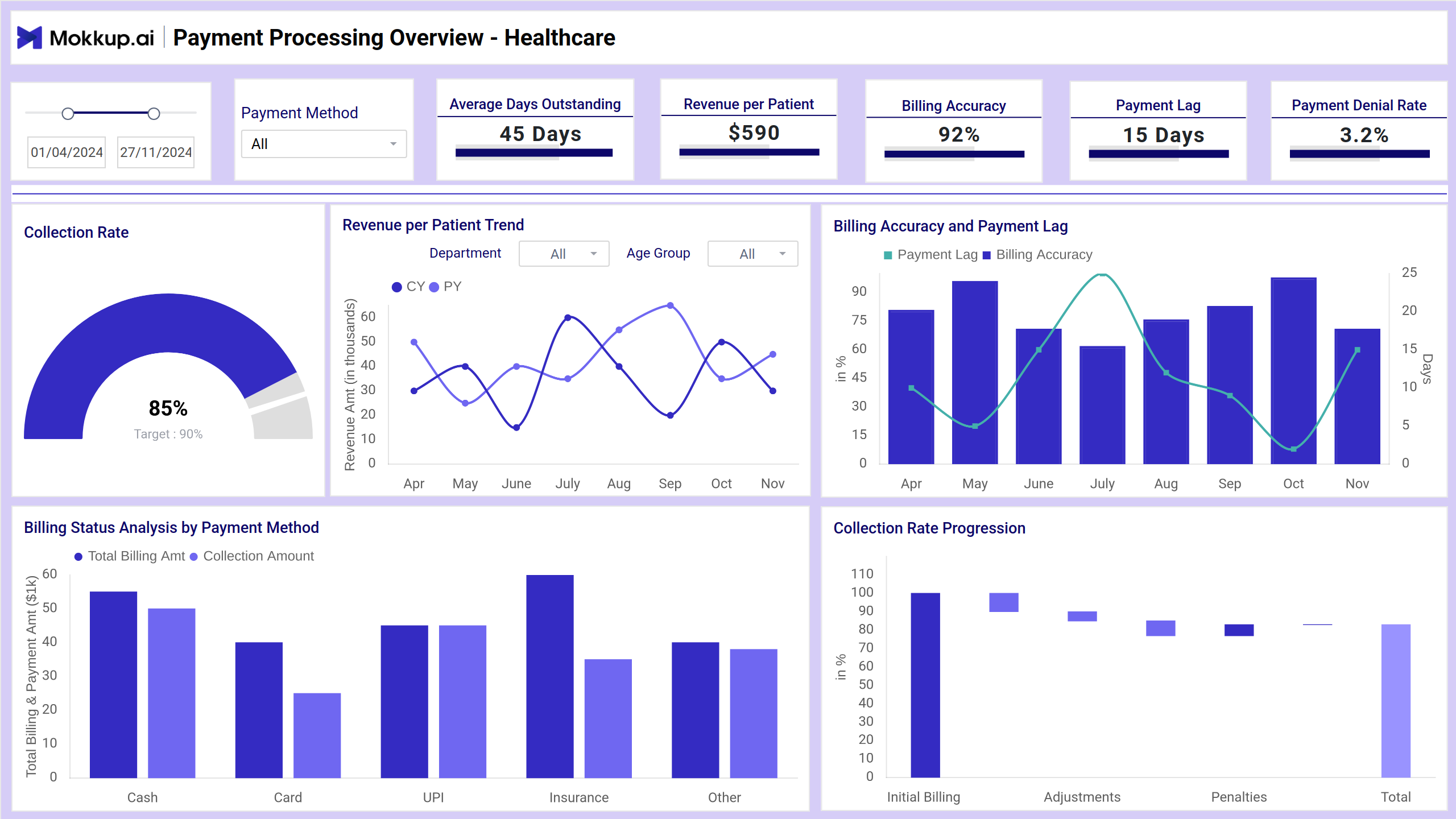
The Healthcare Payment Dashboard wireframe clearly shows revenue cycles, showing billed amounts, collections, and outstanding payments in one place. This template is tailored for finance teams and administrators. It helps monitor claim approvals, payment timelines, and payer performance, making it easier to spot delays, reduce denials, and improve cash flow in healthcare operations.
How to Analyze Data in Healthcare Payment Dashboards
Analyzing Mokkup.ai Healthcare Finance Dashboard helps identify billing inefficiencies, reduce delays, and improve overall financial performance in hospitals or clinics. Here’s how to approach it:
- Monitor collection rate and payment lag to assess how quickly and efficiently payments are processed. Use waterfall and combo charts to spot bottlenecks or drops in performance.
- Check billing accuracy and denial rate to detect errors in invoices or claim submissions. High denial trends often point to incorrect documentation or mismatches with payer policies.
- Review revenue per patient trends across departments or age groups using line charts. This helps uncover which services are most profitable or need adjustment.
- Compare payment methods (cash, UPI, insurance, etc.) using donut and bar charts to see which methods bring in the most revenue and where delays occur.
How to Create a Healthcare Payment Dashboard
You don’t need to build your report from scratch—just start with a ready-to-use sample Healthcare Payment Analysis dashboard template from Mokkup. Add in your data and export it however you like. Here’s how to do it:
1. Create or Log in to Your Mokkup Account
Start by signing up on Mokkup.ai using your email. Already have an account? Just log in, and you’re good to go.
2. Choose and Customize Your Dashboard Template
Find the Healthcare Payment Analysis in the Templates section. Use the drag-and-drop editor to adjust KPIs, edit filters, or add elements based on your data.
3. Export to Your BI Tool
Once your dashboard wireframe is ready, use the BI Tool Export feature to send it directly to Power BI or Tableau for further analysis and enhancements. You can also download the dashboard as a PDF, PNG, or JPEG, embed it on a platform, or invite your team to collaborate.
Note: This is a Pro template. To use and customize this dashboard wireframe, you’ll need a Pro subscription on Mokkup. Upgrade anytime to unlock full access.
Benefits of Healthcare Payment Dashboards
Healthcare Payment Dashboards offer financial clarity and streamline revenue cycle management analytics. Here are the key benefits:
- Improved Cash Flow Management: Track payments and outstanding balances in real-time to avoid delays in revenue collection.
- Faster Claim Resolution: Identify claim denials and bottlenecks early to speed up approvals and reduce rework.
- Better Financial Decision-Making: Use accurate billing and payment data to forecast income, plan budgets, and allocate resources efficiently.
- Enhanced Payer Performance Tracking: Monitor how different insurers perform regarding claim approvals, payment time, and consistency.
- Increased Transparency: Give stakeholders a clear view of financial health with easy-to-read visuals and KPIs.
- Reduced Administrative Overhead: Automated dashboards minimize manual tracking and reporting, saving staff time and effort.
These dashboards transform complex payment data into actionable insights for finance teams and healthcare providers. By using them, organizations can ensure timely collections, reduce revenue leakage, and improve overall financial performance.
KPIs to Track in Healthcare Payment Dashboards
Tracking the right KPIs helps healthcare teams improve revenue cycles, reduce delays, and optimize billing efficiency. Here are key metrics to monitor:
- Collection Rate: Measures how much of the billed amount has been successfully collected. A high rate indicates effective collection strategies.
- Average Days Outstanding: Tracks the average time taken to receive payment. Shorter times mean faster revenue turnaround.
- Revenue per Patient: Shows the average income generated per patient, helping assess profitability across services or departments.
- Billing Accuracy: Indicates how many invoices are billed correctly. Fewer errors mean fewer denials and faster collections.
- Payment Lag: Measures the delay between invoicing and actual payment. Helps pinpoint where the process slows down.
- Denial Rate: Tracks the percentage of denied claims. A high rate suggests issues with documentation, coding, or payer requirements.
Frequently Asked Questions
Q1. What is a Healthcare Payment Dashboard?
It’s a visual tool that tracks billing, collections, payment delays, and claim denials to improve financial performance in healthcare settings.
Q2. Who uses this dashboard?
Finance teams, billing staff, and healthcare administrators use it to monitor revenue cycles and optimize payment processes.
Q3. What are the most important metrics to track?
Key metrics include collection rate, average days outstanding, billing accuracy, denial rate, and revenue per patient.