What is a Facility Space Management Dashboard?
A facility space management dashboard template monitors and optimizes the use of rooms and workspaces in offices, schools, or any managed environment. It uses data from occupancy sensors, bookings, and check-ins to display how spaces are used in real time. This type of dashboard is crucial for organizations that aim to improve efficiency through room occupancy tracking and office room utilization report indicators.
How to Create a Facility Space Management Dashboard
You don’t need to build your report from scratch—just start with a ready-to-use Facility Space Management dashboard template from Mokkup. Add in your data and export it however you like. Here’s how to do it:
1. Create or Log in to Your Mokkup Account
Start by signing up on Mokkup.ai using your email. If you already have an account, just log in, and you’ll be good to go.
2. Choose and Customize Your Dashboard Template
Find the Facility Space Management Dashboard template in the Templates section. Use the drag-and-drop editor to adjust KPIs, edit filters, or add elements based on your data.
3. Export to Your BI Tool
Once your dashboard wireframe is ready, use the BI Tool Export feature to send it directly to Power BI or Tableau for further analysis and enhancements. You can also download the dashboard as a PDF, PNG, or JPEG, embed it on a platform, or invite your team to collaborate.
Note: This is a Pro template. You’ll need a Pro subscription on Mokkup to use and customize this dashboard wireframe. Upgrade anytime to unlock full access.
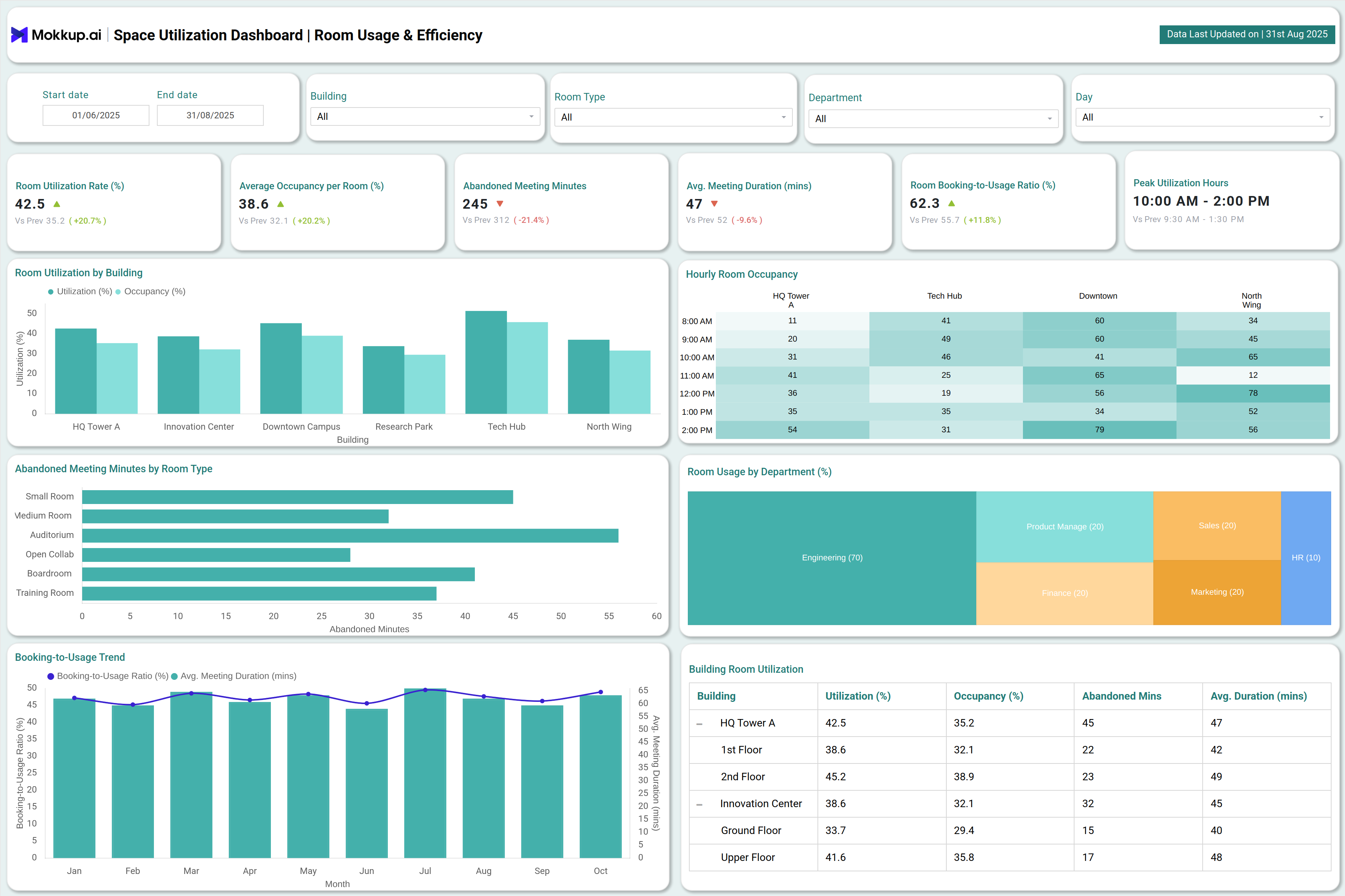
Facility Space Management Dashboard Example
The dashboard wireframe offers clear visualizations such as bar charts showing meeting room usage stats, occupancy heatmaps, trend graphs, and KPIs like utilization rates, abandoned meeting minutes, and average occupancy per room. For example, a dashboard might display:
- Hourly occupancy rates for each building
- Breakdown of space usage by departments or teams
- Abandoned meeting minutes to highlight underutilized areas
How to Analyze Data in Facility Space Management Dashboards
Analyzing data in a facility space management dashboard template becomes easier when you focus on the right visuals and KPIs. Here’s what to look for:
- Meeting Room Usage Statistics: Bar charts help track how frequently meeting rooms are being used and compare usage across different time periods.
- Occupancy Heatmaps: Heatmaps quickly highlight patterns of room occupancy, making it easy to identify peak and off-peak times.
- Trend Graphs: Trend lines show changes in space utilization over time, helping you understand long-term usage patterns.
- Utilization KPIs: Metrics like utilization rates, abandoned meeting minutes, and average occupancy per room provide a comprehensive view of space efficiency.
- Breakdown by Departments or Teams: Detailed usage data by departments or classrooms reveals how different groups are utilizing spaces.
- Abandoned Meeting Minutes: Pinpoint underutilized areas by analyzing no-shows or unused booked time.
- Energy and Cost Tracking: Pair occupancy data with energy consumption and operational costs to evaluate both efficiency and sustainability.
Benefits of Facility Space Management Dashboards
Facility dashboards deliver measurable value by enabling facility managers and administrators to:
- Boost room utilization through active room occupancy tracking
- Reduce operational costs by finding and repurposing underused spaces
- Enhance employee satisfaction by providing access to properly managed work environments
- Improve sustainability with tracking of energy consumption and space optimization savings
- Enable cross-department planning for future space needs using real usage data
These benefits contribute to smoother operations and smarter decision-making for any organization.
KPIs to Track in Facility Space Management Dashboards
Effective dashboards focus on KPIs that drive real improvements:
- Room Utilization Rate (%): Measures the percentage of time rooms are used versus available.
- Average Occupancy: Tracks the number of occupants per room, helping right-size room assignments.
- Abandoned Meeting Minutes: Shows lost time due to no-shows and underutilization.
- Booking-to-Usage Ratio (%): Highlights booked time versus actually used, surfacing inefficiencies.
- Energy Consumption per Room: Key for sustainability and cost reduction.
- No-show Rate (%): Directly impacts resource allocation and utilization planning.
- Peak Utilization Hours: Helps allocate resources or offer incentives during off-peak times.
These metrics are essential for an actionable facility space management dashboard that drives real workplace improvements.
Frequently Asked Questions
Q1.Who uses facility space management dashboards?
Facility managers, office administrators, workplace experience teams, and educational institutions aiming to optimize classroom utilization overview.
Q2.What’s the difference between occupancy tracking and utilization analytics?
Occupancy tracking records room presence, while utilization analytics merge time, attendance, and booking data for deeper insights.
Q3.How do facility space management dashboards help reduce costs?
Dashboards allow organizations to repurpose or optimize spaces by identifying underutilized rooms and tracking energy consumption, directly reducing unnecessary operational expenses.