
What is an Energy Distribution Dashboard?
An Energy Distribution Dashboard is a utility analytics tool that provides a complete view of energy output, losses, downtime, renewable share, and customer impact. It consolidates KPIs such as Total Energy Output, Distribution Loss Percentage, Grid Downtime, Renewable Energy Share, Grid Efficiency, and Customer Outage Count into a single interface. This helps energy providers track performance, improve efficiency, and minimize power outages. By using an energy dashboard, utility managers can make data-driven decisions to ensure reliable and sustainable energy distribution.
How To Create Energy Distribution Dashboards
You don’t need to build your report from scratch—just start with a ready-to-use sample Energy Distribution dashboard template from Mokkup. Plug in your own data and export it however you like. Here’s how to do it:
1. Create or Log in to Your Mokkup Account
Start by signing up on Mokkup.ai using your email. Already have an account? Just log in, and you’re good to go.
2. Choose and Customize Your Dashboard Template
Find the Energy distribution dashboard template in the Templates section. Use the drag-and-drop editor to adjust KPIs, edit filters, or add elements based on your data.
3. Export to Your BI Tool
Once your dashboard is ready, use the BI Tool Export feature to send it directly to Power BI or Tableau for further analysis and enhancements. You can also download the dashboard as a PDF, PNG, or JPEG, embed it on a platform, or invite your team to collaborate.
Note: This is a Pro template. To use and customize this dashboard wireframe, you’ll need a Pro subscription on Mokkup. Upgrade anytime to unlock full access.
Energy Distribution Dashboard Example
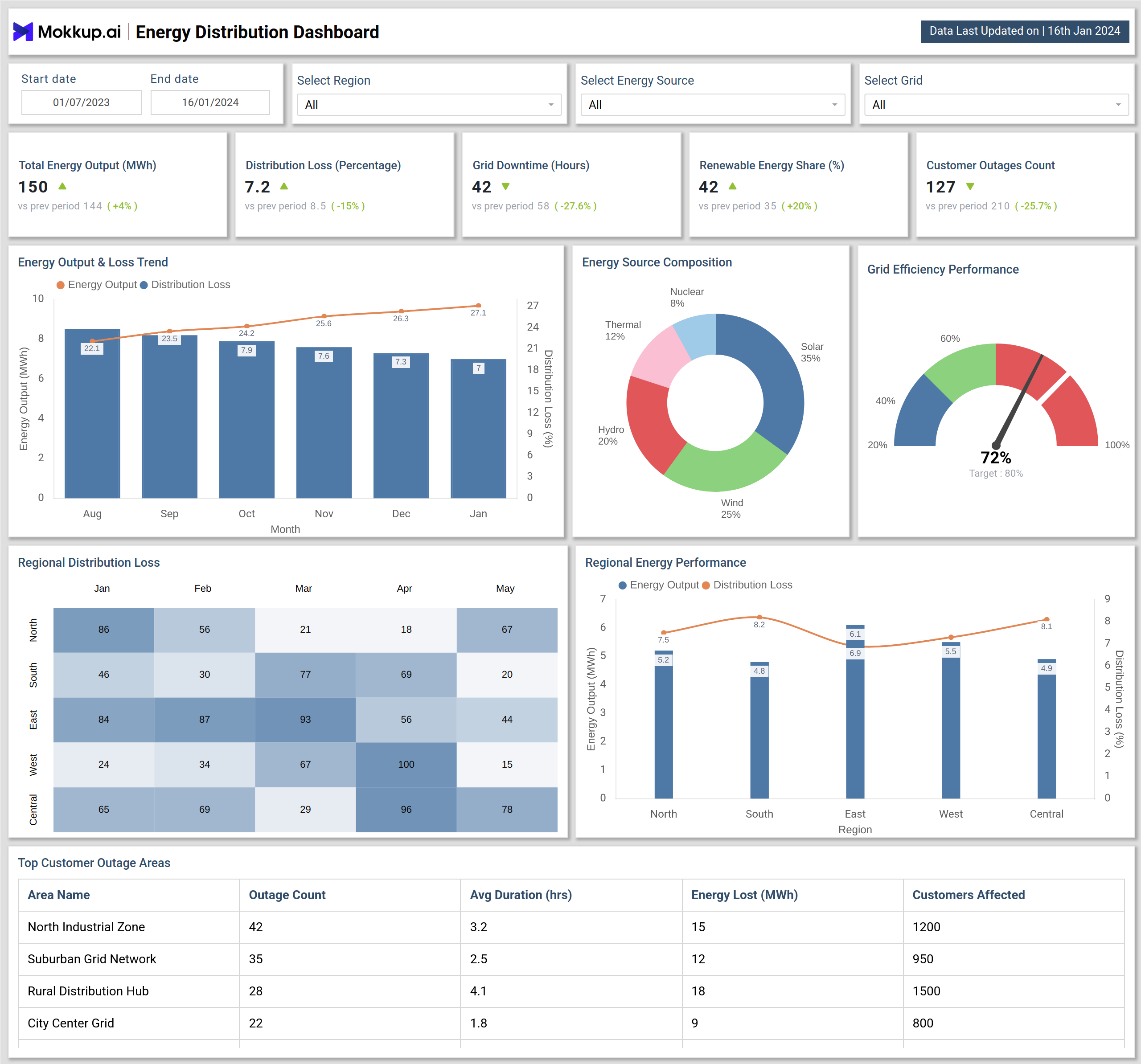
Create your personalized energy KPI dashboard, bringing all of your metrics into one structured view. The Mokkup Energy Distribution Dashboard wireframe includes visualizations such as Energy Output & Loss Trend, Energy Source Composition, Grid Efficiency Performance, Regional Distribution Loss, Regional Energy Performance, and Top Customer Outage Areas. Filters for date, region, energy source, and grid allow users to tailor analysis to specific needs. Once the data is added, this dashboard can be exported to BI tools like Power BI or Tableau for deeper analysis, making it a practical solution for utilities seeking to improve efficiency and reliability.
How to Analyze Data in Energy Distribution Dashboard
To effectively use the Energy Distribution Dashboard, follow these steps:
- Track Energy Output & Distribution Loss Trends to measure energy efficiency over time.
- Review Grid Efficiency Performance against target thresholds to detect underperforming grids.
- Analyze Regional Distribution Loss to identify problem areas and prioritize corrective measures.
- Use Energy Source Composition to evaluate renewable versus non-renewable energy mix.
- Monitor Customer Outages Count and Duration to improve service reliability and customer satisfaction.
- Compare Regional Energy Performance to assess strengths and weaknesses across areas.
- Benchmark current data against previous periods to measure progress in reducing losses and downtime.
By analyzing data this way, utilities can reduce outages, improve efficiency, and accelerate renewable energy adoption.
Benefits of Energy Distribution Dashboard
An Energy Distribution Dashboard provides several advantages for utilities and energy providers:
- Improve Efficiency: Track energy output and distribution losses in real time.
- Increase Transparency: Share grid performance data across departments.
- Enhance Reliability: Monitor grid downtime and outages to improve response time.
- Support Sustainability: Measure renewable energy share and track progress toward clean energy goals.
- Regional Insights: Compare performance across regions to identify weak areas.
Overall, this dashboard simplifies energy performance tracking and helps utilities deliver more reliable and efficient energy to customers.
KPIs to Track in the Energy Distribution Dashboard
A strong Energy Distribution Dashboard tracks key KPIs including:
- Total Energy Output (MWh): Monitors energy generated and distributed.
- Distribution Loss (%): Tracks energy lost during transmission and distribution.
- Grid Downtime (Hours): Measures total hours of outages across grids.
- Renewable Energy Share (%): Shows the percentage of energy from solar, wind, hydro, and other renewable sources.
- Customer Outages Count: Captures the total number of outage incidents impacting customers.
- Grid Efficiency Performance (%): Measures how efficiently the grid meets demand.
By monitoring these KPIs, energy providers can improve grid reliability, optimize operations, and enhance customer satisfaction.
Frequently Asked Questions
1. Why is an Energy Distribution Dashboard important?
An Energy Distribution Dashboard is important because it provides real-time visibility into grid performance, energy losses, downtime, and customer outages. It helps utility providers improve efficiency, reduce distribution losses, and ensure reliable service.
2. What KPIs should be included in an Energy Distribution Dashboard?
The most important KPIs include Total Energy Output (MWh), Distribution Loss (%), Grid Downtime (Hours), Renewable Energy Share (%), Customer Outages Count, and Grid Efficiency Performance (%). These metrics give a complete picture of grid health and operational performance.
3. Can this dashboard track renewable energy performance?
Yes. The dashboard includes Renewable Energy Share (%) and Energy Source Composition charts to track solar, wind, hydro, nuclear, and thermal energy contributions. This helps utilities monitor their clean energy goals.