
What Is a Community College Student Retention & Demographics Dashboard?
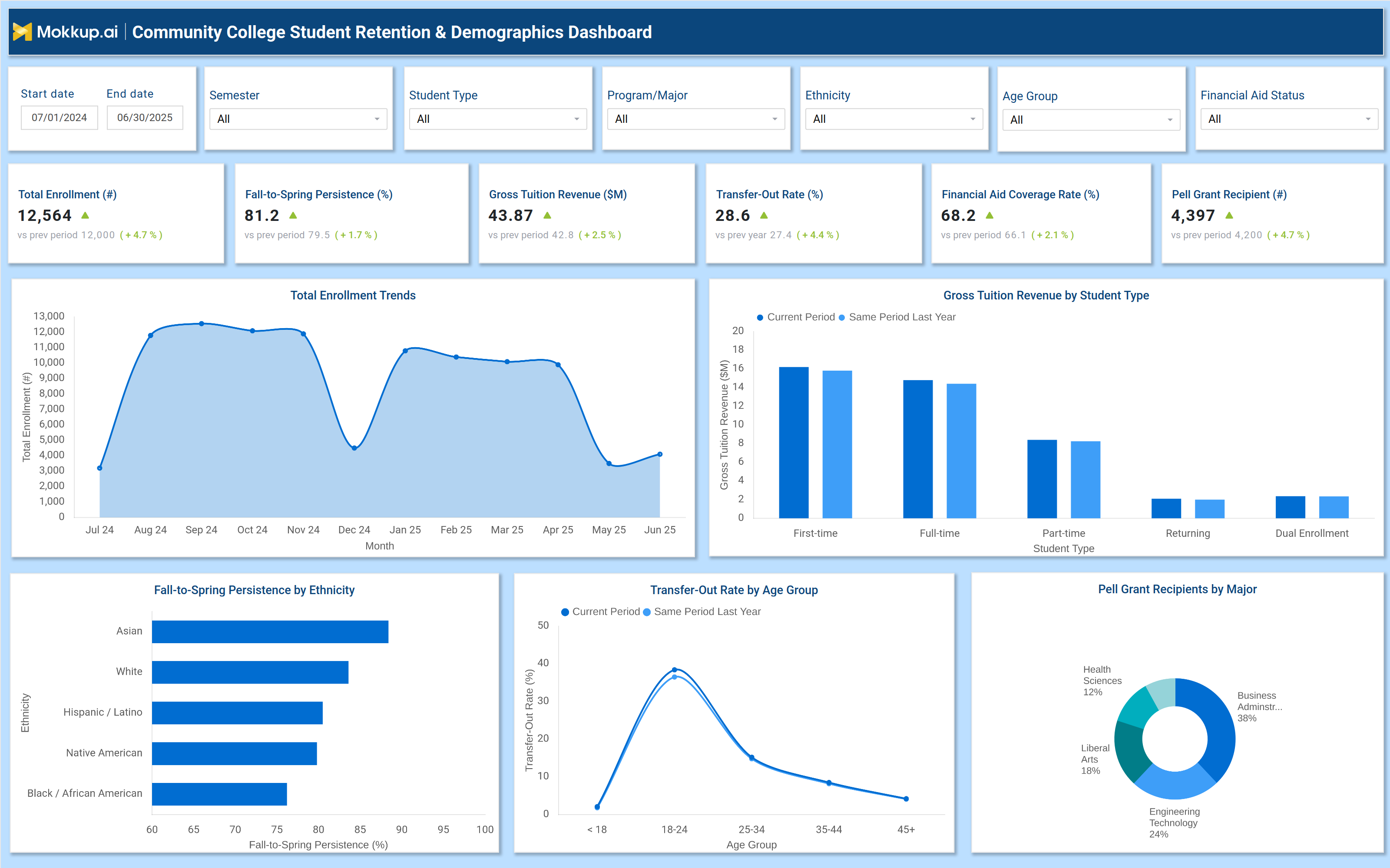
A financial aid tracking dashboard is a centralized analytics tool that tracks enrollment trends, student success metrics, and demographic breakdowns to improve institutional decision-making. It consolidates data on persistence rates, financial aid distribution, transfer-out trends, and student demographics into a single, interactive interface. Administrators use this student success metrics dashboard for community colleges to identify at-risk populations, optimize, and implement targeted interventions. By analyzing enrollment and retention data visualization for colleges and institutions can reduce dropout rates, improve graduation outcomes, and enhance financial sustainability.
How to Create a Community College Student Retention & Demographics Dashboard
You don’t need to build your report from scratch, just start with a ready to use dashboard template from Mokkup. Add in your data and export it however you like. Here’s how to do it:
1. Create or Log in to Your Mokkup Account
Start by signing up on Mokkup.ai using your email. If you already have an account, just log in, and you’ll be good to go.
2. Choose and Customize Your Dashboard Template
Find the Community College Student Retention & Demographics Dashboard template in the Templates section. Use the drag and drop editor to adjust KPIs, edit filters, or add elements based on your data.
3. Export to Your BI Tool
Once your dashboard wireframe is ready, use the BI Tool Export feature to send it directly to Power BI or Tableau for further analysis and enhancements. You can also download the dashboard as a PDF, PNG, or JPEG, embed it on a platform, or invite your team to collaborate.
Note: This is a Pro template. You’ll need a Pro subscription on Mokkup to use and customize this dashboard wireframe. Upgrade anytime to unlock full access.
Community College Student Retention & Demographics Dashboard Example
A well-designed enrollment trends reporting dashboard includes filters for date ranges, student types, programs, ethnicity, age groups, and financial aid status. Key metrics displayed in performance tiles include total enrollment, fall to spring persistence rates, gross tuition revenue, transfer out rates, financial aid coverage, and Pell Grant recipients. Trend charts compare current enrollment against historical data, while bar graphs break down persistence rates by ethnicity. A line chart tracks transferout rates across age groups, and a pie chart visualizes Pell Grant distribution by major. These components provide a higher education student demographics reporting tool that helps administrators monitor retention trends, assess financial aid impact, and refine student support strategies.
How to Analyze Data in a Community College Student Retention & Demographics Dashboard
Here is how you can analyze data from this dashboard:
- Review total enrollment trends to assess growth or decline in student intake.
- Compare fall-to-spring persistence rates by ethnicity, age, and program to identify at-risk groups.
- Monitor gross tuition revenue to evaluate financial health and enrollment stability.
- Track transferout rates by age group to detect early departure patterns.
- Analyze financial aid coverage to ensure equitable distribution of resources.
- Examine Pell Grant recipient data by major to assess financial need across programs.
- Compare current metrics with historical data to measure progress in retention efforts.
Benefits of a Community College Student Retention & Demographics Dashboard
The following are the benefits of using this dashboard:
- Improves student retention by identifying at-risk populations early.
- Enhances financial planning with tuition revenue and aid distribution insights.
- Supports data-driven interventions for struggling student groups.
- Optimizes resource allocation by tracking enrollment and persistence trends.
- Strengthens institutional reporting with automated demographic and retention analytics.
- Reduces dropout rates through targeted support programs.
- Increases transparency for administrators, faculty, and policymakers.
KPIs to Track in a Community College Student Retention & Demographics Dashboard
The following key KPIs can be tracked by using such a Student Demographics Analytics dashboard:
- Total Enrollment (count): Measures overall student intake and institutional growth.
- Fall to Spring Persistence Rate (%): Tracks the percentage of students who return for the next semester.
- Gross Tuition Revenue ($M): Evaluates financial health based on student enrollment.
- Transfer Out Rate (%): Identifies students leaving for other institutions.
- Financial Aid Coverage Rate (%): Assesses the proportion of students receiving aid.
- Pell Grant Recipients (count): Monitors financial need among the student population.
Frequently Asked Questions
1. Who should use a community college retention dashboard?
Administrators, student affairs teams, financial aid officers, and institutional researchers.
2. What data sources feed into this student demographics analytics dashboard?
Student information systems (SIS), financial aid databases, and enrollment records.
3. How does a higher education persistence dashboard help community colleges?
It provides data-driven insights to improve persistence rates, optimize financial aid, and reduce dropout rates.