
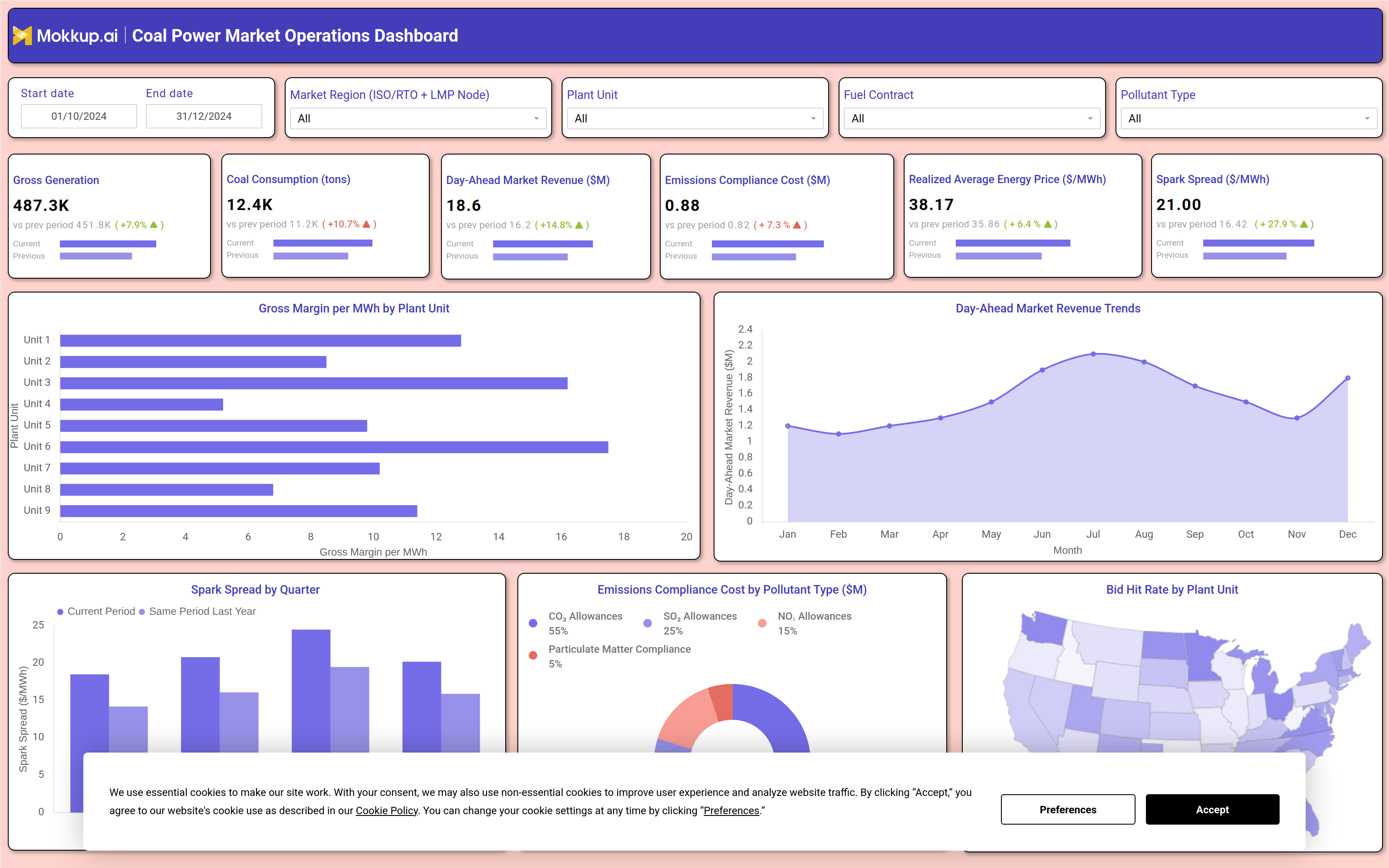
What is a Coal Power Market Operations Dashboard?
The Coal Power Market Operations Dashboard is a wireframe template built for coal generation and market operations teams who need to track plant output, fuel usage, and market revenue performance in one connected view. It brings together generation volume, coal consumption, day-ahead market revenue, emissions compliance cost, realized energy pricing, and spark spread so plant managers, market traders, and compliance teams are not switching between separate systems to understand how a plant is performing against the market. This coal power market operations dashboard is built for teams managing multiple generating units across different market regions, with filters for market region, plant unit, fuel contract, and pollutant type. Trading desks use the day-ahead market revenue tracking dashboard view to line up bid performance against realized energy prices, while compliance teams reference the same filters to isolate cost by pollutant category before a reporting deadline.
How to Create a Coal Power Market Operations Dashboard
You don't need to build your report from scratch, just start with a ready-to-use dashboard template from Mokkup. Add in your data and export it however you like. Here's how to do it:
1. Create or Log in to Your Mokkup Account
Start by signing up on Mokkup.ai using your email. If you already have an account, just log in, and you'll be good to go.
2. Choose and Customize Your Dashboard Template
Find the Coal Power Market Operations Dashboard template in the Templates section. Use the drag-and-drop editor to adjust KPIs, edit filters, or add elements based on your data.
3. Export to Your BI Tool
Once your dashboard wireframe is ready, use the BI Tool Export feature to send it directly to Power BI or Tableau for further analysis and enhancements. You can also download the dashboard as a PDF, PNG, or JPEG, embed it on a platform, or invite your team to collaborate.
Note: This is a Pro template. You'll need a Pro subscription on Mokkup to use and customize this dashboard wireframe. Upgrade anytime to unlock full access.
Coal Power Market Operations Dashboard Example
A coal plant operations manager or market analyst opens the Coal Power Market Operations Dashboard at the start of a trading day to understand how the fleet performed against the market and where cost pressure is building. Filtering by market region and plant unit narrows the view to the segment they are accountable for, whether a single unit or an entire fleet.
From there, the dashboard lets managers compare generation output against coal consumption to judge how efficiently fuel is being converted into revenue and to see whether the current period is trending ahead of or behind the same period last year. Traders can identify which plant units are producing the strongest margin per megawatt-hour and prioritize dispatch decisions accordingly, while also using the dashboard as a spark spread monitoring tool for power plants to judge whether current market prices justify running a unit versus holding it offline. Reviewing revenue trends across the year helps teams anticipate seasonal demand shifts and plan fuel procurement and contract negotiations ahead of tighter pricing windows.
Compliance officers use the same dashboard to track how emissions-related costs are distributed across pollutant categories and flag any unit whose compliance cost is rising faster than its output justifies. Altogether, this coal power market operations dashboard helps generation, trading, and compliance teams align around a shared view of plant performance, so decisions about dispatch, fuel contracts, and emissions spending are made with the full market picture in front of them, not from fragmented reports.
How to Analyze Data in a Coal Power Market Operations Dashboard
Here is how you can analyze data from this dashboard:
- Analyze regional performance: Filter by market region to evaluate performance at a specific pricing node.
- Compare margin trends: Review the Spark Spread by Quarter chart against the same period last year to identify margin shifts.
- Evaluate plant profitability: Use the plant unit filter to analyze gross margin per MWh for an individual generating unit.
- Monitor market revenue: Track the day-ahead market revenue trend month over month to identify seasonal demand changes.
- Assess compliance costs: Review emissions compliance costs by pollutant type to determine which category is driving spending.
- Measure bidding performance: Compare bid hit rates by region with realized energy prices to evaluate bidding effectiveness.
- Compare fuel efficiency: Apply the fuel contract filter to assess coal consumption efficiency across different contract types.
- Support dispatch decisions: Use the spark spread monitoring view to determine whether a generating unit should be dispatched or kept offline.
Benefits of a Coal Power Market Operations Dashboard
The following are the benefits of using this dashboard:
- Centralize market operations: Combine generation, fuel, revenue, and emissions data into a single coal power market operations dashboard.
- Speed up dispatch planning: Monitor day-ahead market revenue in one view instead of relying on manual spreadsheet analysis.
- Improve margin analysis: Track gross margin per MWh across plant units to compare operational profitability.
- Reduce reporting effort: Eliminate manual reconciliation between fuel consumption and generation output across multiple units.
- Monitor compliance costs: Give compliance teams clear visibility into emissions costs by pollutant category before reporting deadlines.
- Benchmark trading performance: Compare spark spread performance with the previous year without exporting data for manual analysis.
KPIs to Track in a Coal Power Market Operations Dashboard
The following key KPIs can be tracked by using this gross margin per MWh analysis dashboard:
- Gross Generation — total electricity output produced across all plant units in the selected period.
- Coal Consumption (tons) — the volume of coal burned to produce that generation, used to judge fuel efficiency.
- Day-Ahead Market Revenue ($M) — revenue earned from energy sold into the day-ahead market.
- Emissions Compliance Cost ($M) — powers emissions compliance cost tracking by pollutant type so compliance teams can flag the category driving spend.
- Realized Average Energy Price ($/MWh) — the actual price achieved per megawatt-hour sold into the market.
- Spark Spread ($/MWh) — the margin between energy price and fuel cost, a core profitability signal for this dashboard.
- Gross Margin per MWh — profit per megawatt-hour after fuel and emissions costs. Higher margins improve dispatch decisions and plant profitability.
- Bid Hit Rate — percentage of energy bids accepted by the market. Indicates bidding effectiveness and market competitiveness.
Frequently Asked Questions
1. What data does the Coal Power Market Operations Dashboard track?
It tracks generation output, coal consumption, day-ahead market revenue, emissions compliance cost, realized energy price, and spark spread, along with chart-level views for gross margin per MWh and bid hit rate by plant unit. All of these can be filtered by market region, plant unit, fuel contract, and pollutant type.
2. Can I customize this dashboard template for my own coal plant data?
Yes. The dashboard wireframe is built in Mokkup and can be customized with the drag-and-drop editor to match your plant units, market regions, and fuel contracts before export to Power BI or Tableau.
3. Is the bid hit rate tracking dashboard template useful for trading desks specifically?
Yes, the bid hit rate tracking dashboard template view shows how often submitted bids clear at market price across plant units and regions, which trading desks use to refine bidding strategy going forward.