What is a Coal Power Plant Executive Insights Dashboard?
A coal power plant executive insights dashboard is a central analytics platform designed for decision-makers in the electric power utilities sector. It provides a consolidated view of performance metrics that reflect plant efficiency, operational stability, and financial outcomes. This coal power plant performance dashboard aggregates executive KPIs to simplify performance review and comparisons across plants. This executive insights dashboard for coal power plants combines production, cost, emission, and safety indicators into a single interface, allowing management teams to evaluate plant reliability and profitability at a glance. It helps identify trends, compare performance across units, and align business goals with operational efficiency. Within the enterprise analytics for coal power utilities, such dashboards play a critical role in bridging executive decisions with operational performance. They track key parameters like generation output, capacity utilization, return on assets, and emission intensity — all essential for maintaining competitive performance in the coal-based power generation industry.
How to Create a Coal Power Plant Executive Insights Dashboard
You don’t need to build your report from scratch—just start with a ready-to-use dashboard template from Mokkup. Add your data and export it as needed. Here’s how to do it:
1. Create or Log in to Your Mokkup Account
Start by signing up on Mokkup.ai using your email. If you already have an account, log in, and you’ll be all set.
2. Choose and Customize Your Dashboard Template
Find the Coal Power Plant Executive Insights Dashboard template in the Templates section. Use the drag-and-drop editor to adjust KPIs, edit filters, or add elements based on your data.
3. Export to Your BI Tool
Once your dashboard wireframe is ready, use the BI Tool Export feature to send it directly to Power BI or Tableau for further analysis and enhancements. You can also download the dashboard as a PDF, PNG, or JPEG, embed it on a platform, or invite your team to collaborate.
Note: This is a Pro template. You’ll need a Pro subscription on Mokkup to use and customize this dashboard wireframe. Upgrade anytime to unlock full access.
Coal Power Plant Executive Insights Dashboard Example
A coal-based power generation analytics dashboard provides executives and plant managers with a clear overview of how each unit performs in relation to key operational and financial objectives.
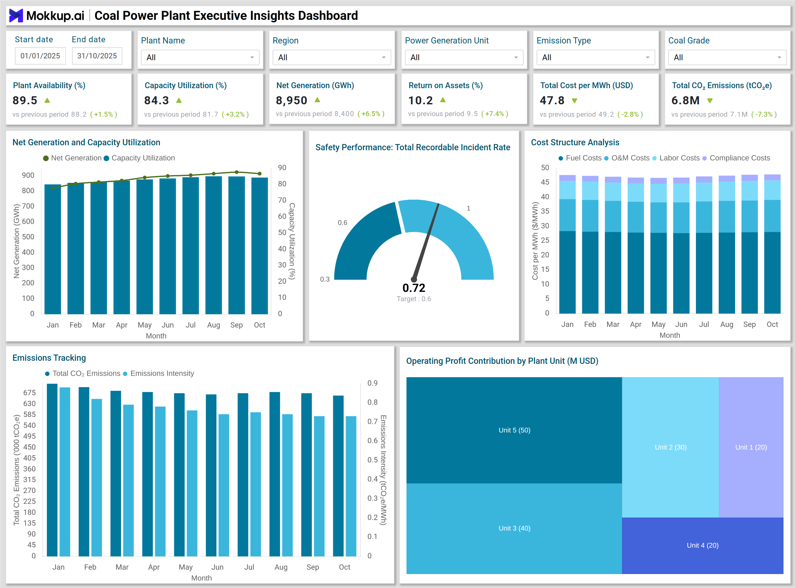
In a typical layout, KPI cards at the top display key metrics, including Plant Availability, Capacity Utilization, Net Generation, Return on Assets, Total Cost per MWh, and Total CO₂ Emissions. These KPIs set the foundation for quick assessment of performance trends.
These visual elements form a coal power generation KPI dashboard that links operational metrics with financial and environmental outcomes.
The visual section may include a Combo Chart (bar and line) comparing generation output versus the capacity utilization trend. This visual helps identify how efficiently the available capacity converts into energy generation. A Stacked Column Chart on Operating Cost Composition per MWh breaks down cost categories, helping pinpoint areas for potential savings.
A Line Chart showing Emissions and Intensity Trend enables tracking of environmental impact over time, while a Treemap visualizing Operating Profit Contribution by Plant Unit helps highlight which plant units are the strongest profit contributors. Finally, a Gauge Chart for Total Recordable Incident Rate (TRIR) offers visibility into safety performance, aligning workforce well-being with organizational priorities.
Together, these visuals present a comprehensive example of a coal power generation KPI dashboard, offering both operational depth and executive clarity.
How to Analyze Data in Coal Power Plant Executive Insights Dashboards
Here’s how plant managers and financial analysts can leverage the dashboard:
- Compare Generation vs. Utilization: Examine monthly output and utilization to measure how effectively plant capacity is being used. Identify underperforming units or maintenance gaps.
- Assess Cost Drivers: Use the operating cost composition chart to analyze cost elements per megawatt-hour (MWh) and identify inefficiencies in maintenance, labor, or fuel.
- Track Asset Efficiency: Review return on assets (ROA) trends to gauge how effectively investments in infrastructure and logistics are generating value.
- Monitor Emissions Performance: Correlate emission trends with generation data to assess progress in lowering intensity and achieving sustainability targets.
- Evaluate Profit Contribution: Use the treemap visualization to compare how each plant unit contributes to total profit and identify high-performing or low-yield units.
- Review Safety Indicators: Track TRIR metrics regularly to ensure safety programs are delivering measurable results and maintaining compliance standards.
Benefits of Coal Power Plant Executive Insights Dashboards
- Comprehensive Performance Visibility: Provides a unified view of operational, financial, and environmental metrics, enabling faster and more informed executive decision-making.
- Improved Operational Efficiency: Helps pinpoint performance bottlenecks, cost overruns, and underutilized capacity.
- Enhanced Profitability Tracking: Links financial outcomes to plant-level operations, enabling easier identification of profit drivers.
- Sustainability and Compliance Monitoring: Supports emission tracking and compliance reporting with clear visual indicators.
- Data-Driven Strategic Planning: Empowers executives to plan maintenance schedules, asset upgrades, and investment decisions using performance insights.
- Improved Workforce Safety Oversight: Tracks safety KPIs to ensure a safer and more productive plant environment.
KPIs to Track in Coal Power Plant Executive Insights Dashboards
- Plant Availability (%): Measures the proportion of time the plant is operational and ready for power generation.
- Capacity Utilization (%): Evaluates how efficiently installed capacity is used to generate electricity.
- Net Generation (GWh): Represents total power output delivered to the grid after accounting for internal consumption.
- Return on Assets (%): Indicates how effectively plant assets generate profit relative to their total value.
- Total Cost per MWh (USD): Summarizes all operating costs incurred for producing one megawatt-hour of power.
- Total CO₂ Emissions (tCO₂e): Quantifies total carbon dioxide emissions, supporting efforts to reduce emissions and achieve sustainability goals.
- Total Recordable Incident Rate (TRIR): Tracks workforce safety performance and incident frequency over a defined period.
Each of these KPIs provides essential insight into the health, efficiency, and profitability of coal power generation operations. Together, they form the analytical foundation of a coal power plant's operational performance metrics framework.
Frequently Asked Questions
Q1. Who uses a Coal Power Plant Executive Insights Dashboard?
Executives, plant managers, and financial analysts use it to monitor operational performance, costs, and asset efficiency across coal power facilities.
Q2. How often should dashboard metrics be reviewed?
Monthly reviews are recommended for strategic KPIs, while daily or weekly checks are suitable for operational indicators such as availability and utilization.
Q3. Why is TRIR included as a KPI?
Safety performance is critical in coal power plants. Tracking TRIR ensures focus on workforce safety and operational discipline.