
What is a Coal Power Plant Cost & Profitability Dashboard?
A Coal Power Plant Cost & Profitability Dashboard is a performance management tool used by electric power utilities to track, compare, and optimize the financial efficiency of coal-fired generation assets. It helps operations, finance, and asset managers understand how different cost components—such as fuel, maintenance, and operations—affect overall profitability. This dashboard brings together all primary financial metrics that define plant efficiency and cost control. It supports key decision-making by showing how expenses and revenues align with performance goals. Through visualized insights, utilities can identify which generating units deliver the highest returns and which cost areas need optimization. A coal power plant cost analysis dashboard is essential for utilities managing complex portfolios of generation units. It supports accurate benchmarking, better budgeting, and proactive cost management across thermal power operations. This dashboard supports coal power generation profitability metrics, quantifying unit-level returns and margin drivers.
How to Create a Coal Power Plant Cost & Profitability Dashboard
You don’t need to build your report from scratch—just start with a ready-to-use dashboard template from Mokkup. Add in your data and export it however you like. Here’s how to do it:
1. Create or Log in to Your Mokkup Account
Start by signing up on Mokkup.ai using your email. If you already have an account, just log in, and you’ll be good to go.
2. Choose and Customize Your Dashboard Template
Find the Coal Power Plant Cost & Profitability Dashboard template in the Templates section. Use the drag-and-drop editor to adjust KPIs, edit filters, or add elements based on your data.
3. Export to Your BI Tool
Once your dashboard wireframe is ready, use the BI Tool Export feature to send it directly to Power BI or Tableau for further analysis and enhancements. You can also download the dashboard as a PDF, PNG, or JPEG, embed it on a platform, or invite your team to collaborate.
Note: This is a Pro template. You’ll need a Pro subscription on Mokkup to use and customize this dashboard wireframe. Upgrade anytime to unlock full access.
Coal Power Plant Cost & Profitability Dashboard Example
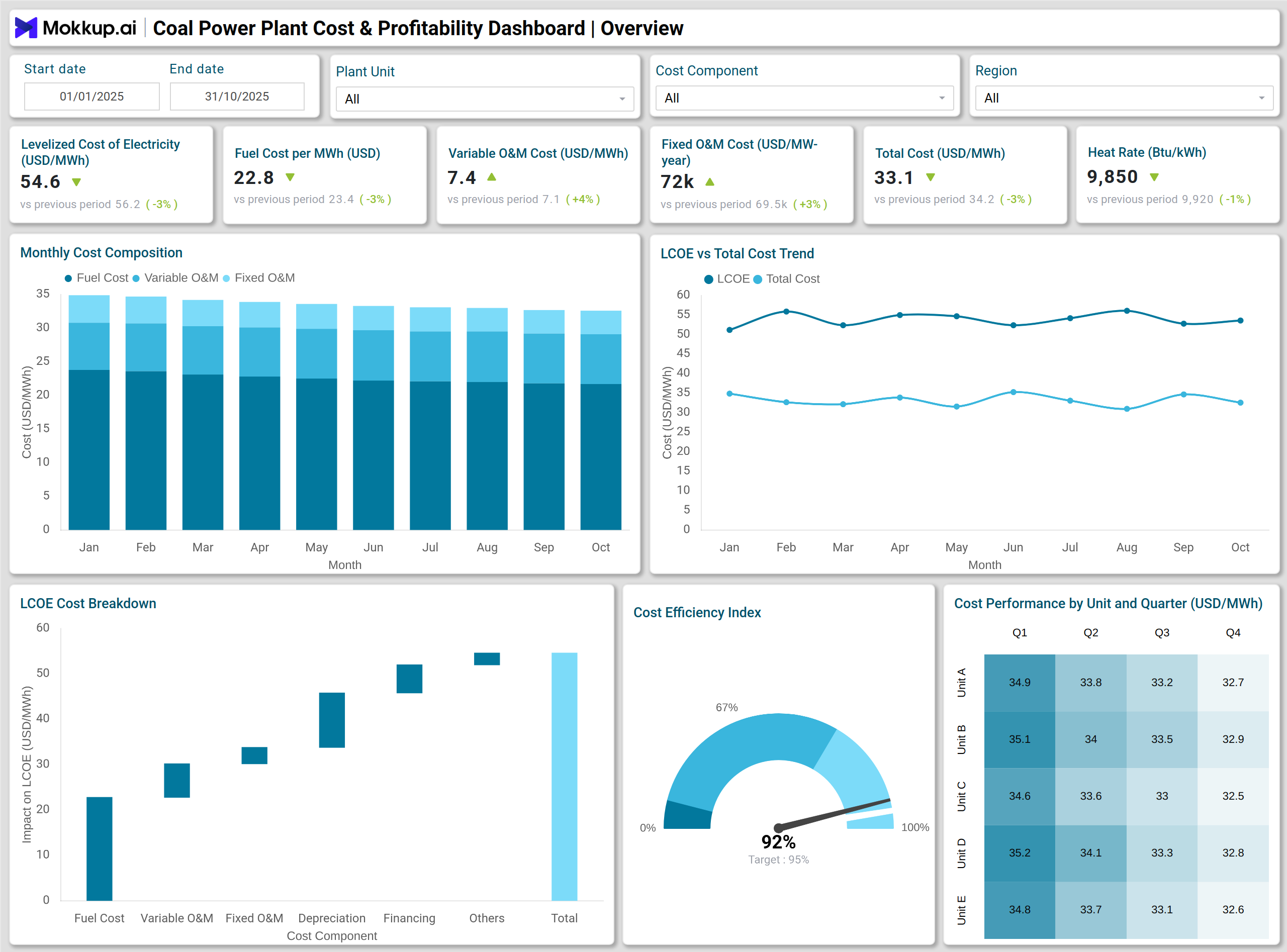
A financial performance dashboard for coal plants typically displays the cost and profit structure across multiple generating units. For example,
- Stacked Column Chart – Cost Breakdown by Component visualizes how fuel, variable O&M, and fixed O&M costs contribute to total generation cost.
- The Line Chart – LCOE and Total Cost Trend tracks how Levelized Cost of Electricity and total operating costs change month-over-month, helping analysts detect cost escalations or efficiency improvements.
- A Combo Chart (Bar + Line) – Revenue vs Profit Trend links revenue growth with profitability, showing how market prices and operating margins affect financial outcomes.
- Waterfall Chart – Revenue to Net Profit Bridge, explain how each cost driver reduces gross revenue down to net profit.
- Treemap – Expense Contribution by Cost Category
- Sankey Chart – Cash Flow Distribution further illustrates how cash inflows and outflows are distributed across the plant’s financial structure.
Teams use coal-fired power plant cost tracking tools on the dashboard to monitor fuel and O&M expense variances. Together, these visuals turn complex financial data into actionable insights for profitability monitoring in thermal power plants, ensuring that cost management decisions are backed by clear performance analytics.
How to Analyze Data in Coal Power Plant Cost & Profitability Dashboards
- Use the coal energy generation efficiency dashboard view to compare efficiency gains and fuel consumption per unit.
- Review LCOE and total cost variations to identify seasonal or operational cost shifts.
- Use profitability dashboards to perform profitability monitoring for thermal power plants across units and months.
- Use bar or donut charts to compare the cost and profitability of each generating unit.
- Monitor gauge charts to check if cost efficiency levels meet internal benchmarks.
- Analyze waterfall charts to understand how cost elements affect profit margins.
- Use heatmaps to evaluate how financial KPIs perform across different months or units.
- Compare plant performance against defined cost and profitability goals for long-term planning.
Benefits of Coal Power Plant Cost & Profitability Dashboards
- Comprehensive cost visibility: Provides clear insights into total and component-level generation costs.
- Improved financial control: Enables precise tracking of expenses, helping utilities manage budgets effectively.
- Profitability optimization: Identifies the most and least profitable plant units for focused operational improvements.
- Strategic decision support: Helps executives gain insights to align cost performance with revenue goals.
- Enhanced reporting accuracy: Simplifies financial reporting by consolidating key performance indicators in one view.
- Efficiency tracking: Supports continuous improvement by highlighting areas of fuel and O&M efficiency gains.
KPIs to Track in Coal Power Plant Cost & Profitability Dashboards
- Levelized Cost of Electricity (LCOE) – Measures the average total cost per unit of electricity generated.
- Total Cost per MWh – Summarizes all operational and maintenance costs for each megawatt-hour produced.
- Fuel Cost per MWh – Tracks the fuel expenditure associated with power generation.
- Variable O&M Cost per MWh – Evaluates maintenance expenses that vary with production output.
- Fixed O&M Cost per MW-year – Accounts for fixed maintenance costs independent of production levels.
- Capacity Utilization Rate – Measures how efficiently available generation capacity is used.
- Revenue per MWh – Represents income earned per unit of electricity sold.
Frequently Asked Questions
Q1. Why is a cost and profitability dashboard important for coal power utilities?
It helps financial and operational teams monitor total generation cost, evaluate efficiency, and ensure profitability targets are achieved across units.
Q2. How do utilities use this dashboard for decision-making?
Utilities use it to identify cost-saving opportunities, optimize maintenance spending, and benchmark profitability across generating units.
Q3. Can this dashboard be customized for other thermal power plants?
Yes. The same structure and KPIs can be tailored for natural gas or biomass-based generation facilities with similar cost metrics.
Q4. Which roles benefit most from this dashboard?
Financial analysts, plant managers, asset performance teams, and senior executives benefit from using it for both cost management and profitability assessment.