What is a CNG Station Lifecycle & ROI Dashboard?
The CNG Station Lifecycle & ROI Dashboard is a structured analytics template designed for energy infrastructure managers, fleet operators, and capital planning teams overseeing compressed natural gas fueling networks. It brings together station-level investment data, utilization rates, maintenance costs, and payback metrics into a single view, making CNG station lifecycle management dashboard operations far more traceable and accountable.
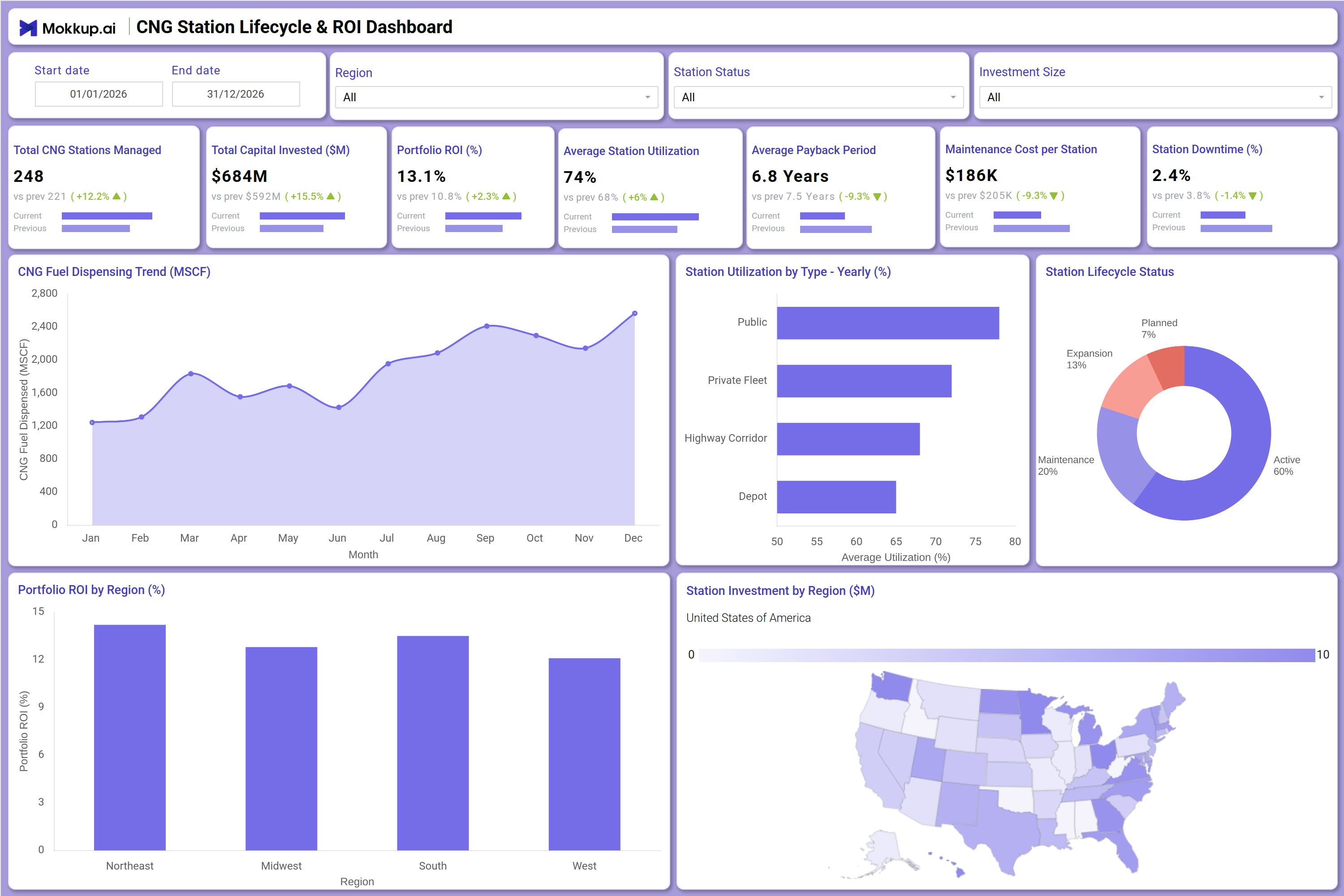
Teams can monitor Total Capital Invested, Portfolio ROI, Average Payback Period, and Station Downtime across their entire network using five configurable filters: Start Date, End Date, Region, Station Status, and Investment Size. By consolidating these metrics in one template, the dashboard supports natural gas station utilization by type decisions and helps leadership align capital deployment with performance expectations.
How to Create a CNG Station Lifecycle & ROI Dashboard
You don’t need to build your report from scratch, just start with a ready-to-use CNG Station Lifecycle & ROI dashboard template from Mokkup. Add in your data and export it however you like. Here’s how to do it:
1. Create or Log in to Your Mokkup Account
Start by signing up on Mokkup.ai using your email. If you already have an account, just log in, and you'll be good to go.
2. Choose and Customize Your Dashboard Template
Find the CNG Station Lifecycle & ROI Dashboard template in the Templates section. Use the drag-and-drop editor to adjust KPIs, edit filters, or add elements based on your data.
3. Export to Your BI Tool
Once your dashboard wireframe is ready, use the BI Tool Export feature to send it directly to Power BI or Tableau for further analysis and enhancements. You can also download the dashboard as a PDF, PNG, or JPEG, embed it on a platform, or invite your team to collaborate.
Note: This is a Pro template. You'll need a Pro subscription on Mokkup to use and customize this dashboard wireframe. Upgrade anytime to unlock full access.
CNG Station Lifecycle & ROI Dashboard Example
A capital planning manager at a CNG network operator opens this dashboard at the start of a quarterly review to assess whether their station portfolio is generating the returns projected during the investment approval stage. The top KPI row immediately surfaces whether Portfolio ROI is trending above or below the prior period and whether Average Payback Period has shifted, giving leadership the context they need before diving deeper into CNG station ROI tracking across individual regions. Moving down, the CNG Fuel Dispensing Trend chart allows operations teams to identify seasonal patterns in fuel throughput across the year, while the Station Utilization by Type chart reveals which station categories, including Public, Private Fleet, Highway Corridor, and Depot, are performing closest to capacity.
The Station Lifecycle Status donut and the Portfolio ROI by Region bar chart together help planners prioritize where expansion investment will deliver the highest return, supporting compressed natural gas station investment analysis at a regional and lifecycle stage level.
How to Analyze Data in a CNG Station Lifecycle & ROI Dashboard
Here is how you can analyze data from this dashboard:
- Filter by Region: Compare ROI and utilization across Northeast, Midwest, South, and West markets.
- Track Fuel Dispensing Trends: Monitor monthly throughput to identify early revenue risks.
- Compare Station Types: Analyze yearly utilization across public, fleet, corridor, and depot stations.
- Assess Regional ROI: Use the ROI chart to identify markets generating the strongest returns.
- Monitor Lifecycle Status: Review station status distribution across active, maintenance, expansion, and planned stages.
- Focus on Underperforming Stations: Filter by station status to identify sites needing capital or operational attention.
- Evaluate Capital Distribution: Use the regional investment map to compare spending against ROI performance.
- Track Cost vs Returns: Monitor payback period and maintenance costs to assess profitability.
Benefits of a CNG Station Lifecycle & ROI Dashboard
The following are the benefits of using this dashboard:
- Centralized Investment Visibility: Combines capital, ROI, and maintenance metrics in one dashboard.
- Improved ROI Tracking: Supports analysis of payback periods and operational performance.
- Reduced Reporting Effort: Prebuilt KPIs and charts simplify capital review processes.
- Regional Investment Insights: Guides infrastructure expansion with location-based performance analysis.
- Lifecycle Planning Support: Highlights station stages for operational and expansion planning.
- Better Investment Decisions: Aligns capital allocation with utilization and maintenance trends.
- Shared Performance View: Gives planners and operations teams a unified network-wide perspective.
KPIs to Track in a CNG Station Lifecycle & ROI Dashboard
The following key KPIs can be tracked by using this dashboard:
- Total CNG Stations Managed: Core count metric for this CNG station lifecycle management dashboard, tracking the total number of stations across the network.
- Total Capital Invested ($M): Measures cumulative capital deployed across all CNG stations, central to CNG portfolio return on investment dashboard analysis.
- Portfolio ROI (%): Quantifies the overall return generated from the station network relative to total investment, the primary CNG station ROI tracking metric.
- Average Station Utilization (%): Tracks mean utilization across all stations by type, supporting natural gas station utilization by type benchmarking.
- Average Payback Period (Years): Measures how long each station takes on average to recover its capital cost, key to compressed natural gas station investment analysis.
- Maintenance Cost per Station ($): Evaluates per-station operational expenditure against investment to assess net return and cost efficiency.
- Station Downtime (%): Tracks the percentage of time stations are unavailable, directly affecting throughput and the CNG fuel dispensing trend monitoring baseline.
Frequently Asked Questions
Q1. What types of organizations benefit most from the CNG Station Lifecycle & ROI Dashboard?
This dashboard is built for CNG network operators, fleet fuel managers, and energy infrastructure investment teams. It is particularly useful for organizations managing multiple stations across different regions and lifecycle stages.
Q2. Can this dashboard track performance differences across station types?
Yes. The Station Utilization by Type - Yearly (%) chart breaks down utilization across Public, Private Fleet, Highway Corridor, and Depot stations. Teams can compare performance across categories and adjust investment or operations accordingly.
Q3. Is this dashboard suitable for regional capital allocation planning?
Yes. The Portfolio ROI by Region bar chart and the Station Investment by Region map together support region-level investment analysis. Teams can identify which markets are generating the strongest returns and where capital reallocation is warranted.