
What is a CNG Gas Procurement & Compression Cost Dashboard?
The CNG Gas Procurement & Compression Cost Dashboard is a structured analytics template designed for fleet operations managers, procurement teams, and energy cost analysts who manage compressed natural gas supply chains. Built as a CNG gas procurement cost dashboard, it consolidates procurement spend, compression efficiency, supplier reliability, and total cost per gasoline gallon equivalent into a single view.
Teams use this template to track how procured gas costs, compression expenses, and contract-to-spot ratios interact to drive total fuel cost. By monitoring the gas procurement forecast vs actual variance alongside supplier on-time delivery performance, procurement leads can identify cost anomalies early and take corrective action before they affect operational budgets.
How to Create a CNG Gas Procurement & Compression Cost Dashboard
You don’t need to build your report from scratch, just start with a ready-to-use CNG Gas Procurement & Compression Cost dashboard template from Mokkup. Add in your data and export it however you like. Here’s how to do it:
1. Create or Log in to Your Mokkup Account
Start by signing up on Mokkup.ai using your email. If you already have an account, just log in, and you'll be good to go.
2. Choose and Customize Your Dashboard Template
Find the CNG Gas Procurement & Compression Cost Dashboard template in the Templates section. Use the drag-and-drop editor to adjust KPIs, edit filters, or add elements based on your data.
3. Export to Your BI Tool
Once your dashboard wireframe is ready, use the BI Tool Export feature to send it directly to Power BI or Tableau for further analysis and enhancements. You can also download the dashboard as a PDF, PNG, or JPEG, embed it on a platform, or invite your team to collaborate.
Note: This is a Pro template. You'll need a Pro subscription on Mokkup to use and customize this dashboard wireframe. Upgrade anytime to unlock full access.
CNG Gas Procurement & Compression Cost Dashboard Example
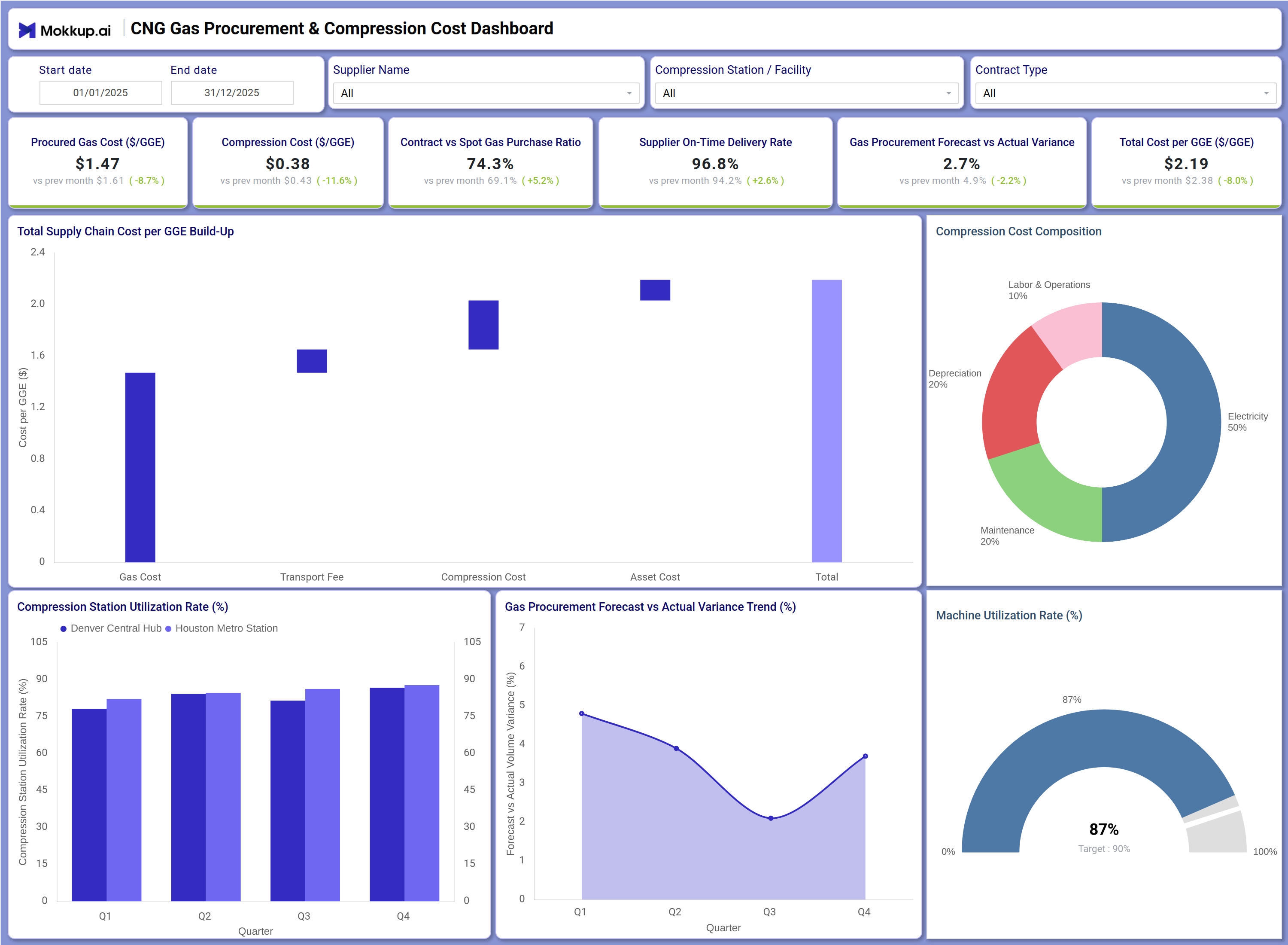
A procurement analyst at a CNG fleet operator opens this dashboard at the start of each month to assess whether fuel costs are trending within approved budget thresholds. The KPI row immediately surfaces whether the procured gas cost, compression cost per GGE, and total cost per GGE are moving in the right direction compared to the prior period. From here, the analyst can determine if the current contract vs spot gas purchase ratio is providing a cost advantage or whether exposure to spot pricing needs to be rebalanced.Moving into the visual section, the CNG supply chain cost analysis waterfall chart breaks down how each cost component — gas cost, transport fee, compression cost, and asset cost — stacks up to form the total cost per GGE. This view helps managers pinpoint which stage is driving cost increases without scanning multiple reports. The compression cost composition donut immediately shows whether electricity, depreciation, maintenance, or labor is the dominant compression expense driver.
The compression station utilization rate monitoring charts allow operations teams to compare quarterly performance across facilities such as Denver Central Hub and Houston Metro Station. If one station is consistently underutilizing capacity while another runs close to the machine utilization target, planners can redistribute load or schedule maintenance accordingly. The gas procurement forecast vs actual variance trend line shows whether procurement planning accuracy is improving quarter over quarter, which directly informs how much buffer stock or contract flexibility is needed.
How to Analyze Data in a CNG Gas Procurement & Compression Cost Dashboard
Here is how you can analyze data from this dashboard:
- Filter by Time Period: Compare procurement and compression costs across months or quarters.
- Evaluate Supplier Performance: Use the supplier filter to identify vendors with stronger delivery reliability.
- Analyze Facility Costs: Review hub-level supply chain costs by compression station or facility.
- Break Down Supply Chain Costs: Use the waterfall chart to identify rising cost components.
- Monitor Compression Expenses: Track electricity and depreciation share within compression costs.
- Assess Procurement Strategy: Compare contract vs spot purchase ratios to evaluate sourcing effectiveness.
- Compare Station Utilization: Analyze utilization rates across facilities to support load balancing decisions.
- Track Forecast Accuracy: Review forecast vs actual variance trends to improve procurement planning.
- Measure Equipment Efficiency: Monitor machine utilization against capacity targets.
Benefits of a CNG Gas Procurement & Compression Cost Dashboard
The following are the benefits of using this dashboard:
KPIs to Track in a CNG Gas Procurement & Compression Cost Dashboard
The following key KPIs can be tracked by using this dashboard:
- Procured Gas Cost ($/GGE): The core input in any CNG gas procurement cost dashboard — measures the average cost paid per gasoline gallon equivalent of natural gas sourced from suppliers.
- Compression Cost ($/GGE): Tracks the expense of compressing natural gas to CNG-grade pressure per GGE — essential for compression cost per GGE tracking and identifying efficiency losses.
- Contract vs Spot Gas Purchase Ratio (%): Measures the proportion of gas purchased under fixed contracts versus spot market prices — a key indicator for CNG supply chain cost analysis and procurement risk management.
- Supplier On-Time Delivery Rate (%): Tracks the percentage of scheduled deliveries fulfilled on time by suppliers — critical for maintaining uninterrupted CNG supply operations.
- Gas Procurement Forecast vs Actual Variance (%): Evaluates how closely actual gas procurement volumes match forecasted quantities — central to tracking gas procurement forecast vs actual variance and improving planning accuracy.
- Total Cost per GGE ($/GGE): The aggregate cost per gasoline gallon equivalent including gas, transport, compression, and asset costs — the primary benchmark for CNG fleet cost efficiency.
- Machine Utilization Rate (%): Measures compressor equipment utilization against a defined target — supports compression station utilization rate monitoring and maintenance planning decisions.
Frequently Asked Questions
Q1. What industries benefit most from the CNG Gas Procurement & Compression Cost Dashboard?
This dashboard is built for CNG fleet operators, municipal transit agencies, natural gas distributors, and energy procurement teams. Any organization managing compressed natural gas supply chains and tracking fuel cost per GGE will find it directly applicable.
Q2. Can this dashboard track procurement costs across multiple compression stations?
Yes. The Compression Station / Facility filter allows users to isolate performance data for individual stations such as Denver Central Hub or Houston Metro Station. The compression station utilization rate monitoring charts display quarterly trends per facility side by side.
Q3. Is this dashboard suitable for contract vs spot gas purchase strategy analysis?
Yes. The Contract vs Spot Gas Purchase Ratio KPI and the Contract Type filter work together to support procurement strategy reviews. Teams can assess whether increasing contract coverage reduces total cost per GGE over time.