What is a Cash Flow Planner Dashboard?
The Cash Flow Planner Dashboard template provides a comprehensive view of retail businesses' cash flow trends and liquidity metrics. This single-screen dashboard wireframe offers actionable insights into a retail business's financial health, tracking cash inflows, outflows, and balances. It enables data-driven decision-making by clearly separating financial trends and activities.
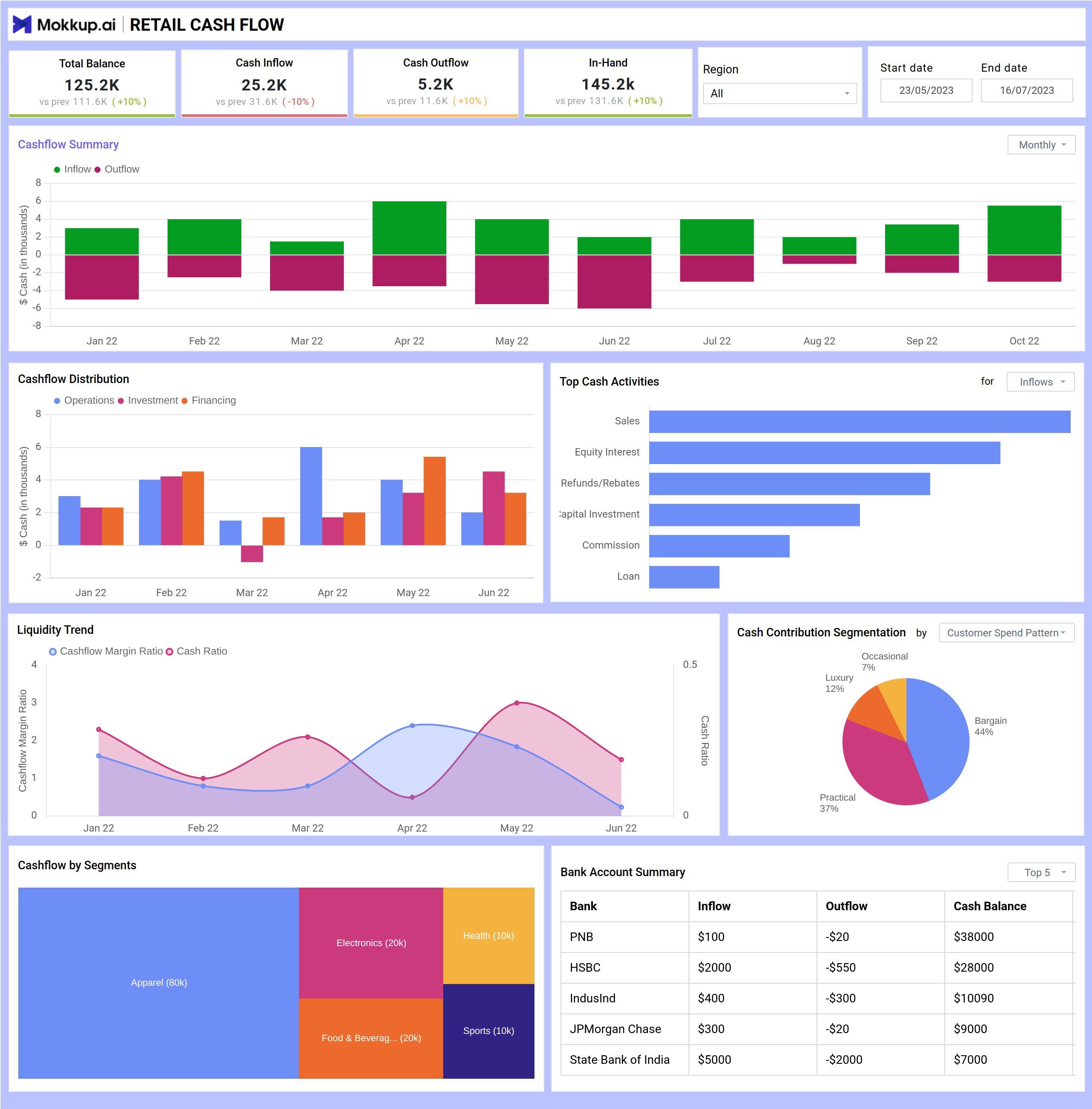
Cash Flow Dashboard Example
The Mokkup.ai Financial Dashboard template offers a clear snapshot of a business’s inflow and outflow of funds over time. It helps finance teams, business owners, and analysts to monitor liquidity, identify spending patterns, and make informed decisions to maintain healthy cash reserves.
How to Analyze Data in Cash Flow Dashboards
Analyzing the Cash Flow Planner Dashboard template helps retail businesses monitor liquidity, spot trends, and make smarter financial decisions. Here’s how to use it:
- Track cash inflows and outflows with stacked bar charts to compare revenue and expenses over time. Identify surplus periods and detect cash crunches early.
- Use distribution visuals to understand how cash is split across operations, investments, and financing. This helps evaluate if funds are being used efficiently.
- Check top cash activities with bar charts to pinpoint key income sources like sales or investments—helpful for optimizing revenue streams.
- Monitor liquidity ratios with line charts showing cash flow margin and cash ratio, which indicate the business's ability to meet short-term obligations.
- Analyze rent or product-wise contributions with pie and segmented bar charts to understand which categories or departments generate the most consistent cash flow.
How to Create a Cash Flow Planning Dashboard
You don’t need to build your report from scratch—just start with a ready-to-use sample Cash Flow Planner Dashboard template from Mokkup. Add in your data and export it however you like. Here’s how to do it:
1. Create or Log in to Your Mokkup Account
Start by signing up on Mokkup.ai using your email. Already have an account? Just log in, and you’re good to go.
2. Choose and Customize Your Dashboard Template
Find the Cash Flow Planner Dashboard in the Templates section. Use the drag-and-drop editor to adjust KPIs, edit filters, or add elements based on your data.
3. Export to Your BI Tool
Once your dashboard wireframe is ready, use the BI Tool Export feature to send it directly to Power BI or Tableau for further analysis and enhancements. You can also download the dashboard as a PDF, PNG, or JPEG, embed it on a platform, or invite your team to collaborate.
Note: This is a Pro template. To use and customize this dashboard wireframe, you’ll need a Pro subscription on Mokkup. Upgrade anytime to unlock full access.
Benefits of Cash Flow Dashboards
Cash flow dashboards provide an overview of financial health, allowing companies to better plan, manage, and optimize their cash resources. Here's how they help:
- Improved Decision-Making: Visual insights into inflows, outflows, and balances enable smarter financial planning.
- Real-Time Monitoring: Track liquidity metrics instantly, helping you react quickly to changes in financial status.
- Expense Management: Spot spending spikes or inefficiencies and adjust budgeting accordingly.
- Enhanced Forecasting: Historical trends help predict future cash positions and avoid shortfalls.
- Department-Level Visibility: Understand which segments or activities are driving or draining cash.
With easy-to-read visuals and customizable filters, these dashboards simplify complex financial data, giving finance teams the clarity they need to stay in control.
KPIs to Track in Cash Flow Dashboards
Cash flow dashboards combine key financial indicators to help businesses understand their liquidity position and financial health. These KPIs allow teams to make quick, informed decisions.
- Total Balance, Cash Inflow, Cash Outflow, and In-Hand Cash: Displayed as top-level KPI cards, these metrics give an instant snapshot of cash activity and balance, including period-over-period changes.
- Cashflow Distribution: Categorizes cash movements into operational, investment, and financing activities, helping assess resource allocation.
- Liquidity Trend: A dual-axis line chart tracks ratios like cash flow margin and cash ratio, helping evaluate financial resilience.
- Cash Contribution Segmentation: A pie chart breaks down inflow by customer or product category, offering insights into revenue concentration and customer behavior.
- Cashflow by Segments: Stacked bar chart showing cash flow across departments or business lines to identify high-performing or resource-heavy areas.
- Bank Account Summary: A table consolidating inflows, outflows, and balances across all bank accounts for easier monitoring and reconciliation.
Frequently Asked Questions
Q1. What is a Cash Flow Dashboard used for?
A cash flow dashboard helps businesses monitor and analyze the cash movement in and out of their operations. It provides a real-time view of liquidity, enabling informed financial decisions.
Q2. Who benefits from using a cash flow dashboard?
Finance teams, business owners, and CFOs use it to manage daily cash positions, forecast future cash needs, and identify trends in income and expenses.
Q3. Can a cash flow dashboard help with financial planning?
Yes. By visualizing patterns in inflows and outflows, businesses can forecast cash needs, plan investments, and avoid liquidity shortfalls.