
Welcome to the world of data visualization! Today, we're diving into the magic of box plots—a cool way to understand numbers visually. Think of box plots as your data storytellers. They show us where most numbers hang out, how spread out they are, and if there are any special ones that stand out from the crowd. It's like turning numbers into a picture book! Whether you're a data pro or just starting out, box plots are here to make sense of the numbers and tell us their unique stories. So, let's take a friendly stroll through the world of box plot examples and discover how they turn data into easy-to-understand pictures.
Table of Contents
- Introduction to Box Plots
- Understanding Box Plot Components
- Types of Box Plots
- When to Use a Box Plot
- Advantages and Limitations of Box Plots
Introduction to Box Plots

A box plot, also known as a box-and-whisker plot, is a graphical representation of the distribution of a dataset. It provides a visual summary of key statistical measures, helping to identify the central tendency, spread, and potential outliers within the data. Box plots are particularly useful for comparing the distributions of different groups or datasets.
Understanding Box Plot Components

Here's a breakdown of the key components of a box plot:
- Median (Q2 or 50th percentile): The line inside the box represents the median of the dataset, which is the middle value when the data is ordered.
- Quartiles (Q1 and Q3): The box is divided into two parts, the lower and upper quartiles (Q1 and Q3, respectively). Q1 represents the 25th percentile, and Q3 represents the 75th percentile. The box itself covers the interquartile range (IQR), which is the range between Q1 and Q3.
- Whiskers: Whiskers extend from the box to the minimum and maximum values within a defined range. The length of the whiskers in a box plot is often a multiple of the IQR. Sometimes, the whiskers are set to a maximum range or include all data within a certain distance from Q1 and Q3.
- Outliers: Points beyond the whiskers are considered outliers. These can be individual data points or values significantly different from the rest of the dataset.
Types of Box Plots
While the basic box plot provides a comprehensive overview of a dataset's distribution, there are variations and adaptations that cater to different analytical needs. Here are some types of box plots:
1. Standard Box Plot:

Represents the median, quartiles, and potential outliers in a single box-and-whisker plot.
2. Horizontal Box Plot:

A variation of the standard box plot displaying the boxes horizontally. This is useful when dealing with a large number of groups or categories.
3. Grouped Box Plot:

Displays multiple box plots side by side, allowing for easy visual comparison between groups or categories.
4. Variable Width Box Plot:
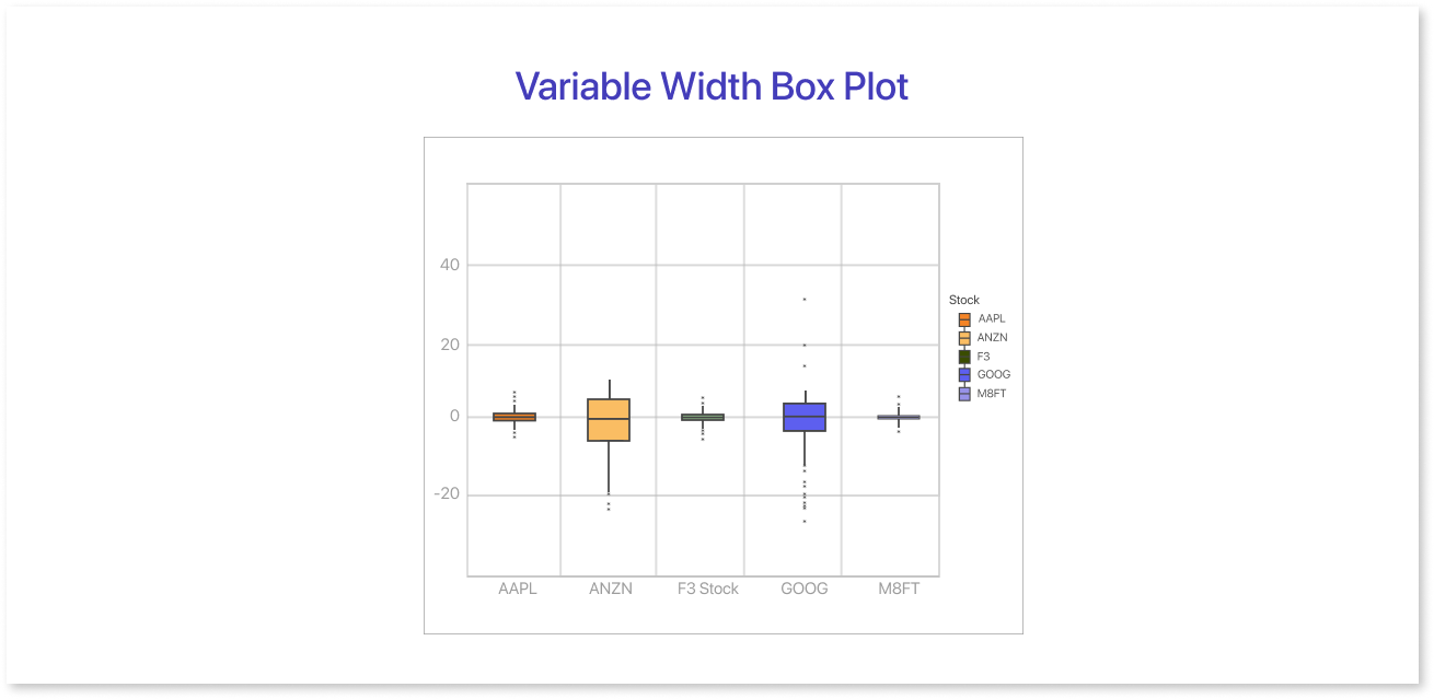
Adjusts the box's width based on the number of observations within a given range. This helps to represent areas of higher or lower data density visually.
5. Mean and Standard Deviation Plot:

Includes mean and standard deviation markers and the traditional box plot elements. This provides insights into the overall distribution and variability of the data.
6. Probability Plot:
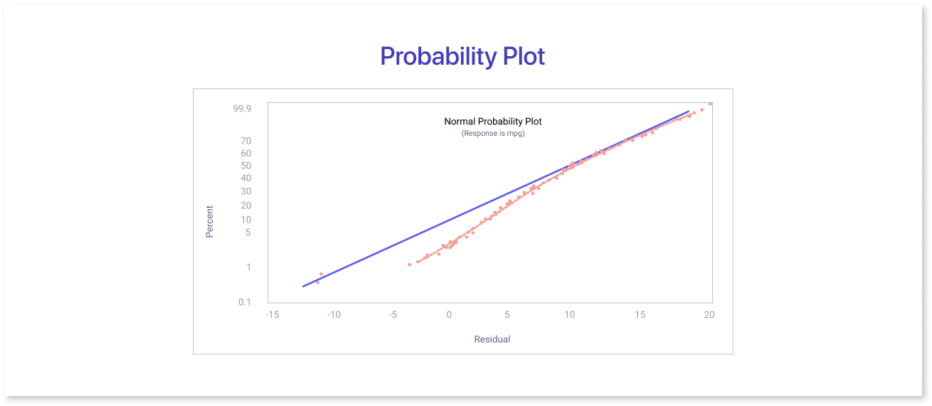
Uses theoretical quantiles against observed quantiles to assess how well a dataset follows a particular distribution. It's useful for checking the normality of data.
The box plot quartile type choice depends on the data's specific characteristics and the analytical goals. Experimenting with different types can reveal nuances in the distribution and make your visualizations more tailored to your analysis.
When to Use a Box Plot
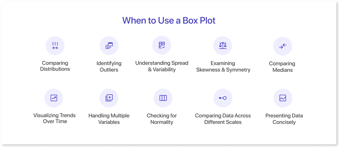
Box plots are versatile data visualization tools that are particularly useful in various scenarios. Here are some situations where using a box plot can be advantageous:
- Comparing Distributions: Box plots are excellent for comparing the distributions of multiple datasets or groups. They provide a clear visual summary of central tendency, spread, and outliers, making it easy to identify patterns and differences.
- Identifying Outliers: Box plots make spot outliers in a dataset straightforward. Outliers in box and whisker can be critical in understanding unusual or extreme values that impact the overall interpretation of the data.
- Understanding Spread and Variability: If you need to assess the spread and variability of a dataset, box plots effectively show the range between the minimum and maximum values and the interquartile range (IQR).
- Examining Skewness and Symmetry: Box plots can help identify skewness in the data distribution. A skewed distribution may have a longer tail on one side, affecting the overall shape and symmetry, and box plots make this visually apparent.
- Comparing Medians: When you want to compare the central tendencies of different groups or categories, box plots provide a quick overview of the medians, helping you understand which group tends to have higher or lower values.
- Visualizing Trends Over Time: If data is collected over time or in different conditions, creating box plots for each time point or condition allows you to see trends and variations in the data distribution.
- Handling Multiple Variables: Box plots can be employed to visualize the distribution of a variable across different categories or groups simultaneously. This is especially useful in exploratory data analysis.
- Checking for Normality: Probability plots derived from box plots can help assess the normality of a dataset. Deviations from a normal distribution may influence the choice of statistical analyses.
- Comparing Data Across Different Scales: Box plots are effective when comparing data with different scales. They provide a standardized visual representation that facilitates comparison.
- Presenting Data Concisely: Box plots offer a compact and informative representation of data, making them suitable for a quick, visual summary.
Advantages and Limitations of Box Plots
a. Advantages of Box Plots
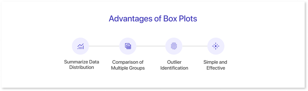
Box plots, also known as Box and whisker plots, offer several advantages for data visualization:
- Summarize Data Distribution: They effectively showcase a dataset's central tendency, spread, and potential outliers in a single graphic. The box encompasses the middle 50% of the data (quartiles), while the whiskers extend to 1.5 times the interquartile range (IQR) to depict potential outliers.
- Comparison of Multiple Groups: Box plots enable easy comparison of multiple datasets within a single chart. By placing them side-by-side, you can readily spot differences in medians, spreads, and outlier presence across groups.
- Outlier Identification: Box plots readily highlight outliers, data points falling outside the whiskers. This can be crucial for identifying potential errors, unusual events, or influential points in your data.
- Simple and Effective: Box plots are easy to understand and interpret, even for viewers with limited statistical knowledge. Their clear visual elements make them suitable for presentations and reports.
b. Limitations of Box Plots
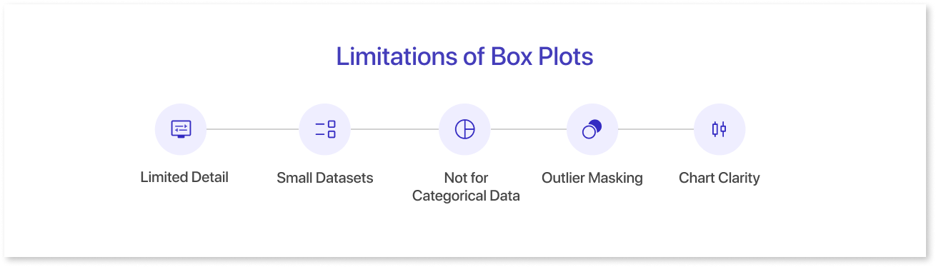
Despite their advantages, box plots also have limitations to consider:
- Limited Detail: They provide a high-level overview of data distribution but might not reveal finer details, especially for complex or non-normal distributions. For deeper analysis, consider combining box plots with other visualizations like histograms.
- Small Datasets: Box plots can be misleading for small datasets (less than 20 data points) as they may need to represent the true distribution accurately.
- Not for Categorical Data: Box plots are designed explicitly for continuous numerical data. Applying them to categorical data can be confusing and inaccurate.
- Outlier Masking: In the presence of extreme outliers, the whiskers might get stretched, potentially masking other outliers within the whisker range.
- Chart Clarity: Boxplots can be confusing for some due to their statistical complexity, and simpler charts may be more user-friendly for those unfamiliar with statistical concepts.
Summing Up
In conclusion, a box plot is a statistical visualization tool that provides a concise summary of the distribution of a dataset. It presents key metrics such as the median, quartiles, and potential outliers, offering insights into the spread and central tendency of the data. Box plots are particularly useful when comparing multiple datasets or identifying variations within a single dataset. Their simplicity and effectiveness make them valuable for exploring and communicating the overall characteristics of numerical data, making them a preferred choice in statistical analysis and data interpretation. Visualize how your box plot analysis works with the rest of your dashboard by building a wireframe on Mokkup.ai first.
Frequently Asked Questions
A box plot displays the distribution of data through five key points: minimum, first quartile (Q1), median, third quartile (Q3), and maximum. It also highlights outliers.
Look at the box and whiskers:
- The box shows the middle 50% of data.
- The line inside the box is the median.
- Whiskers show the range, and dots outside indicate outliers.
It’s great for spotting outliers, understanding spread and symmetry, and comparing multiple datasets side by side quickly.
Use a box plot when you need a compact summary of data spread, especially for comparing several groups. Histograms are better for seeing the full shape of the distribution.
Box plots are often used in quality control to monitor product dimensions or educational variations and compare exam score distributions across different classes.
Prompt it. Wireframe it with Mokkup.ai.
