
Imagine a dynamic, radial display resembling the sun's rays, where each segment represents a distinct category. This innovative charting technique goes beyond conventional graphs, offering an insightful depiction of relationships and hierarchies within complex datasets.
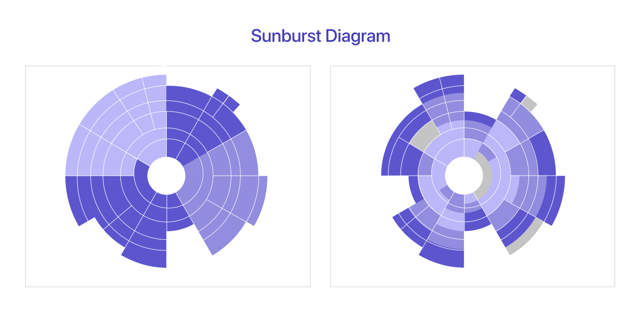
A Sunburst Chart shows hierarchical data using circles, with each circle representing a different level of the organizational structure. This captivating visual allows users to comprehend the distribution of values across multiple dimensions effortlessly. Whether dissecting organizational structures, exploring file directories, or analyzing budget allocations, the Sunburst Chart brings a unique dimension to data interpretation.
For creating a sunburst chart excel can be achieved with ease, offering a dynamic tool to navigate through hierarchical data. Additionally, Tableau users can leverage the power of a tableau Sunburst Chart to visualize complex structures, transforming their data into a visually engaging and insightful representation.
Table of Content
- What is the purpose of the sunburst chart?
- Choosing the Right Data for a Sunburst Chart.
- 10 Best Practices for Sunburst Chart Design.
- Common mistakes to avoid.
What is the purpose of the sunburst chart?
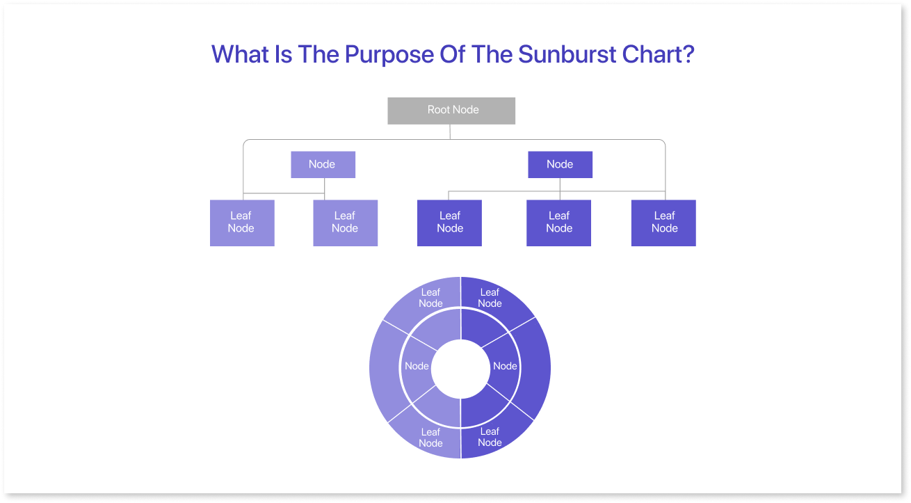
When would you use a sunburst chart? For showing hierarchical systems simply and clearly. The chart shows data in circles, with the innermost circle representing the highest level.
It was made to display hierarchical data. Each level is shown as a ring, making it easier to see the complicated connections in the data.
Key Components:
- Rings: The concentric circles in the sunburst chart symbolize the various levels of the hierarchy. The innermost ring corresponds to the highest level, while each subsequent ring delves deeper into the hierarchical structure.
- Sectors: Within each ring, the chart is divided into sectors, each representing a specific category or subcategory. The size of the sectors corresponds to the proportionate values they represent in the dataset.
- Hierarchy: The hierarchical structure is visually conveyed through the arrangement of rings and sectors. The proximity of sectors to the center indicates their hierarchy, providing a clear view of parent-child relationships.
Examples:
- Organizational Structures: Sunburst charts are ideal for visualizing organizational hierarchies, and showcasing departments, teams, and individual roles within a company.
- File Directories: When exploring file systems or directory structures, a Sunburst Chart can offer a comprehensive view of the nested folders and files, aiding in navigation and understanding the file hierarchy.
- Budget Allocations: The chart is effective in illustrating budget breakdowns, showcasing how funds are distributed across different categories and subcategories.
Choosing the Right Data for a Sunburst Chart
Before delving into the selection of data, let's briefly understand how sunburst charts function. These charts display hierarchical data in a circular format, with each level of the hierarchy represented by a ring. The innermost ring typically signifies the top-level category, while subsequent rings represent subcategories.
- Hierarchical Structure: Sunburst charts are most effective when visualizing data with a clear hierarchical structure. Ensure that your dataset has well-defined levels of categories and subcategories.
- Categorical Data: Sunburst charts are ideal for categorical data where each data point falls into distinct categories. This can include different types of products, places, or any system where things can be grouped.
- Proportional Data: Since the size of each segment in a sunburst chart corresponds to the proportion of data it represents, it's essential to have data with clear distinctions in terms of quantity or percentage.
Tips for Organizing Hierarchical Data:
- Clear Hierarchical Order: Arrange your data in a clear hierarchical order. The top-level category should be at the center, and subsequent levels should radiate outward.
- Consistent Levels: Maintain consistency in the number of levels in your hierarchy. Having too many levels can make the chart cluttered, while too few may oversimplify the data.
- Labels: Label each segment with clear and concise names. This helps users understand the content of each category without having to refer to additional information.
- Number of Segments: While the Sunburst diagram can accommodate numerous segments, it's recommended to limit their number for better clarity. Excessive segments may pose a challenge for viewers to distinguish, potentially resulting in a loss of meaningful insights.
10 Best Practices for Sunburst Chart Design
Sunburst charts are powerful visual tools for representing hierarchical data in a circular format. To be effective and clear in communication, it's important to follow best practices in Sunburst chart design. Here are key principles to consider when creating sunburst charts:
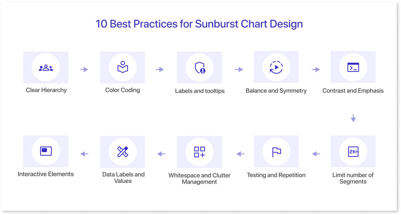
1. Clear Hierarchy:
Organize your data in a logical and hierarchical order. The innermost ring should represent the top-level category, followed by subsequent rings for each level of subcategories. Ensure that the data structure is easily comprehensible.
2. Color Coding:
Use a consistent and meaningful color scheme to distinguish between categories and subcategories. Assign colors that are visually distinct to enhance comprehension. Consider color gradients or shades to represent variations within each category, providing additional insights.
3. Labels and tooltips:
Include clear and concise labels for each segment. Labels should be positioned strategically to avoid clutter while ensuring that essential information is readily available. Add tooltips for extra details when users hover over parts, without making the chart too complex.
4. Balance and Symmetry:
Strive for a balanced and symmetrical design. Clear sunburst charts are easier to understand and stop viewers from feeling confused by a messy design. Maintain a harmonious distribution of segments to create an aesthetically pleasing visualization.
5. Contrast and Emphasis:
Use contrast to highlight specific segments or levels within the chart. This can be achieved through variations in color intensity, border thickness, or even by employing animation effects. Emphasize key data points or highlight trends by making certain segments stand out.
6. Interactive Elements:
Implement interactive features, such as drill-down functionality, to allow users to explore deeper levels of the hierarchy. Interactivity enhances user engagement and facilitates a more dynamic exploration of the data.
7. Data Labels and Values:
Display important data values directly on the chart to provide context. Ensure that data labels are legible and appropriately positioned to avoid clutter. Consider using percentage values to represent proportions, particularly when comparing the size of segments relative to the whole.
8. Whitespace and Clutter Management:
Incorporate ample whitespace to avoid a crowded appearance. Adequate spacing between segments enhances readability and reduces the risk of misinterpretation. When dealing with a large number of segments, consider strategies such as data aggregation or filtering to manage clutter.
9. Testing and Repetition:
Test the Sunburst Chart with potential users to gather feedback on its clarity and effectiveness. Iterate on the design based on user insights to enhance overall usability.
10. Limit number of Segments:
Although Sunburst Charts can accommodate numerous segments, it's advisable to limit their number for clarity. Excessive segments may challenge viewers to distinguish them, potentially leading to a loss of meaningful insights.
Common mistakes to avoid
| Common Mistakes | Solution |
| Extremely complex hierarchies | Simplify the hierarchical structure and consolidate lower-level categories by aiming for a balance between detail and simplicity. |
| Inadequate labeling | Ensure clear labeling for each segment by prioritizing well-labeled charts for enhanced user comprehension. |
| Inappropriate use of Sunburst Charts | Evaluate whether a Sunburst Chart is the most suitable choice for the data set at hand. Consider alternative chart types like layered pie chart or treemaps when hierarchy is unclear. |
| Ignoring data accuracy | Thoroughly review and validate data before creating the Sunburst Chart. Also, ensure data accuracy to prevent misleading visualizations. |
| Poor color choices | Select a consistent color scheme that will ensure sufficient contrast between segments. |
Final Thoughts
The sunburst chart is a helpful tool for displaying hierarchical data in a circular format. It assists users in analyzing relationships and proportions within a dataset. Users can explore data at various levels of granularity, facilitating in-depth analysis with a sunburst chart.
Ready to elevate your data visualization game? Visualize how the sunburst chart looks with the rest of your dashboard by quickly creating a mock dashboard on Mokkup.ai
Prompt it. Wireframe it with Mokkup.ai.
