
In today's information-saturated world, charts, and deceptive graphs reign supreme as visual ambassadors of data. Yet, beneath their seemingly objective surfaces lurks a potential for manipulation. Don't fall prey to the "SCAM" of misleading charts!
This checklist helps you become a chart detective, able to find distortions and hidden agendas. Prepare to dissect source credibility, chart design trickery, and the subtle messaging woven into data. This guide helps you understand charts better so you can draw smart conclusions and easily grasp the information. So, grab your magnifying glass and critical thinking cap, and get ready to expose the truth behind those alluring lines and bars!
Table of Contents
- Introduction to Misleading Charts
- Importance of Chart Accuracy
- Common Types of Misleading Charts
- Checklist for Accurate Data Representation
- Impact of Misleading Charts
- The Role of Technology in Chart Evaluation
Introduction to Misleading Charts
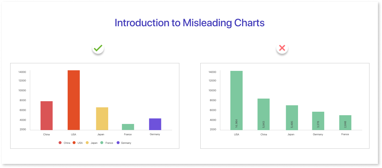
Charts are powerful tools for communicating information. However, they can also be easily manipulated to deceive or mislead viewers. Examples of misleading graphs are visualizations of data that distort or misrepresent the actual information they are supposed to convey. This can happen on purpose to trick viewers or by accident because of bad design or not knowing good data visualization rules.
Why Use Misleading Charts?
There are several reasons why someone might create a misleading chart:
- To persuade: Charts can be used to sway public opinion, influence policy decisions, or promote a particular product or service. By distorting the data, creators can make their case seem more convincing.
- To hide the truth: Sometimes, data may not be flattering or convenient. Misleading charts can be used to obscure negative information or downplay its importance.
- Ignorance: Not everyone who creates charts is a skilled data visualizer. Misleading charts can happen when designs are bad or people don't know how to show data well.
Common Tricks of the Trade:
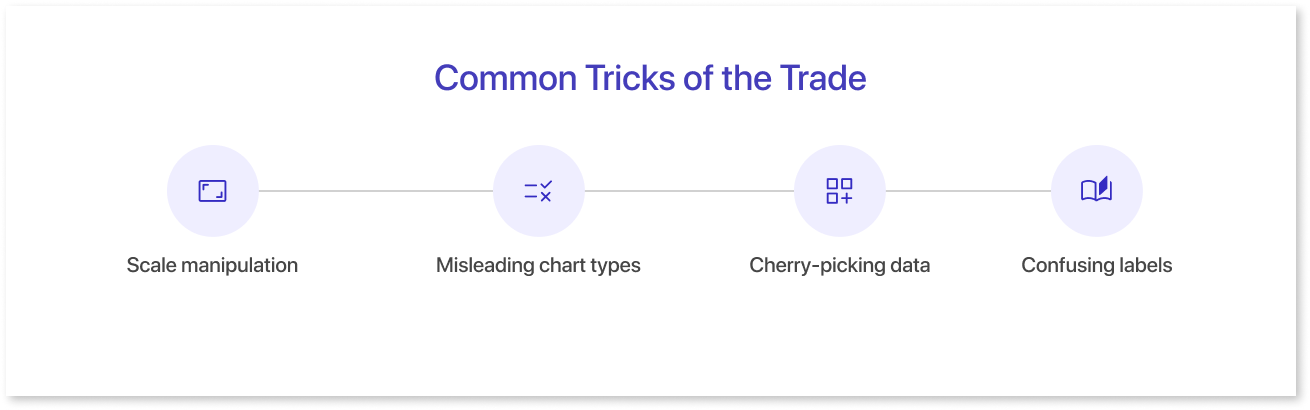
Here are some of the most common tricks used to create misleading charts:
- Scale manipulation: The way the axes of a chart are scaled can dramatically affect how viewers perceive the data. For example, a chart might use a very small y-axis scale to make a small change look larger than it is.
- Misleading chart types: Choosing the wrong type of chart can also be misleading. For example, a pie chart might be used to compare data that is not actually part of a whole.
- Incomplete data: Leaving out important data points can give a false impression of the overall trend.
- Cherry-picking data: Focusing on data that supports a particular argument while ignoring data that contradicts it is another common trick.
- Confusing labels: Using unclear or misleading labels on the axes and data points can make it difficult for viewers to understand what the chart is actually showing.
Importance of Chart Accuracy
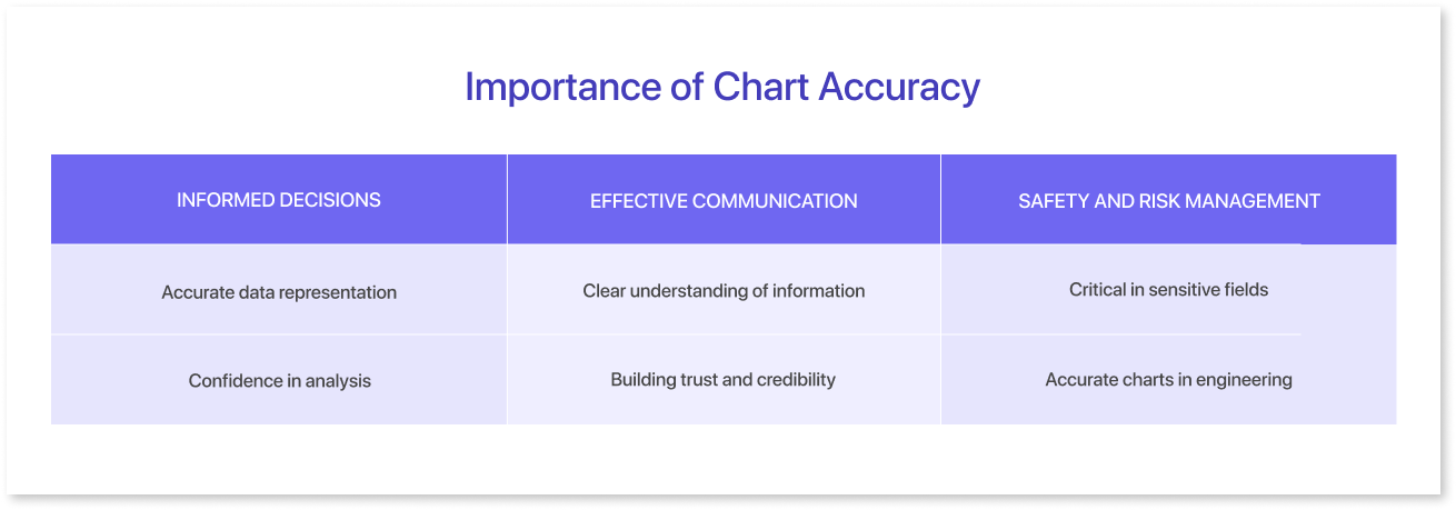
Chart accuracy is absolutely crucial for several reasons, impacting various aspects of decision-making, understanding, and safety:
1. Informed Decisions:
- Accurate data representation: Accurate charts build trust, enabling informed decisions based on real trends and patterns through reliable data representation. Misleading charts can lead to wrong conclusions and detrimental actions.
- Confidence in analysis: When data is accurately portrayed, analysts and decision-makers can confidently interpret trends and relationships, allowing for better resource allocation, risk mitigation, and strategic planning.
2. Effective Communication:
- Clear understanding of information: Accurate charts effectively communicate complex data in a concise and understandable way, facilitating communication between different stakeholders and promoting collaboration. Misleading charts can create confusion and hinder effective communication.
- Building trust and credibility: Accurate charts establish trust in the data and the source, allowing for better engagement with the information and its implications. Misleading charts can erode trust and damage credibility.
3. Safety and Risk Management:
- Critical in sensitive fields: In fields like healthcare, finance, or navigation, inaccurate charts can have serious consequences. Inaccurate medical charts can cause wrong diagnosis or treatment, and inaccurate financial charts can lead to risky investments.
- Accurate charts in engineering and construction prevent accidents, errors, equipment failure, and safety hazards, ensuring proper calculations and planning. Misleading charts can lead to costly mistakes and endanger lives.
Overall, the importance of chart accuracy cannot be overstated. It promotes informed decision-making, effective communication, and safety across various disciplines. When dealing with charts, it's crucial to be critical of the data source, design, and potential for misrepresentation.
Common Types of Misleading Charts
Here are some common types of misleading charts, along with examples and explanations of how they can be deceptive:
1. Truncated Axes:
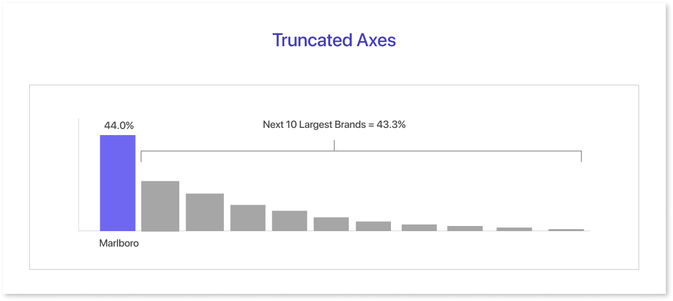
- Description: The chart conceals certain data. This data is typically located at the top or bottom of the y-axis. The purpose of this concealment is to create the illusion of larger changes than what actually occurred.
- Example: Imagine a chart showing website traffic over time. The y-axis might only show the past month, where traffic has increased slightly. But if the chart included the previous year, it would show that traffic has actually been declining overall.
2. Improper Scaling:
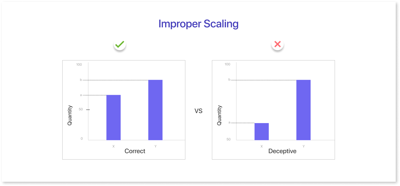
- Description: This chart has a wrong scale, making it hard to see how big the differences between data points are.
- Example: A bar chart might compare two companies' profits. One company's profits are shown as a tall bar, while the other company's profits are shown as a short bar. However, if the y-axis is scaled so that a small difference in profits appears large, viewers might be misled into thinking that the first company is much more profitable than the second company.
3. Misleading 3D Effects:
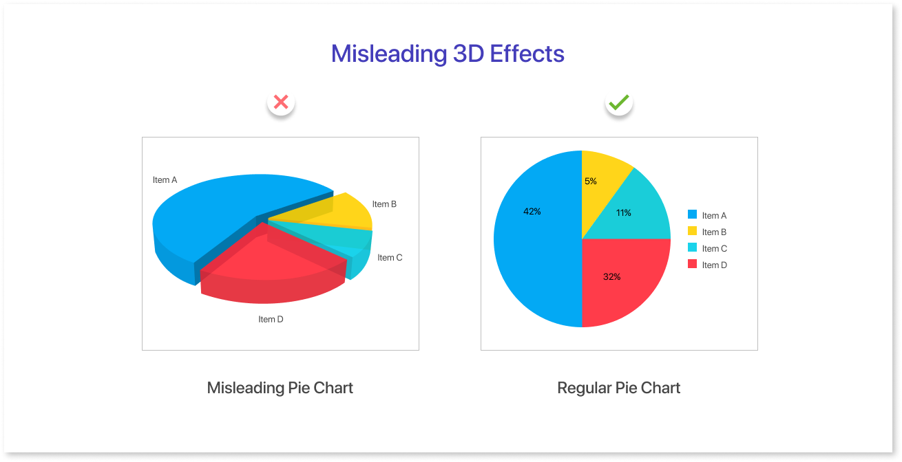
- Description: While 3D charts can be visually appealing, they can also be misleading because they can distort the relative size of data points and make it difficult to judge distances and angles.
- Example: A pie chart might be shown in 3D, making it appear as if one slice of the pie is much larger than the others. However, this might be an illusion caused by the perspective of the 3D chart.
4. Cherry-picking Data:
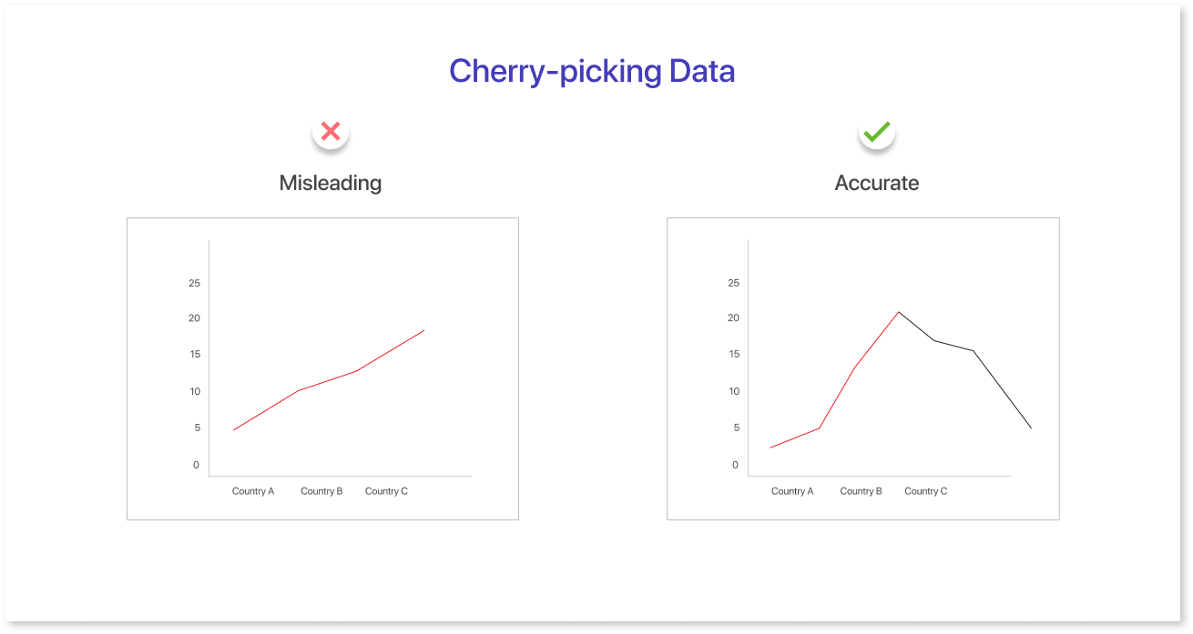
- Description: This type of chart only shows data that supports a particular conclusion, while ignoring other relevant data.
- Example: A chart might show that crime rates have decreased in a city. However, if the chart only shows data from the past few months, it might be ignoring a longer-term trend of increasing crime rates.
5. Deceptive Color Choices:
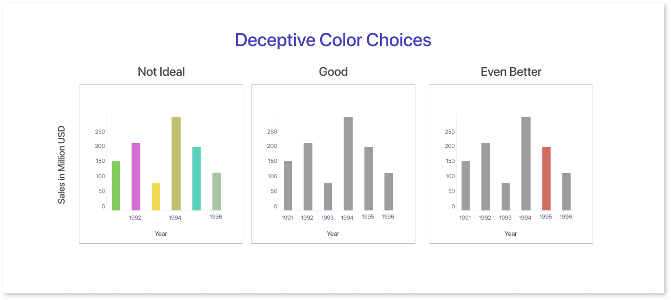
- Description: This type of chart uses colors that can be misleading, such as red to represent negative data and green to represent positive data, regardless of the actual context of the data.
- Example: A chart might show that the stock market has gone up in the past month. If the chart uses red for increases, people may think the market has actually decreased, which is misleading.
These are just a few examples of bad charts. Questioning charts and considering the data, design, and possibility of misrepresentation is crucial.
Checklist for Accurate Data Representation
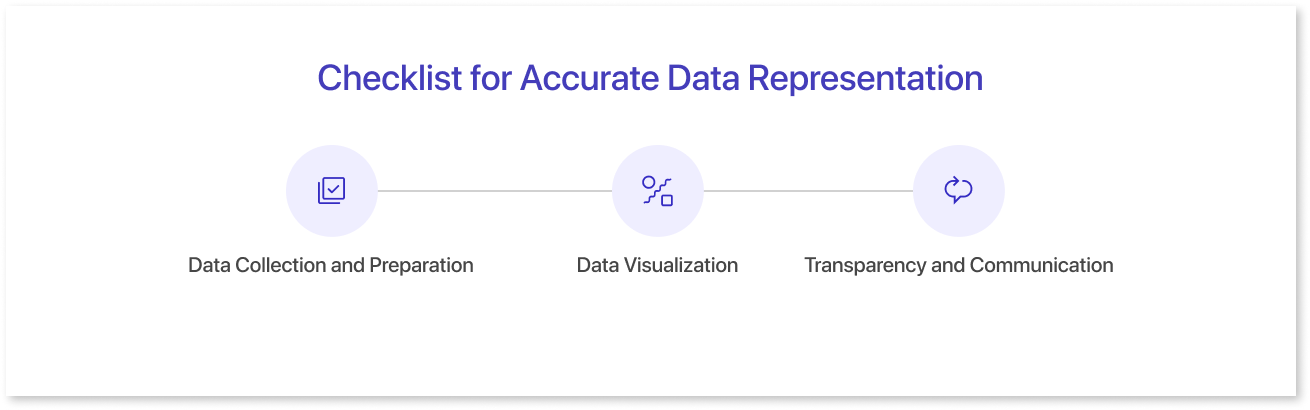
Creating accurate data representations is crucial for effective communication and decision-making. Here's a checklist to help ensure accuracy in data representation:
1. Data Collection and Preparation:
a. Data Source:
- Credible and reliable source: Verify the source's expertise and reputation in the relevant field.
- Transparent data collection methods: Understand how the data was collected and documented for potential biases or limitations.
- Complete and relevant data: Ensure the data captures the intended scope and reflects the target population accurately.
b. Data Cleaning and Validation:
- Identify and address missing values, outliers, and inconsistencies.
- Apply appropriate data transformation techniques (e.g., normalization, scaling) without distorting the underlying relationships.
- Perform validity checks to confirm data accuracy and adherence to collection protocols.
2. Data Visualization:
a. Chart Design:
- Clear and concise: Avoid unnecessary complexity or clutter that obscures the message.
- Appropriate chart type: Choose a chart that effectively communicates the data type and relationship between variables.
- Accurate and consistent scales: Label axes clearly and ensure consistent units and scales for meaningful comparison.
- Legible and accessible: Use fonts, colors, and sizes that are easy to read and understand for the intended audience.
b. Data Representation:
- Truthful and unbiased: Avoid manipulating axes, using misleading 3D effects, or cherry-picking data to support a specific agenda.
- Contextualized and informative: Provide relevant labels, titles, and legends that explain the data and its limitations.
- Highlight key insights: Guide the reader's attention to the intended message without obscuring other relevant information.
3. Transparency and Communication:
- Document data sources, methods, and limitations.
- Present data in a neutral and objective manner.
- Encourage critical thinking and interpretation of the data.
- Be open to feedback and address questions about the data.
Impact of Misleading Charts
Misleading charts can have significant consequences, as they can distort information, mislead decision-makers, and lead to misguided actions. One real-life example that gained widespread attention is the "hockey stick graph" used in discussions about climate change.
The hockey stick graph, prominently featured in the Intergovernmental Panel on Climate Change (IPCC) reports, depicts a sharp increase in global temperatures over the past century, resembling the shape of a hockey stick. The graph initially appeared to show consistent temperatures before the 20th century. However, in reality, there were instances when the temperature increased and decreased.
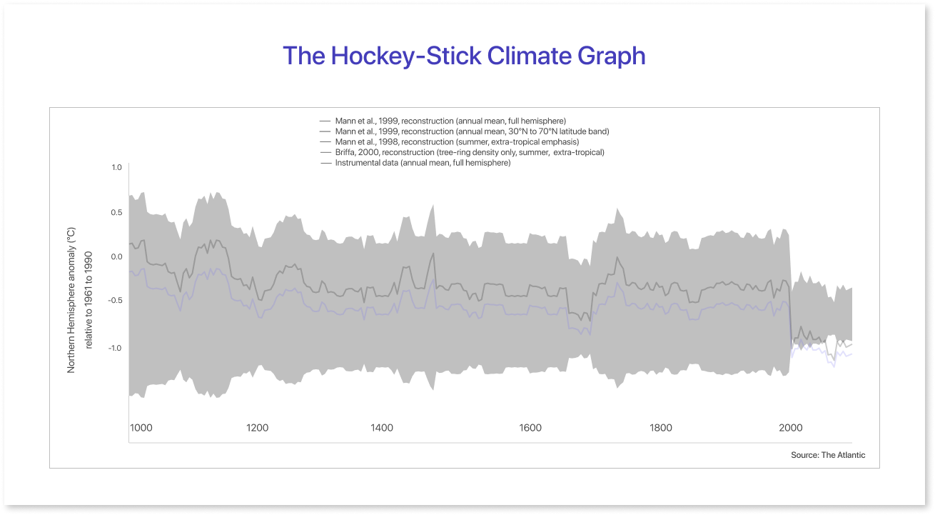
However, critics argued that the hockey stick graph was misleading because it downplayed historical variations in climate. The graph showed stable temperatures before 1900, but there were periods of both hotter and colder weather. The hockey stick graph controversy caused debates about climate change data reliability and potential biases from data manipulation.
This example illustrates the impact of a misleading chart on public perception and policy decisions. The hockey stick graph raised doubts about climate change science. This, in turn, made it more challenging to address the environmental issues associated with global warming.
Misleading charts can have big effects on public opinion, policy-making, and resource allocation. These effects may not match the actual reality of the situation. It emphasizes the importance of ensuring transparency, accuracy, and clarity in presenting data to facilitate informed decision-making. <source>
The Role of Technology in Chart Evaluation
Technology is revolutionizing chart evaluation, shifting it from subjective analysis to data-driven insights. Tools assess charts for accuracy, clarity, and design adherence, providing quantifiable metrics to guide decision-making. Interactive dashboard design enable real-time data exploration, uncovering hidden trends and outliers.
Advanced algorithms can even generate alternative chart layouts, fostering experimentation and optimization. This data-centric approach enhances evaluation accuracy and speeds up the process, ultimately improving communication and decision-making across various domains.
Introduction to Mokkup:
Mokkup is an online tool that helps data analysts, developers, and business teams work together more easily. This platform simplifies the process of creating attractive data visualizations. It offers a simple interface, various elements and templates, and powerful design features. Users can easily create visually appealing dashboard wireframes using this platform.
By prioritizing design first, Mokkup empowers you to create dashboard wireframes that are not just beautiful but also clear, accurate, and effective in communicating your message. So, ditch the data-first approach and embrace Mokkup's collaborative canvas to design with data in mind, ensuring your visualizations inform, inspire, and never mislead.
Remember, clear and accurate data visualizations are essential for making informed decisions. By using Mokkup to prioritize design and user feedback early on, you can take the first step towards creating visualizations that effectively communicate your message and avoid the pitfalls of misleading charts.
Key Features:
- Intuitive Interface: Mokkup offers an easy-to-navigate interface, ensuring a user-friendly experience for individuals involved in the data visualization process.
- Extensive Element Library: Mokkup has many elements and templates for users to create data visualizations in a creative way.
- Design Flexibility: Mokkup.ai allows users to customize the look of their visualizations with different themes for more design choices.
- Endless Creativity: Mokkup.ai is more than a wireframing tool. It's a place where ideas can be brought to life together. It is great for data analysis and business intelligence. Its features are valuable for anyone working with data visualization tools.
Mokkup.ai can help you create clear and accurate data visualizations, avoiding the pitfalls of misleading charts. With its intuitive interface and wide range of features, Mokkup.ai makes it easy to create informative and visually appealing charts.
Summing Up
In conclusion, identifying misleading charts is crucial for making informed decisions based on accurate data. This checklist serves as a valuable guide to spot potential distortions. Pay attention to axis scaling, labeling clarity, and data set. Scrutinize chart types for suitability and avoid manipulative visual tactics. Assess context and be wary of cherry-picked data. Utilize the checklist's key points to navigate through the visual landscape of charts effectively. By thinking about these things, people can get better at reading charts, understanding data, and promoting clear information.
Last but not least, beware of bad data visualization techniques like using 3D pie charts, which can distort proportions and mislead readers by making smaller slices appear larger, ultimately compromising the integrity of your data presentation. Incorporating a misleading data visualization in your dashboard can be as simple as altering the axis scale to exaggerate differences, creating the illusion of drastic changes that may not accurately represent the data.
Prompt it. Wireframe it with Mokkup.ai.
