
What is a Trauma Center ICU Utilization Dashboard?
A Trauma Center ICU Utilization Dashboard is a real-time analytics tool designed to monitor, assess, and optimize the use of critical care resources in emergency and trauma units. It provides healthcare administrators and ICU managers with visibility into how effectively intensive care beds, staff, and equipment are being used.
By integrating data from admissions, transfers, and discharges, this dashboard helps in tracking ICU occupancy trends, patient flow, and staffing efficiency. It supports better decision-making for surge management, critical care readiness, and patient safety. Hospitals use such dashboards to ensure optimal ICU capacity utilization, minimize patient transfer delays, and reduce clinical risks through evidence-based operational insights. It acts as a key component of trauma ICU performance monitoring dashboards, focusing on improving efficiency, quality of care, and outcomes in high-acuity environments.
How to Create a Trauma Center ICU Utilization Dashboard
You don’t need to build your report from scratch—just start with a ready-to-use Trauma center ICU utilization dashboard template from Mokkup. Add in your data and export it however you like. Here’s how to do it:
1. Create or Log in to Your Mokkup Account
Start by signing up on Mokkup.ai using your email. If you already have an account, just log in, and you’ll be good to go.
2. Choose and Customize Your Dashboard Template
Find the Trauma Center ICU Utilization Dashboard template in the Templates section. Use the drag-and-drop editor to adjust KPIs, edit filters, or add elements based on your data.
3. Export to Your BI Tool
Once your dashboard wireframe is ready, use the BI Tool Export feature to send it directly to Power BI or Tableau for further analysis and enhancements. You can also download the dashboard as a PDF, PNG, or JPEG, embed it on a platform, or invite your team to collaborate.
Note: This is a Pro template. You’ll need a Pro subscription on Mokkup to use and customize this dashboard wireframe. Upgrade anytime to unlock full access.
Trauma Center ICU Utilization Dashboard Example
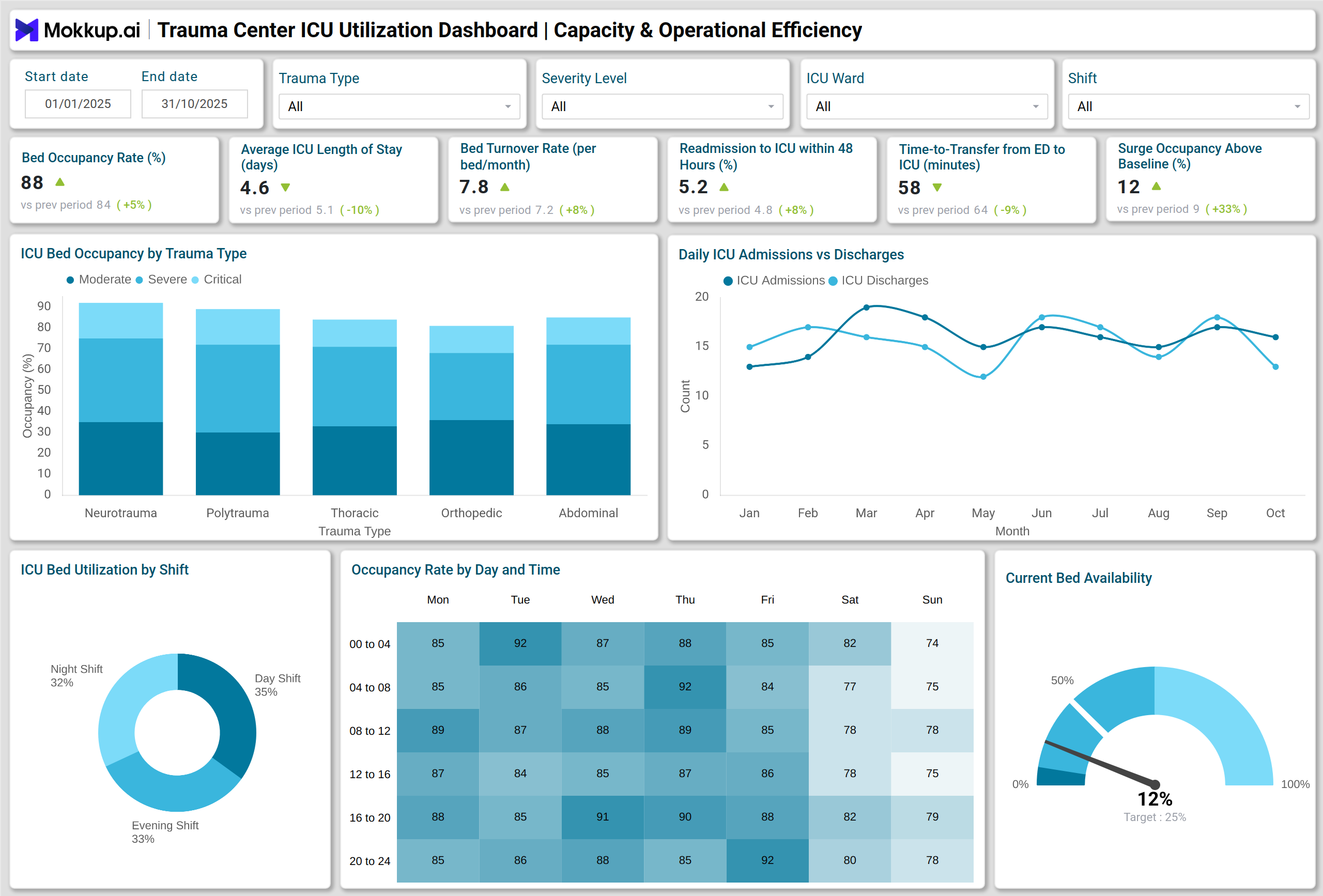
A typical Trauma Center ICU Utilization Dashboard visualizes key performance indicators (KPIs) through intuitive charts and interactive visuals. For instance, a line chart can display monthly trends in bed occupancy and availability, while a stacked column chart tracks admissions, discharges, and transfers. A gauge chart can indicate current ICU bed availability against capacity benchmarks.
A combo chart might show the relationship between ICU capacity utilization and surge occupancy, helping leaders forecast future needs. For patient safety, a treemap illustrates infection incidents by unit and type, and a stacked bar chart compares mortality and readmission rates.
A well-structured Trauma ICU occupancy and bed management dashboard allows hospitals to balance bed allocation, monitor availability in real time, and reduce admission bottlenecks. These visuals form a unified view of trauma ICU performance—offering actionable insights into patient care flow, staff allocation, and resource readiness.
By integrating metrics into one interface, hospitals gain an accurate picture of critical care resource utilization in hospitals, helping them respond to dynamic emergency demands.
How to Analyze Data in Trauma Center ICU Utilization Dashboards
Effective analysis of Emergency and critical care utilization metrics begins with understanding how your ICU resources are being used. Here’s how to analyze data in Trauma Center ICU Utilization Dashboards:
- Monitor occupancy patterns: Track bed occupancy rate and availability to identify underutilization or overcapacity.
- Evaluate patient throughput: Analyze bed turnover rate and average length of stay (LOS) to optimize patient flow.
- Assess resource strain: Review staff overtime hours to evaluate workload balance and staffing needs.
- Identify transfer efficiency: Monitor door-to-ICU time to ensure timely critical care transfers from the emergency department.
- Track infection trends: Use VAE/VAP rate visuals to identify infection clusters and evaluate safety interventions.
- Review outcomes: Compare mortality and readmission rates to measure quality and clinical performance.
- Correlate performance metrics: Combine operational and clinical KPIs to understand how resource use affects outcomes and costs.
Benefits of Trauma Center ICU Utilization Dashboards
This dashboards offers several benefits as follows:
- Enhance operational visibility: Gain real-time insights into ICU performance and patient flow.
- Optimize resource allocation: Identify under- or over-utilized beds and staff to balance workloads.
- Plan surge capacity: Prepare effectively for trauma influxes and emergency surges with data-backed forecasting.
- Reduce patient delays: Streamline transfers from the emergency department to ICU for faster critical care.
- Strengthen clinical quality: Track safety indicators and patient outcomes to ensure continuous improvement.
- Enable data-driven leadership: Support ICU directors and trauma administrators in making informed operational decisions.
- Ensure compliance: Maintain alignment with healthcare quality, safety, and reporting standards.
KPIs to Track in Trauma Center ICU Utilization Dashboards
Here are the core KPIs every Trauma Center ICU Utilization Dashboard should include:
- Bed Occupancy Rate (%) – Measures the percentage of occupied ICU beds to assess overall capacity utilization.
- Average ICU Length of Stay (Days) – Tracks the mean duration patients spend in ICU, indicating efficiency of care and bed turnover.
- Bed Turnover Rate (per Bed per Month) – Reflects how frequently each bed is used, showing patient throughput and operational efficiency.
- Average Bed Availability (%) – Monitors the proportion of unoccupied beds to identify resource readiness and surge capacity.
- Overtime Hours (% of Total Staff Hours) – Evaluates staff workload and resource strain, helping manage fatigue and staffing balance.
- Door-to-ICU Transfer Time (Hours) – Measures time taken from emergency department arrival to ICU admission, indicating transfer efficiency.
- ICU Mortality Rate (%) – Tracks the percentage of ICU patients who do not survive, providing insights into clinical outcomes and quality of care.
These KPIs provide a balanced view of trauma center ICU analytics and insights, helping teams monitor utilization efficiency, patient outcomes, and operational readiness.
Frequently Asked Questions
Q1. Who uses a Trauma Center ICU Utilization Dashboard?
ICU directors, trauma program coordinators, and hospital administrators use it to manage bed occupancy, staffing, and patient throughput in critical care settings.
Q2. What data sources are used for this dashboard?
It typically pulls data from hospital EMRs, bed management systems, staff scheduling tools, and infection control reports.
Q3. How does it improve patient care?
By reducing ICU transfer delays, preventing resource bottlenecks, and monitoring safety metrics, it enhances both clinical efficiency and patient outcomes.