What is a Virtual Care Insights Dashboard?
The virtual care dashboard is a powerful tool for obtaining digital health insights through the use of several metrics. With real-time telemedicine data, you can ensure an accurate picture of revenues, appointment schedules, and billing patterns, improving operational efficiency. This telemedicine dashboard template allows healthcare organizations to manage challenges like regulatory compliance and resource optimization to unlock new digital possibilities.
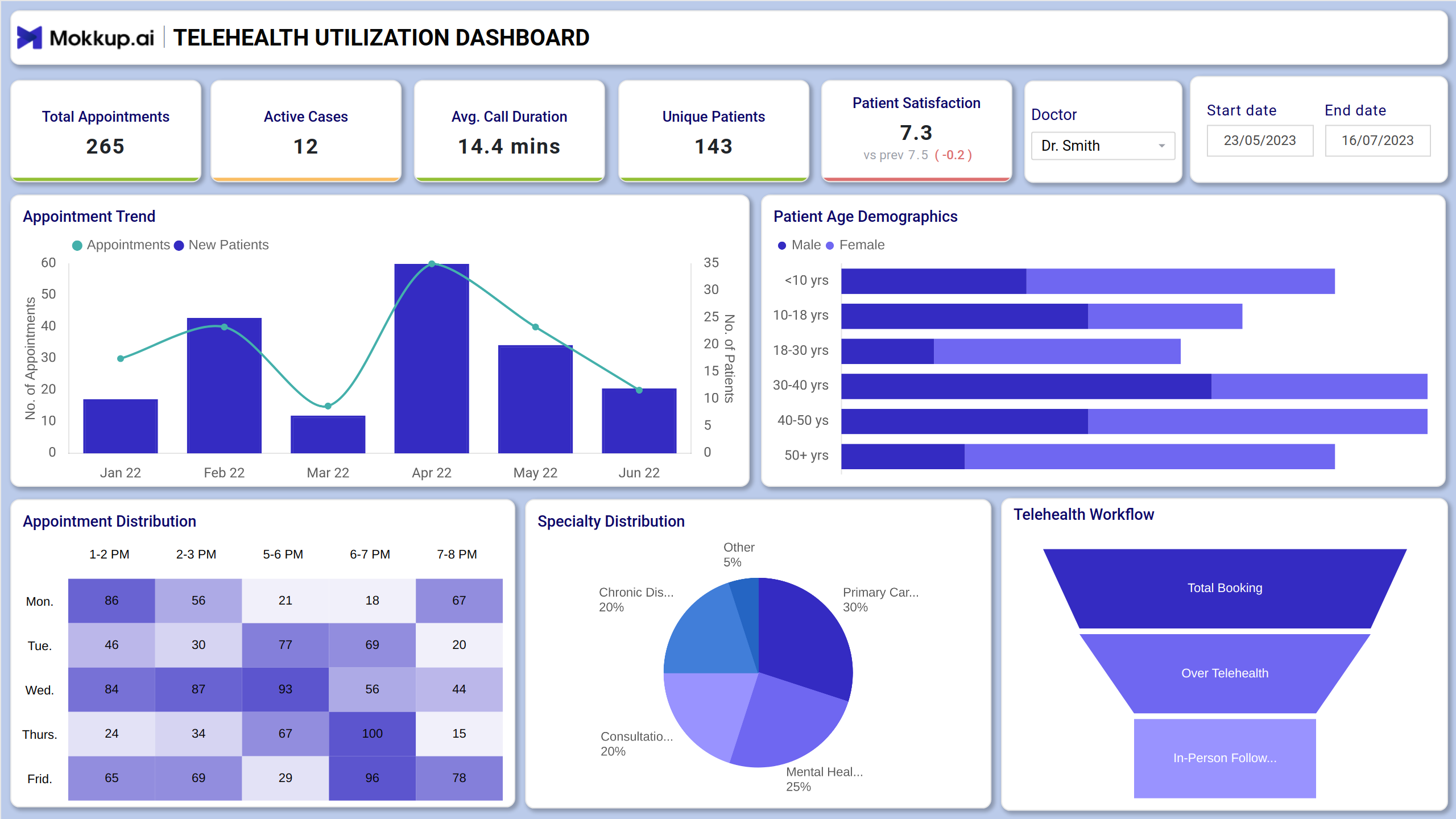
Virtual Care Dashboard Example
This telemedicine dashboard template provides a centralized view of major telehealth operations to boost clinical outcomes. It begins with an intuitive filter, like data range and provider name, to drill down to specific cohorts. For telehealth analytics, providers get clean visuals that include major KPIs like patient age demographics, appointment trends, etc. Providers and administrators can use this dashboard to identify care gaps, optimize virtual staffing, and improve follow-up rates by analyzing session frequency and missed appointment trends.
How to Analyze Data in Virtual Healthcare Dashboards
To analyze data in this remote patient monitoring dashboard, focus on interpreting key performance indicators (KPIs) across clinical and operational dimensions. Start with the KPIs tiles at the top and evaluate the average call duration to assess consultation efficiency. Also, get a quick snapshot of patient counts, unique patients, and active cases. You can analyze the appointment trend chart to identify spikes or drops in virtual visits over time. Pie charts are used for specialty distribution, and funnel charts streamline the telehealth workflow.
How to Create a Virtual Care Dashboard
You don’t need to build your report from scratch—just start with a ready-to-use Mokkup.ai virtual health dashboard template. Add in your data and export it however you like. Here’s how to do it:
1. Create or Log in to Your Mokkup Account
Start by signing up on Mokkup.ai using your email. If you already have an account, just log in, and you’ll be good to go.
2. Choose and Customize Your Dashboard Template
Find theVirtual Care Insights dashboard in the Templates section. Use the drag-and-drop editor to adjust KPIs, edit filters, or add elements based on your data.
3. Export to Your BI Tool
Once your dashboard wireframe is ready, use the BI Tool Export feature to send it directly to Power BI or Tableau for further analysis and enhancements. You can also download the dashboard as a PDF, PNG, or JPEG, embed it on a platform, or invite your team to collaborate.
Note: This is a Pro template. To use and customize this dashboard wireframe, you’ll need a Pro subscription on Mokkup. Upgrade anytime to unlock full access.
Benefits of Virtual Care Dashboards
This dashboard wireframe can be used for real-time virtual care tracking to enable proactive decision-making, supporting optimized care delivery. Here are more benefits that you need to know:
- This customizable dashboard template helps reconcile the care gaps to improve patient care outcomes.
- It consolidates several key metrics into a single, easy-to-read format that reduces the administrative workload.
- It helps identify the medical issues that telehealth care service providers handle to refine future strategies.
- Measure and act on patient satisfaction scores, appointment wait times, and call duration to enhance care quality.
Pro tip: It can be similar to child wellness insights that allow you to track the metrics related to infant care.
KPIs to Track in Virtual Care Dashboards
Look at some major Virtual consultation KPIs here:
- Average Call Duration: This metric measures the duration of the telehealth service call from start to end.
- Patient Satisfaction: This KPI evaluates the overall experience, comfort, and quality of care patients receive from virtual care services.
- Appointment Trend: This metric is shown in a graphical interface, giving insights into appointment patterns over time.
- Patient Age Demographics: It shows the distribution of virtual healthcare service users based on age groups.
- Appointment Distribution: The breakdown of telehealth care appointments based on timings to identify high-demand periods.
- Telehealth Workflow: It will depict the structured workflow as part of virtual care analytics to ensure end-to-end service delivery.
Frequently Asked Questions
1. How can this dashboard improve virtual care delivery?
The dashboard reveals trends like high no-show rates, long call durations, or low satisfaction scores, helping teams identify pain points and make data-driven improvements to scheduling, staffing, and service quality.
2. What insights can I get from age demographics and appointment distribution?
These visuals help you understand patient segments using telehealth and identify high-demand time slots, critical for tailoring outreach and optimizing scheduling.