
What is a Strategic Partnership Analysis Dashboard?
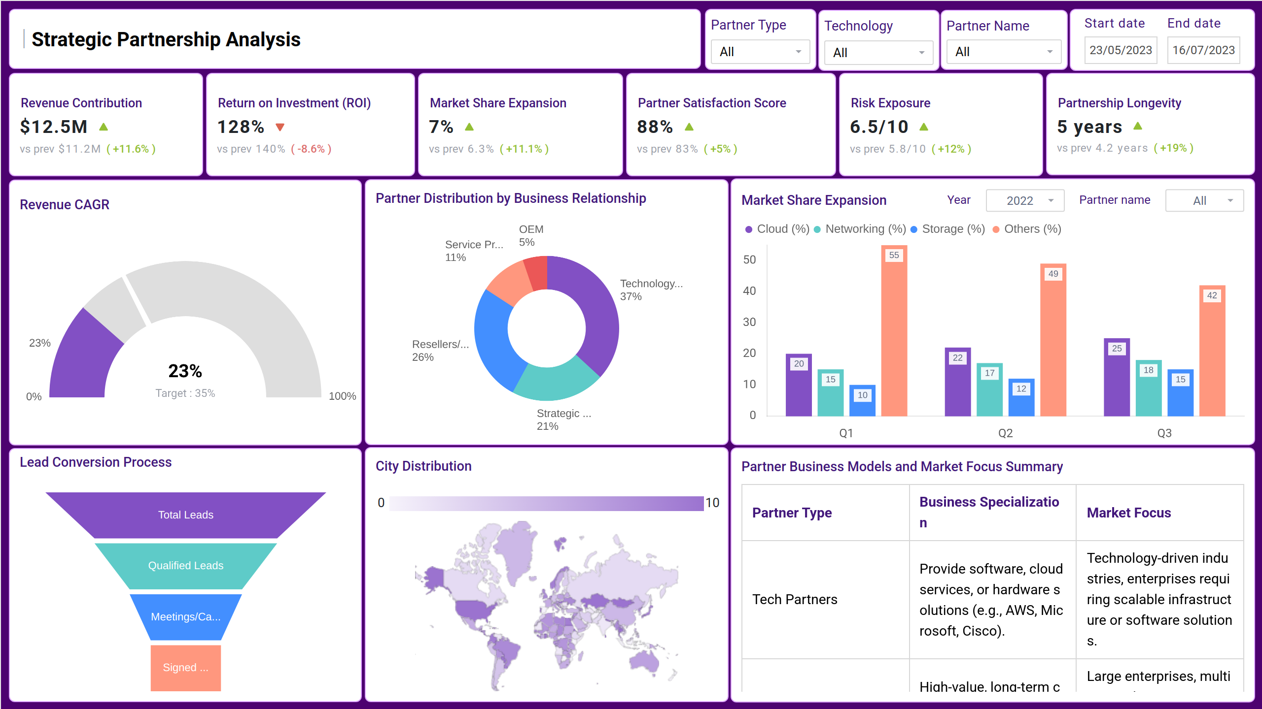
The strategic partnership analysis dashboard provides a high-level view of strategic partnerships with the identification of key trends through metrics. This dashboard wireframe helps companies evaluate their partnerships, see how each contributes to business growth, and find opportunities to improve or expand these relationships.
Benefits of Strategic Partnership Dashboards
This partnership performance dashboard helps organizations track and manage their partnerships. It gives businesses clear insights into revenue, partner performance, geographic distribution, and technology strengths, helping them make better partnership decisions.
Using these insights, businesses can strengthen their relationships, expand into new areas, and align their strategies with the right partners. Organizations can achieve long-term success and drive business growth with a clear understanding of each partnership’s value.
In addition to understanding the partner dependencies, if risks are holding you back, then you must check out the enterprise risk monitor dashboard. Click here
Strategic Partnership Dashboard Example
The Mokkup’s Strategic partnership dashboard template is highly useful for tracking and optimizing your partnerships, offering customizable filters and metrics that allow you to tailor the data according to your specific needs. Users can apply filters to analyze performance by partner, region, campaign type, or time period, enabling a deeper understanding of each partnership's impact. The dashboard’s customizable properties let you modify key performance indicators (KPIs) to align with business goals, ensuring that the metrics most relevant to your strategy are always front and center.
KPIs to Track in Strategic Partnership Dashboards
This partner analytics dashboard wireframe can be used for tracking metrics such as:
- Revenue Contribution: It measures how much revenue is generated by a specific partner or set of partners relative to the total revenue.
- Return on Investment: Used to measure the financial effectiveness and overall value derived from a partnership.
- Market Share Expansion: This KPI measures how much a company’s market share has grown due to its partnership efforts.
- Partner Satisfaction Score: It is used to evaluate how satisfied a company’s partners are with the relationship, collaboration, and support they receive.
- Risk Exposure: It measures the potential negative impact or vulnerabilities a business might face due to its strategic partnerships.
- Partnership Longevity: This KPI calculates how long a partnership has been active and successful.
- Revenue CAGR: Measures revenue growth rate over a set period to assess long-term growth.
- Partner Distribution by Business Relationship: Provides a breakdown of your partners based on the type or nature of the business relationship you have with them
- Lead Conversion Process: Tracks how effectively leads generated through partnerships are being nurtured and converted into customers
- City Distribution: Visualizes where partners are located, helping to identify potential growth areas.
How to Create a Strategic Partnership Dashboard
You don’t need to build your dashboard from scratch—just start with a ready-made sample partnership dashboard template from Mokkup. Add your business data and export it in the format you prefer. Here’s how to create one:
1. Create or Log in to Your Mokkup Account
To access the dashboard templates, sign up on Mokkup.ai using your email. If you already have an account, just log in and jump right in.
2. Choose and Customize Your Business Collaboration Dashboard
Head to the Templates section and select the Strategic Partnership Analysis Dashboard. Use the drag-and-drop editor to modify metrics, apply demographic filters, or add elements that align with your reporting needs.
3. Export to Your BI Tool
Once your dashboard is set, use the BI Tool Export feature to move it to Power BI or Tableau for deeper insights. You can also download it as a PDF, PNG, or JPEG, embed it where needed, or share it with your team for easy collaboration.
Note: This is a Pro template. To use and customize this dashboard wireframe, you’ll need a Pro subscription on Mokkup. Upgrade anytime to unlock full access.
How to Analyze Data in Strategic Partnership Dashboards
Analyzing data in Strategic Partnership Dashboards involves interpreting key metrics and KPIs to assess the effectiveness of your partnerships and make data-driven decisions. Here's how to approach the analysis:
- Review high-level metrics first
- Dive into partner-specific performance
- Analyze campaign performance
- Look for Bottlenecks and drop-offs
- Generate actionable insights.
Frequently Asked Questions
1. What metrics should be included in the Best Partnership Analysis Dashboard?
The best partnership analysis dashboard should include key metrics such as:
- Leads generated by each partner
- Lead-to-customer conversion rates
- Revenue attributed to each partnership
- Partner-sourced vs. partner-influenced revenue
- Campaign performance (e.g., CTR, open rates)
- Time-to-conversion for leads
2. Is the Strategic Partnership Dashboard customizable?
Yes, the dashboard can be customized to reflect the specific goals, KPIs, and metrics relevant to your partnerships