The Service Ops Dashboard offers a comprehensive overview of the service desk's performance and workload, providing valuable insights into various key performance indicators (KPIs) and ticket analytics. From tracking the volume and types of tickets to monitoring the status of open and closed tickets, it equips service managers with actionable data to optimize service delivery and enhance customer satisfaction.
Key Terms to Know
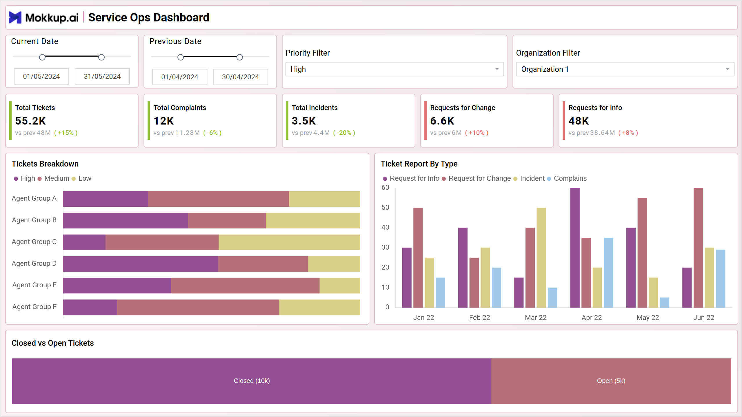
- Total Tickets: Represents the overall number of tickets or service requests logged within a specific period, such as a day, week, month, or year.
- Total Complaints: Indicates the total number of complaints received from customers or users regarding products, services, or experiences.
- Total Incidents: Represents the total number of incidents or technical issues reported by users or detected through monitoring systems.
- Requests for Change: Refers to the total number of requests submitted for changes to IT systems, processes, or configurations.
- Requests for Info: Represents the total number of requests for information or inquiries received from users or stakeholders.
- Tickets Breakdown: Visualizes the breakdown of tickets by category, such as high, medium or low.
- Tickets Report by Type: Displays a detailed report of tickets categorized by type, allowing for a more granular analysis of service requests. This chart provides insights into trends and patterns in ticket types over time.
- Closed vs Open Tickets: This visualization helps in understanding the status of tickets and prioritizing resolution efforts based on the number and severity of open tickets.
Incident Management
The Incident Management screen provides an overview of incident resolution processes and customer satisfaction metrics. Through key performance indicators (KPIs) and detailed analytics, this dashboard helps to track incident severity, requester seniority, resolution times, and agent group performance.
Key Terms to Know
- Total Highly Satisfied: Represents the total number of incidents where customers or users have reported being highly satisfied with the resolution process.
- Total Dissatisfied: Indicates the total number of incidents where customers or users have reported being dissatisfied with the resolution process.
- Total Unknowns: Represents the total number of incidents where customer satisfaction feedback is unknown or not provided.
- Total Satisfied: Represents the total number of incidents where customers or users have reported being satisfied with the resolution process.
- Tickets by Severity: Visualizes the distribution of tickets by severity levels such as critical, minor, normal and unclassified. This chart helps in identifying the severity levels of incidents and prioritizing resolution efforts accordingly.
- Tickets by Requester Seniority: Displays the distribution of tickets based on the seniority level of the requester, such as junior, mid-level, and senior staff. This chart provides insights into the types of incidents reported by different levels of employees.
- Number of Tickets by Day Open: Illustrates the trend of ticket volume over time, showing the number of tickets opened on each day. This chart helps in identifying patterns and trends in incident reporting and workload distribution.
- Number of Tickets: The bar chart displays the number of tickets categorized by the type of issue. It helps in identifying the most common types of support requests, allowing for targeted improvements and resource allocation.
- Tickets by Cases/Agent Groups: Displays the distribution of tickets by agent groups or teams responsible for handling incidents. This chart helps in assessing the workload distribution among different agent groups and ensuring equitable resource allocation.
Project Progress
The Project Progress screen provides insights on project performance, financial metrics, and task status for effective project management.
Key Terms to Know
- Total Revenue: Represents the total income generated from projects within a specific period.
- Total Cost: Indicates the total expenses incurred in executing projects and other costs.
- Total Margin: Calculates the difference between total revenue and total cost, representing the overall profitability of projects.
- Total Projects: Represents the total number of projects undertaken within a specific period.
- Average Ratings: Represents the average customer satisfaction ratings or performance ratings received for completed projects.
- Tasks by Status: Visualizes the distribution of project tasks by status categories such as in progress, completed, pending, etc.
- Total Time Taken: This chart provides insights into the billable and non-billable work hour commitment required for project execution,
- Total Planned vs Actual Time Taken by Project: Compares the total planned time with the actual time taken for project completion. This chart helps in identifying deviations from planned schedules and optimizing project timelines.
- Project Details: Displays detailed project information including location, planned end date, total hours spent, and completion rate. This table offers a comprehensive view of project progress and status.
- Revenue vs Cost: Compares project revenue with project costs over time using a multi-line chart. This chart helps in assessing project profitability and cost-effectiveness.
Dashboard Template Insights
Here's how the dashboard wireframe empowers stakeholders to improve service delivery, customer satisfaction, and strategic decision-making:
- It enables stakeholders to monitor key performance indicators (KPIs) and track operational metrics to ensure effective service delivery.
- By monitoring customer feedback, satisfaction ratings, and incident resolution metrics, the dashboard helps businesses understand customer needs and preferences. It allows stakeholders to prioritize customer-centric initiatives, address issues promptly, and improve overall customer satisfaction and loyalty.
- The dashboard enables data-driven decision-making, empowering businesses to identify opportunities, mitigate risks, and drive strategic initiatives for continuous improvement.
Conclusion
The Service Ops Dashboard serves as a vital wireframe for optimizing service operations, enhancing customer satisfaction, and driving business success. By providing real-time insights, analytics, and actionable data, the dashboard enables stakeholders to monitor performance, identify opportunities, and make informed decisions to improve service delivery and operational efficiency.