
The SaaS product analysis dashboard template offers a detailed overview of key metrics related to product performance and user engagement. By consolidating data on user activity, subscription trends, and feature usage, this dashboard provides valuable insights into product success and areas for improvement. It is designed to support strategic decision-making and enhance the overall user experience.
The dashboard wireframe comprises six screens: Executive Summary, Revenue Analysis, Klaviyo, User Journey Report, Page Wise Analysis & Customer Journey; each is explained briefly below.
Executive Summary
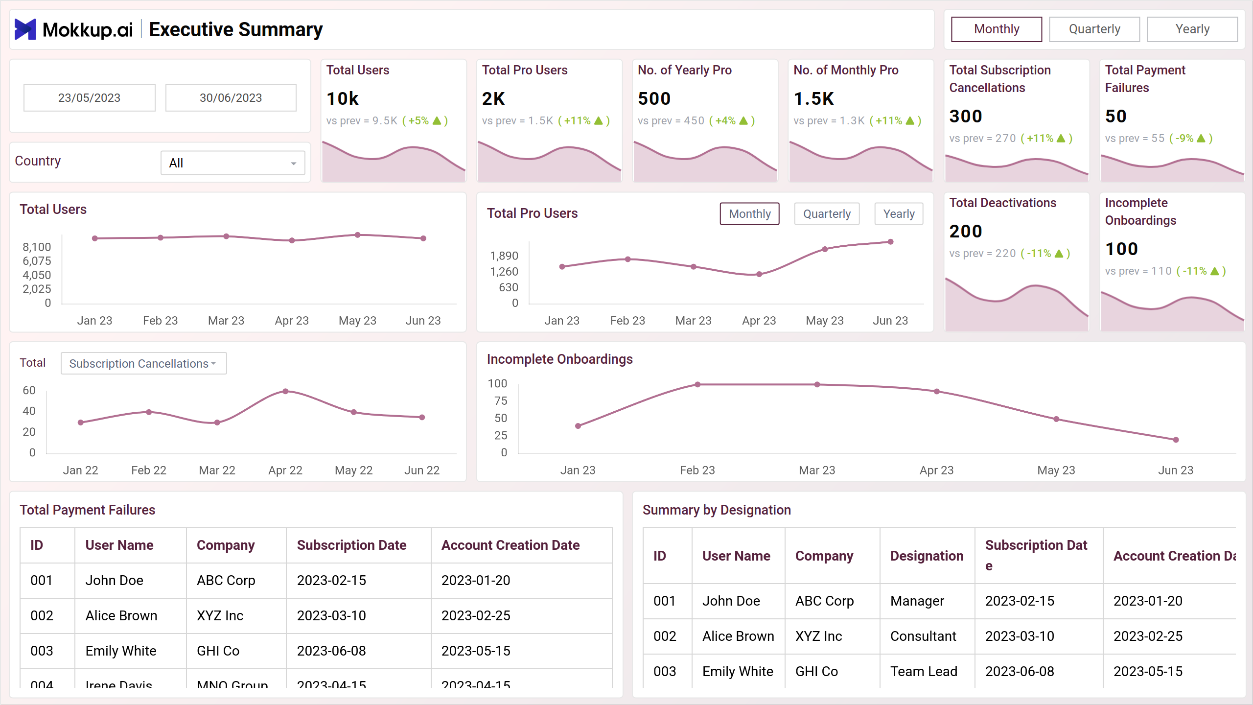
This screen presents key metrics such as the total number of users, total pro users, and subscription cancellations. It also visualizes trends in these metrics over time and compares them to previous year's data. By providing a snapshot of the product's overall health, this section enables stakeholders to quickly assess the product's performance and identify areas for further analysis.
Key Terms to Know
- Total Users: Displays the overall number of users registered on the platform.
- Total Pro Users: Indicates the number of users subscribed to the Pro version.
- No. of Yearly Pro: Shows the count of users subscribed to the yearly Pro plan.
- No. of Monthly Pro: Reflects the number of users subscribed to the monthly Pro plan.
- Total Subscription Cancellations: Indicates the total number of subscription cancellations.
- Total Payment Failures: Displays the number of failed payment attempts.
- Total Deactivation: Shows the number of user accounts that have been deactivated.
- Incomplete Onboardings: Lists the count of users who did not complete the onboarding process.
- Summary by Designation: Provides an overview of users segmented by their roles or designations.
Revenue Analysis
This view provides a comprehensive overview of the product's revenue performance. This section includes key metrics such as gross revenue, net revenue, and active subscriber growth. It also visualizes trends in these metrics over time and compares them to previous year's data. By providing detailed data on revenue performance, this section enables stakeholders to understand the product's financial health, identify areas for revenue growth, and make data-driven decisions to optimize pricing and marketing strategies.
Key Terms to Know
- Gross Revenue: Displays the total revenue generated before any deductions.
- Net Revenue: Shows the revenue remaining after expenses and deductions.
- Active Subscribers Growth: Indicates the growth rate of active subscribers over time.
- MRR (Monthly Recurring Revenue): Reflects the predictable revenue generated monthly from subscriptions.
- Subscriber Churn Rate: Measures the percentage of subscribers who cancel their subscriptions over a period.
- Subscriber Lifetime Value: Estimates the total revenue a business can expect from a subscriber over their lifetime.
- Average Revenue per User: Calculates the average income generated per user.
- Retention by Cohort: Analyzes retention rates of different groups of subscribers over time.
- Top Countries by Revenue: Lists the countries generating the highest revenue.
- Top Customers by Revenue: Identifies the customers contributing the most to the company's revenue.
Klaviyo
This screen includes key metrics such as the total number of emails sent, open rate, bounce rate, and unsubscribe rate. It also visualizes trends in these metrics over time and compares them to industry benchmarks. By providing detailed data on email marketing performance, this section enables stakeholders to understand the effectiveness of email campaigns, identify areas for improvement, and optimize email marketing strategies to drive customer engagement and revenue.
Key Terms to Know
- Mails Sent: Displays the total number of emails sent during a campaign or time period.
- Mails Opened: Indicates the number of emails that were opened by recipients.
- Mails Bounced: Shows the count of emails that were not delivered successfully.
- Unsubscription: Reflects the number of recipients who unsubscribed from the mailing list.
- Spams Report: Lists the number of emails marked as spam by recipients.
- Summary by Domain: Provides an overview of email performance segmented by recipient domains.
- Summary by Country: Offers a breakdown of email engagement based on the recipient's country.
- Flow-wise Decomposition: Analyzes the performance of emails across different communication flows or sequences.
- Campaign Decomposition: Breaks down the results of specific email campaigns to assess their effectiveness.
User Journey Report
This view provides a comprehensive overview of user behavior and interactions with the product. It includes information on user acquisition channels, user retention rates, and key user actions within the product. It also visualizes user journeys through the product and identifies areas of friction or drop-off. By providing detailed data on user behavior, this section enables stakeholders to understand how users interact with the product, identify areas for improvement, and optimize the user experience to drive product adoption and satisfaction.
Key Terms to Know
- Total Users: Displays the overall number of users on the platform.
- DAU (Daily Active Users): Indicates the number of users who are active on a daily basis.
- WAU (Weekly Active Users): Shows the count of users who are active on a weekly basis.
- MAU (Monthly Active Users): Reflects the number of users who are active on a monthly basis.
- Engagement Rate: Measures the level of interaction or activity among users.
- Average Retention Rate: Calculates the percentage of users who continue to use the platform over time.
- Users Stickiness: Indicates the frequency with which users return to the platform, often calculated as DAU/MAU.
- Users by Country: Provides a breakdown of users based on their country of origin.
- Users by Source/Medium: Shows where users are coming from, segmented by the source or medium, such as search engines, social media, or direct traffic.
Page Wise Analysis
This screen provides a comprehensive overview of user behavior and interactions with individual web pages. This section includes key metrics such as page impressions, clicks, click-through rates, and average time spent on page. It also visualizes trends in these metrics over time and compares them to previous year's data. By providing detailed data on page performance, this section enables stakeholders to understand which pages are most effective in driving user engagement, identify areas for improvement, and optimize the website's content and structure to enhance user experience and conversion rates.
Key Terms to Know
- Top Pages by Session: Lists the pages with the highest number of user sessions.
- Impressions: Shows the number of times a page or element is displayed to users.
- Clicks: Reflects the total number of user clicks on a page or element.
- CTR (Click-Through Rate): Measures the percentage of impressions that resulted in clicks.
- Average Position: Indicates the average ranking position of a page in search results.
- Session Duration: Displays the average time users spend on the site during a session.
- Pages by Session: Provides data on the number of pages viewed per session.
- Pages by Active Users: Shows which pages are most frequently visited by active users.
- Device Usage for Blogs: Breaks down the type of devices used by visitors to read blogs.
- Country Wise Load Time: Analyzes the loading time of pages segmented by the visitor's country.
- Top Searched Terms: Lists the most common search terms used by visitors on the site.
Customer Journey
This view provides a visual representation of the user's path through the product. This section includes information on the key pages or steps that users typically take, as well as the conversion rates between these steps. By visualizing the user journey, stakeholders can identify areas of friction or drop-off, understand how users are progressing through the product, and optimize the user experience to drive product adoption and conversion rates.
Key Terms to Know
- Start Date: Indicates the beginning date for the data or analysis period.
- End Date: Shows the final date for the data or analysis period.
- Country: Displays the geographic location of users based on their country.
- User Journey Flow: Maps out the typical path users take while interacting with the product, highlighting key steps and transitions.
Dashboard Template Insights
Here are four key achievements of this dashboard wireframe:
- Provides detailed metrics on user activity and engagement, helping to understand customer behavior better.
- Highlights trends in subscription growth and retention, offering valuable data for revenue planning.
- Identifies the most and least used product features, guiding future development priorities.
- Combines critical performance data, enabling businesses to assess product success and make informed decision
Conclusion
In conclusion, this wireframe delivers crucial insights into user engagement, subscription trends, and feature performance. By bringing together essential metrics, it empowers businesses to make data-driven decisions that enhance product offerings and customer satisfaction. This dashboard serves as a valuable resource for refining strategies and driving sustained growth in the competitive SaaS market.