What is a Risk Response Assessment Dashboard?
The Risk Response dashboard template provides real-time insights into emergency incidents, response efficiency, and patient outcomes. This dashboard wireframe helps evaluate the effectiveness of risk responses by combining proactive risk identification and response planning with incident response analytics.
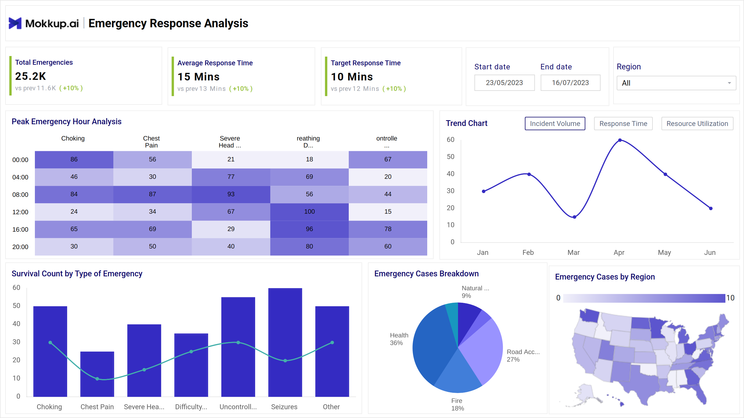
Risk Response Dashboard Example
This Risk strategy evaluation tool provides a centralized view of how an organization manages risk incidents. The dashboard's navigation is broken into overview, heatmaps for peak emergency hours, line charts for trends, bar charts for survival count, and emergency cases by region. It includes interactive filters for date range and regions for zooming-in on high-priority risks.
How to Analyze Data in Risk Management Dashboards
To truly harness the value of this dashboard, it is vital to analyze data through KPIs. You need to evaluate risk mitigation tracking metrics like emergency hours, which can measure peak risk periods. Breaking down emergency cases through pie charts provides an overview of emergency cases by different categories. Comparing various categories ensures real-time risk reporting with survival counts and success rates.
How to Create a Risk Response Dashboard
Follow these three steps for developing a risk control effectiveness dashboard:
1. Create or Log in to Your Mokkup Account
Start by signing up on Mokkup.ai using your email. If you already have an account, just log in, and you’ll be good to go.
2. Choose and Customize Your Dashboard Template
Find the Risk Response Assessment dashboard template in the Templates section. Use the drag-and-drop editor to adjust KPIs, edit filters, or add elements based on your data.
3. Export to Your BI Tool
Once your dashboard wireframe is ready, use the BI Tool Export feature to send it directly to Power BI or Tableau for further analysis and enhancements. You can also download the dashboard as a PDF, PNG, or JPEG, embed it on a platform, or invite your team to collaborate.
Note: This is a Pro template. You’ll need a Pro subscription on Mokkup to use and customize this dashboard wireframe. Upgrade anytime to unlock full access.
Benefits of Risk Response Dashboards
The Mokkup.ai risk response dashboard is a must-have for turning awareness into action since it measures the threat and impact of mitigation efforts. Here is why your business needs it:
- Empowers decision-makers to rely on solid facts to ensure risk preparedness.
- Making it visible to stakeholders increases accountability.
- Quickly detect patterns and trends to uncover hidden risks.
- Ensure an honest record of response timelines and risk assessments for transparent reporting.
Indeed, an Enterprise Risk Monitor will enhance risk oversight capabilities by providing a 360-degree view of risks.
KPIs to Track in Risk Response Dashboards
This business continuity dashboard can evaluate metrics such as:
- Total Emergencies: Total incidents recorded within the specified period.
- Average Response Time: It is defined as the average time taken to respond to emergencies.
- Target Response Time: The desired response time goal.
- Peak Emergency Hour Analysis: Heatmap showing hourly distribution of incidents by type (e.g., choking, chest pain).
- Emergency Cases Breakdown: Pie chart categorizing cases (e.g., road accidents, natural disasters).
Frequently Asked Questions
1. How is response effectiveness measured?
Effectiveness is typically measured by comparing:
- Initial risk rating (likelihood x impact)
- Residual risk after response
- KPIs such as time to respond, survival rate (in emergencies), and completion rate of mitigation actions.
2. Who is responsible for conducting the assessment?
Typically, risk response assessments are conducted by:
- Risk Managers
- Project Managers
- Compliance Teams
- Internal Auditors