The RCT Performance & Analysis dashboard template provides a comparative analysis of different treatment groups in a randomized control trial. It helps stakeholders track participant metrics, effectiveness measures, and trends over time. The interactive filters enable in-depth analysis by group, demographics, and trial outcomes. With a focus on participant engagement and treatment effectiveness, the dashboard wireframe supports decision-making and enhances the ability to identify trends and make adjustments as necessary.
Overview
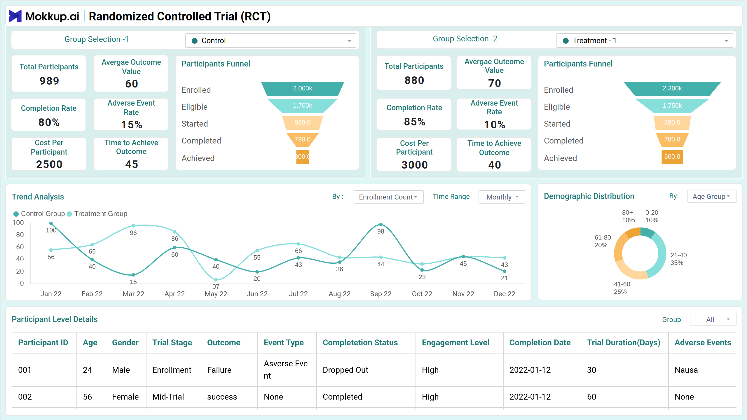
This screen provides a high-level summary of the randomized control trial, enabling stakeholders to compare different treatment groups. The visualizations highlight trends in enrollment, retention, and adverse event rates, offering insights into the trial’s overall progress and effectiveness.
Key Terms to Know
- Group Selection 1: Choose between Control, Treatment 1, and Treatment 2.
- Group Selection 2: Choose between Control, Treatment 1, and Treatment 2.
- Total Participants: Number of participants in the selected group.
- Average Outcome Value: Mean outcome value for participants.
- Completion Rate: Percentage of participants who completed the trial.
- Adverse Event Rate: Percentage of participants reporting adverse events.
- Cost per Participant: Average cost incurred per participant.
- Time to Achieve Outcome: Average time taken to reach the defined outcome.
- Trend Analysis: Compares trends between Group 1 and Group 2 with drop-down options for enrollment count, dropout rate, retention rate, completion rate, total cost, and more. Another drop-down allows selection of time range (weekly, monthly, quarterly).
- Demographic Distribution: Shows participant distribution with drop-down options for age group, location, and gender.
- Participant Level Details: Displays participant-specific data with columns for participant ID, age, gender, outcome, completion status, engagement level, trial outcome, adverse event rate, and additional details.
Effectiveness Measures
This screen evaluates treatment impact through statistical measures, comparing groups on outcomes, dropout reasons, and effect sizes. Visuals like treatment effect over time and p-value comparisons highlight effectiveness, while filters enable in-depth subgroup analysis.
Key Terms to Know
- Age Filter: Filter participants by age group.
- Gender: Filter participants by gender.
- Drop-out Reason: Shows reasons for participant dropouts across different groups.
- Summary Statistics: Displays static results for both groups, including p-value and effect size.
- Effect Size Comparison with p-value: Compares different categories like health improvement, test scores, reduction in symptoms, and recovery rate.
- Treatment Effect Over Time: Tracks treatment effectiveness over time with a legend for Group 1 and Group 2. A drop-down allows selection of time range (weekly, monthly, quarterly).
Dashboard Template Insights
The dashboard wireframe offers valuable insights for both researchers and stakeholders by providing a detailed comparison of treatment effects across different groups.
- Helps track the progress and evolution of different treatment groups over time, identifying patterns and changes in key metrics.
- It clearly visualizes how each treatment compares in terms of overall effectiveness based on various outcome measures, such as health improvement or symptom reduction.
- Understanding the reasons behind participant dropouts is crucial for refining future trials and improving engagement strategies.
- The dashboard wireframe tracks costs per participant and the time taken to achieve outcomes, supporting resource allocation and project efficiency.
Conclusion
The RCT Performance & Analysis dashboard template empowers stakeholders to gain a comprehensive view of trial outcomes, treatment effectiveness, and participant metrics. By using this dashboard wireframe, researchers can make informed decisions, optimize trial processes, and ensure better alignment between treatment strategies and expected outcomes.