
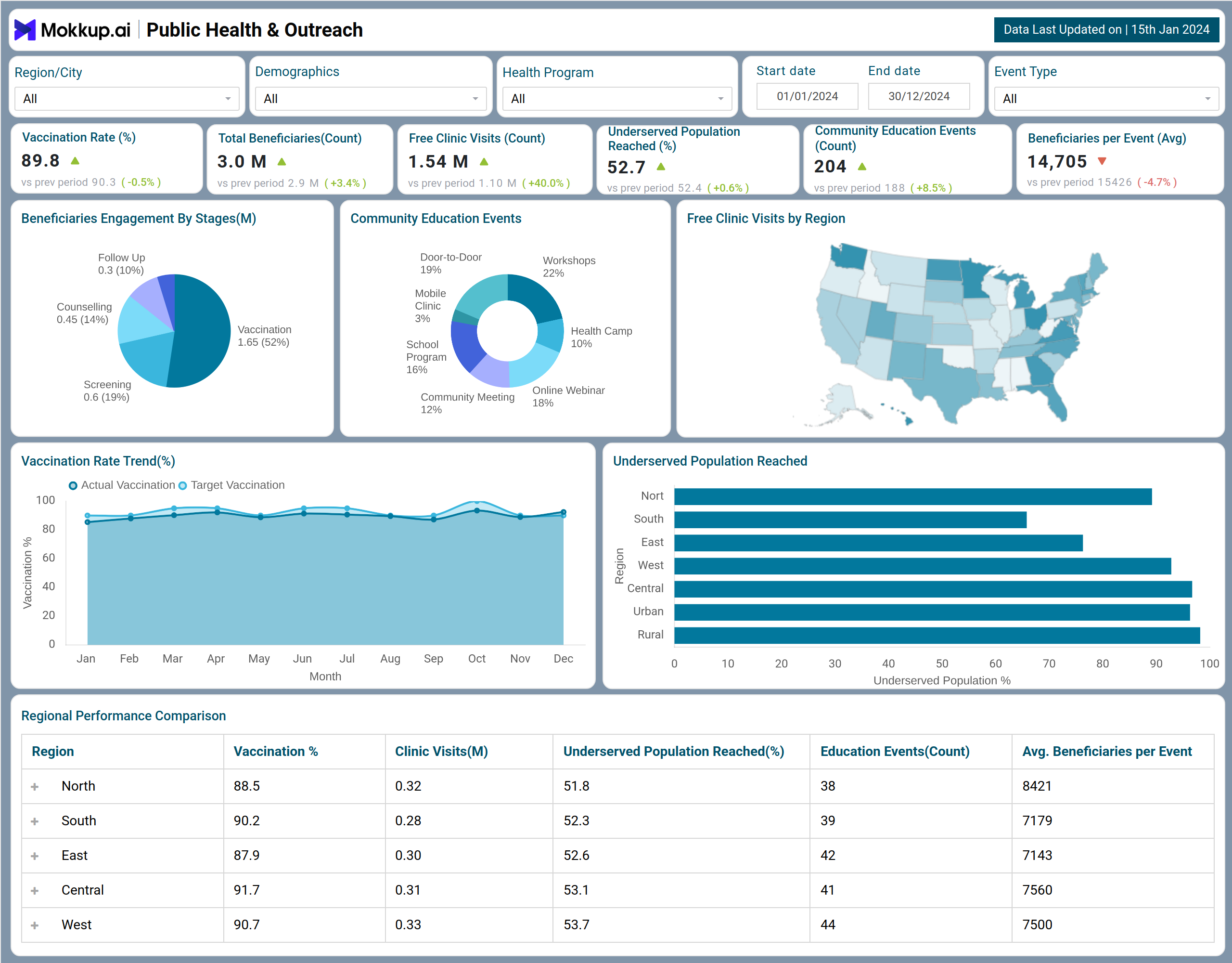
What is a Public Health & Outreach Dashboard?
A Public Health & Outreach Dashboard is a comprehensive decision-support platform that helps health organizations oversee vaccination drives, monitor free clinic attendance, and assess outreach initiatives for underserved communities. As a community health monitoring system, it combines data from clinics, regional programs, and community events into a unified view.
Equipped with KPI cards, filters, and interactive charts, it operates as a vaccination and free clinic tracking dashboard for health program managers. In addition, it delivers health program outreach analytics that uncover performance gaps, measure event impact, and track coverage across vulnerable groups. Ultimately, it acts as a population health engagement reporting tool that strengthens decision-making and program effectiveness. Similar to the Public Health Safety Report, it highlights the importance of education programs and allows regional performance comparison.
How to Create a Public Health & Outreach Dashboard
You don’t need to build your report from scratch-just start with a ready-to-use Public Health & Outreach dashboard template from Mokkup. Add in your data and export it however you like. Here’s how to do it:
1. Create or Log in to Your Mokkup Account
Start by signing up on Mokkup.ai using your email. If you already have an account, just log in, and you’ll be good to go.
2. Choose and Customize Your Dashboard Template
Find the Public Health & Outreach Dashboard template in the Templates section. Use the drag-and-drop editor to adjust KPIs, edit filters, or add elements based on your data.
3. Export to Your BI Tool
Once your dashboard wireframe is ready, use the BI Tool Export feature to send it directly to Power BI or Tableau for further analysis and enhancements. You can also download the dashboard as a PDF, PNG, or JPEG, embed it on a platform, or invite your team to collaborate.
Note: This is a Pro template. You’ll need a Pro subscription on Mokkup to use and customize this dashboard wireframe. Upgrade anytime to unlock full access.
Public Health & Outreach Dashboard Example
A Public Health & Outreach Dashboard uses bar charts, line charts, heatmaps, and KPIs to track outreach performance and community health trends. Filters such as time, demographics, program type, and geography make the dashboard interactive for targeted analysis. Navigation features like tabs, drill-downs, and map-based selection help users move easily from high-level summaries to detailed insights. Together, these elements ensure health programs can be monitored, optimized, and scaled effectively.
How to Analyze Data in Public Health & Outreach Dashboards
The process to analyze data in this dashboard includes:
- Define objectives: Clarify what the dashboard should reveal for decision-making.
- Track core health metrics: Monitor disease incidence, vaccination coverage, and health outcomes.
- Apply Health Program Outreach Analytics: Measure campaign reach, participation, and community engagement.
- Compare across dimensions: Evaluate data by time, geography, and demographics to spot disparities.
- Check data reliability: Identify gaps, underreporting, or inconsistencies that affect insights.
- Link outreach to impact: Assess how programs influence health outcomes.
Benefits of Public Health & Outreach Dashboards
The following are some of the crucial benefits of the Population health engagement reporting tool:
- Centralized vaccination and outreach data monitoring: Track all vaccination and outreach activities in one place.
- Data-driven decision-making for health program planning: Use collected data to guide and improve program strategies.
- More intelligent resource allocation based on regional demand: Allocate staff and resources efficiently according to local needs.
- Improved community engagement through event tracking: Monitor events to boost participation and involvement.
- Transparent reporting to stakeholders and funders: Share clear and accurate program results with stakeholders.
- Custom filters for demographics, program types, and event categories: Easily segment data for targeted analysis and insights.
KPIs to Track in Public Health & Outreach Dashboards
Public health professionals can track the following KPIs from this vaccination and free clinic tracking dashboard:
- Overall Vaccination Rate (%) -Tracks the share of the population vaccinated in a given period.
- Total Beneficiaries (Count) -Measures the number of individual programs that reach.
- Free Clinic Visits -Shows attendance across free health clinics.
- Underserved Population Reached (%) -Highlights outreach effectiveness for vulnerable groups.
- Community Education Events- Counts all awareness and education initiatives conducted.
- Beneficiaries per Event (Avg.) - Indicates the average participation per event.
Frequently Asked Questions
1. How can this dashboard help identify regions with low vaccination coverage?
It visualizes vaccination trends and underserved population percentages, allowing managers to pinpoint regions needing targeted outreach.
2. Can the dashboard measure the effectiveness of different community outreach programs?
Yes, tracking engagement stages, event participation, and regional performance it highlights which initiatives deliver the most impact.
3. Is the dashboard customizable for different demographics or program segments?
Yes, filters allow segmentation by region, age, gender, program type, event type, and timeframe for targeted insights.