
What is a Preventive Dentistry & Outreach Dashboard?
A Preventive Dentistry & Outreach Dashboard is a data visualization tool designed to provide dental healthcare professionals and program managers with detailed insights into preventive dental care activities and outreach efforts. It aggregates data from dental clinics, patient screenings, fluoride treatments, volunteer participation, and dental camps to monitor oral health trends and program effectiveness.
This dashboard also works as a real-time dental screening dashboard, helping teams track progress, identify underserved areas, and improve preventive dental care statistics across different demographics.
How to Create a Preventive Dentistry & Outreach Dashboard
You don’t need to build your report from scratch—just start with a ready-to-use Preventive Dentistry & Outreach dashboard template for communities from Mokkup. Add in your data and export it however you like. Here’s how to do it:
1. Create or Log in to Your Mokkup Account
Start by signing up on Mokkup.ai using your email. If you already have an account, just log in, and you’ll be good to go.
2. Choose and Customize Your Dashboard Template
Find the Preventive Dentistry & Outreach Dashboard template in the Templates section. Use the drag-and-drop editor to adjust KPIs, edit filters, or add elements based on your data.
3. Export to Your BI Tool
Once your dashboard wireframe is ready, use the BI Tool Export feature to send it directly to Power BI or Tableau for further analysis and enhancements. You can also download the dashboard as a PDF, PNG, or JPEG, embed it on a platform, or invite your team to collaborate.
Note: This is a Pro template. You’ll need a Pro subscription on Mokkup to use and customize this dashboard wireframe. Upgrade anytime to unlock full access.
Preventive Dentistry & Outreach Dashboard Example
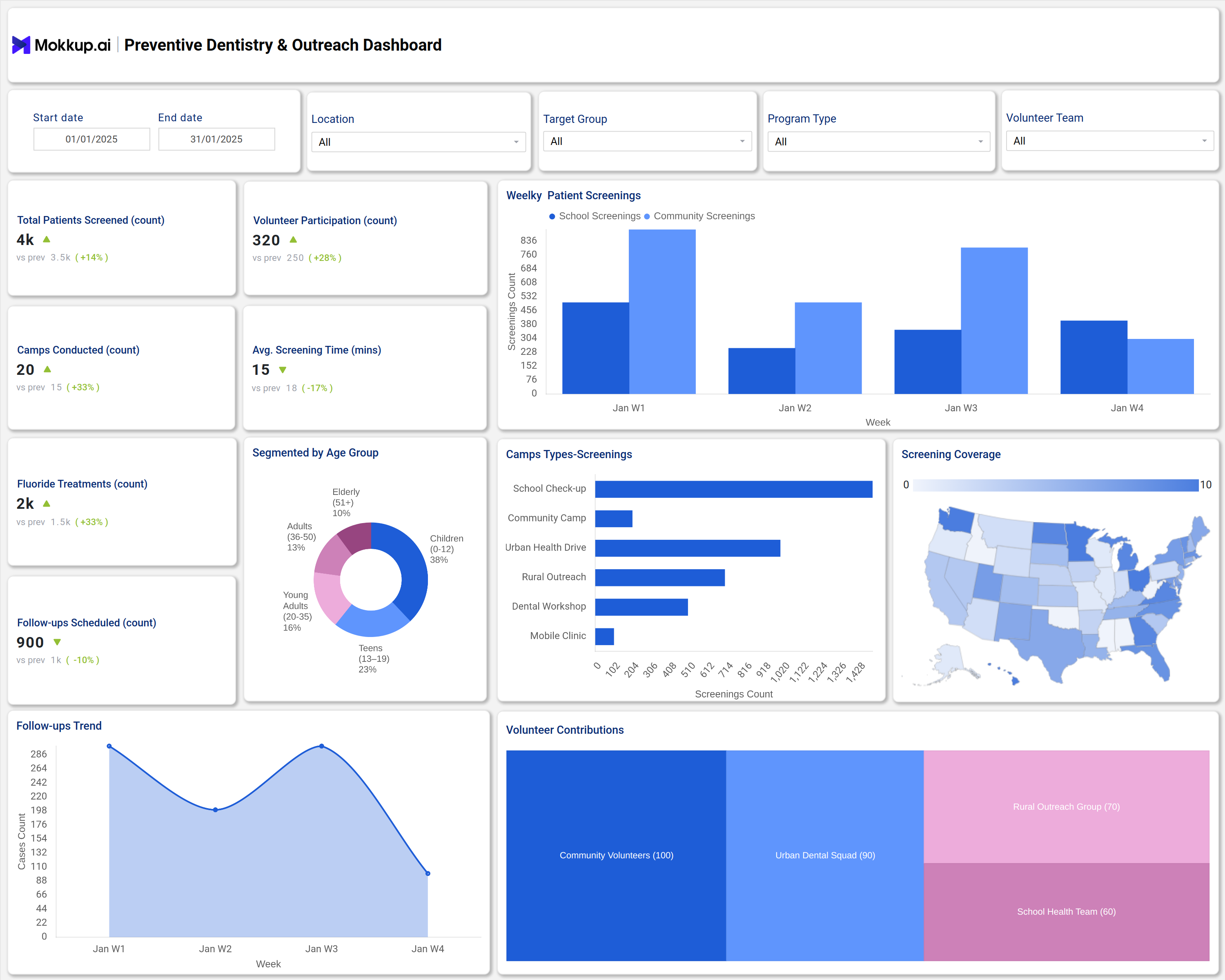
A typical example of this dashboard includes measurements such as total patients screened, fluoride treatments administered, camps conducted, and volunteer involvement. It segments data by age groups and program types, showing weekly patient screenings and screening coverage by location.
Visual tools like bar charts for camp types and screening counts, along with follow-up scheduling trends, help track ongoing outreach effectiveness. Volunteer contributions are also monitored to ensure community engagement. These components provide a comprehensive view of preventive dental care delivery and help align resources with community needs to reduce cavities and improve oral hygiene awareness.
Together, these insights form a real-time dental screening dashboard that strengthens dental outreach analytics and supports data-driven preventive strategies.
How to Analyze Data in Preventive Dentistry & Outreach Dashboards
- Use it as a performance monitor to monitor the total number of patients screened, assess outreach coverage and evaluate preventive program success.
- Track fluoride treatment counts for insights on cavity prevention effectiveness.
- Analyze volunteer participation to optimize staffing and community engagement.
- Use weekly patient screening trends to evaluate campaign timing and impact.
- Segment data by age groups to tailor preventive interventions to target demographics.
- Review follow-up schedules to ensure continuity of care and patient compliance.
- Map geographic screening coverage to identify areas needing increased outreach efforts.
These data points improve preventive dental care statistics and guide decisions for better resource allocation.
Benefits of Community Preventive Dentistry & Outreach Dashboards
- Provides clear visibility into preventive dental care and outreach program performance.
- Enhances resource allocation by identifying high-impact areas and groups.
- Supports early detection of oral health issues through screening metrics.
- Improves community engagement via volunteer tracking and program participation.
- Allows for timely data-driven adjustments to outreach strategies.
- Increases accountability and reporting accuracy for funding and stakeholders.
- Boosts patient oral health tracking and cavity prevention through actionable insights.
Dashboards like these serve as the foundation for strong dental outreach analytics, ensuring that every program drives measurable results.
KPIs to Track in Community Preventive Dentistry & Outreach Dashboards
- Total Patients Screened: Measures overall outreach reach and program scale.
- Fluoride Treatments (count): Indicator of preventive intervention coverage.
- Volunteer Participation (count): Tracks volunteer involvement in outreach activities.
- Camps Conducted (count): Number of dental camps held to provide community care.
- Average Screening Time (mins): Efficiency metric for patient screenings.
- Follow-ups Scheduled (count): Reflects continuity in patient care post-screening.
Frequently Asked Questions
1.How does fluoride treatment data support cavity prevention analytics?
Fluoride application reduces dental decay risk; tracking this data helps measure preventive care effectiveness.
2.Can these dashboards assist in patient oral health tracking?
Yes, by recording screenings and follow-up appointments, these dashboards support ongoing oral health monitoring.
3. How are outreach programs evaluated using this dashboard?
Through metrics like total patients screened, camps conducted, and geographic coverage, program reach and impact are quantified.